El veredicto
Right, let me tell you something — E11EVEN Technologies has the ingredients of a Michelin-star restaurant. 20,000+ projects, 10 testimonials with real names attached, a portfolio that actually looks like someone gave a damn. But then you serve it on a plate that takes 6.3 SECONDS to reach the table on mobile. You're a WEBSITE DESIGN AGENCY with a website that loads like it's being delivered by carrier pigeon! That's like a Michelin chef microwaving the bread rolls. The copy has real flair in places — sharp, confident, occasionally brilliant — but it keeps talking about how great the kitchen is instead of telling the customer how the meal will change their life. Fix that catastrophic load time, tighten the hero messaging, and inject some actual business outcomes into those testimonials, and this site goes from 'nice portfolio piece' to a genuine client-converting machine. Right now? You're leaving money on the table while your page is still loading.
The Branding Agency That Needs to Brand Itself Better
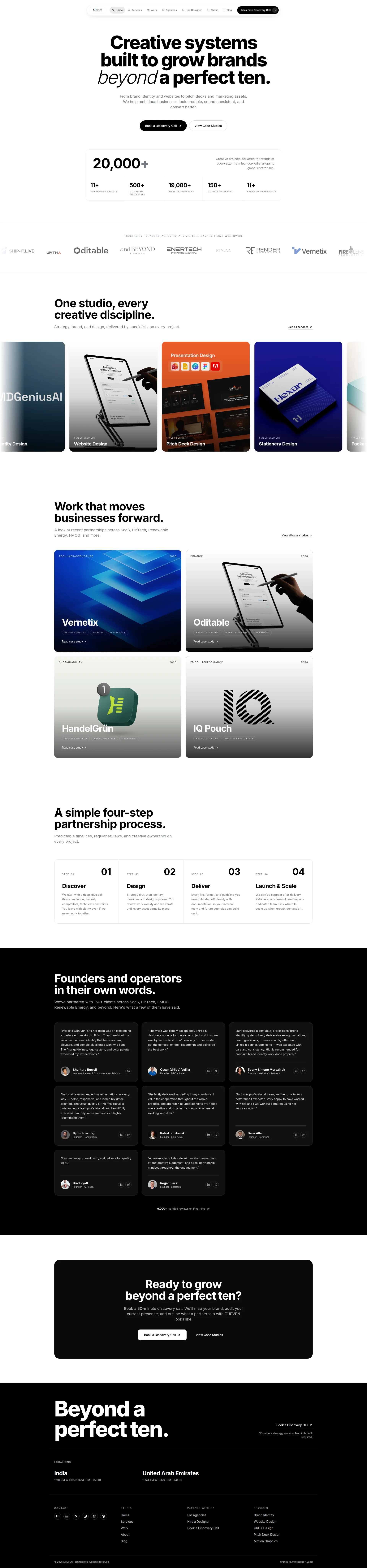
Look, E11EVEN Technologies is clearly not a scam operation run from someone's bedroom. The portfolio is real, the testimonials have names and companies attached, and the service breadth is genuinely impressive. But here's the thing — you're a branding and web design agency. Your website IS your portfolio. And right now your mobile LCP is 6.3 seconds. That's not a performance issue, that's a confession. You're handing prospects a reason to bounce before they even see your work. The hero copy is punchy and the visual design from the screenshot looks clean and modern, but the site is carrying 5.9MB of page weight and 60 images like a designer who can't say no to their own assets. The trust signals are strong but incomplete — no pricing, no contact form, no legal pages visible. For a studio pitching 'credibility' as a core deliverable, some of this is genuinely ironic.
Sección Hero
DECENT
Right, let's start with what's GOOD because I'm not a monster — Creative systems built to grow brands beyond a perfect ten is a genuinely tasty headline. It's specific, it uses the brand's own language, and it creates curiosity without being one of those insufferable riddles that makes you wonder if the copywriter was having a stroke. The italic serif on beyond creates real typographic rhythm — THAT is a branding agency showing its craft on the plate. The dual CTA — Book a Discovery Call primary, View Case Studies secondary — is smart. You're serving the hungry customer AND the one who wants to read the menu first. Brilliant.
But then — BLOODY HELL — there's a capitalization error in the subheadline! 'We' is capitalized mid-sentence after a comma! You're a BRANDING AGENCY! That's like a spelling mistake on a restaurant's menu — it makes everyone question whether you actually care about the details you're charging premium prices for. Get that fixed before I finish this sentence.
Here's the real problem though: your hero is a beautiful plate with no aroma. Where's the social proof above the fold? You've got 20,000+ projects and 10 solid testimonials — why is NONE of that in the hero? Your first impression is entirely copy-dependent, and while the copy is good, it's not 'I'll trust you with my brand budget without seeing proof' good. Nobody is. And ambitious businesses? Come ON. That's every business that's ever existed! Name your customer — founders, SaaS teams, FMCG brands — or you're essentially shouting into a crowded room and hoping the right person turns around. Oh, and the nav says Book Free Discovery Call but the hero button drops the word Free. The nav version is BETTER. Free removes friction. Why would you hide the stronger copy in the corner?!
Ejemplos de mejoras
From brand identity and websites to pitch decks and marketing assets, We help ambitious businesses look credible, sound consistent, and convert better.
From brand identity and websites to pitch decks and marketing assets, we help founders and fast-growing teams look credible, sound consistent, and convert better. Trusted by 500+ mid-sized businesses across 150 countries.
Fixes the embarrassing capitalization error, names a specific audience segment so the right people self-select, and injects the social proof number directly into the hero where it actually earns its keep instead of sitting below the fold gathering dust.
Puntos fuertes
- Headline 'beyond a perfect ten' is distinctive brand language that actually differentiates — it's not another 'we build beautiful brands' snoozefest, it's a signature phrase that sticks like a good sauce
- Dual CTA structure handles both the ready-to-buy customer and the still-browsing researcher — that's understanding your audience like a chef who offers both tasting menus and à la carte
- Typographic hierarchy is chef's kiss — the italic serif contrast on 'beyond' demonstrates the design craft being sold, showing rather than telling, which is exactly how you plate confidence
A mejorar
- Capitalization error 'We help ambitious businesses' mid-sentence after a comma — a branding agency with a grammar mistake in its hero is like a hygiene inspector with dirty fingernails. FIX IT.
- Zero social proof above the fold — you've got 20,000+ projects and 10 real testimonials sitting below the scroll while your hero relies on pure copy confidence. That's serving the appetizer without letting anyone smell the kitchen
- Target audience 'ambitious businesses' is so vague it means absolutely nothing — every business thinks it's ambitious. Name founders, name SaaS, name FMCG — qualify your leads before they even click
Copywriting
DECENT
Listen, I'm going to say something I don't say often — parts of this copy are genuinely EXCELLENT. Identity systems built to move markets, not win awards — THAT is the kind of line that makes a CMO stop scrolling, screenshot it, and send it to their CEO. That's a dish that sells itself. The process section? You leave with clarity even if we never work together — that is DISARMING. That's the kind of confidence that makes people trust you precisely because you're not desperate. Most agency websites read like a LinkedIn post drafted by committee during a team-building exercise. This doesn't. Respect.
BUT — and this is a big but — your copy has a chronic illness: it keeps talking about the CHEF instead of the MEAL. We start where most agencies skip ahead — who cares about your process?! Tell me what I GET! Your testimonials? Ten of them, real names, real companies — beautiful. But not a SINGLE ONE mentions a measurable business outcome! The logo system exceeded my expectations is a pat on the back. We closed our Series A two weeks after the rebrand is a REASON TO HIRE YOU. See the difference? One makes you feel good. The other makes you money.
And that stat block — 20,000+ projects. Let me do the maths. Over 11 years, that's roughly 1,818 projects per year. Nearly FIVE projects a DAY. Does that scream premium bespoke studio to you? Or does it scream volume factory? For a studio positioning itself as the fine-dining option, leading with the biggest, most diluted number is like a restaurant bragging about how many covers they do. 500+ mid-sized business brands built would be ten times more persuasive. The word count is healthy, the tone is confident, the grammar is mostly clean apart from that hero disaster. But you're leaving serious conversion on the table by describing your ingredients instead of describing how the dish TASTES.
Ejemplos de mejoras
We start with a deep-dive call. Goals, audience, market, competitors, technical constraints. You leave with clarity even if we never work together.
We start with a deep-dive call. Goals, audience, market, competitors, technical constraints. You leave with a clear positioning direction — even if we never work together. Most clients say it's the most useful 30 minutes they've spent on their brand.
The original line is already strong — this version adds a specific outcome ('clear positioning direction') and a social proof micro-claim that reinforces the value of the call. It's the difference between saying 'our food is good' and 'our food will make you come back Thursday.' One informs, the other converts.
Puntos fuertes
- 'Identity systems built to move markets, not win awards' is a line so sharp it could cut glass — it signals strategic maturity over aesthetic vanity and positions the studio as a business partner, not a decoration service
- Process section copy is client-benefit-led throughout — 'You leave with clarity even if we never work together' is the kind of trust-building line that most agencies would be too insecure to write. That's REAL confidence.
- Ten testimonials with full names, company names, and specific deliverables — significantly more credible than the anonymous 'CEO of a tech company' nonsense that plagues every other agency site
A mejorar
- Stat block leads with 20,000+ total projects — a number so large it screams volume factory and directly contradicts the premium positioning. That's putting 'fast food' on the menu of a fine-dining restaurant. Segment it: '500+ mid-sized business brands built' hits harder.
- Ten testimonials and NOT ONE mentions a measurable business outcome — every quote praises deliverable quality but none prove ROI. 'Beautiful brand' doesn't open wallets. 'Revenue increased 40% post-rebrand' does.
- Agency-centric framing keeps creeping in — 'We start where most agencies skip ahead' talks about YOUR process rather than MY transformation. Flip the lens: tell me what changes in MY business, not what happens in YOUR studio
Desbloquear las 8 categorías restantes
Call-to-Action
GOOD
Contenido bloqueado
Prueba Social
DECENT
Contenido bloqueado
Arquitectura
GOOD
Contenido bloqueado
SEO y Meta
DECENT
Contenido bloqueado
Móvil
NEEDS WORK
Contenido bloqueado
Diseño Visual & Branding
GOOD
Contenido bloqueado
Rendimiento
CRITICAL
Contenido bloqueado
llmreadiness
DECENT
Contenido bloqueado
Contenido bloqueado
Accede a la conclusión completa con las 3 acciones prioritarias y un mensaje motivador personalizado.