El veredicto
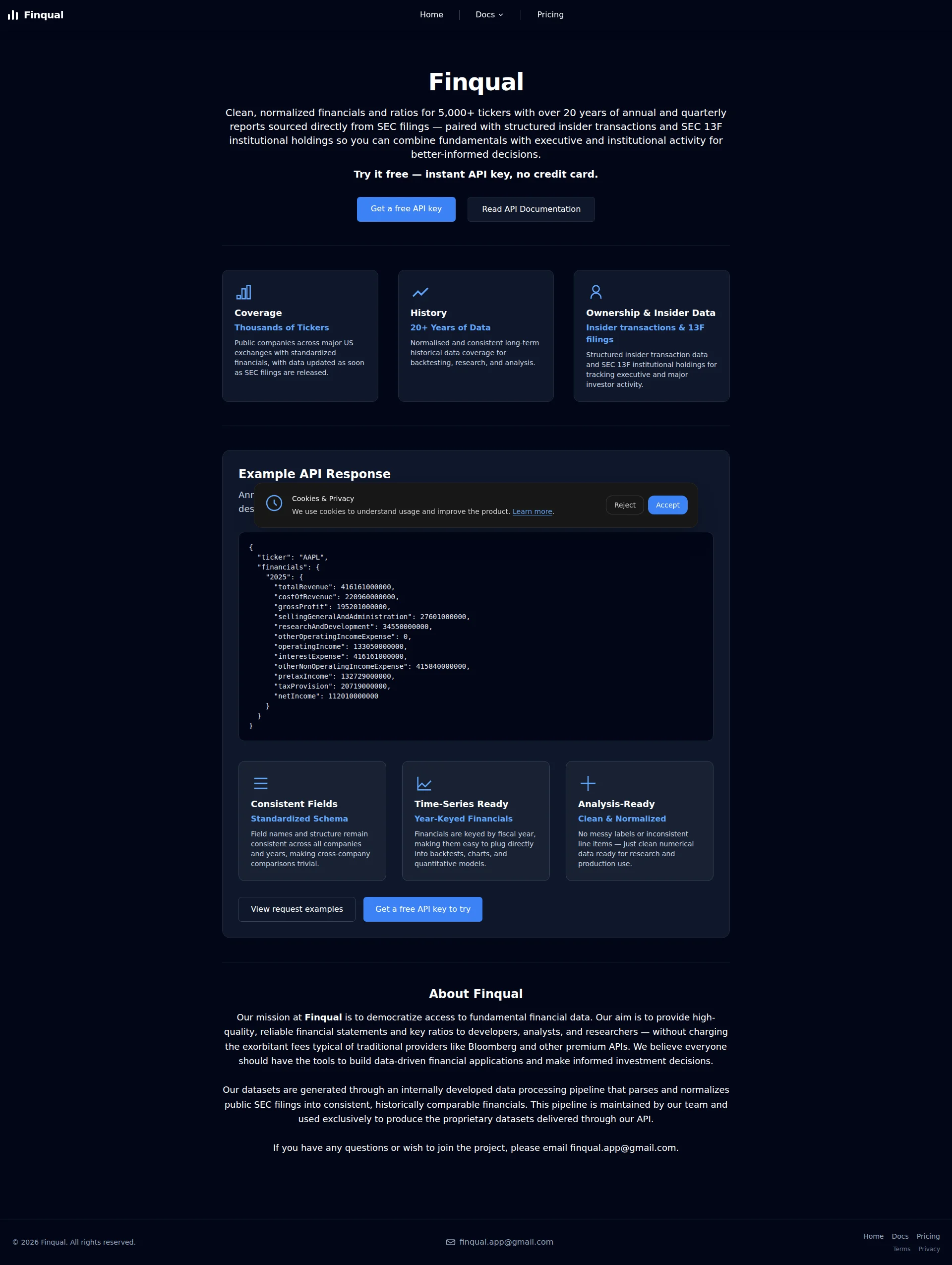
Right, listen up. Finqual has got REAL ingredients in the kitchen — insider transaction data, 5,000+ tickers, transparent pricing, and a page that loads faster than I can yell 'IT'S RAW!' But BLOODY HELL, what have you done with the rest of it?! Your hero headline is literally just your company name — that's like putting a blank sign outside your restaurant and hoping people wander in because the building smells nice. Zero social proof, a Gmail address as your main contact (are you SERIOUS?!), and copy so feature-dense it reads like someone swallowed a SEC filing and threw up on the page. The performance is genuinely brilliant — LCP over 1200 seconds on mobile is... wait. WAIT. That LCP is 1,206 seconds?! That's TWENTY MINUTES to paint the largest element! Your PageSpeed score might look pretty but something is catastrophically broken under the hood. You've got a product that could genuinely compete, sitting on a landing page that's doing everything in its power to make sure nobody finds out. Fix the trust signals, rewrite that hero like you actually want customers, sort out whatever is causing that absurd load time, and stop treating your landing page like a README file. There's a Michelin-star dish buried under all this — but right now you're serving it on a paper plate in a car park.
Finqual: The API That Dresses Like a Bloomberg Killer But Forgot to Invite Anyone to the Party
Look, Finqual is doing some things right — the performance is borderline embarrassing for competitors (98/100 mobile PageSpeed, 85KB total weight, LCP at 1.21s), the pricing is transparent and genuinely accessible, and the insider transaction angle is a real differentiator against FMP and AlphaVantage. The comparison table on the pricing page? Smart. But then you scroll and realize there are zero testimonials, zero customer logos, a Gmail address as the main contact, no Open Graph tags, and a hero headline that is literally just the company name. This site is built like a developer's weekend project that accidentally got good at one thing (performance) and forgot everything else (persuasion). The copy is feature-dense but benefit-starved, the trust signals are basically nonexistent, and the H1 being 'Finqual' is the kind of SEO decision that makes Google cry into its algorithm. There's a real product here — it just needs a landing page worthy of it.
Sección Hero
NEEDS WORK
Is THAT your hero?! Your H1 is literally just Finqual. That's it. Just the name. That's like opening a restaurant and putting NOTHING on the menu board except Daves Place.' A visitor landing on this page cold has ZERO idea what you do until they wade through a 60-word paragraph so dense it could qualify as its own SEC filing. And look — the ingredients ARE there! 5,000+ tickers, 20+ years of history, insider transactions, 13F holdings — that's a properly stocked kitchen! But you've shoved every single ingredient into one massive run-on sentence and served it as a wall of text. It's like dumping lobster, truffle, and wagyu into a blender and calling it soup. SEPARATE THE FLAVOURS! Now, credit where it's due — and I mean this sincerely — your CTA pairing is actually well done. Get a free API key next to Read API Documentation is a beautiful primary/secondary split. That micro-copy underneath — Try it free — instant API key, no credit card — THAT is how you reduce friction. Genuinely smart. But then there's NOTHING else. No social proof. No user count. No trusted by X developers. No Y million API calls served. For a B2B API where developers are deciding whether to build their entire application on your data pipeline, you're asking them to take a leap of faith based on... a paragraph and a blue button. The dark theme is fine for developers — I'm not arguing with that. But your hero is ALL text, no visual demonstration. That API response code block sitting below the fold? That's your money shot and you've hidden it like you're embarrassed by it. Pull something visual up into the hero. SHOW the product, don't just describe it in a run-on sentence that would make your English teacher weep.
Ejemplos de mejoras
Finqual
Financial Data API for Developers — Free, Clean, and Actually Useful
Your H1 should scream what you ARE, not just who you are. 'Finqual' tells a cold visitor absolutely nothing — they have to read an entire paragraph to figure out you're a financial data API. A benefit-led H1 answers 'what is this and why should I care?' in under 3 seconds. That's the difference between a restaurant with a menu in the window and one with blacked-out glass.
Clean, normalized financials and ratios for 5,000+ tickers with over 20 years of annual and quarterly reports sourced directly from SEC filings — paired with structured insider transactions and SEC 13F institutional holdings so you can combine fundamentals with executive and institutional activity for better-informed decisions.
Get instant API access to clean financials for 5,000+ tickers — income statements, balance sheets, insider trades, and 13F holdings, normalized and ready to plug into your models. No Bloomberg fees. No messy data.
The original is one monstrous sentence that front-loads process ('sourced directly from SEC filings') over outcomes. The rewrite leads with what the developer actually GETS, uses second-person framing ('your models'), and closes with the emotional punch that differentiates you. Stop writing like a compliance document and start writing like you want customers!
Puntos fuertes
- Primary/secondary CTA pairing is genuinely well-executed — 'Get a free API key' vs 'Read API Documentation' correctly segments ready buyers from researchers, and THAT is proper kitchen organisation
- The micro-copy 'Try it free — instant API key, no credit card' is specific, friction-reducing, and placed exactly where it needs to be — this is the one dish on the menu that's actually seasoned properly
- Concrete numbers are present (5,000+ tickers, 20+ years, quarterly reports) — you've got premium ingredients, they're just buried under a mountain of garnish nobody asked for
A mejorar
- H1 is just 'Finqual' — your company name — which communicates absolutely NOTHING about what you do, wastes the most SEO-valuable element on the entire page, and forces a 60-word paragraph to do all the heavy lifting. That's like having a head chef who just stands there while the dishwasher runs the kitchen!
- ZERO social proof in the hero section — no user count, no developer logos, no 'X API calls served' counter — you're asking developers to build on your infrastructure based on vibes alone, and that's a recipe for bounced visitors
- The hero body copy is a single breathless run-on sentence stuffed with features (SEC filings, 13F holdings, insider transactions) that reads like someone dictated a product spec sheet while running for a bus — break it up, lead with benefits, and let the features breathe!
Copywriting
NEEDS WORK
BLOODY HELL, this copy reads like it was written by someone who knows every single thing about the product and assumed the reader does too. That's the cardinal sin of copywriting — it's like a chef who seasons food to their own palate and never once asks the customer what they taste. The homepage is drowning in feature descriptors — normalized, standardized schema, year-keyed financials, SEC 13F institutional holdings — and almost NONE of it is translated into what those features actually DO for the developer sitting there at 2am trying to decide between you and a competitor. You say 20+ Years of Data like it's self-explanatory. It's NOT! Say backtest your strategy across two full market cycles — 2008 crash, COVID crash, and everything between. THAT makes a developer's eyes light up. And then we get to the About Finqual section. Oh, mate. Our mission is to democratize access to fundamental financial data. That's not copy, that's a university thesis abstract! And it CLOSES with If you have any questions or wish to join the project, please email [email protected]. JOIN THE PROJECT?! A Gmail address?! You're supposed to be a commercial API service, not a weekend hackathon looking for contributors! That single line is doing more damage to your credibility than you can possibly imagine. Now, the GOOD stuff — because there IS good stuff and I'm not going to pretend otherwise. Your pricing page comparison table is EXCELLENT. Get the Edge Other Free APIs Dont Offer' — that's competitive, specific, benefit-led copy. That's the one perfectly cooked steak on a plate of raw chicken. That energy, that specificity, that competitive fire — it needs to be on the HOMEPAGE, not buried on a secondary page. The tone is right for developers — no fluff, no consumer nonsense — but right tone and persuasive copy are two very different things. You can be direct AND compelling. Right now you're just direct.
Ejemplos de mejoras
Our mission at Finqual is to democratize access to fundamental financial data. Our aim is to provide high-quality, reliable financial statements and key ratios to developers, analysts, and researchers — without charging the exorbitant fees typical of traditional providers like Bloomberg and other premium APIs.
Bloomberg charges $24,000/year for financial data. Finqual charges $0 to start — and $19.99/mo for full historical access. Same SEC-sourced fundamentals, none of the enterprise sales call.
The original is abstract mission-speak that could be on any fintech's 'About' page. The rewrite makes the EXACT same point but with a concrete price comparison that creates an immediate 'wait, WHAT?' moment. For developers, specificity beats aspiration every single time. Stop telling them your philosophy and start showing them the price tag.
Puntos fuertes
- The pricing page comparison table ('Get the Edge Other Free APIs Don't Offer') is sharp, competitive, and benefit-focused — it's the best-written section on the entire site, and frankly it's carrying the whole operation on its back like a sous chef covering for an absent head chef
- Concrete specificity appears consistently: '5,000+ tickers,' '20+ years,' '$5.99/mo,' '100 API calls/day' — these numbers build real credibility, and specificity is the seasoning that separates amateur copy from professional
- The tone is appropriately no-nonsense and technical for a developer audience — no hollow buzzwords like 'revolutionary' or 'game-changing,' and that restraint actually earns respect with this crowd
A mejorar
- Features are almost NEVER translated into developer outcomes — '20+ Years of Data' just sits there as a bald fact when it should be 'backtest across two full market cycles including 2008 and COVID' — you're listing ingredients instead of describing the dish!
- The 'About Finqual' section uses grant-application language ('democratize access') and closes with 'wish to join the project' plus a Gmail address — that's not a commercial API, that's a GitHub README begging for contributors. Seriously?!
- Zero customer-outcome language ANYWHERE on the site — no 'developers using Finqual have built X,' no use cases, no 'here's what you can do with this' framing — your data sits there like raw ingredients on a counter with no recipe in sight
Call-to-Action
DECENT
Contenido bloqueado
Prueba Social
CRITICAL
Contenido bloqueado
Arquitectura
DECENT
Contenido bloqueado
SEO y Meta
NEEDS WORK
Contenido bloqueado
Móvil
GOOD
Contenido bloqueado
Diseño Visual & Branding
DECENT
Contenido bloqueado
Rendimiento
GOOD
Contenido bloqueado
llmreadiness
DECENT
Contenido bloqueado