El veredicto
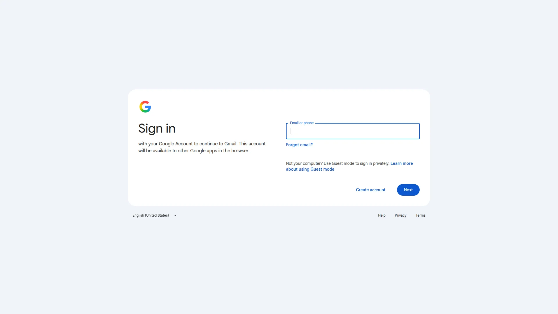
Right, listen up. This is Google's sign-in page — it's a LOGIN FORM, not a landing page. Roasting it for conversions is like yelling at a dishwasher for not plating your steak. But here's the thing: even a dishwasher can be clean or filthy, and this one's got problems. The design? Spotless. Minimal. Elegant, even — like a perfectly white plate with nothing on it. The copy? 53 words. FIFTY-THREE. My Gordon Ramsay insults have more words than this entire page. Trust signals? Nonexistent beyond the Google logo doing ALL the heavy lifting like a sous chef carrying the whole kitchen on his back. The HTML weighs over 1,200KB for a page with one text field — that's like shipping a refrigerator to deliver a single ice cube. LCP at 1.3 seconds is genuinely fast though, I'll give them that. Google gets away with this because they're Google. You try serving this to cold traffic and you'll be closing your restaurant by Tuesday.
Google's Login Page Walks Into a Roast — And It Deserves Every Bit
Look, this is Google's sign-in page. It does ONE job: get you logged in. And honestly? It does that job with the quiet confidence of someone who knows they own the internet. The visual design is clean, the hierarchy is clear, and the CTA is right there in your face. But strip away the brand recognition and what do you have? A white card floating in a gray void with 53 words and zero reasons to trust it if you'd never heard of Gmail. No social proof, no structured data, an HTML file the size of a small novel, and LLM readiness so bad it's basically invisible to AI. Google gets away with it because it's Google. You? You won't.
Sección Hero
NEEDS WORK
BLOODY HELL, is THAT your hero section?! It's like walking into a Michelin-star restaurant and being handed a napkin with Eat Food written on it. Sign in as your H1 — oh, BRILLIANT. Really stretching the creative muscles there, aren't we? That's about as inspiring as a WET FLOOR sign in a hospital corridor.
Look, I'll be fair — the PLATING is decent. The white card on the light gray background is clean, the Google logo sits top-left where your eye goes first, the left-right split between headline and form is logical, and the typography hierarchy works: big bold Sign in, smaller lighter subtext, neat form label. The blue Next button pops against all that white like a garnish on a clean plate. That part? That's competent kitchen work.
But WHERE is the sizzle?! Where's the aroma that makes someone WANT to sit down?! There's zero value proposition anywhere above the fold. Not a single Worlds most popular email' or 1.8 billion users trust Gmail — NOTHING. The subtext just says with your Google Account to continue to Gmail like a robot reading instructions off a cereal box. That's a MECHANISM, not a REASON.
And Next as your CTA label? SERIOUSLY?! Next is what you say when you're speed-dating and the person bores you. It tells the user absolutely NOTHING about what's waiting for them. No anticipation, no reward, just... next.
No hero image. No inbox preview. No productivity visual. Just a text field floating in a sea of white space like a lonely crouton in a bowl of nothing. Google's brand recognition is doing ALL the work here — it's like a world-famous chef serving plain toast and people eating it because of the NAME on the door. You don't have that luxury, so learn from this: clarity without persuasion is just a sign, not a sales pitch.
Ejemplos de mejoras
Sign in
Sign in to Gmail — 15 GB free, zero spam, works everywhere
The H1 right now is a plain instruction — like writing 'KITCHEN' on the kitchen door. Adding core value props directly into the headline turns a bland command into an actual reason to proceed. Give them the AROMA before they walk in.
Next
Continue to my inbox
'Next' tells you absolutely nothing — next what? Next disappointment? 'Continue to my inbox' confirms the destination and makes clicking feel like opening a door to something you WANT, not just stepping through a bureaucratic checkpoint.
Puntos fuertes
- Message clarity is razor-sharp — 'Sign in' communicates the page purpose in under 1 second flat, no ambiguity, no confusion, like a perfectly labeled ingredient jar
- The blue CTA button is visually contrasted against the white card, sits above the fold, and you'd have to be BLIND to miss it — solid functional placement
- Typography hierarchy between the H1, subtext, and form label is clean and deliberate — the visual pecking order works exactly as it should
A mejorar
- Zero value proposition in the hero — there's absolutely no reason WHY you'd want to sign in communicated anywhere above the fold, it's all instruction and no inspiration
- 'Next' is the most lifeless, flavorless CTA label I've ever seen — it communicates nothing about what happens after you click, like a menu that just says 'Food'
- No hero visual whatsoever — the left half of the card is just floating text on white emptiness with no supporting imagery, no inbox preview, no visual promise of what's inside
Copywriting
CRITICAL
53 words. FIFTY-THREE WORDS. I've sent back dishes with more words on the complaint card! This page has less copy than a fortune cookie, and somehow the fortune cookie would be more persuasive.
Now look — I KNOW this is a login page, not a sales page. But even a sign-in screen can have a PULSE. What we've got here is a page that reads like it was written by a thermostat. Every single word is mechanical, functional, devoid of any human warmth. It's the culinary equivalent of boiled chicken with no salt — technically edible, spiritually devastating.
This account will be available to other Google apps in the browser — oh WONDERFUL, thank you for explaining Single Sign-On architecture to me like I'm reading a server manual at 3 AM! Nobody on EARTH woke up excited about their account being available to other apps in the browser. The BENEFIT is sign in once, access everything — THAT'S what makes someone feel something. You've served the recipe card instead of the meal!
The one bright spot — and I mean the ONE moment of actual empathy on this entire page — is the Guest mode copy: Not your computer? Use Guest mode to sign in privately. THAT anticipates a real human worry and addresses it directly. That's the one line that tastes like someone actually thought about the person reading it. More of THAT, please!
No persuasive structure. No hook. No benefit stack. No emotional reason to feel good about proceeding. It's: instruction → box → button. A vending machine has more personality. Grammar and spelling are flawless, which — congratulations, you've achieved the absolute bare minimum. And here's the real kicker: the META DESCRIPTION (Gmail is email thats intuitive, efficient, and useful. 15 GB of storage, less spam, and mobile access') is genuinely better copy than anything on the actual page. The best writing is hidden where users will NEVER see it. That's like keeping your best dish in the walk-in freezer and serving cardboard to the dining room!
Ejemplos de mejoras
with your Google Account to continue to Gmail. This account will be available to other Google apps in the browser.
One login. Gmail, Drive, Meet, and everything else — all waiting for you on the other side.
The original reads like server documentation — it explains the MECHANISM of SSO instead of the BENEFIT. The rewrite communicates what the user actually GETS: one key that unlocks their entire digital life. Stop serving the recipe and start serving the DISH.
Puntos fuertes
- Grammar and spelling are completely flawless across all 53 words — zero errors, which is the ONE box that's fully and properly checked
- The Guest mode copy ('Not your computer? Use Guest mode to sign in privately') is the single moment of genuine empathy — it anticipates a real user anxiety and serves up the solution before they even ask
- Language is jargon-free and accessible to literally any human being with a pulse and an email address
A mejorar
- 'This account will be available to other Google apps in the browser' is a technical SSO explanation masquerading as copy — it's serving the blueprint instead of the building, zero benefit framing whatsoever
- 53 words total isn't 'minimal and powerful,' it's just ABSENT — the meta description hidden in the HTML has better, more persuasive copy than the actual visible page
- Zero persuasive structure anywhere — no hook, no benefit stack, no emotional payoff for continuing — just a cold instruction and an empty box, like a restaurant that hands you a plate and says 'figure it out'
Desbloquear las 8 categorías restantes
Call-to-Action
DECENT
Contenido bloqueado
Prueba Social
CRITICAL
Contenido bloqueado
Arquitectura
CRITICAL
Contenido bloqueado
SEO y Meta
CRITICAL
Contenido bloqueado
Móvil
GOOD
Contenido bloqueado
Diseño Visual & Branding
DECENT
Contenido bloqueado
Rendimiento
CRITICAL
Contenido bloqueado
llmreadiness
CRITICAL
Contenido bloqueado
Contenido bloqueado
Accede a la conclusión completa con las 3 acciones prioritarias y un mensaje motivador personalizado.