El veredicto
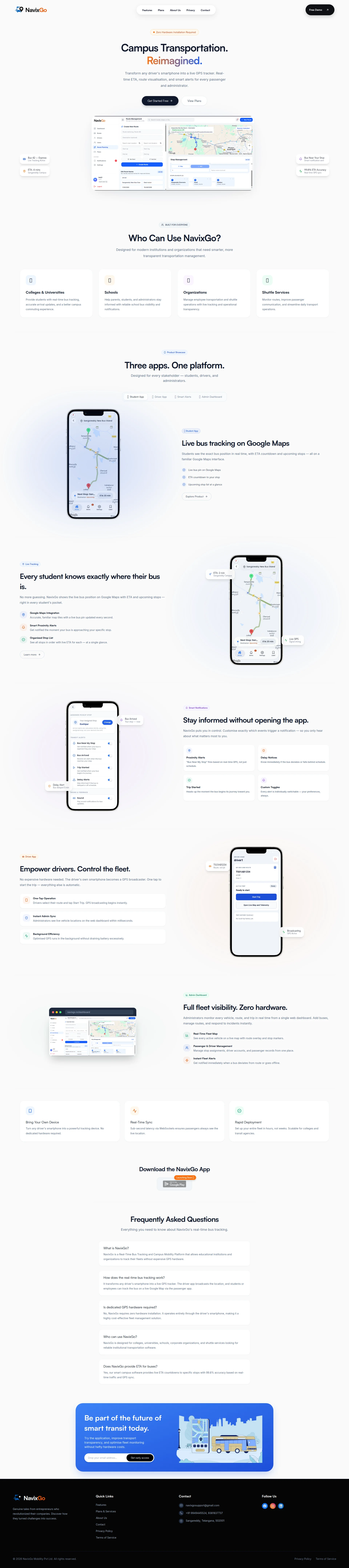
Right, let me tell you what's happening here. NavixGo has a genuinely BRILLIANT concept — turning smartphones into GPS trackers without hardware is clever, properly clever. The site looks clean, the design is modern, and someone clearly has taste. BUT. You've got a mobile LCP of nearly NINE SECONDS. Nine! That's not a page load, that's a bloody nap. You've got 10 testimonials sitting somewhere but they're buried like leftovers at the back of the fridge. You mention Google Maps integration which is smart. But here's what's killing me — you've got a 'Launching Soon' app store section on a page that's supposed to SELL. That's like putting a 'kitchen under renovation' sign on your restaurant door and wondering why nobody's booking tables. The ingredients are premium. The recipe needs a complete rethink. Stop describing your product and start SELLING it, because right now this page converts like a menu with no prices and no waiter in sight.
NavixGo: The Bus Tracker That Forgot to Sell Itself
Look, NavixGo is solving a real problem — campus bus tracking without expensive hardware is legitimately smart. The site looks modern, loads fast on desktop, and the copy is mostly coherent. But here's the thing: this is a B2B SaaS product asking institutions to hand over their fleet management, and there's not a single customer logo, testimonial, case study, or deployment number anywhere on this page. Zero. The 'Download the NavixGo App — Launching Soon 🚀' section is basically a neon sign saying 'we're not ready, please leave.' Add a mobile LCP of 8.96 seconds — which is catastrophically bad for SEO — and you've got a product that looks promising but converts like a locked door. The potential is real. The execution needs a fire lit under it.
Sección Hero
DECENT
Right, Campus Transportation. Reimagined. — oh WONDERFUL, another SaaS page that reimagined something! You know what else was reimagined? Every single landing page I've reviewed this year. That word is more overcooked than a Sunday roast left in the oven overnight. HOWEVER — and I'll give credit where it's due — the subheadline Transform any drivers smartphone into a live GPS tracker' is BRILLIANT. That's your actual headline, you donut! That's the thing that makes someone lean forward and say wait, WHAT? But you've buried it under generic fluff like a truffle hidden under mashed potatoes.
The Zero Hardware Installation Required banner tag above the H1? Fantastic differentiator. But it's TINY. It's like whispering your best dish's name while shouting about the ambiance. Make it LOUD.
Now, your CTAs — Get Started Free and View Plans. Listen to me carefully: you're selling to college administrators, school transport directors, and fleet managers. These people don't get started free like they're downloading a meditation app. They REQUEST DEMOS. They RUN PILOTS. They TALK TO HUMANS. Your CTA language is serving fast food when your buyers expect fine dining service.
The hero visual shows the product dashboard — good instinct, that's what I want to see. Shows me the actual kitchen, not just a photo of the building. But where's the social proof? You've got 10 testimonials on this page apparently, and NOT ONE shows up in the hero? No trusted by X institutions, no logos, NOTHING? For a B2B product asking schools to trust you with CHILDREN'S SAFETY, that's not just a gap — it's a canyon. You're asking me to eat at a restaurant with no reviews, no Michelin stars, and the chef won't even come out to say hello. SERIOUSLY?!
Ejemplos de mejoras
Campus Transportation. Reimagined.
Campus Bus Tracking. No Hardware. No Guessing.
'Reimagined' is the soggy bread of SaaS headlines — everyone uses it, nobody remembers it. The replacement leads with the two concrete differentiators that actually make NavixGo worth choosing. Stop being poetic. Start being SPECIFIC.
Get Started Free
Request a Free Demo
College transport managers don't 'get started' like they're signing up for Netflix. They evaluate, they pilot, they get approvals from three committees. 'Request a Free Demo' matches their actual buying process and doesn't make your product feel like a toy.
Puntos fuertes
- 'Zero Hardware Installation Required' tag hits the #1 objection for fleet tracking — cost of hardware — right between the eyes. Smart placement, even if it needs to be louder
- 'Transform any driver's smartphone into a live GPS tracker' is concrete, specific, and genuinely differentiated — this is filet mignon copy buried under garnish
- Dual CTA structure gives visitors two commitment levels, and the product screenshot as hero visual immediately shows what you're getting — no stock photo nonsense
A mejorar
- ZERO social proof in the hero — no customer count, no institution logos, no 'trusted by' badge — you've got 10 testimonials on this page and none of them are earning their keep up top where it matters
- 'Get Started Free' is consumer-app language slapped onto a B2B institutional product — a college administrator seeing this thinks 'this isn't built for me' before they even scroll
- '99.8% ETA Accuracy' is presented as gospel truth with absolutely no source, no methodology, no validation — it reads like you picked a number that sounded impressive and ran with it
Copywriting
NEEDS WORK
Oh BLOODY HELL, where do I start? The copy on this page is like a chef who knows every ingredient in the kitchen but has never actually tasted the food. You DESCRIBE everything — Administrators monitor every vehicle, route, and trip in real time — but you never once tell me WHY I SHOULD CARE. That's a feature, not a benefit! Never get another panicked call from a parent asking where the bus is — THAT'S a benefit! But you never go there. You're reading the recipe out loud instead of serving the dish.
The specificity is... inconsistent. 99.8% ETA Accuracy and Set up your entire fleet in hours, not weeks — those are GORGEOUS. Concrete, punchy, makes me believe you've actually done this before. But then you drown me in empty calories like smarter, more transparent transportation management and a better campus commuting experience. Those phrases mean NOTHING. They're the verbal equivalent of boiling water and calling it soup.
And then — oh, THEN — I get to the footer and I read: Genuine tales from entrepreneurs who revolutionized their companies. Discover how they turned challenges into success. EXCUSE ME?! This is a CAMPUS BUS TRACKING website! That's a TEMPLATE PLACEHOLDER you never bothered to replace! That's like leaving the Lorem Ipsum on your restaurant menu and wondering why customers look confused. That single line tells every visitor: We didnt care enough to proofread our own page.' Absolutely inexcusable.
The FAQ section, though? Chef's kiss. Direct questions, direct answers, addresses the hardware objection head-on with confidence. THAT'S the copywriting quality the rest of the page should aspire to. Whoever wrote the FAQ — give them the rest of the page. Now.
You've got 10 testimonials on this page but the copy does almost nothing to leverage them into the narrative. And there's zero urgency anywhere — no reason to act today versus next semester. A college admin reads this, nods politely, bookmarks it, and forgets it exists by Thursday. Where's the FIRE?!
Ejemplos de mejoras
Genuine tales from entrepreneurs who revolutionized their companies. Discover how they turned challenges into success.
Trusted by institutions across campuses to keep students safe and administrators sane. Here's what they have to say.
The original is a TEMPLATE PLACEHOLDER that was never replaced — it mentions 'entrepreneurs' on a campus bus tracking page. The replacement introduces the testimonials you actually have on the page and ties them to real outcomes your buyers care about.
Designed for modern institutions and organizations that need smarter, more transparent transportation management.
If your students are guessing when their bus arrives, parents are flooding your office with calls, and your drivers have no way to flag delays — NavixGo fixes all three. No hardware. No IT project. Live in hours.
The original is the kind of corporate nothing-speak that makes buyers' eyes glaze over. The replacement opens with three specific pain points that drive the actual purchase decision and immediately connects them to the solution's key differentiators. SELL the problem, then serve the solution.
Puntos fuertes
- FAQ section is the best-written part of the entire page — directly addresses the #1 objection ('Is dedicated GPS hardware required?') with a clear, confident answer that builds trust
- Technical specificity in the driver app section ('Sub-second latency via WebSockets', 'GPS runs in the background without draining battery') gives technically-minded evaluators real meat to chew on
- 'Set up your entire fleet in hours, not weeks' is a genuinely powerful benefit statement that tackles implementation anxiety — the real fear behind every B2B purchase
A mejorar
- Footer contains an obvious template placeholder — 'Genuine tales from entrepreneurs who revolutionized their companies' — on a CAMPUS BUS TRACKING site. This is a credibility grenade sitting next to your contact info, and it needs to be defused IMMEDIATELY
- Copy is almost entirely feature-descriptive with no emotional payoff — 'Students see the exact bus position' never becomes 'Students stop standing in the rain, parents stop flooding your phone lines, and you stop firefighting all day'
- Zero urgency or reason-to-act-now anywhere on the page — no limited pilot spots, no implementation timeline pressure, no 'semester starts in X weeks' framing — giving busy administrators every excuse to procrastinate forever
Call-to-Action
NEEDS WORK
Contenido bloqueado
Prueba Social
CRITICAL
Contenido bloqueado
Arquitectura
DECENT
Contenido bloqueado
SEO y Meta
NEEDS WORK
Contenido bloqueado
Móvil
CRITICAL
Contenido bloqueado
Diseño Visual & Branding
DECENT
Contenido bloqueado
Rendimiento
CRITICAL
Contenido bloqueado
llmreadiness
DECENT
Contenido bloqueado