El veredicto
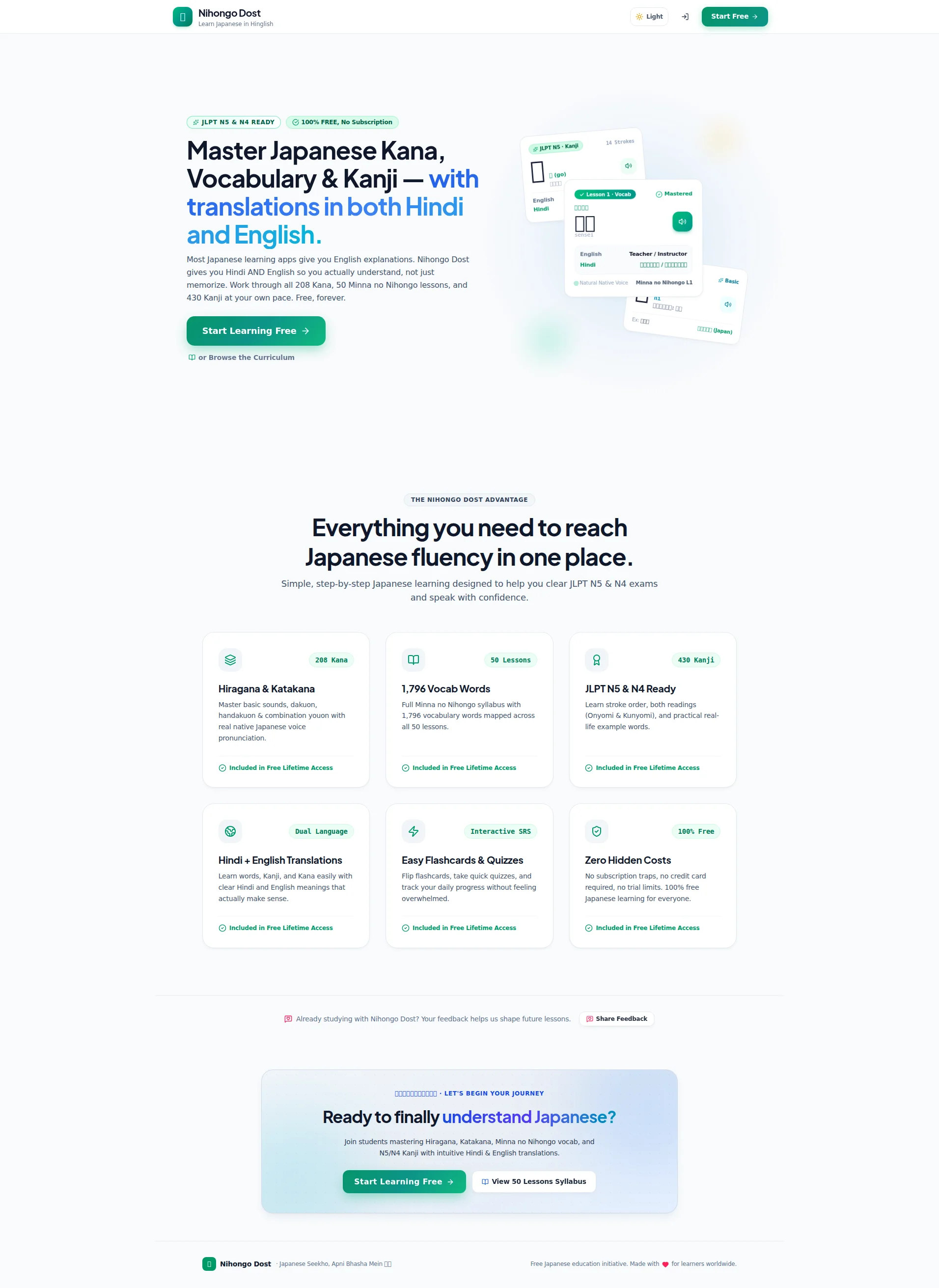
Right, listen up. Nihongo Dost has stumbled onto a BRILLIANT niche — teaching Japanese to Hindi speakers in BOTH Hindi and English — and it's treating that golden differentiator like yesterday's leftover rice. The design? Clean, modern, actually quite appetizing. The hero? Gets the point across, even if it buries the best line in a tiny paragraph nobody reads. The copy? Specific numbers, decent tone, but it's ALL features and ZERO transformation — like listing every ingredient on the menu but never describing how the dish TASTES. And the trust situation? BLOODY HELL. The page claims there are 10 testimonials somewhere in the data, but I can't see a SINGLE one displayed on this page! No user counts, no social proof, no reviews — you're asking cold visitors to walk into an empty restaurant and just... trust you? The performance is genuinely painful too — 4.9 seconds to load a page with barely any images. That's LCP in the POOR range, mate. The bones are solid, the niche is REAL, but right now this page is leaving serious conversions on the tatami mat because it refuses to show off what it's got.
Nihongo Dost: The Scrappy Underdog That Forgot to Brag
Look, the concept is legitimately brilliant. Teaching Japanese to Hindi speakers? That's a gap the size of the Pacific Ocean, and nobody else is filling it. The problem is this page treats that killer differentiator like a footnote instead of a battle cry. The hero gets the job done — you know what it is, you know it's free — but then the page just... lists features. Six feature cards, all saying 'Included in Free Lifetime Access,' and not one single human being vouching for any of it. No user count, no testimonials, no 'join 12,000 students' — nothing. For a SaaS B2C product where trust is everything, this is like opening a restaurant with a great menu and no reviews, no photos of food, and a locked front door. The bones are solid, the niche is real, but right now this page is leaving serious conversion money on the tatami mat.
Sección Hero
DECENT
Right, the hero section. It's like a chef who has the BEST ingredient in the kitchen — a wagyu steak, if you will — and decides to hide it under a pile of garnish. Let me explain.
The headline Master Japanese Kana, Vocabulary & Kanji — with translations in both Hindi and English does the job. You know what it is, you know the angle, you get it in under 3 seconds. The green highlighted text on with translations in both Hindi and English draws the eye to the differentiator. Fine. FINE. That's competent.
But here's where I want to THROW MY APRON at the screen: the REAL hook — Most Japanese learning apps give you English explanations. Nihongo Dost gives you Hindi AND English so you actually understand, not just memorize — is sitting in a tiny paragraph below the headline where NOBODY is going to read it! That sentence is the WAGYU STEAK of your entire page! It's the reason your product EXISTS! And you've buried it under the mashed potatoes like you're embarrassed by it! MAKE IT THE HEADLINE!
The CTA Start Learning Free — good. Action verb, benefit implied, that green button pops against the white background like a fresh herb on a white plate. The secondary Browse the Curriculum option for the window-shoppers? Smart. Nice two-tier approach. I'll give you that.
The product mockup showing the actual flashcard UI with Japanese, Hindi, and English? That's doing real work. It's not some stock photo of a smiling student — it's the ACTUAL product. Visitors can see what they're getting. Well done.
But WHERE — and I mean WHERE — is your social proof?! Not a single user count. Not a star rating. Not a join X students learning Japanese right now. The source data says you have 10 testimonials! TEN! And you're showing ZERO of them in the hero! That's like having ten five-star reviews for your restaurant and keeping them locked in the freezer! For an unknown platform asking complete strangers to trust you, this is a conversion killer at the EXACT moment they're deciding whether to stay or bounce. Even a simple Join 5,000+ Hindi-speaking learners would transform this entire section. The JLPT N5 & N4 READY and 100% FREE, No Subscription badges are pulling some weight, but badges are CLAIMS — they're not PROOF. Is THAT your idea of earning trust?!
Ejemplos de mejoras
Master Japanese Kana, Vocabulary & Kanji — with translations in both Hindi and English.
The Only Japanese App That Teaches You in Hindi AND English — So You Actually Understand, Not Just Memorize.
The original headline describes what the product covers (Kana, Vocab, Kanji) but EVERY Japanese app covers those — that's like advertising your restaurant serves 'food.' The rewrite leads with the actual differentiator, the bilingual Hindi+English approach, which is what makes this product unique and immediately relevant to the target audience.
Start Learning Free
Start Learning Free — Join 5,000+ Students
Adding a user count directly to or beneath the CTA button provides immediate social proof at the highest-intent moment on the page. It squashes the 'am I the only one using this?' anxiety that kills conversions for unknown platforms. You've got 10 testimonials worth of users — SHOW IT.
Puntos fuertes
- The differentiation angle — Hindi + English vs. English-only competitors — is immediately visible through the green highlighted text in the headline, making the core value proposition scannable at a glance like a perfectly plated signature dish
- The CTA 'Start Learning Free' paired with the secondary 'Browse the Curriculum' creates a smart two-tier hierarchy — one for the hungry, one for the curious — and that green button has excellent contrast against the clean white background
- The product mockup in the hero shows ACTUAL UI — flashcards with Japanese, Hindi, and English — instead of generic stock imagery, giving visitors a real preview of what they're signing up for, which is exactly the kind of transparency that builds confidence
A mejorar
- The actual killer differentiator copy — 'Most Japanese learning apps give you English explanations. Nihongo Dost gives you Hindi AND English so you actually understand, not just memorize' — is BURIED in a tiny paragraph below the headline instead of BEING the headline. That's your wagyu steak hidden under the garnish!
- ZERO social proof in the hero section despite having 10 testimonials available — no user count, no star ratings, no 'join X students' messaging. For an unknown platform asking for trust at the most critical first-impression moment, this is like opening night with an empty dining room and expecting people to walk in anyway
- The hero section has excessive whitespace below the product mockup before the next section begins, creating a visual dead zone that makes the page feel unfinished — like serving a beautiful appetizer on a plate three times too large
Copywriting
DECENT
The copywriting on this page is like a chef who knows every technique in the book but forgot to actually SEASON the food. It's technically competent, structurally sound, and COMPLETELY lacking the flavour that makes people come back for seconds.
Let me start with what's actually GOOD, because credit where it's due. The specificity is BRILLIANT. 208 Kana, 50 Minna no Nihongo lessons, 430 Kanji, 1,796 vocabulary words — those are REAL numbers that signal REAL effort. Most competitors wave their hands and say thousands of words like that means something. Your precision here? That's a chef listing the exact provenance of every ingredient. It builds credibility. Well done.
The tone hits the right register too — casual, direct, not drowning in academic jargon. Free, forever is punchy. No subscription traps, no credit card required, no trial limits — that speaks directly to a REAL fear your audience has. And that Hinglish footer tagline Japanese Seekho, Apni Bhasha Mein? LOVELY cultural touch. That's the kind of detail that tells your Hindi-speaking audience this was built FOR you, not translated AT you.
But HERE'S WHERE I LOSE MY MIND. Look at your six feature cards: Hiragana & Katakana, 1,796 Vocab Words, JLPT N5 & N4 Ready, Hindi + English Translations, Easy Flashcards & Quizzes, Zero Hidden Costs. Every. Single. One. Is about what the PRODUCT does. Not ONE tells me what the USER becomes! Where's the transformation?! Where's the student who went from zero to passing JLPT N5? Where's Imagine watching your favorite anime without subtitles? You're reading me the RECIPE instead of describing how the dish TASTES! Seriously?!
The persuasive arc is practically nonexistent. Hero → feature grid → CTA. That's it. No objection handling. No desire-building. No heres what happens after you sign up.' No transformation story. You have TEN testimonials according to the data, and you're displaying NONE of them in the copy flow! That's like having ten regulars who RAVE about your cooking and telling them to shut up when new customers walk in!
And that section headline — Everything you need to reach Japanese fluency in one place — oh come ON. That could be slapped on Duolingo, Rosetta Stone, Babbel, or literally ANY language learning platform on Earth. You had ONE job with that line: remind people this is built for HINDI speakers. And you went GENERIC instead. That's prime real estate wasted on wallpaper copy.
Ejemplos de mejoras
Everything you need to reach Japanese fluency in one place.
The first Japanese learning platform built for Hindi speakers — not translated for them.
The original line is so generic it could belong to literally any language app ever made. The rewrite hammers the actual differentiator: this wasn't retrofitted with Hindi as an afterthought, it was built for Hindi speakers from the ground up. That's a fundamentally different and far more compelling claim that no competitor can steal.
Hiragana & Katakana — Master basic sounds, dakuon, handakuon & combination youon with real native Japanese voice pronunciation.
Hiragana & Katakana — Read your first Japanese sentence in 2 weeks, with pronunciations explained in Hindi so it actually clicks the first time.
The original drowns in technical jargon that beginners won't understand (dakuon? handakuon?). The rewrite leads with the user outcome — reading Japanese in 2 weeks — and reinforces the Hindi advantage. It turns a feature description into a benefit promise that actually makes someone want to click.
Puntos fuertes
- Exceptional specificity with precise numbers throughout — '208 Kana,' '50 Minna no Nihongo lessons,' '430 Kanji,' '1,796 vocabulary words' — this level of detail signals genuine content depth and builds the kind of credibility that vague competitors can only dream of. That's a chef who knows EXACTLY what's in the pantry
- The hero subheadline 'Most Japanese learning apps give you English explanations. Nihongo Dost gives you Hindi AND English so you actually understand, not just memorize' is a textbook problem-agitate-solution structure that directly calls out the competition — it's the sharpest line on the entire page and it WORKS
- Tone is pitch-perfect for a young, budget-conscious South Asian learner demographic — 'Free, forever,' 'No subscription traps,' and the Hinglish footer tagline all hit the right cultural register like a chef who actually KNOWS their audience instead of guessing
A mejorar
- The six feature cards are almost entirely feature-focused with ZERO outcome language — 'Hiragana & Katakana,' '1,796 Vocab Words' — there's not a single line about what the user BECOMES or ACHIEVES after using these features. You're listing ingredients without describing the meal, and THAT'S what actually drives sign-ups
- The page jumps from hero straight to feature grid to CTA with NO middle section addressing objections, building desire, or showing transformation — and you have 10 testimonials that are completely ABSENT from the page! The persuasive arc is 'here's what it is, here's what it has, now sign up' — that's the BARE minimum and it leaves every skeptical visitor unconvinced
- The section headline 'Everything you need to reach Japanese fluency in one place' is so painfully generic it could be copy-pasted onto ANY language learning platform on the planet — it completely ABANDONS the Hindi-speaker differentiation angle that is this product's entire reason for existing. That's like a sushi restaurant advertising 'We serve food!'
Desbloquear las 8 categorías restantes
Call-to-Action
DECENT
Contenido bloqueado
Prueba Social
CRITICAL
Contenido bloqueado
Arquitectura
DECENT
Contenido bloqueado
SEO y Meta
NEEDS WORK
Contenido bloqueado
Móvil
DECENT
Contenido bloqueado
Diseño Visual & Branding
DECENT
Contenido bloqueado
Rendimiento
CRITICAL
Contenido bloqueado
llmreadiness
NEEDS WORK
Contenido bloqueado
Contenido bloqueado
Accede a la conclusión completa con las 3 acciones prioritarias y un mensaje motivador personalizado.