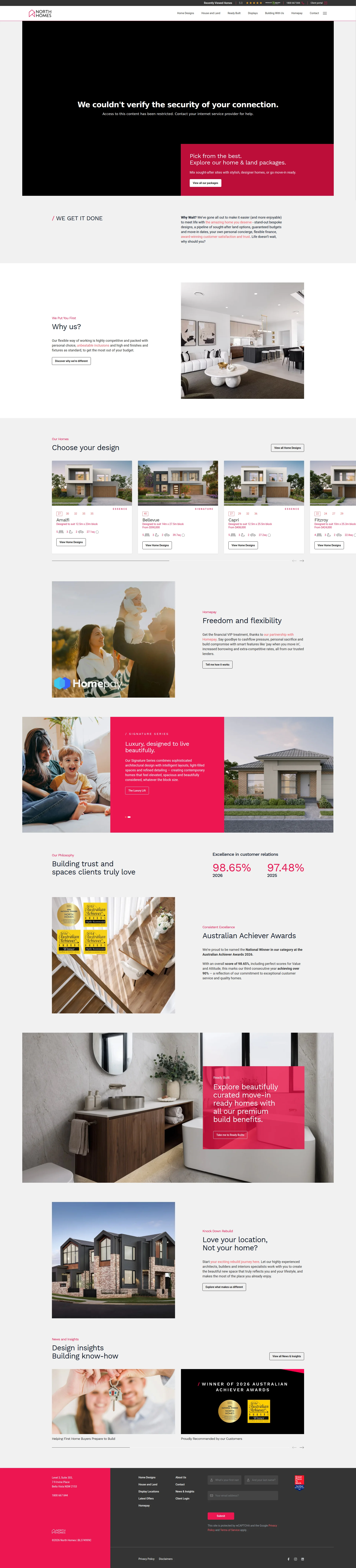
El veredicto
Right, listen up. North Homes has the INGREDIENTS of a bloody brilliant site — real awards, a 98.65% satisfaction score, actual prices on homes, and a catalogue that would make most builders weep with envy. But you've gone and served it on a plate that takes SEVENTEEN SECONDS to reach the table on mobile. That's not a website, that's a hostage situation! The hero section is having an identity crisis — there's a security error message greeting your customers before they even see a house. The H1 tag? GONE. Missing. Like someone nicked it off the counter. You've got 681KB of unused JavaScript just sitting there doing NOTHING, like a sous chef scrolling Instagram during service. You've blocked every major AI crawler except Perplexity, so good luck being cited by ChatGPT or Claude when someone asks 'best home builders in Sydney.' The trust signals are genuinely strong, the copy has real specifics buried in it, and the design looks premium — but NONE of that matters when Google is watching your 16.9-second LCP and quietly sliding your rankings into the bin. Fix the performance, find your H1, move your best proof to the top, and you'd actually have something worth serving. Right now? Beautiful plating, raw chicken.
Pretty House, Broken Engine: North Homes Looks Great But Loads Like a Wet Cement Truck
Look, North Homes is not a disaster. They've got award wins, a 98.65% customer satisfaction score, prices on homes, and a surprisingly clear product catalogue. That's more than most home builders manage. But here's the thing — none of that matters if your mobile site takes 16.91 seconds to show the main content. That's not a website, that's a punishment. Google is watching that LCP number and quietly moving your rankings to the bottom drawer. The hero section is an identity crisis wrapped in a security warning (yes, there's a literal SSL error message visible on load). The H1 tag is completely missing — a basic SEO crime in 2026. And with 53 images, 34 scripts, and 7.3MB of page weight, this site is dressed in a tuxedo but running on a skateboard. Fix the performance, fix the H1, and stop blocking every AI bot except Perplexity — and you'd have a genuinely competitive site.
Sección Hero
NEEDS WORK
BLOODY HELL, what is going on here?! You're a PREMIUM home builder asking people to hand over $400K+ and the FIRST thing they see is a security error message saying We couldnt verify the security of your connection'?! That's like putting a health inspector's warning on the front door of your restaurant and wondering why nobody's booking a table! You've got TWO heroes fighting each other like cats in a bag — the error message on top, and then your actual CTA below it: Pick from the best. Explore our home & land packages. And mate, Pick from the best? EVERY builder says that. That's the we serve food of home building taglines — it tells me absolutely NOTHING. Where's the geography? Where's the price anchor? Where's your 98.65% satisfaction score that's doing push-ups three scrolls down where nobody can see it? Your CTA button says View all our packages — that's a menu browse, not a call to action. It's passive. It's limp. It's a soggy crouton when you need a steak knife. The red-and-dark colour palette creates decent contrast on that button, I'll give you that, and the typography hierarchy from headline to subtext is clean enough. But the hero image behind the text? It's doing decorative wallpaper duty instead of showing an actual jaw-dropping North Homes build. You've got a personal concierge service, guaranteed budgets, award wins — and you've hidden ALL of it below the fold like you're embarrassed by your own brilliance. For a purchase this size, your hero needs to hit like a wrecking ball in the first three seconds. Right now it's hitting like a damp sponge.
Ejemplos de mejoras
Pick from the best. Explore our home & land packages. Mix sought-after sites with stylish, designer homes, or go move-in ready.
Award-winning home builder. Sydney, Newcastle & Hunter. Guaranteed budgets, move-in dates, and your own personal concierge — from $278K. Explore our packages →
The original is vague lifestyle fluff that could belong to ANY builder. The replacement anchors geography, price, and the three most differentiating features — guaranteed budget, guaranteed dates, personal concierge — in one punchy hero statement that gives a nervous buyer actual reasons to trust you before they even think about scrolling.
Puntos fuertes
- CTA button sits above the fold with the red brand colour creating reasonable visual contrast — at least the waiter showed up to the table, even if the order's wrong
- The offer direction is clear enough — home and land packages are the product, catalogue browsing is the next step — so the kitchen knows what it's cooking
- Typography maintains a basic headline-to-subtext hierarchy with the red accent drawing the eye toward the CTA area
A mejorar
- A visible SSL security error message appears as the FIRST element users see — this is like greeting diners with a cockroach on the welcome mat, absolutely catastrophic for a premium brand asking for six-figure commitments
- Zero unique value proposition in the hero — 'Pick from the best' is empty garnish with no mention of awards, guaranteed budgets, personal concierge, or anything that separates you from every other builder on the block
- No social proof anywhere near the hero — your 98.65% satisfaction score and 5-star rating are buried so far down the page they might as well be in a different postcode
Copywriting
DECENT
Right, here's the maddening thing about your copy — you've actually got BRILLIANT ingredients sitting in the pantry, but you've plated the meal backwards! You've got a 98.65% satisfaction score, guaranteed budgets, a 24-hour callback promise, a 98% build delivery hit rate, prices starting from $278K, and block dimensions on every design. That's REAL specificity. That's the wagyu. That's what makes people trust you enough to sign a contract worth more than their car. But WHERE have you put all of it? Three scrolls down! Meanwhile, your opening sections are serving up vague adjective soup — highly competitive, unbeatable inclusions, high end finishes. Those aren't proof, those are WISHES! Every builder on the planet claims that! It's like putting We cook food good on your menu instead of listing your Michelin stars. Your tone is actually well-calibrated — aspirational without being snobbish, and 'you're never just a number' is a direct uppercut to the volume-builder fear. The Homepay section? EXCELLENT. Pay when you move in, increased borrowing, extra-competitive rates — that's benefit-led, anxiety-crushing copy that actually EARNS the reader's attention. The blog titles are useful and SEO-friendly. Grammar is clean. Word count of 873 is in the sweet spot. But then you've got Why Wait? as a section header — mate, the answer to Why Wait? is BECAUSE YOUR SITE TAKES 17 SECONDS TO LOAD, but more importantly, it's a weak rhetorical hook that delays the good stuff. The fix isn't about writing new copy — it's about RESTRUCTURING. Move your proof and differentiators to the top. Stop leading with claims and start leading with evidence. You've got the ingredients for a Michelin-star meal; you're just serving dessert first and the steak last.
Ejemplos de mejoras
Our flexible way of working is highly competitive and packed with personal choice, unbeatable inclusions and high end finishes and fixtures as standard, to get the most out of your budget.
Every North Homes build comes standard with your own personal concierge, a guaranteed completion date, and 100% budget transparency from day one — no surprise costs, no cookie-cutter compromises.
The original is adjective soup — every competitor claims 'highly competitive' and 'unbeatable inclusions.' The replacement converts the same space into a specific, benefit-led statement that directly addresses the three biggest fears of a new home buyer: cost blowouts, delays, and feeling like just another number on a spreadsheet.
Puntos fuertes
- Genuine specificity with real numbers throughout — 98.65% satisfaction, 24-hour callback promise, 98% build delivery rate, and prices from $278K give the copy the kind of credibility that most builders can only dream about
- Tone is perfectly calibrated for the audience — aspirational without being pretentious, and lines like 'you're never just a number' land a direct punch on the volume-builder anxiety that keeps buyers up at night
- The Homepay section copy is a masterclass in benefit-led writing — 'pay when you move in', 'increased borrowing', 'extra-competitive rates' directly addresses financial anxiety with specific, tangible solutions
A mejorar
- Your most compelling differentiators — personal concierge, 100% visibility portal, monthly project limits — are buried 3+ scrolls down while the hero and opening sections waste premium real estate on generic claims like 'unbeatable inclusions' that any competitor could copy-paste
- Opening copy is drowning in unsubstantiated superlatives: 'highly competitive', 'unbeatable inclusions', 'high end finishes' — the PROOF exists on the same page but arrives far too late to do the conversion work where it actually matters
- 'Why Wait?' as a section header is a limp rhetorical question that doesn't earn its place — it's filler where you could be delivering a knockout punch with actual value
Call-to-Action
DECENT
Contenido bloqueado
Prueba Social
DECENT
Contenido bloqueado
Arquitectura
DECENT
Contenido bloqueado
SEO y Meta
CRITICAL
Contenido bloqueado
Móvil
CRITICAL
Contenido bloqueado
Diseño Visual & Branding
DECENT
Contenido bloqueado
Rendimiento
CRITICAL
Contenido bloqueado
llmreadiness
CRITICAL
Contenido bloqueado