El veredicto
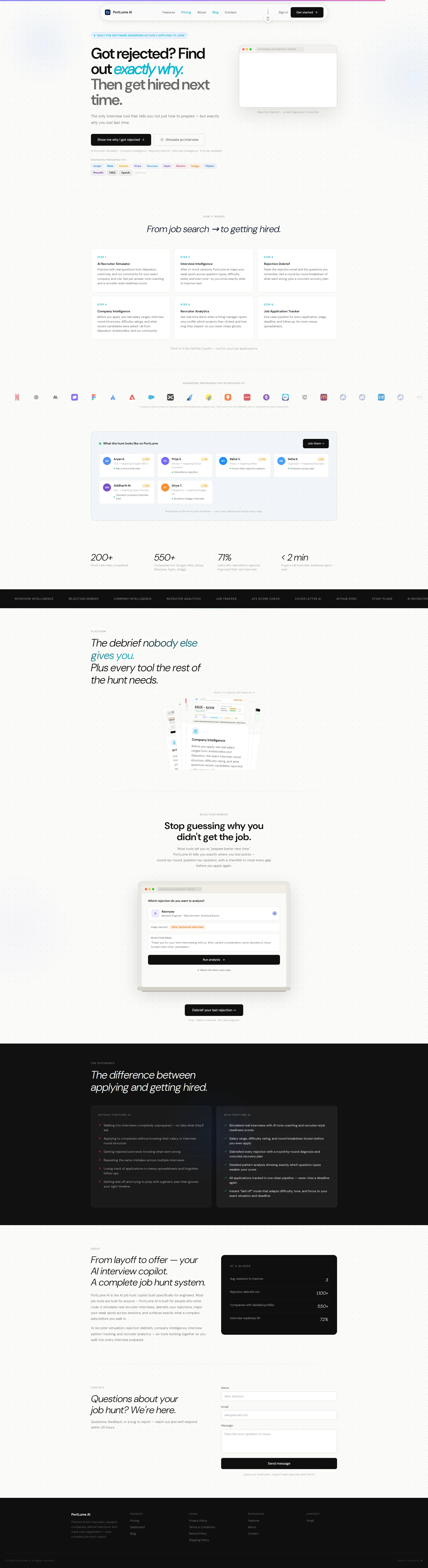
Right, let me tell you what's happening here. PortLume AI has a BRILLIANT concept — genuinely brilliant. 'Find out exactly why you got rejected' is the kind of headline that grabs a desperate engineer by the collar at 2am and DEMANDS attention. The copy is sharp, the pain point is real, the differentiation is clear. You've got logos from Google, Meta, Amazon, Stripe — proper aspirational firepower. Ten testimonials with photos. The before/after section actually does its bloody job. BUT — and I cannot stress this enough — your mobile LCP is nearly TWELVE SECONDS. That's not a landing page, that's a hostage situation! You've built a gourmet meal for engineers who live on their phones, then served it on a plate that takes 12 seconds to arrive at the table. By then, your customer has walked out, gone to the chippy next door, eaten, and come home. 514KB of unused JavaScript, 165 HTTP requests — for a LANDING PAGE! The social proof stats (200+ mock interviews) feel like you launched last Thursday. Fix the catastrophic performance, bulk up the credibility numbers, and this could genuinely be a conversion machine. Right now? It's a Michelin-star recipe cooked in a microwave that keeps tripping the fuse box.
The Rejection Whisperer That Can't Load on Mobile
Listen, the concept here is legitimately good. 'Find out exactly why you got rejected' is the kind of hook that makes a desperate engineer stop scrolling at 2am. The copy is specific, the features are well-differentiated, and the before/after comparison section is doing real work. BUT — and this is a Gordon Ramsay-sized but — you've built a product for engineers who live on their phones, and your mobile LCP is nearly 12 seconds. That's not a website, that's a punishment. You've got 57 images, 514KB of unused JavaScript, and 165 HTTP requests loading what is essentially a landing page. The social proof numbers scream 'we launched last Tuesday' — 200+ mock interviews and 1,100+ rejection debriefs don't exactly inspire confidence when you're competing against InterviewBit and LeetCode. Fix the performance, beef up the credibility, and this could genuinely convert. Right now it's a Ferrari engine in a car with flat tires.
Sección Hero
DECENT
RIGHT. Let's talk about this hero section. The headline — Got rejected? Find out exactly why. — is GORGEOUS. It's a punch in the gut wrapped in a promise. That's textbook PAS, that's a chef who knows their flavour profiles. Within three seconds I know exactly what this thing does, and more importantly, I know it's speaking to MY pain. That's rare. That's a perfectly seared scallop in a sea of frozen fish fingers.
The dual CTA strategy — Show me why I got rejected and Simulate an interview — is genuinely smart. You're splitting intent like a proper sous chef portions a tasting menu: one path for the engineer licking their wounds after a rejection, another for the one prepping proactively. Good thinking.
Now the logos — Google, Meta, Amazon, Stripe — they're there, they're aspirational, they do their job. Fine. But HERE'S WHERE YOU'RE LOSING ME: where are the RESULTS?! You've got company logos but ZERO outcome-based proof above the fold. No X engineers hired, no X rejections analyzed, NOTHING that says this actually works. It's like putting a beautiful menu in the window but no queue out the door — people need to see OTHER PEOPLE eating before they walk in!
The product mockup showing actual rejection feedback (Your STAR stories had no numbers) — THAT is brilliant. You're showing the dish, not just describing it. Makes the value tangible. But that subtitle — The only interview tool that tells you not just how to prepare — but exactly why you lost last time — is your SHARPEST line and it's buried in tiny body text like a truffle hidden under a pile of garnish. BRING IT FORWARD!
And Free tier available? BLOODY HELL, that's the most non-committal thing I've ever read. That's like a restaurant saying Food may be served. Say Free forever, no card required or don't bother!
Ejemplos de mejoras
AI Recruiter Simulator · Company Intelligence · Rejection Debrief · Interview Intelligence · Free tier available
Free forever · No card required · 1,100+ rejections analyzed · Used by engineers targeting Google, Meta, Stripe
The original is a feature list that adds ZERO persuasion — it's like listing ingredients instead of describing the dish. The replacement converts the same space into trust-building social proof with a clear no-risk signal. Lead with proof, not a menu nobody asked for.
Puntos fuertes
- Pain-first H1 ('Got rejected? Find out exactly why.') is an absolute BELTER — it creates instant emotional resonance and communicates the core value in under 3 seconds, like a perfectly seasoned dish that hits every taste bud on first bite
- Dual CTA strategy smartly splits visitor intent between rejection diagnosis and interview simulation — two entrances to the same kitchen, each serving the right course to the right customer
- Product mockup visual showing actual rejection debrief output ('Your STAR stories had no numbers') makes the value proposition TANGIBLE rather than abstract — you're showing the dish, not just reading the recipe aloud
A mejorar
- ZERO outcome-based social proof above the fold — no 'X engineers hired at Google' or 'X rejections analyzed,' just aspirational logos sitting there like garnish on an empty plate. WHERE ARE THE RESULTS?!
- Your sharpest differentiator ('The only interview tool that tells you not just how to prepare — but exactly why you lost last time') is buried in microscopic body text — that line should be on a BILLBOARD, not whispered in a footnote
- 'Free tier available' is so vague and limp it might as well say 'we might let you try it, maybe, if you're lucky' — swap it for 'Free forever · No card required' and watch the hesitation evaporate
Copywriting
DECENT
Alright, I'll give credit where it's due — this copy is GENUINELY above average. It's specific, it's pain-aware, and it doesn't drown in the corporate waffle that makes most SaaS pages read like a dishwasher manual. The before/after comparison section? CHEF'S KISS. Getting rejected and never knowing what went wrong mapped to Debriefed every rejection with a round-by-round diagnosis and concrete recovery plan — THAT is benefits-first writing. That's taking raw ingredients and turning them into something a customer actually wants to eat.
The specificity throughout — 71% of users improved their next interview, salary ranges like $160K–$230K, skill breakdowns like Arrays & Sliding Window 38% — these are the seasoning that makes copy CREDIBLE. Engineers smell vagueness like a sommelier smells corked wine, and you've avoided that trap. Well done.
The GitHub Copilot for your job applications analogy? BRILLIANT. It's a one-line shortcut that lands with surgical precision on your exact audience. That's a chef who knows their diners.
BUT — and here's where I start throwing pans — you've got feature descriptions repeated NEARLY VERBATIM across multiple sections! The six-step How It Works cards and the platform deep-dive section are basically the same dish served twice with different plating. That's not a tasting menu, that's a kitchen that's run out of ideas and is padding the courses!
And that sessions to improve: 3 stat? Seriously?! It sits there with NO context, looking like a broken data point or a placeholder someone forgot to finish. It's like finding a raw chicken breast in the middle of a beautifully plated entrée — it DESTROYS the credibility of every real stat sitting next to it.
The most emotionally powerful line on the entire page — From layoff to offer — is BURIED near the bottom in the About section. That's your most desperate, most motivated customer segment, and you're making them scroll through a novel before you speak to them! Bring that emotional hook UP. Way up. Like, second-section-of-the-page up.
Ejemplos de mejoras
sessions to improve 3 Rejection debriefs run 1,100+ Companies with detailed profiles 550+ Interview readiness lift 72%
1,100+ rejections analyzed · 550+ company profiles · 72% of users improved their next interview · Trusted by engineers targeting FAANG
The original stat block has a mysterious orphaned '3' with no context that reads like a bug and poisons the credibility of every real number next to it. The rewrite strips out the broken element and presents the same data in a single clean, flowing line that leads with the most impressive figure. Stop serving raw chicken next to your best dish.
Puntos fuertes
- The before/after comparison section is textbook benefits-first copywriting — mapping 'Getting rejected and never knowing what went wrong' to 'Debriefed every rejection with a round-by-round diagnosis' is the kind of specific, fear-to-outcome writing that actually converts hesitant visitors
- The GitHub Copilot analogy for the Job Tracker ('Think of it like GitHub Copilot — but for your job applications') is a razor-sharp audience-specific reference that communicates value in one sentence — that's a chef who knows exactly who's sitting at the table
- Specificity throughout — salary ranges ($160K–$230K), improvement percentages (71%, 72%), skill breakdowns (filler words, passive voice detection) — gives the copy real credibility instead of the vague hand-waving that plagues every other SaaS page
A mejorar
- Feature descriptions are repeated nearly verbatim across the 'How It Works' cards and the platform deep-dive section — it's the same dish served twice with different garnish, and it makes the page feel padded and exhausting to read
- The 'sessions to improve: 3' stat reads like a broken placeholder that someone forgot to finish — it has zero context, zero explanation, and it sits there undermining every legitimate number around it like a rotten tomato in a Caprese salad
- 'From layoff to offer' — your most emotionally powerful framing — is buried in the About section near the BOTTOM of the page. That's your hungriest, most desperate audience segment and you're making them scroll through a feature encyclopedia before you acknowledge them. MOVE IT UP!
Call-to-Action
DECENT
Contenido bloqueado
Prueba Social
CRITICAL
Contenido bloqueado
Arquitectura
DECENT
Contenido bloqueado
SEO y Meta
DECENT
Contenido bloqueado
Móvil
CRITICAL
Contenido bloqueado
Diseño Visual & Branding
DECENT
Contenido bloqueado
Rendimiento
CRITICAL
Contenido bloqueado
llmreadiness
NEEDS WORK
Contenido bloqueado