El veredicto
Right, listen up. PortLume AI is like a young chef with genuine talent who's serving dinner on a paper plate in a car park. The VALUE PROP is solid — developers getting ghosted by ATS systems is a real, painful problem, and this product actually solves it. The hero messaging lands, the before/after comparison section is the best thing on the menu, and the free tier is smart enough to get people through the door. But BLOODY HELL — an 8.46-second mobile LCP?! That's not a loading time, that's a SMOKE BREAK. Your visitors could order a pizza, receive it, eat a slice, and your hero STILL wouldn't be painted. Zero testimonials with actual human faces, a Gmail support address pretending to be a real business, and social proof numbers floating around without any methodology — it's like claiming your restaurant is Michelin-starred because your mum said the soup was nice. The pricing page can't decide if it lives in rupees or dollars, and there's a 'Shipping Policy' link on a DIGITAL product. You've got the ingredients for something genuinely good here — now stop plating it like a first-year culinary student having a panic attack. Fix that catastrophic load time, get three real developers to put their face next to a quote, pick ONE currency, and this thing could actually compete.
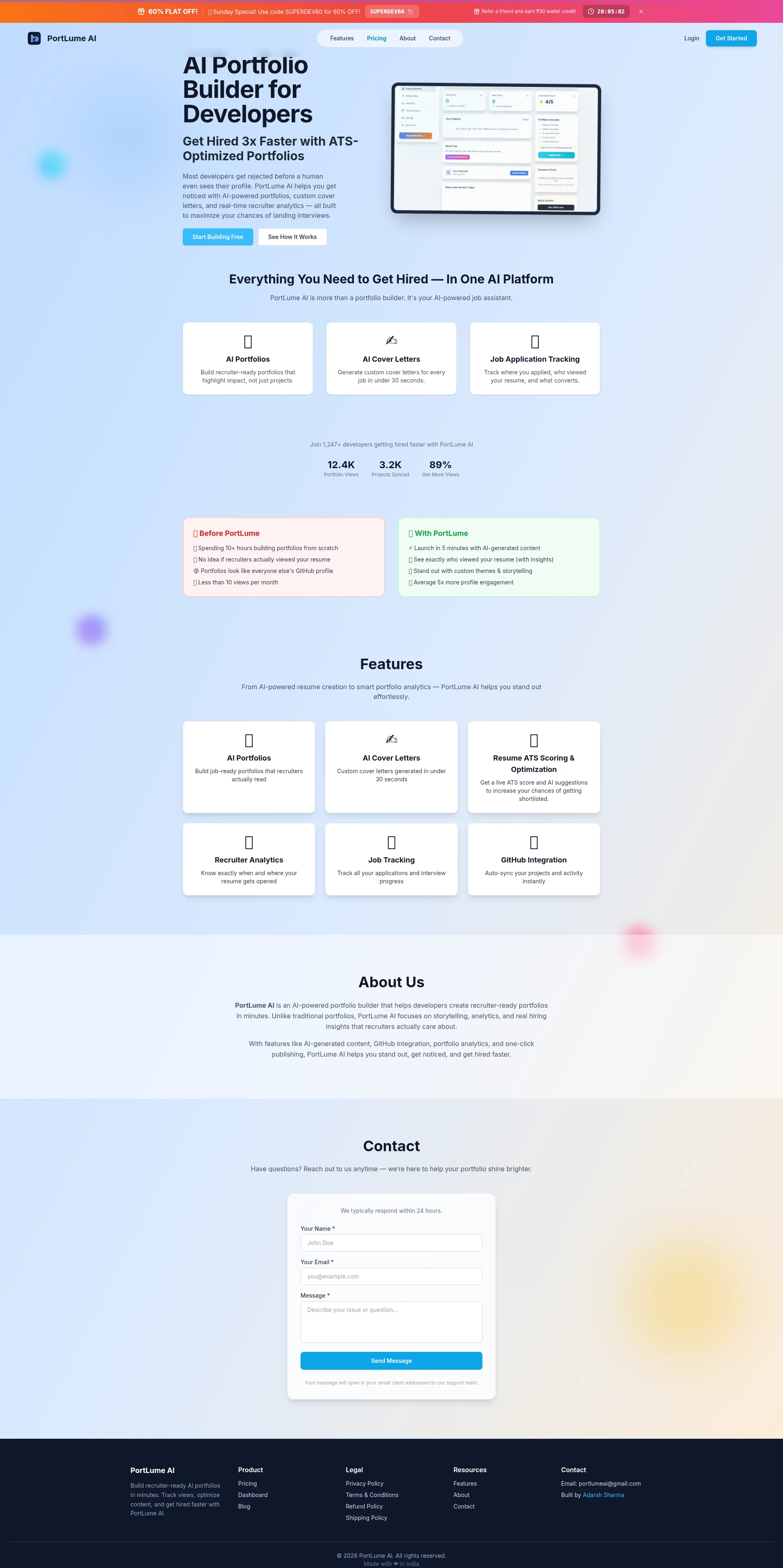
The Developer Portfolio That Can't Load Fast Enough to Impress Recruiters
Listen, PortLume AI is a genuinely interesting product solving a real problem — developers getting ghosted by ATS systems before a human ever sees their work. The core messaging lands, the feature set is legitimate, and the free tier is generous enough to get people in the door. BUT. The mobile performance is catastrophically bad (8.46s LCP — you could brew a coffee, drink it, and the hero still wouldn't be painted). The trust signals are thin: no real testimonials with photos, a Gmail contact address, and social proof numbers that feel like they were picked on a Tuesday afternoon. The pricing page is an identity crisis — rupees on one page, dollars on another, with a 'Shipping Policy' footer link on a 100% digital product. This site is a developer's first serious SaaS attempt, and it shows both the ambition and the gaps. Fix the performance, add three real human testimonials, and decide what currency you live in.
Sección Hero
DECENT
Alright, I'll give you this — you walk into this hero and within THREE SECONDS you know exactly what's on the menu: AI builds your developer portfolio so recruiters actually see you. That's not nothing. That's actually better than what most SaaS founders manage after six months of navel-gazing. The H1 AI Portfolio Builder for Developers is clean, keyword-rich, and doesn't try to be clever. GOOD. The subheadline Get Hired 3x Faster with ATS-Optimized Portfolios adds a quantified punch — it's got teeth. And Start Building Free as your primary CTA? That's the right dish for this audience. Developers are skeptical, tight-fisted creatures — you're lowering the drawbridge correctly. The secondary See How It Works gives fence-sitters an escape hatch. Smart.
BUT HERE'S WHERE I START THROWING PANS. Where is your social proof?! 1,247+ developers getting hired faster is sitting BELOW the fold like a garnish nobody sees because the plate's already been cleared! A visitor who bounces — and with your 8.46-second load time, MOST of them will — sees ZERO proof this thing works. You're asking people to trust an AI tool with their career based on... what, vibes?! That's like opening a restaurant with no reviews, no photos of the food, and a sign that says Trust me, its delicious.'
And your KILLER differentiator — GitHub sync plus real-time recruiter analytics — is buried in the features section like a truffle hidden under a pile of mashed potatoes! That's the thing that makes you DIFFERENT from every other resume builder. Surface it in the hero! The hero image is there but it's small and underwhelming — a tiny product screenshot that whispers when it should SCREAM the transformation you're selling. You've got the right ingredients on the counter, but you're plating this hero like someone who's afraid to take up space on the plate.
Ejemplos de mejoras
Most developers get rejected before a human even sees their profile. PortLume AI helps you get noticed with AI-powered portfolios, custom cover letters, and real-time recruiter analytics — all built to maximize your chances of landing interviews.
Most developers get rejected before a human even sees their profile — the ATS kills your application before any recruiter reads your name. PortLume AI builds you a recruiter-ready portfolio in 5 minutes: GitHub-synced, ATS-optimized, and tracked so you know exactly when a hiring manager opens it. Join 1,247+ developers who stopped guessing and started getting callbacks.
The revised version keeps the pain-first opening but adds the specific mechanism (ATS), the specific time claim (5 minutes), the differentiating features (GitHub sync, recruiter tracking), and PULLS the social proof number up into the hero where it actually does conversion work instead of gathering dust below the fold.
Puntos fuertes
- H1 plus subheadline combo delivers the offer and a quantified benefit ('3x Faster') within 3 seconds — no ambiguity, no fluff, just a clean serve
- Dual CTA structure ('Start Building Free' + 'See How It Works') correctly handles both ready-to-buy and still-sniffing-the-menu visitors — that's proper conversion architecture
- Supporting paragraph leads with the pain point ('Most developers get rejected before a human even sees their profile') BEFORE introducing the solution — pain-first framing is exactly how you hook a skeptical developer audience
A mejorar
- ZERO social proof visible in the hero — the '1,247+ developers' stat is hiding below the fold like a sous chef ducking out for a cigarette during service, meaning every bounce visitor sees NO validation whatsoever
- The genuinely differentiated features (GitHub sync + real-time recruiter analytics) are buried in later sections instead of being weaponized in the hero where they'd actually KILL hesitation — you're hiding your best dish in the back of the menu!
- Hero visual is small and low-impact — a product screenshot that doesn't communicate the before/after transformation your copy is selling; it's like showing a photo of raw ingredients instead of the finished plate
Copywriting
DECENT
RIGHT. The copywriting on PortLume AI is doing more right than wrong, which — and I don't say this often — puts it ahead of most early-stage SaaS products I've seen. The before/after comparison section (❌ Before PortLume vs ✅ With PortLume) is genuinely BRILLIANT. It's the filet mignon of this entire page. It's concrete, it uses the visitor's own language (looks like everyone elses GitHub profile'), and it quantifies the gap (Less than 10 views per month → Average 5x more profile engagement). That section ALONE is doing more selling than half the hero. Whoever wrote that — well done. Seriously.
Now here's where I grab you by the apron and drag you back to the pass. The features section goes FLAT like a soufflé that someone slammed the oven door on. Build recruiter-ready portfolios that highlight impact, not just projects — lovely, that's a benefit. Know exactly when and where your resume gets opened — YES, that makes me FEEL something. But then: Track all your applications and interview progress and Auto-sync your projects and activity instantly — OH COME ON! Those are feature DESCRIPTIONS, not benefit statements! You're reading me the ingredient list instead of describing how the dish TASTES. Tell me what auto-sync MEANS for my life: Your GitHub projects appear in your portfolio automatically — no copy-pasting, no updating, no forgetting to add that project you shipped at 2am.
And the 89% Get More Views stat — is THAT what we're serving?! SERIOUSLY?! 89% of WHOM? Compared to WHAT? Measured HOW? It reads like someone typed a placeholder at 11pm and it shipped to production. That's like putting Food: Pretty Good on your restaurant sign. The About Us section is equally lazy — it's a warmed-over rehash of the features section pretending to be a company story. Use that space for a founder story, a mission, SOMETHING with a heartbeat!
The tone, though — I'll give you full marks. It's calibrated perfectly for developers: direct, casual, no enterprise jargon, no buzzword soup. The pricing copy (No hidden fees, no surprise charges, no auto-renewals) is EXACTLY the friction-killing language a B2C SaaS needs. You know how to talk to your audience. Now apply that skill CONSISTENTLY across every section instead of just the ones you felt inspired to write.
Ejemplos de mejoras
89% Get More Views
89% of PortLume users report more recruiter profile views within 30 days
The original stat is grammatically incomplete and has zero context — it's a floating percentage with no anchor. The revision specifies WHO (PortLume users), WHAT (recruiter profile views), and WHEN (within 30 days), transforming a meaningless number into a credible data point.
Auto-sync your projects and activity instantly
Your GitHub projects sync automatically — your portfolio updates itself every time you push code, so it's always current without you touching it
The original is a feature description that makes a developer shrug. The revision translates it into the actual benefit: zero maintenance, always up-to-date, no manual work. THAT'S what developers want to hear — less work, not more features.
Puntos fuertes
- The 'Before/After PortLume' comparison section is the BEST copy on the entire page — specific, audience-native language with concrete numbers that make the visitor feel the gap between their current pain and the promised outcome
- Tone is consistently calibrated for developers throughout: direct, casual, zero buzzword soup — this builds genuine credibility with a skeptical technical audience that can smell corporate nonsense from a mile away
- Pricing page copy ('No hidden fees, no surprise charges,' 'No auto-renewals') proactively kills the most common payment objections before they even form — that's proper objection-handling in copy form
A mejorar
- Features section is a mixed grill of benefit statements and raw feature descriptions — 'Auto-sync your projects and activity instantly' tells me WHAT it does but not WHY I should care; half your features read like changelog entries instead of reasons to sign up
- The '89% Get More Views' stat is grammatically broken and contextually meaningless — 89% of whom, versus what baseline, measured over what period? It looks like a placeholder that accidentally went live and nobody noticed. That's EMBARRASSING for a product selling analytics!
- About Us section is entirely redundant with the features section and wastes prime real estate — no founder story, no mission, no 'why we built this,' just the same talking points reheated like yesterday's risotto
Call-to-Action
DECENT
Contenido bloqueado
Prueba Social
CRITICAL
Contenido bloqueado
Arquitectura
DECENT
Contenido bloqueado
SEO y Meta
DECENT
Contenido bloqueado
Móvil
CRITICAL
Contenido bloqueado
Diseño Visual & Branding
NEEDS WORK
Contenido bloqueado
Rendimiento
CRITICAL
Contenido bloqueado
llmreadiness
NEEDS WORK
Contenido bloqueado