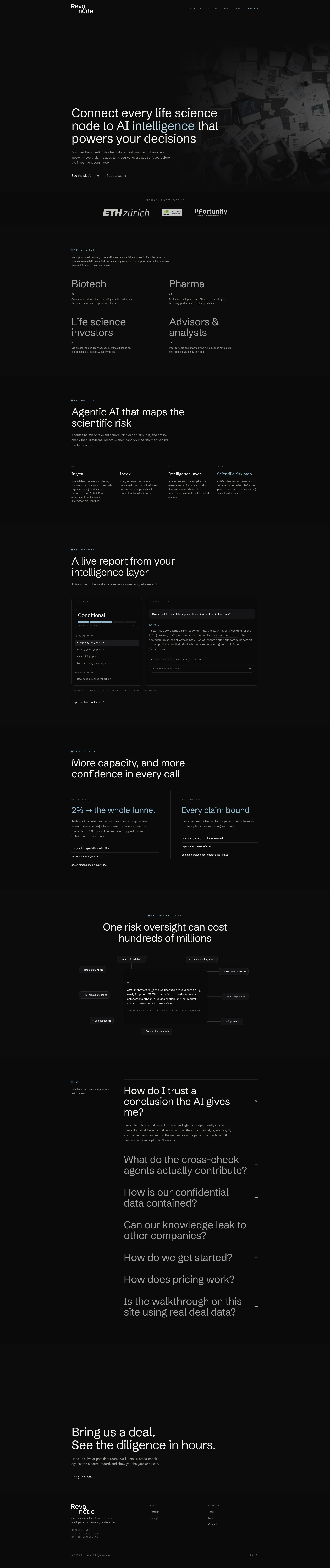
El veredicto
Right, listen up. Revonode is like a Michelin-starred chef cooking in a pitch-black kitchen — the ingredients are BRILLIANT, the technique is sharp, but nobody can bloody SEE the food. The copy is genuinely excellent for niche B2B SaaS: specific numbers, real pain points, no 'we're disrupting the paradigm' nonsense. That alone puts it ahead of 90% of the slop I see daily. BUT — and this is a Gordon-sized but — the trust architecture is thinner than a crêpe at a budget hotel. One anonymous testimonial. No client logos with actual names. No security certifications visible for a platform asking pharma VPs to hand over confidential M&A data. You've got ETH Zürich affiliation and a couple of program logos, which is SOMETHING, but it's like putting one sprig of parsley on an empty plate and calling it garnished. The design is sleek, dark, consistent — but so dense and moody it's practically a sensory deprivation tank. Performance? LCP at 3.25 seconds puts you in average territory — not a disaster, but not winning any races either. You've built a genuinely clever product and written copy that proves you understand your buyer's nightmares. Now stop whispering your credentials in a dark room and START PROVING THEM. More testimonials, real names, security badges, case studies — the kitchen is ready, but you need to open the bloody restaurant.
Revonode: The Dark Knight of Biotech SaaS — Impressive Brain, Invisible Muscles
Look, Revonode is not your average 'AI for everything' garbage fire. The team actually knows what biotech diligence means, and it shows in the copy — specific numbers, real pain points, no fluff about 'disrupting the space.' That's genuinely rare and worth celebrating. BUT. This site is essentially a very smart person wearing a black turtleneck in a dark room, whispering their credentials instead of showing them. One anonymous testimonial. No pricing numbers. No security certifications visible. No case studies. Two founders, no client logos, and a load time that's slower than a Phase III trial. For a product asking VP-level pharma executives to trust it with confidential M&A data, the trust architecture is built on vibes and good writing alone. The design is sleek but so dark and dense it's practically a sensory deprivation tank. You've got a killer idea wrapped in a prototype-level go-to-market. Time to stop whispering and start proving.
Sección Hero
DECENT
RIGHT. Let me give credit where it's due — this hero does something that 80% of B2B SaaS pages completely BUTCHER: it leads with a specific, meaningful outcome instead of some vapid capability claim. Mapped in hours, not weeks — every claim traced to its source, every gap surfaced before the investment committee. THAT is copy that makes a pharma BD director who's been burned by a missed orphan-drug designation sit up in their chair. You understand what this thing does within 3-5 seconds. Genuinely well done. Take a bow.
BUT THEN — oh, THEN — you go and open with Connect every life science node to AI intelligence that powers your decisions. WHAT IS THAT?! It's like serving a beautiful wagyu steak and then pouring ketchup on it! Life science node? AI intelligence? That's the kind of abstract techno-babble that makes a VC nod politely while mentally swiping left. Your ACTUAL differentiator — the claim-binding, source-tracing, agentic cross-check system — is buried three sections down like a truffle under six feet of mud. LEAD WITH THE TRUFFLE!
The dual CTAs — See the platform and Book a call — are above the fold, which is good. But See the platform?! 'SEE'?! That's the most passive verb in the English language! You're selling a $100K+ enterprise tool, not inviting someone to watch paint dry. Make them FEEL something.
Social proof in the hero? You've got ETH Zürich and a couple of affiliation logos. Better than nothing, like having ONE napkin at a dinner party. But where are the numbers? No deals analyzed, no clients served, no X hours saved. For a platform targeting Top-20 Pharma directors, this is showing up to the board meeting with a business card instead of a track record.
And the hero visual — it's atmospheric, dark, decorative. Very moody. Very cinematic. Very NOT your actual product. Show me the risk map! Show me the claim-binding UI! That's your money shot and you're hiding it like it's a state secret. BLOODY HELL, let the product speak!
Ejemplos de mejoras
Connect every life science node to AI intelligence that powers your decisions
Find every risk in a biotech deal — before your investment committee does
The original is abstract and feature-oriented — it sounds like a LinkedIn headline written by a committee. The replacement leads with the buyer's actual fear (missing a risk, getting embarrassed at IC) and implies speed and completeness without leaning on the word 'AI' like a crutch.
See the platform
Watch a live diligence run
'See the platform' is passive and generic — it's the 'chef's special' of CTAs where nobody knows what's actually on the plate. 'Watch a live diligence run' is specific, implies the product works in real-time, and creates genuine curiosity.
Puntos fuertes
- Outcome-first headline with specific timeframe ('hours, not weeks') that immediately speaks to the core pain of the target buyer — this is how you write copy that makes people STOP scrolling
- Dual CTA structure ('See the platform' + 'Book a call') covers both self-serve explorers and sales-ready buyers above the fold — smart kitchen layout
- ETH Zürich affiliation logo provides instant credibility for a scientific audience — it's not much, but it's a real ingredient, not garnish
A mejorar
- The opening line 'Connect every life science node to AI intelligence' is abstract jargon soup that dilutes the otherwise sharp subtitle — visitors read THIS first and bounce before reaching the good stuff below
- ZERO quantified social proof in the hero: no deals analyzed, no clients served, no time saved — for enterprise B2B, that credibility gap is wider than the English Channel
- Hero visual is decorative and atmospheric rather than showing the actual product interface — you're hiding your best dish in the back kitchen while serving an empty plate
Copywriting
DECENT
Alright, I need to be honest here — Revonode's copy is LEGITIMATELY GOOD. And I don't hand out compliments like free bread rolls. The team clearly lives in their buyer's world: You see the landmines before the IC meeting, not after is the kind of line that makes a pharma BD director's stomach drop in recognition. The 2% → the whole funnel stat? Specific, memorable, paints the problem without making the reader do mental gymnastics. THAT is how you set a table.
And that testimonial about losing seven years of exclusivity over a missed orphan-drug designation — CHEF'S KISS. That's not marketing copy, that's a horror story told at the right dinner party. It makes the product feel necessary, not nice-to-have. The technical specificity throughout — the 100 µg arm only, n=23, with no active comparator, the pooled figure across all arms is 54% — this is the language of the ACTUAL BUYER, not some marketer who spent 20 minutes on Wikipedia. Tone match is superb. It reads like a senior scientist who also understands business, and that's rarer than a perfectly cooked soufflé.
BUT — and here's where I slam my hand on the counter — the solution sections go full mechanism-brain. Agents test each claim against the external record describes HOW your kitchen works, not HOW THE FOOD TASTES. Your problem sections are dripping with buyer empathy, then your product sections suddenly sound like a technical manual. The benefits translation is inconsistent — brilliant when describing the pain, clinical when describing the cure. That's like a restaurant with an incredible menu description and then serving the dish without any seasoning.
The FAQ section? EXCELLENT. Real questions, honest answers, no corporate dodge. If it cant show its receipt, it isn't asserted' — I want that on a t-shirt. The ILLUSTRATIVE DATASET disclaimer is handled with transparency that actually BUILDS trust rather than undermining it. Smart.
But the pricing copy — oh, the PRICING COPY. You explain the model clearly but give ZERO value anchoring. If one missed designation costs hundreds of millions, WHAT DOES REVONODE COST in comparison? That contrast would be DEVASTATING in the best possible way, and you just... left it on the cutting board. And that single testimonial being anonymous? TOP-20 PHARMA DIRECTOR, GLOBAL BUSINESS DEVELOPMENT with no name, no company, no photo? In 2025, enterprise buyers treat anonymous quotes the same way I treat frozen risotto — with deep suspicion and immediate rejection.
The copy is doing HEAVY lifting that the design and trust signals are completely failing to support. It's like having a world-class sommelier working in a restaurant with no wine glasses.
Ejemplos de mejoras
Agents test each claim against the external record for gaps and risks. Real-world results bound to references are prioritized for trusted analysis.
Agents hunt down every contradiction in the external record — failed trials, competing patents, crowded indications — so your team walks into IC with the full risk picture, not the founder's version of it.
The original describes the mechanism like a recipe card. The rewrite translates the same mechanism into the buyer's lived experience: the visceral fear of being ambushed at IC with information the founder conveniently forgot to mention.
Two things drive it: a license sized by how much deal material you keep indexed with us, and investigation tokens consumed by the deals you actually put through diligence.
Two things drive the cost: how much deal material you keep on file, and how many deals you actually run through diligence. No seat counts, no per-document fees, no surprises. One missed designation costs more than a year of Revonode.
The original is clear but cold — like reading terms and conditions. The rewrite adds the value anchor that makes the price feel trivial compared to the cost of a single miss, which is exactly the frame the testimonial sets up so perfectly.
Puntos fuertes
- Hyper-specific numbers and technical details ('68% for the 100 µg arm only, n=23') demonstrate genuine domain expertise — this isn't marketing fluff, it's proof you actually know the science your buyers live and breathe
- The '2% → the whole funnel' framing is sharp, memorable, and makes the ROI case without ever using the painfully overused phrase 'ROI' — brilliant problem articulation
- FAQ section answers real objections with genuine transparency, including data containment and pricing model questions — the kind of honesty that enterprise buyers actually respect and need before signing anything
A mejorar
- Solution section copy describes mechanisms ('agents test each claim against the external record') without consistently translating to buyer outcomes — the 'so what' is implied but rarely stated, like describing every ingredient without telling me what the dish actually tastes like
- Pricing copy explains the model structure but provides ZERO value anchoring — no 'compared to a 50-hour specialist team at $X/hour' contrast that would make the price feel irrelevant next to the cost of a miss
- The single testimonial is anonymous with no company, no name, no photo — enterprise buyers in 2025 treat unsigned testimonials like unsigned checks: interesting but worthless
Desbloquear las 8 categorías restantes
Call-to-Action
DECENT
Contenido bloqueado
Prueba Social
CRITICAL
Contenido bloqueado
Arquitectura
DECENT
Contenido bloqueado
SEO y Meta
CRITICAL
Contenido bloqueado
Móvil
DECENT
Contenido bloqueado
Diseño Visual & Branding
DECENT
Contenido bloqueado
Rendimiento
NEEDS WORK
Contenido bloqueado
llmreadiness
CRITICAL
Contenido bloqueado
Contenido bloqueado
Accede a la conclusión completa con las 3 acciones prioritarias y un mensaje motivador personalizado.