El veredicto
Right, listen. Nancy and Zach are out there living in a converted school bus with 9 animals, pulling over for every giant peach and weird sculpture in America — and their WEBSITE can't even pull over for basic SEO? The title tag literally just says 'Right At The Light' like Google's supposed to read their minds! The copy is BRILLIANT — genuinely funny, warm, the kind of voice that makes you want to quit your job and buy a bus. But that personality is sitting on a technical foundation held together with prayers and a free WordPress theme. The hero section can't decide what it wants to be, the SEO schema is more broken than a deep fryer at a fish and chips shop on a Friday night, and there are ZERO trust signals on the homepage despite having actual fans who spot their bus on the interstate. Performance is solid — 1.2 second load time, well done, that's a properly seared steak in a kitchen full of raw chicken. But the 373KB HTML is bloated like a soufflé that someone sat on. You've got the ingredients of a Michelin-star travel blog and you're serving it on a paper plate. The bus deserves better. YOUR AUDIENCE deserves better. Let's get this kitchen in order.
The Bus Is Cooler Than The Website — And The Bus Lives In A Parking Lot
Look, Nancy and Zach are living the dream — 200 square feet, 9 animals, and a bus the color of a traffic cone. The content is genuinely fun, the niche is real, and the 'Choose a Detour' widget is the kind of interactive idea that most bland travel blogs couldn't dream up. BUT. The homepage is doing too many things at once, the SEO infrastructure is embarrassingly broken for a blog that DEPENDS on Google traffic, and the hero section buries the personality under a layout that can't decide what it wants to be. You've got the voice of a road trip legend and the technical setup of someone who just discovered WordPress last Tuesday. The bus deserves better. Let's fix it.
Sección Hero
DECENT
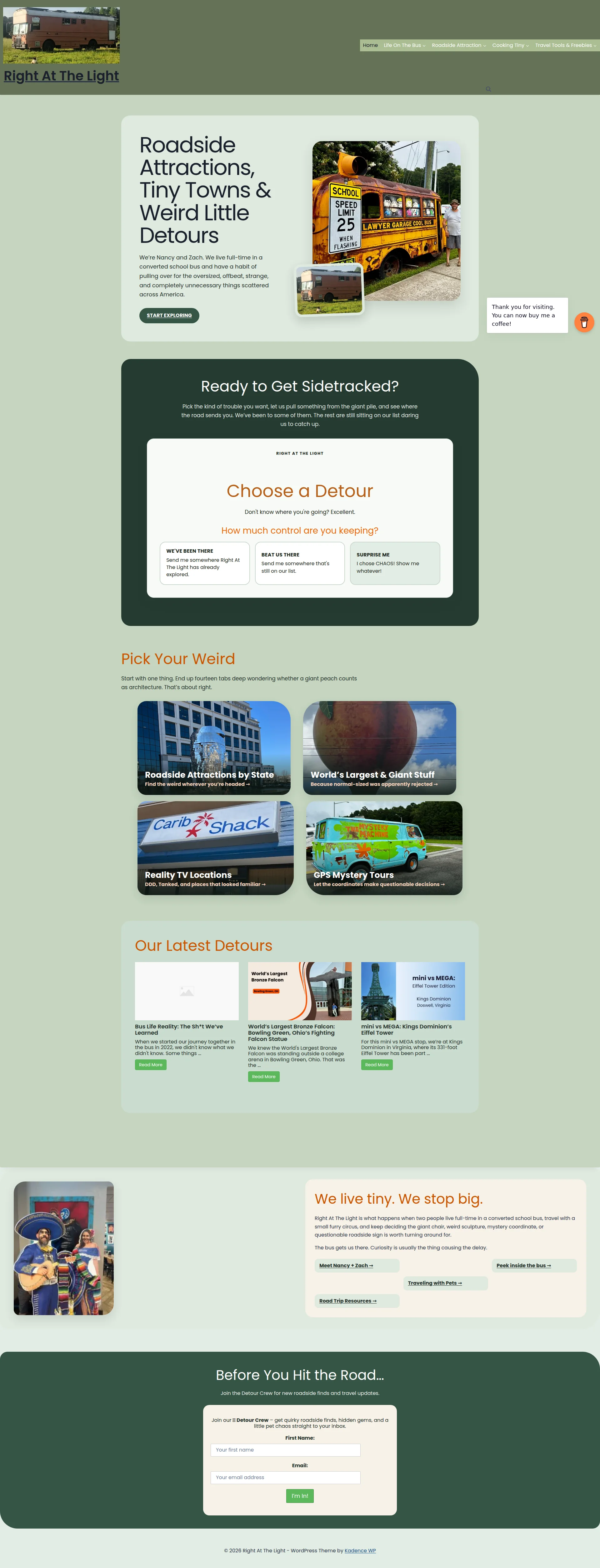
RIGHT. Let me tell you what's maddening about this hero section — it's got REAL personality trapped inside a layout that's fighting itself like two cats in a carrier!
The H1 — Roadside Attractions, Tiny Towns & Weird Little Detours — is genuinely EXCELLENT. Specific, searchable, tells you exactly what kind of beautiful madness you're signing up for. That's a perfectly seasoned dish right there. And the sub-copy? 'We're Nancy and Zach. We live full-time in a converted school bus...' — you know EXACTLY who these people are in two sentences. Most travel blogs take three paragraphs to say absolutely nothing. This says everything. WELL DONE on that.
But then — BLOODY HELL — look at the execution! The hero image of that quirky school bus scene is fighting the headline for attention like two sous chefs arguing over one burner. They're sitting side by side in this muted sage-green card container, neither one winning. It's not a hero section, it's a custody battle! The visual hierarchy is saying we threw ingredients at the wall and hoped something would taste good.
And that START EXPLORING button? Is THAT your CTA?! It's a tiny dark button cowering in the corner of the card like a garnish nobody asked for. For a blog that lives and dies on clicks and newsletter signups, you're whispering when you should be SHOUTING. Make that button the loudest thing in the room!
And WHERE is the social proof? You've got fans who literally recognize your bus on the highway — that's the kind of street cred money can't buy! And you're hiding it?! No subscriber count, no spotted us on I-95? moment, no 8,000 road trippers already in the crew. You've got the ingredients for a spectacular first impression and you're plating it like a cafeteria lunch. Get those numbers up front, make that CTA impossible to ignore, and let the image SUPPORT the headline instead of arm-wrestling it.
Ejemplos de mejoras
We're Nancy and Zach. We live full-time in a converted school bus and have a habit of pulling over for the oversized, offbeat, strange, and completely unnecessary things scattered across America. START EXPLORING
We're Nancy and Zach — two people, one converted school bus, 9 animals, and a hard rule: if it's giant, weird, or completely unnecessary, we're pulling over. Join 8,000+ road trippers who get the detours first. → START EXPLORING THE WEIRD
Adds specificity (9 animals, the community size as social proof), makes the CTA text more action-oriented and on-brand, and gives the visitor a reason to subscribe beyond just 'explore.' The number makes it feel like a movement, not just a blog.
Puntos fuertes
- H1 is specific, niche-targeted, and immediately communicates the blog's exact focus — roadside weirdness — with zero ambiguity. That's a perfectly cooked headline, no notes
- The two-sentence personal introduction ('We're Nancy and Zach...') delivers a complete brand identity faster than most About pages manage to — real personality in minimal space
- The 'START EXPLORING' CTA is present above the fold, which at least clears the minimum bar even if it doesn't clear it with any style whatsoever
A mejorar
- Zero social proof in the hero — no follower count, no press mentions, no 'join X road trippers' stat — despite having real fans who recognize the bus on the interstate. You're hiding your best ingredient!
- The CTA button 'START EXPLORING' is visually undersized and blends into its dark card container like overcooked vegetables in brown gravy — a first-time visitor could scroll right past it
- The hero image placement creates visual competition with the headline rather than reinforcing it — the layout reads as two separate elements in a boxing match rather than one cohesive hero unit
Copywriting
DECENT
Now HERE'S where it gets properly frustrating — because the copy on this site is genuinely GOOD, which makes every gap feel like watching a talented chef burn the toast!
Start with one thing. End up fourteen tabs deep wondering whether a giant peach counts as architecture. Thats about right.' — THAT is the kind of line that makes people bookmark a site, share it with friends, and come back for more. Nancy writes like a PERSON, not a content mill robot, and in the travel blog world that's rarer than a perfectly poached egg at a motorway service station.
The Choose a Detour section? 'Don't know where you're going? Excellent.' — that's witty, on-brand, and actually sells the interactive experience. I chose CHAOS! Show me whatever! as a button option? BRILLIANT. That's personality doing the selling for you. The Pick Your Weird section headers — Because normal-sized was apparently rejected — are the kind of micro-copy that most blogs never bother writing. You bothered. And it WORKS.
BUT — and here's where I need you to sit down — the homepage copy is personality-rich and benefit-POOR. Almost everything is written from heres what WE do' instead of heres what YOU get.' It's like a restaurant menu that only talks about how much fun the chef had cooking. Lovely for the chef. What's in it for ME?
And then — oh, this one STINGS — the newsletter CTA: Join the Detour Crew for new roadside finds and travel updates. TRAVEL UPDATES?! Seriously?! You spent the entire page building this incredible quirky voice and then you sign off with the most generic phrase in the entire travel blog universe! Every newsletter on earth promises updates. The inline form copy buried INSIDE the form is actually better — quirky roadside finds, hidden gems, and a little pet chaos — but you've hidden the good stuff where nobody reads first! That's like putting the seasoning UNDER the plate!
The blog post teasers are also letting you down. When we started our journey together in the bus in 2022, we didnt know what we didn't know' — that tells me NOTHING about why I should click. Where's the giant falcon? Where's the weird GPS mystery? Give me a REASON to click, not a sentence that wanders off mid-thought like someone who forgot why they walked into the kitchen!
Ejemplos de mejoras
Before You Hit the Road… Join the Detour Crew for new roadside finds and travel updates.
Before You Hit the Road… Get the weird stuff first. The Detour Crew gets new roadside giants, hidden small-town gems, GPS mystery drops, and yes — occasional cat chaos. No algorithm. Just the good detours.
Replaces the generic 'travel updates' with specific content pillars that match what the blog actually delivers, adds personality consistent with the brand voice, and gives a concrete reason to subscribe beyond vague 'updates.' You wouldn't describe a five-course meal as 'food' — don't describe your newsletter as 'updates.'
Puntos fuertes
- Section headers and transitional copy have genuine wit and voice — 'Because normal-sized was apparently rejected' and 'I chose CHAOS!' are on-brand micro-copy that most blogs never bother to write. This is SEASONING done right
- The About section copy is unusually specific and personal, with concrete details (the bus, the animals, the lifestyle) that build authentic connection rather than generic lifestyle blogging fluff
- The 'Choose a Detour' interactive section copy perfectly frames the UX — it turns a navigation widget into a personality moment, which is genuinely smart content design that most travel blogs couldn't dream up
A mejorar
- Homepage copy is almost entirely creator-focused ('we've been,' 'we didn't know') with minimal explicit benefit framing for the reader — what does the VISITOR leave with? Tell them!
- Newsletter section lead copy 'Join the Detour Crew for new roadside finds and travel updates' uses the catastrophically generic phrase 'travel updates' which murders the specificity the rest of the site works so hard to build
- Post teasers on the homepage are truncated mid-thought and fail to deliver a reason to click — 'we didn't know what we didn't know' is not a hook, it's a sentence that wandered off and never came back
Desbloquear las 8 categorías restantes
Call-to-Action
DECENT
Contenido bloqueado
Prueba Social
CRITICAL
Contenido bloqueado
Arquitectura
DECENT
Contenido bloqueado
SEO y Meta
CRITICAL
Contenido bloqueado
Móvil
DECENT
Contenido bloqueado
Diseño Visual & Branding
DECENT
Contenido bloqueado
Rendimiento
DECENT
Contenido bloqueado
llmreadiness
NEEDS WORK
Contenido bloqueado
Contenido bloqueado
Accede a la conclusión completa con las 3 acciones prioritarias y un mensaje motivador personalizado.