El veredicto
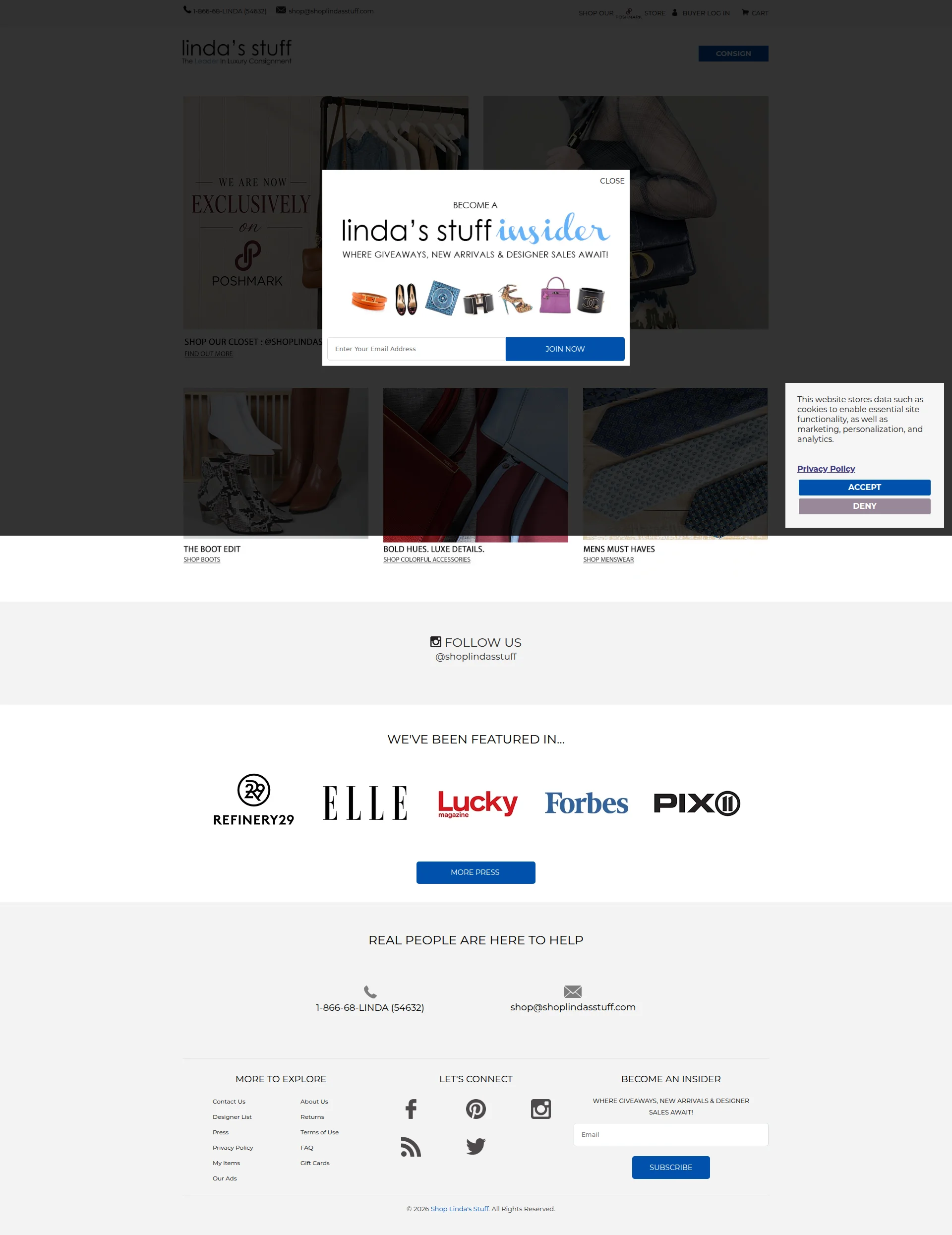
Right, let me be straight with you. Linda built a $25 million luxury consignment empire from scratch — that's the kind of origin story that makes me want to stand up and applaud. Forbes, Elle, Refinery29 — the press logos are REAL and they're EARNED. But this website? It's like serving a Michelin-quality steak on a paper plate in a car park. You've got THREE pop-ups ambushing every visitor before they've even seen the menu — a cookie banner, a newsletter modal, AND a Poshmark migration notice, all at once. The hero section is buried under a dark overlay like it's in witness protection. There are 10 testimonials with photos sitting somewhere in the back kitchen and NOT A SINGLE ONE is on the homepage. LCP clocks in at 3.47 seconds — that's AVERAGE territory, not catastrophic, but for a luxury brand where first impressions are everything, it's still too bloody slow. The press credentials are gold, the founding story is compelling, the copy on the About page is genuinely excellent — but NONE of it is where visitors actually land. You've got a Rolls-Royce engine stuffed inside a rusted-out minivan. The ingredients are world-class. The plating is an embarrassment. Fix the presentation or keep losing customers to competitors who figured out that 2026 requires more than a Shopify template and a prayer.
Linda's Stuff: A $25M Business Dressed Like It's Still on eBay in 2009
Listen, Linda built a $25 million empire from selling her kid's video games — that's genuinely impressive and we respect the hustle. But this website? It's like showing up to a luxury consignment gala in a wrinkled Forever 21 dress. The homepage buries a cookie banner, a newsletter pop-up, AND a Poshmark migration notice all at once, creating what can only be described as a digital ambush. Visitors who survive that gauntlet are rewarded with... a darkened hero section they can barely read. The press logos from Elle, Forbes, and Lucky Magazine are gold — but they're sitting in a graveyard of missed opportunities: no customer reviews, no trust badges, no secure payment icons, and a page that takes 3.5 seconds to load. For a luxury resale brand competing in 2026, this site is leaving serious money on the table. The bones are there. The story is there. The credibility is there. The execution, however, is somewhere back in 2012.
Sección Hero
CRITICAL
BLOODY HELL — is THAT your hero section?! I've seen clearer messaging on a foggy motorway sign at midnight! The moment someone lands on this page, they're assaulted by THREE separate interruptions — a cookie consent banner lurking in the corner, a massive newsletter pop-up hogging the center of the screen, AND a Poshmark migration announcement underneath. That's not a welcome mat, that's a MUGGING.
Look, the background imagery — fashion on racks, luxury accessories — that's directionally right. You're a luxury consignment brand, so showing product makes sense. But nobody can SEE any of it because your pop-up is sitting on top of the hero like a drunk uncle at a wedding reception, blocking everything worth looking at!
And what's the headline hiding underneath all this chaos? WE ARE NOW EXCLUSIVELY ON POSHMARK. Excuse me — WHAT?! If you've moved to Poshmark, why does this website still exist? That's not a value proposition, love — that's a FAREWELL CARD. A visitor landing here for the first time has absolutely NO idea whether you're open for business, closed for renovation, or just having an existential crisis.
The CONSIGN button? Tiny little thing hiding in the navigation corner like it's embarrassed to be here. Where's the big, bold, hero-level call to action? Where's the headline that screams Earn 80% on your designer pieces? Where's the social proof? You've got Forbes and Elle logos — BRILLIANT credentials — but they're buried several scrolls down the page where most visitors will never reach because they already bounced from your pop-up ambush!
And here's what really burns my apron — you have 10 testimonials with photos. TEN! And not a single one is anywhere NEAR the hero. That's like having a Michelin star and hiding the certificate in the toilet. The visual hierarchy is non-existent: all-caps tiny text on dark imagery, no size differentiation, no breathing room. This hero needs to be torn down to the studs and rebuilt from scratch. One headline. One CTA. ZERO pop-ups on load. That's the recipe. Follow it.
Ejemplos de mejoras
WE ARE NOW EXCLUSIVELY ON [POSHMARK]
The #1 Luxury Consignment Destination — Earn Up to 80% on Your Designer Items. Featured in Forbes, Elle & More.
Your current hero headline announces a platform migration — that's a logistics memo, not a value proposition! Nobody cares about your internal business decisions. The replacement leads with what matters to the CUSTOMER: earning potential, luxury positioning, and third-party credibility. That's how you hook someone in three seconds instead of confusing them into closing the tab.
Puntos fuertes
- Fashion imagery in the background is thematically appropriate for a luxury consignment brand — at least the ingredients are right even if the plating is a disaster
- The 'CONSIGN' CTA button is consistently present in the navigation across all pages — persistent, even if it's whispering when it should be shouting
- The Poshmark migration announcement shows the brand is actively communicating major updates — just doing it at the worst possible time and place
A mejorar
- Three simultaneous interruptions on page load (cookie banner, newsletter pop-up, Poshmark announcement) create a digital ambush that destroys any hero message before it can breathe
- No clear headline or value proposition visible in the hero — a first-time visitor cannot understand what Linda's Stuff offers within 3 seconds, which is a conversion death sentence
- Zero social proof in the hero zone — 10 customer testimonials with photos exist but are completely absent from the homepage, and the impressive press logos (Forbes, Elle, Refinery29) are buried far below the fold
Copywriting
NEEDS WORK
Right, the copywriting situation here is like having a world-class chef who only cooks in the break room and serves crackers in the dining room. Your About Us page? GENUINELY brilliant. $25 million business, 93,000 square foot office space, up to 80% of the sale price, most transactions completing within just a few days — those are the kind of specific, mouth-watering numbers that make people pull out their wallets. But they're HIDDEN on a page that 90% of your visitors will never find! Seriously?!
The homepage itself has roughly 97 words of actual copy. Ninety-seven! I've written longer shopping lists! And what's there? Navigation labels like SHOP OUR STORE and section headers like 'WE'VE BEEN FEATURED IN.' That's not copywriting — that's LABELING. You might as well put sticky notes on the walls and call it interior design.
REAL PEOPLE ARE HERE TO HELP — oh, ARE they? As opposed to what, robots? Aliens? That's what every company says. It's the marketing equivalent of our food is edible. And WHERE GIVEAWAYS, NEW ARRIVALS & DESIGNER SALES AWAIT — await WHERE? This is vague, benefit-free fluff that could be on literally any retail site from Target to Tiffany's.
Now, your FAQ page — credit where it's due — is actually well-organized. Clear condition grading, transparent shipping rates, honest return policies. That's proper service, that is. But it's buried in a sub-page like a secret menu.
The real crime? You've got 10 customer testimonials WITH PHOTOS and not a single word from a real customer appears on the homepage. You've got people vouching for your service and you're keeping them locked in the pantry! Let them SPEAK! Put those voices front and center where they can actually convert visitors into customers.
And one more thing — ABCd on your About Us page? A TYPO on your credibility page?! For a luxury brand, that's like finding a hair in the soup at a five-star restaurant. Fix it TODAY.
Ejemplos de mejoras
REAL PEOPLE ARE HERE TO HELP
Real People, Real Answers — Our team responds within 1 business day. Call 1-866-68-LINDA or email us anytime.
The original is a vague platitude that every company from a bank to a burger joint uses. It means absolutely nothing. The replacement adds specificity (response time), provides the actual contact method inline, and gives visitors a concrete reason to feel confident reaching out. THAT'S how you build trust.
WHERE GIVEAWAYS, NEW ARRIVALS & DESIGNER SALES AWAIT!
Get first access to new Chanel, Gucci & Louis Vuitton arrivals — plus exclusive sales and giveaways for insiders only.
The original is generic hype that could describe any newsletter from any retailer on the planet. The replacement names actual luxury brands — which is exactly what your audience is searching for — adds exclusivity framing, and makes the value of subscribing tangible and irresistible.
Puntos fuertes
- About Us page contains highly specific, credible business metrics — '$25 million business,' '93,000 square foot office space,' 'up to 80% of the sale price' — these are the kind of concrete numbers that build instant trust
- FAQ page is comprehensive, well-organized, and answers real customer objections around authentication, returns, and shipping with honest, specific details — proper customer service writing
- The founding story (lawyer turned eBay seller turned $25M empire) is genuinely compelling and differentiating — it's just tragically buried on a sub-page instead of being front and center where it matters
A mejorar
- Homepage has only 97 words of actual copy — your most important page is practically MUTE while all the persuasive content hides on pages most visitors will never find
- Key conversion-driving stats ('earn up to 80%,' 'free domestic shipping,' '30-day returns') and all 10 customer testimonials with photos are buried in sub-pages instead of being front and center on the homepage
- The About Us page contains 'ABCd' — an uncorrected typo for 'ABC' — which is a credibility-destroying error on the very page meant to establish trust for a luxury brand
Desbloquear las 8 categorías restantes
Call-to-Action
CRITICAL
Contenido bloqueado
Prueba Social
CRITICAL
Contenido bloqueado
Arquitectura
NEEDS WORK
Contenido bloqueado
SEO y Meta
CRITICAL
Contenido bloqueado
Móvil
NEEDS WORK
Contenido bloqueado
Diseño Visual & Branding
CRITICAL
Contenido bloqueado
Rendimiento
CRITICAL
Contenido bloqueado
llmreadiness
DECENT
Contenido bloqueado
Contenido bloqueado
Accede a la conclusión completa con las 3 acciones prioritarias y un mensaje motivador personalizado.