El veredicto
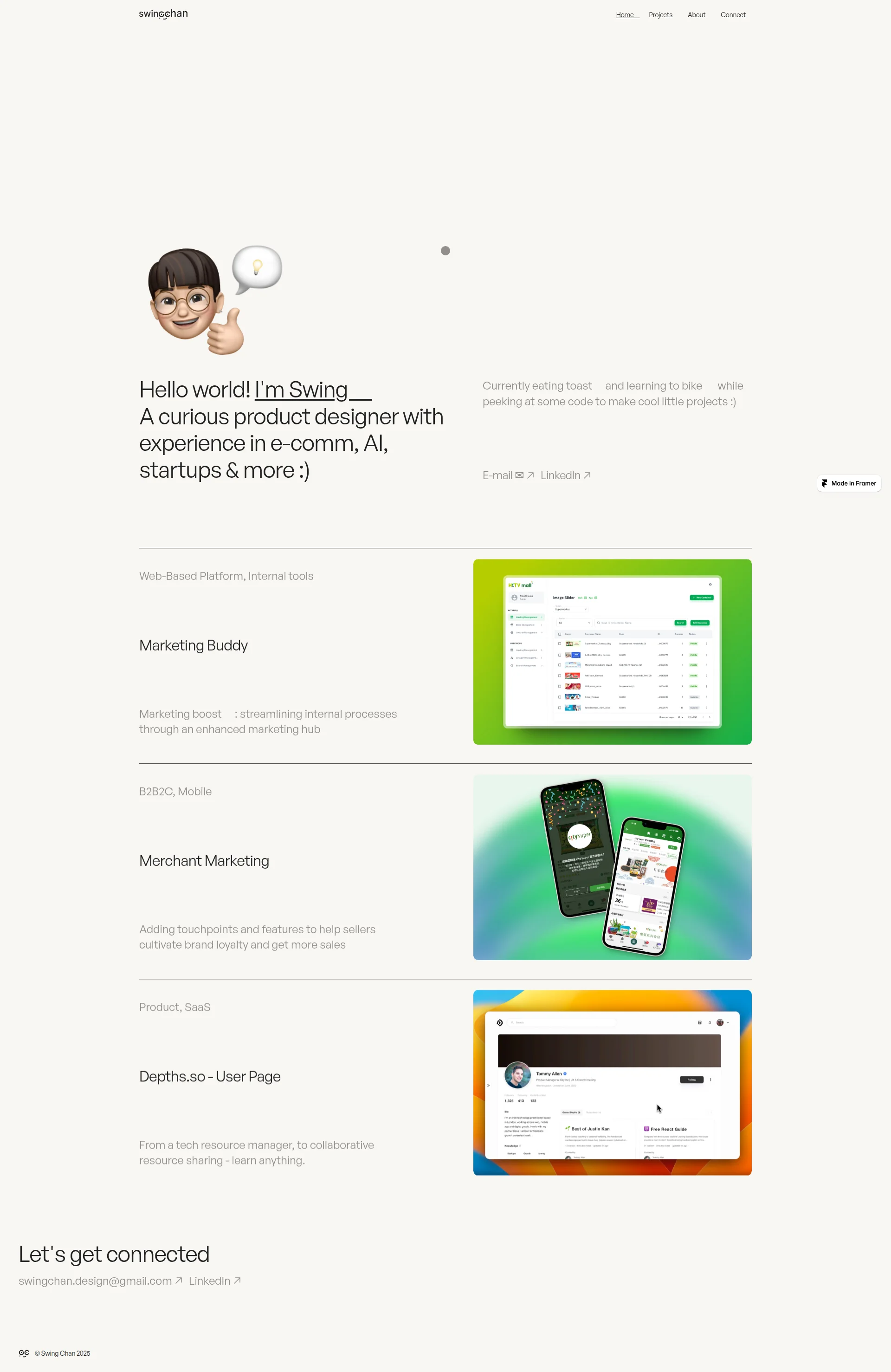
Right, Swing — let me be straight with you. You've got charm, you've got personality, and your case studies show you can actually think like a designer. But BLOODY HELL, your mobile LCP is 6.16 seconds! That's not a loading time, that's a smoke break! Recruiters are scrolling through portfolios on the train, and yours hasn't even served the first course before they've already moved on to the next restaurant. Your hero is warm and human but has zero proof you've ever worked a real kitchen — no company names, no credentials, no reason to trust you above the fold. Your copy on the homepage is thinner than a crêpe, and your meta description reads like a text you'd send your mum. The bones of this dish are solid — the case studies have genuine depth, the tone is consistent, the layout is clean. But you're serving a beautifully plated appetiser on a table that takes six seconds to walk to. Fix the performance, inject some proof, and stop hiding your best ingredients in the pantry.
Cute Portfolio, But Your LCP is Having a Stroke on Mobile
Listen, Swing — I can tell you're a real designer. The case studies have process, the copy has personality, and the emoji-as-navigation thing is actually kind of adorable. But adorable doesn't get you hired. Your mobile performance is a dumpster fire (6.16 seconds to show your portfolio to someone on their phone — that's longer than it takes to make toast, which you apparently eat constantly). You've got 3 projects showing on the homepage when you have at least 6 in the site structure, your hero has zero social proof, and your meta description reads like a text message to a friend. The bones are good. The execution needs a serious intervention. Let's fix this before another recruiter bounces at the loading screen.
Sección Hero
NEEDS WORK
Right, let me tell you what's happening here. Your hero is like a chef who walks into the dining room, gives everyone a big smile and a thumbs up, and then forgets to bring the food. That Memoji avatar with the little lightbulb? Charming. The Hello world! Im Swing' opener? Genuinely warm — in a sea of dead-eyed portfolio templates, you actually feel like a HUMAN BEING. I'll give you that. Your value prop covers the bases — product designer, e-comm, AI, startups. A recruiter knows what you do within four seconds. Fine.
But then — NOTHING. Where's the proof?! Where's the sizzle?! You have SIX YEARS of experience, you've worked at what's apparently Hong Kong's biggest e-commerce platform, and you've buried all of that in your About page like you're ASHAMED of it! That's like a Michelin-starred chef hiding their stars in the broom cupboard!
And those CTAs — E-mail and LinkedIn as plain text links? Are you KIDDING me? They don't say hire me, they say maybe whisper in my general direction if the mood strikes you. Give me a proper button! Give me an action verb! Give me SOMETHING that makes a recruiter's finger actually want to click!
And that right column — oh, that beautiful prime real estate above the fold — you've used it for Currently eating toast and learning to bike. SERIOUSLY?! That's your pitch to the person deciding whether to spend 30 more seconds on your site? That's like putting a joke on the menu where the specials should be. The personality is lovely, but it belongs AFTER you've earned their attention, not INSTEAD of earning it.
The typography hierarchy works — big H1, supporting subtitle, clean tertiary text. The layout is structured. The vibe is distinct. But a likeable hero that doesn't convert is just a friendly waiter at an empty restaurant.
Ejemplos de mejoras
Currently eating toast 🍞 and learning to bike 🚲 while peeking at some code to make cool little projects :)
6 years in product design · HKTVmall · Edelman · Depths.so · Currently open to new opportunities 🚀
The toast line is adorable but it's doing ZERO work for conversion. It's like putting a joke where your specials board should be. Swap it for real credentials and you give recruiters a reason to stay without killing the casual vibe entirely.
Puntos fuertes
- Genuine personality cuts through immediately — the Memoji, casual tone, and emoji give this hero a heartbeat that 90% of portfolio templates completely lack
- Value proposition hits the right verticals fast (e-comm, AI, startups) so the right recruiters self-select without having to dig
- Typography hierarchy is clean and confident — the H1 commands attention, the subtitle supports it, nothing fights for dominance
A mejorar
- ZERO social proof above the fold — no company names, no years of experience, no credibility signals whatsoever, so a recruiter has absolutely no reason to trust you over any other 'curious product designer'
- CTAs are styled as plain text links with tiny icons — they have no visual weight, no urgency, and blend into the page like garnish nobody ordered
- Right column burns prime above-fold real estate on personality fluff ('Currently eating toast') when it could be screaming '6 years experience' or listing actual companies you've designed for
Copywriting
DECENT
Your copy has a split personality, and honestly, it's doing my head in. The homepage is breezy and fun — great. The case studies are actually solid with real design thinking — brilliant. The About page? It's somewhere in the middle, wobbling like a soufflé that can't decide whether to rise or collapse.
Let's start with the homepage. 129 words. ONE HUNDRED AND TWENTY-NINE WORDS. That's not a portfolio, that's a TWEET. Your meta description — 'I'm a product designer, here's some of my work :)' — is the professional equivalent of showing up to a Michelin interview and saying I cook stuff, wanna taste? It's not WRONG, it's just doing absolutely nothing for you!
Now here's what drives me MAD — your case study copy is genuinely GOOD. The Merchant Marketing page explains the problem with real numbers (With over 6,200 sellers on the platform), walks through constraints, articulates design decisions with actual reasoning. THAT is the kind of writing that gets you hired! The Depths.so case study does the same — explaining the 'why' not just the what. So you CAN write! You just chose not to on the page that matters most!
The About page has moments — 6 years in design, with 4 specializing in digital product experiences & UI/UX is concrete and useful. But then you go soft with My passion is discovering fresh insights, putting them into drafts, and molding them into unique experiences. That's the designer equivalent of telling me you're passionate about food. EVERYONE says that. Show me the DISH!
And the typos — digital product experences on the About page, I some research in the Merchant Marketing case study. Small? Yes. But you're a DESIGNER. Details are literally your job. That's like a chef with a dirty apron — it makes people wonder what the kitchen looks like.
The biggest sin? Zero outcome metrics ANYWHERE. Not a single conversion lift, engagement number, or business result. You're describing the recipe without ever telling me how the dish tasted. Did your Merchant Marketing work actually increase sales? Did the Depths.so redesign boost engagement? Without numbers, your work is unvalidated, and unvalidated work is just... pretty pictures.
Ejemplos de mejoras
My passion is discovering fresh insights, putting them into drafts, and molding them into unique experiences.
I dig into the messy problem first — user interviews, competitive analysis, stakeholder briefs — then design my way to something that actually ships and moves numbers.
The original is pure filler that every designer on earth has written at 2am. The replacement is specific about process and implies measurable impact — which is what hiring managers are actually looking for when they read your About page.
Puntos fuertes
- Case study copy demonstrates genuine design thinking — the Merchant Marketing page articulates specific constraints, tradeoffs, and reasoning like someone who actually SHIPS products, not just pushes pixels
- Consistent casual-but-professional tone throughout matches the startup and design-forward audience perfectly — it reads like a real person, not a corporate brochure
- The About page grounds claims with concrete specifics like '6 years in design, with 4 specializing in digital product experiences' — that's the kind of detail that gives a recruiter something to hold onto
A mejorar
- Homepage word count of 129 words is embarrassingly thin — there's not enough copy to build trust, communicate value, or give search engines anything to chew on
- Zero outcome metrics across the entire site — no conversion lifts, no engagement numbers, no business results from any project, making every case study feel like an unfinished sentence
- Two typos found ('digital product experences' and 'I some research') — small errors that undercut the professional polish a design portfolio absolutely needs to maintain
Call-to-Action
CRITICAL
Contenido bloqueado
Prueba Social
CRITICAL
Contenido bloqueado
Arquitectura
DECENT
Contenido bloqueado
SEO y Meta
CRITICAL
Contenido bloqueado
Móvil
NEEDS WORK
Contenido bloqueado
Diseño Visual & Branding
DECENT
Contenido bloqueado
Rendimiento
CRITICAL
Contenido bloqueado
llmreadiness
CRITICAL
Contenido bloqueado