El veredicto
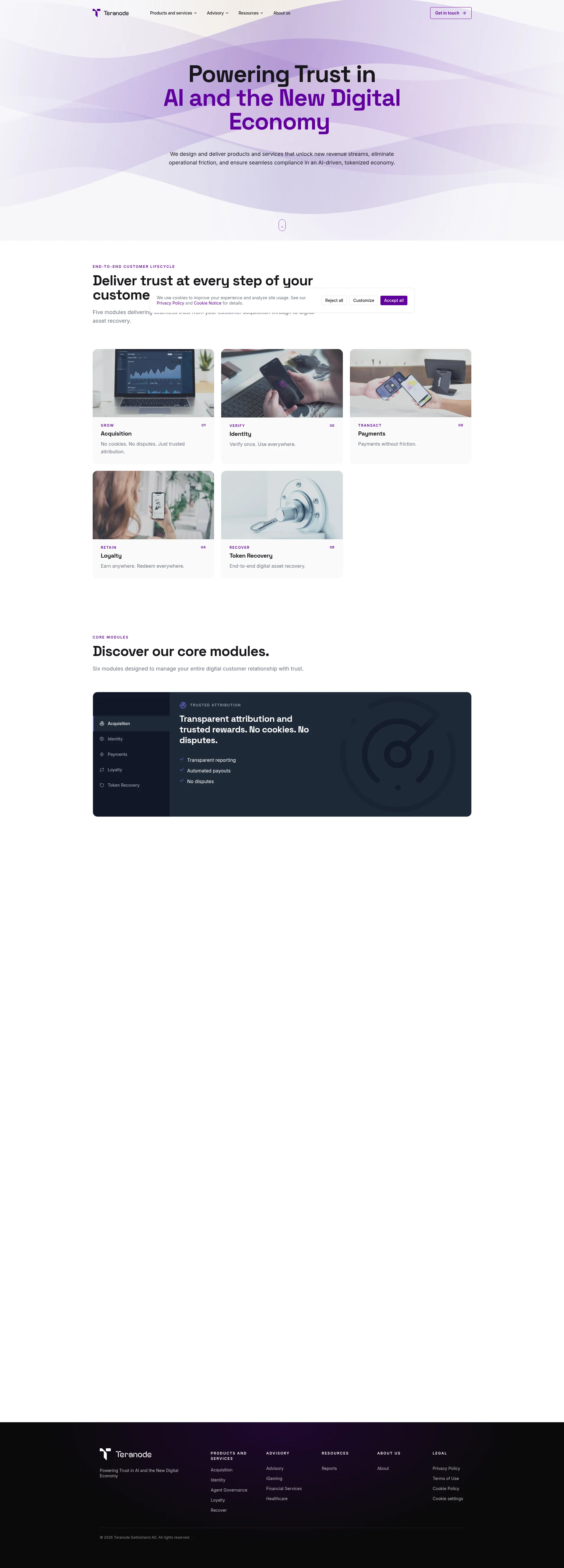
Right, listen up. Teranode walks into my kitchen wearing a pristine chef's jacket, a beautiful purple apron, and absolutely NO FOOD ON THE PLATE. The design is clean, the messaging framework is coherent, and the product concept — blockchain trust infrastructure — is genuinely interesting. But interesting concepts don't close enterprise deals, do they? What closes deals is PROOF. Client logos, case studies, testimonials, a demo button that doesn't feel like shouting into the void. Right now, a skeptical VP of Engineering lands on this page and sees beautiful purple waves, three bullet points, and a 'Get in touch' CTA that could mean literally anything. For a company literally selling 'trust,' having almost no trust signals on the homepage is like opening a restaurant called 'Hygiene First' and having rats in the dining room. The bones of this dish are good — the product pages actually have decent structure, the copy on inner pages shows real competence, and the design palette is premium. But the homepage? 233 words of elevated nothingness trying to sell enterprise blockchain infrastructure. That's not a landing page, that's a business card someone dropped in a puddle. Get some meat on this plate, show me who's actually eating here, and stop hiding your best ingredients three clicks deep.
Teranode: Gorgeous Vibes, Zero Proof You Exist
Look, Teranode clearly has smart people behind it — the messaging framework is coherent, the design is clean, and the product concept (blockchain-based trust infrastructure for AI payments) is genuinely interesting. But interesting concepts don't close B2B enterprise deals. What closes deals is proof: client logos, case studies, pricing signals, a demo button that doesn't feel like it leads to a black hole. Right now, a skeptical VP of Engineering landing on this page sees beautiful purple waves, three bullet points, and a 'Get in touch' CTA that could mean literally anything. There's no pricing page, no security badges, no testimonials, no integration logos — just vibes and vocabulary. For a company literally selling 'trust,' the irony of having zero trust signals is almost poetic. The bones are good. The flesh is missing.
Sección Hero
NEEDS WORK
BLOODY HELL, is THAT your hero? Powering Trust in AI and the New Digital Economy — that's not a value proposition, that's a LinkedIn banner caption! You've got a headline that tells me the CATEGORY you're in, not the OUTCOME you deliver. That's like putting We Serve Food on the front of a restaurant. Yeah, mate, I ASSUMED.
A visitor lands here and in under 3 seconds gets: vibes. Purple vibes. Trust + AI + digital economy vibes. The subheadline — unlock new revenue streams, eliminate operational friction, ensure seamless compliance — is grammatically fine but could describe literally ANY enterprise software built since 2015. Where's the FLAVOUR? Where's the SPECIFICITY?
Now, credit where it's due — the visual execution is actually solid. The purple wave background creates a premium, modern feel. The typography hierarchy between the black Powering Trust in and the purple AI and the New Digital Economy is intentional, readable, and creates genuine brand recognition. That's a well-plated garnish. But garnish without the main course is just a sad leaf on an empty plate.
The hero visual itself — that wave animation — is purely decorative. It reinforces the brand palette but says NOTHING about what the product actually does. Show me a dashboard. Show me a flow diagram. Show me SOMETHING that makes me go oh, THATS what this does.'
And here's what makes me want to throw my spatula: ZERO social proof in the hero. No logos, no client count, no trusted by X companies. For a SaaS B2B product selling to regulated industries — iGaming, healthcare, financial services — this is like serving raw chicken to a food critic. Enterprise buyers need to see that someone else already took the risk. You've got testimonials apparently — the source data says 10 of them! — and you're hiding them like they're a secret ingredient. BRING THEM OUT!
The CTA situation is genuinely baffling. Get in touch lives in the top-right nav, but there's NO dedicated hero CTA button below the headline. The little scroll indicator mouse icon is doing the job a Request a Demo or See How It Works button should be doing. That's like having the maître d' point at the floor instead of handing you a menu.
Your unique value prop — blockchain-based, cookie-less, tamper-proof attribution and identity — is actually INTERESTING. That's a dish worth serving! But none of that specificity makes it into the hero. You're left with a premium-looking header that sounds like every other Web3 infrastructure pitch from 2022. You've got a Michelin-star kitchen cooking microwave meals. Sort it out.
Ejemplos de mejoras
We design and deliver products and services that unlock new revenue streams, eliminate operational friction, and ensure seamless compliance in an AI-driven, tokenized economy.
Five blockchain modules — attribution, identity, payments, loyalty, and recovery — that replace cookie tracking, repeated KYC, and manual reconciliation with tamper-proof, automated infrastructure. Trusted by financial services, iGaming, and healthcare operators.
The original is a list of pleasant-sounding things that could describe literally any B2B software company on earth. The rewrite names the actual modules, replaces vague benefits with specific pain points being eliminated, and adds industry credibility — all in the same space. THAT'S a dish with flavour.
Puntos fuertes
- Typography hierarchy between the two-tone headline (black + purple) is visually clear and creates immediate brand recognition — that's a well-seasoned detail
- The subheadline correctly addresses three enterprise pain points: revenue, friction, and compliance — hitting the right audience concerns even if it's too generic
- The hero design feels premium and modern, with the wave background establishing a professional, fintech-appropriate aesthetic that says 'we're serious'
A mejorar
- Zero social proof in the hero — no client logos, no user count, no 'trusted by' signal — absolutely catastrophic for an enterprise product literally called a TRUST platform
- No dedicated CTA button in the hero body; 'Get in touch' buried in the nav is not a hero CTA, it's a nav link wearing a disguise and hoping nobody notices
- The value proposition stays at category level ('trust infrastructure') and never lands on a specific, memorable differentiation — you've got 3 seconds and you're wasting them on vocabulary
Copywriting
NEEDS WORK
Right, the copywriting across this site has a split personality so severe it needs therapy. On one hand, the product page copy — Acquisition, Identity, Loyalty — follows a clean Problem-Solution-Outcome structure that's genuinely competent. Affiliate marketing is fragmented. Clicks get lost, conversions are disputed, payouts are delayed — NOW we're cooking! That's sharp, specific, and paints a real pain I can FEEL.
On the other hand, the HOMEPAGE — the page doing 80% of the first-impression heavy lifting — is 233 words of elevated vagueness that reads like someone swallowed a McKinsey deck and regurgitated it onto the screen. Seamless compliance in an AI-driven, tokenized economy — brilliant, but what does that mean for my Tuesday morning? NOTHING. It means nothing.
Seriously?! You've got your best ingredients — your sharpest copy, your strongest frameworks — locked away in the pantry while you serve the dining room TOAST. The Unlock Revenue / Remove Friction / Ensure Compliance three-column outcomes framework on your product pages is genuinely excellent. It maps directly to C-suite priorities. It's memorable. It's structured. AND IT'S HIDDEN BEHIND A CLICK. That's like keeping your wagyu in the freezer and serving the guests bread rolls.
The specificity problem is glaring when you look at the numbers: the Loyalty page drops 40% higher retention and 25% increase in repeat purchases — real, useful stats — but they're buried three pages deep and sourced with zero attribution. Backed by real-world case studies is NOT a citation, it's a RUMOUR. The homepage has none of this.
The jargon load is moderate but stacks up fast without plain-language anchors: tokenized economy, tamper-proof source of truth, cryptographically verifiable credentials, interoperable ecosystem. A CTO gets it. A Chief Revenue Officer building the business case? They're reaching for the exit menu.
The tone is consistently professional and controlled — fits the regulated industry targets perfectly. Grammar and spelling are clean. The structural framework on product pages (Problem / Solution / Three Principles / Outcomes) is solid execution. But the homepage skips straight from headline to module cards without ever making you FEEL the pain or WANT the solution. It's a product catalogue, not a conversion page. You're listing dishes instead of making mouths water.
Ejemplos de mejoras
Five modules delivering seamless trust from your customer acquisition through to digital asset recovery.
Five modules. One platform. Replace cookie-based attribution, repeated KYC checks, manual payment reconciliation, siloed loyalty points, and lost digital assets — with blockchain infrastructure that's tamper-proof, automated, and audit-ready.
The original is a journey description that tells you nothing specific. The rewrite names the five specific problems each module solves, makes the platform scope crystal clear, and ends with three enterprise-grade adjectives that actually mean something in regulated industries. THAT'S how you write copy that converts.
Puntos fuertes
- Product pages follow a disciplined Problem-Solution-Outcome structure that speaks directly to enterprise buyer pain points — this is proper cooking, well done
- The 'Unlock Revenue / Remove Friction / Ensure Compliance' three-column outcomes framework is a genuinely strong, C-suite-friendly organizing principle — bring it to the homepage NOW
- Tone is consistently professional and appropriately authoritative for regulated industry targets without being stiff — you know how to set the right table, at least
A mejorar
- Homepage copy at 233 words is thinner than consommé and stays at category abstraction level — zero specific numbers, zero named pain points, zero differentiation from competitors
- Stats like '40% higher retention' and '25% increase in repeat purchases' exist only on inner pages with no source attribution — 'backed by real-world case studies' is a promise, not proof
- Heavy blockchain terminology ('cryptographically verifiable credentials,' 'tamper-proof source of truth,' 'interoperable ecosystem') stacks without plain-language translation for the non-technical decision makers who sign the cheques
Desbloquear las 8 categorías restantes
Call-to-Action
CRITICAL
Contenido bloqueado
Prueba Social
CRITICAL
Contenido bloqueado
Arquitectura
DECENT
Contenido bloqueado
SEO y Meta
NEEDS WORK
Contenido bloqueado
Móvil
DECENT
Contenido bloqueado
Diseño Visual & Branding
DECENT
Contenido bloqueado
Rendimiento
DECENT
Contenido bloqueado
llmreadiness
DECENT
Contenido bloqueado
Contenido bloqueado
Accede a la conclusión completa con las 3 acciones prioritarias y un mensaje motivador personalizado.