El veredicto
Right, listen up. VerbCraft has genuinely good copy — punchy, culturally tuned, and aimed right at the throat of Indian creators who are sick of posting into the void. The value proposition lands in under three seconds, the pricing is transparent in INR, and the feature set actually makes sense for once. But here's where I lose my mind: your mobile LCP is 4.49 seconds. FOUR AND A HALF SECONDS. You're building a tool for mobile-first creators and your page loads slower than a buffet queue at a wedding. That's not a minor issue — that's serving raw chicken to the health inspector. You've got 10 testimonials WITH photos, a Monday logo for social proof, and a clean dark design with orange accents that actually looks professional. But the page is a 2,626-word scrolling marathon, the features section is bloated beyond recognition, and your AI discoverability is literally an 18 out of 100 — for a product that calls itself an AI platform. Fix the mobile speed first. Everything else is garnish on a plate that never reaches the table.
VerbCraft: Great Bones, But Your Mobile LCP is Dying Faster Than Your Competitor's Trending Reel
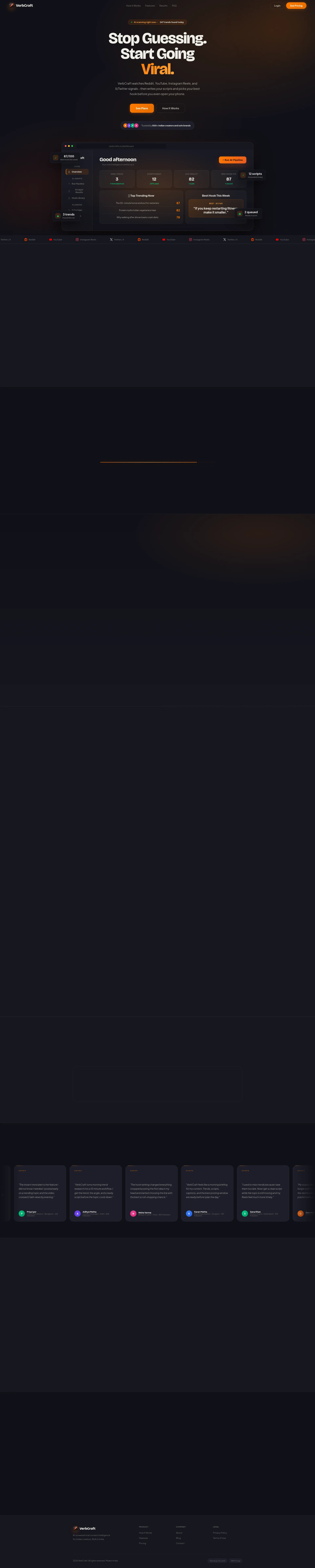
Look, VerbCraft is doing a lot of things right. The niche targeting (Indian creators, INR pricing, Indian English tone) is sharp, the problem-solution narrative is well-structured, and the feature list is genuinely impressive. But here's the brutal truth: your mobile LCP is 4.49 seconds, which means 53% of your target audience — who are literally mobile-first creators — are bouncing before they even read your gorgeous headline. You've built a Ferrari and parked it in a swamp. The copy is punchy, the pricing is transparent, the testimonials exist — but they're all initials and no photos, which in 2026 screams 'I made these up in a coffee shop.' The design looks clean and modern in the screenshot, dark theme with orange accents, dashboard mockup front and center — but the page is a scrolling marathon with 2,626 words that could be tightened by 40%. Fix the mobile performance first. Everything else is furniture rearrangement on the Titanic if your LCP is in the red zone.
Sección Hero
DECENT
RIGHT THEN. Let's talk about this hero section, because it's like a dish that's 80% brilliant and 20% what were you THINKING?
Stop Guessing. Start Going Viral. — NOW we're cooking! That headline hits like a perfectly seared steak. Direct, emotionally loaded, and it speaks to every Indian creator who's posted a Reel at 2am and woken up to 47 views. You understand the offer within 3 seconds — trend detection, script writing, hook selection. That's CLARITY, and clarity is the mise en place of conversion.
The subheadline — VerbCraft watches Reddit, YouTube, Instagram Reels, and X/Twitter signals - then writes your scripts and picks your best hook before you even open your phone — is specific and benefit-soaked. No vague nonsense about leveraging synergies. You're telling me EXACTLY what this thing does. Beautiful.
That dashboard mockup as the hero visual? SMART. You're showing me the actual product, not some stock photo of a woman laughing at a salad. It grounds the promise in reality, and reality sells.
The live ticker — AI scanning right now - 247 trends found today — is a clever little garnish that adds urgency without being obnoxious. I respect that.
BUT HERE'S WHERE I START SHOUTING.
See Plans as your primary CTA?! SERIOUSLY?! That's like a waiter saying Would you like to browse our receipt book? instead of Let me bring you something extraordinary. It's passive, it's transactional, and it kills every ounce of momentum your brilliant headline just built. You've got them excited and then you hand them an invoice.
Trusted by 500+ Indian creators — oh lovely, a nice round number that SCREAMS I picked this in the shower this morning. No specificity, no growth trajectory, no third-party verification. It's there, it's better than nothing, but it's the garnish equivalent of a sad parsley sprig.
And WHERE is your no credit card required messaging? You're a B2C SaaS product in 2026 asking mobile-first creators to commit, and you can't even whisper try it free above the fold? That's leaving money on the table — no, that's leaving money on the FLOOR and walking away.
Ejemplos de mejoras
See Plans
Start Free — No Card Needed
Replaces a passive, price-focused CTA with an action that obliterates friction. 'Start Free' says low commitment; 'No Card Needed' kills the risk objection before it even forms. You want people to TASTE the food, not read the bill.
Trusted by 500+ Indian creators and solo brands
Trusted by 500+ Indian creators — from 34K to 82K followers
Adding the follower range from your own testimonials gives the social proof a concrete outcome dimension. Now '500+' feels like a result, not just a headcount you may or may not have invented over chai.
Puntos fuertes
- Hero subheadline is platform-specific and dripping with benefit: 'watches Reddit, YouTube, Instagram Reels, and X/Twitter signals - then writes your scripts' — no vagueness, no corporate waffle, just a straight shot of value right between the eyes
- Live activity indicator 'AI scanning right now - 247 trends found today' is a masterful touch — it creates urgency AND product credibility simultaneously, like smelling fresh bread as you walk into a bakery
- Dashboard mockup as hero visual shows the ACTUAL product interface — not some generic illustration, not a stock photo, but the real thing. That's confidence, and confidence converts
A mejorar
- Main CTA 'See Plans' is about as inspiring as a parking meter — it redirects to pricing instead of pulling visitors into an experience, killing the emotional momentum your headline just built
- Social proof '500+ Indian creators' is a suspiciously round vanity number with zero specificity — no growth rate, no timeframe, no third-party stamp. It's the equivalent of a restaurant saying 'lots of people eat here'
- ZERO 'no credit card required' or free trial messaging anywhere in the hero — for a B2C SaaS product targeting budget-conscious creators, this is like locking the front door of your restaurant and wondering why nobody comes in
Copywriting
GOOD
BLOODY HELL, whoever wrote this copy actually understands their audience — and in 2026, that's rarer than a perfectly poached egg at a motorway service station.
You spend 2 hours on a Reel. Your competitor posts something half as good and gets 200K. That line is a GUT PUNCH. It's specific, it's relatable, and it uses a concrete number instead of the usual your competitor does better drivel. That's PAS copywriting done RIGHT — Problem, Agitate, Solution, served hot with a side of existential dread.
The cultural localization? CHEF'S KISS. Faster than you can make chai isn't performative diversity checkbox-ticking — it's genuine audience understanding baked into the language. INR pricing, Indian city references in testimonials, the whole tone feels like it was written BY the audience, not AT them. That's the difference between a home-cooked meal and airline food.
The four-step process section is clean and logical. Your Script Writes Itself instead of AI Script Generation. Best Hook Rises to the Top instead of Hook Ranking Algorithm. These are SMALL choices that compound into BIG trust. You're speaking human, not robot, and I respect that enormously.
Now let me tell you where this falls apart like an overworked soufflé.
2,626 WORDS?! On a LANDING PAGE?! That's not a sales page, that's a NOVEL. You've got TWELVE features with full paragraphs each — twelve! A creator scrolling on mobile at 11pm after filming all day is NOT reading your feature encyclopedia. You need to take a cleaver to this thing and cut 40% without blinking. Lead with three killer features, bury the rest in a secondary page.
Now, the testimonials — you've got 10 of them WITH photos, which is genuinely solid. That's a proper spread of social proof with real faces attached. Combined with the Monday logo on the page, you've actually got more trust infrastructure than most competitors at this stage. The stats section — 3x average reach increase, 87% users post within 1 hour — is compelling, but Based on 500+ creator workflows tracked during VerbCraft onboarding is self-reported data that any savvy visitor will side-eye harder than a suspiciously cheap truffle.
Ejemplos de mejoras
Based on 500+ creator workflows tracked during VerbCraft onboarding.
Based on onboarding data from 500+ creators — tracked across their first 30 days. Average results. Individual results vary.
Adding 'Individual results vary' and a specific tracking window makes the claim feel MORE honest, which paradoxically makes it MORE believable. Skeptical visitors trust disclaimers — it's the difference between a chef who says 'this is the best dish ever' and one who says 'this is our most popular dish, though some prefer the fish.'
EVERYTHING YOU GET Built for Indian creators who want consistent growth.
THE 3 FEATURES THAT ACTUALLY MOVE THE NEEDLE Everything else is in the full feature list below.
Restructuring to lead with the top 3 differentiators and demoting the rest reduces cognitive overload dramatically. You're running a tasting menu, not a buffet — curate the experience, don't dump the entire kitchen on the table.
Puntos fuertes
- Pain-point section is a masterclass in emotional precision: 'You spend 2 hours on a Reel. Your competitor posts something half as good and gets 200K' — that's not generic 'save time' rubbish, that's a knife twist that every creator has FELT in their bones
- Cultural localization is authentic and earned, not bolted on: 'faster than you can make chai', INR pricing, Indian city and follower count pairings in testimonials — this signals genuine product-market fit, not a translated American landing page
- Process copy frames every step as a user outcome, not a feature: 'Your Script Writes Itself' and 'Best Hook Rises to the Top' maintain momentum and speak human — exactly what a tired creator needs to hear at midnight
A mejorar
- At 2,626 words, this page is nearly DOUBLE the optimal length — the features section alone lists 12 capabilities with full paragraphs, creating a wall of text that would make even the most enthusiastic creator reach for the back button
- The results stats ('3x average reach increase', '87% users post within 1 hour') lack credible third-party attribution — 'Based on 500+ creator workflows tracked during VerbCraft onboarding' is self-reported data, and a skeptical visitor will discount it faster than a clearance rack
- The page buries its conversion intent under layers of feature exposition — by the time a mobile visitor reaches pricing, they've scrolled through what feels like an entire Wikipedia article on content creation
Call-to-Action
DECENT
Contenido bloqueado
Prueba Social
NEEDS WORK
Contenido bloqueado
Arquitectura
DECENT
Contenido bloqueado
SEO y Meta
CRITICAL
Contenido bloqueado
Móvil
NEEDS WORK
Contenido bloqueado
Diseño Visual & Branding
DECENT
Contenido bloqueado
Rendimiento
CRITICAL
Contenido bloqueado
llmreadiness
CRITICAL
Contenido bloqueado