El veredicto
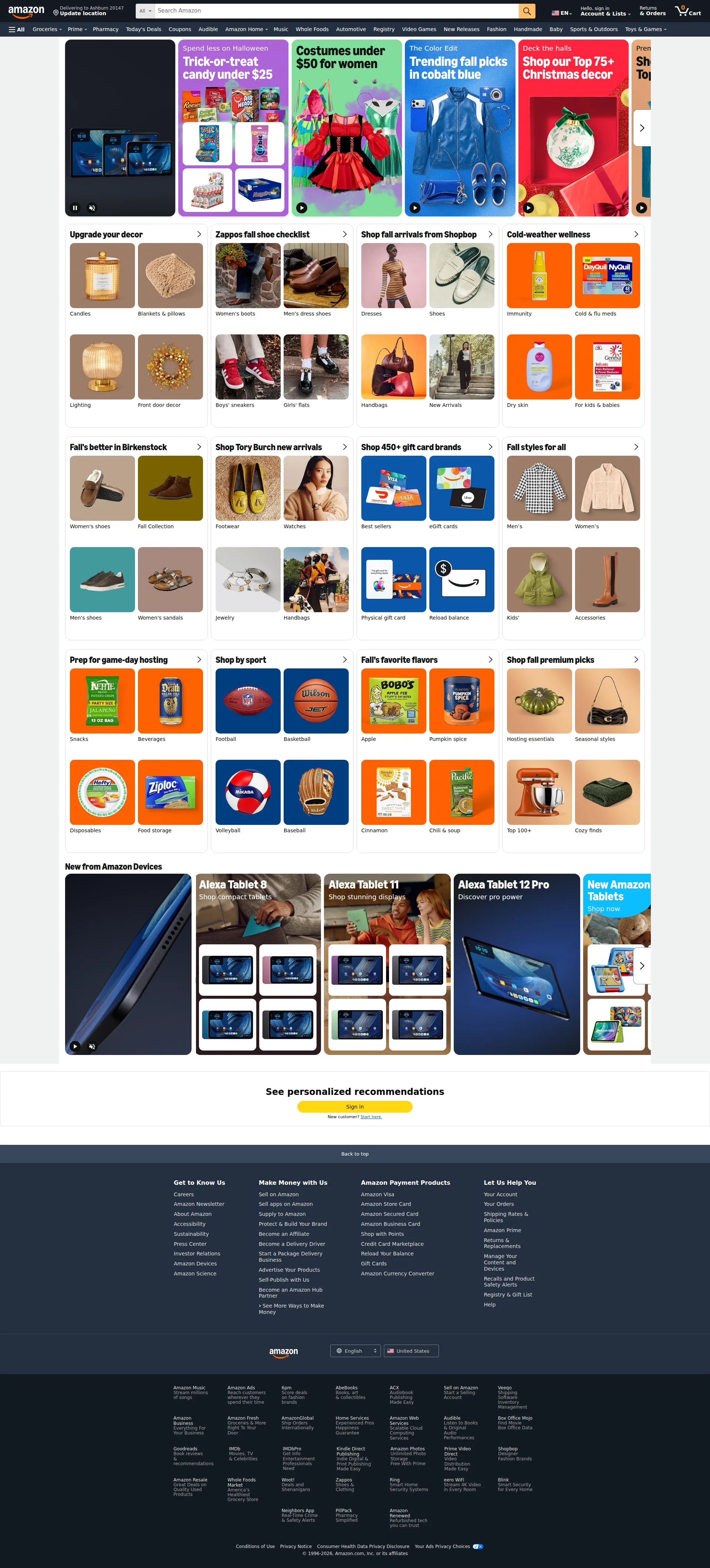
Right, listen up. Amazon is the bloody GOLIATH of e-commerce — a trillion-dollar empire that prints money while the rest of us argue about button colors. But strip away the brand loyalty and three decades of customer conditioning, and what have you got? A homepage that looks like someone emptied every seasonal aisle of a supermarket onto a single page and said 'that'll do.' The hero is FIVE rotating billboards screaming over each other — Halloween candy wrestling Christmas ornaments for attention like two drunk chefs fighting over the last burner. The copy? It's a warehouse inventory list pretending to be marketing. 'Candles. Blankets & pillows. Lighting.' That's not copywriting, that's a stockroom manifest! Performance is an absolute NIGHTMARE — nearly 7 seconds to load, 2.5MB of HTML alone. That's not a webpage, that's a bloody encyclopedia. No H1 tag, no structured data, no llms.txt — in 2026! For a company that INVENTED modern e-commerce, this is like a Michelin-starred chef serving microwave dinners. The trust infrastructure is solid — they've got the brand equity baked in after 30 years. But for anyone trying to learn landing page best practices from this? Don't. This is the exception that proves every rule. Amazon succeeds DESPITE this homepage, not because of it.
Amazon.com: The Digital Walmart That Forgot It's Also a Website
Look, Amazon doesn't NEED our help — they're printing money while you read this. But if you strip away the brand recognition and the 30 years of customer conditioning, what you're left with is a homepage that would get roasted in any UX review. It's a visual slot machine: 77 images, 241 links, Halloween candy next to Christmas decor next to Birkenstock sandals, all crammed onto a page that takes nearly 7 seconds to load. The HTML alone is 2.5MB — that's not a webpage, that's a novel. There's no H1, no structured data, no llms.txt, and the hero is basically five rotating ads fighting each other for attention. The saving grace? Amazon's brand trust is so deeply embedded in consumer psychology that none of this matters to their bottom line. But for anyone trying to learn from this page: don't. This is the exception, not the template.
Sección Hero
NEEDS WORK
BLOODY HELL, is THAT your hero section?! Five rotating banners fighting each other like contestants on Hell's Kitchen who all think they're the head chef! Let me tell you what's happening above the fold on the world's biggest e-commerce site: an Alexa tablet video, Halloween candy under $25, women's costumes under $50, cobalt blue fashion picks, AND Christmas decor — ALL AT ONCE. It's October and you're simultaneously selling me candy corn, cocktail dresses, AND tinsel! That's like putting sushi, a roast dinner, and a crème brûlée on the same plate and calling it a tasting menu — it's NOT, it's a mess!
The value proposition Spend less. Smile more. lives in the title tag but is NOWHERE on the actual page. You've got your best line locked in the kitchen and you're serving the customers silence instead! That's a spectacular own goal that would get you thrown out of any restaurant I run.
What saves this from the bin is that Amazon's brand does the heavy lifting that the copy absolutely refuses to do. People KNOW what Amazon is. But imagine for one second you're a first-time visitor — you'd have NO idea what the primary offer is because there ISN'T one. The CTAs are buried inside auto-rotating slides, so half your visitors will never even SEE half your calls to action. It's like putting the specials board on a revolving door.
The product photography is genuinely beautiful — I'll give credit where it's due, the visual quality across each banner is top-notch. Each individual slide has a functional headline-subheadline-CTA structure. And the price anchoring (under $25, under $50) is smart work — it immediately signals value. But ZERO social proof above the fold? Amazon has BILLIONS of reviews and you can't put a single trust indicator in the hero? That's like owning a vineyard and serving tap water at your own wedding!
Ejemplos de mejoras
Meet Amazon Alexa tablets / Learn more
Everything you need, delivered tomorrow. 300M+ products. Free returns. Trusted by 200M+ Prime members. [Shop Now] [Start Free Trial]
The current hero wastes prime real estate on a niche product launch that only interests a fraction of visitors. A unified value proposition with social proof numbers and a clear primary CTA would serve the FULL audience and immediately communicate why Amazon beats every alternative. Stop serving appetizers when people want the main course!
Puntos fuertes
- High-quality, professionally shot product imagery across all carousel slides — the production value is consistently excellent, like a kitchen where at least the INGREDIENTS are world-class even if the plating is chaos
- Each individual banner maintains a functional headline/subheadline/CTA structure that communicates a specific seasonal offer with clarity — when viewed in isolation, each one actually works
- Price anchoring ('under $25,' 'under $50') is deployed effectively to signal value immediately and reduce purchase hesitation — this is smart, proven persuasion technique done right
A mejorar
- FIVE rotating banners with completely different messages — tablets, Halloween, fashion, Christmas — create a cognitive car crash with zero coherent takeaway; it's like a restaurant with five different cuisines and no identity
- Zero social proof in the hero section despite having billions of customer reviews — no star ratings, no customer counts, no trust indicators above the fold; you're sitting on a goldmine of credibility and HIDING it
- Auto-rotating carousel means the primary CTA is a moving target — visitors who don't manually interact miss 80% of the hero content, which is like serving courses to an empty table
Copywriting
CRITICAL
Oh, come ON. The copywriting on this homepage is the equivalent of a chef walking out to your table, reading the ingredient list off the back of a packet, and walking away. Candles. Blankets & pillows. Lighting. Front door decor. That's not copy — that's a SHOPPING LIST someone left on the kitchen counter! Seriously?!
Let me tell you what passes for marketing on a trillion-dollar company's homepage: Upgrade your decor, Zappos fall shoe checklist, Cold-weather wellness, Falls better in Birkenstock,' Prep for game-day hosting. Category names. Just... category names. There are ZERO benefit statements, zero emotional hooks, zero urgency beyond vague seasonal vibes, and absolutely no persuasive structure. It's like serving a raw potato and calling it haute cuisine.
Here's what makes me want to flip a table: the title tag says Spend less. Smile more. — that's actually a DECENT tagline! It's got a benefit, it's got emotion, it's memorable. And it appears NOWHERE on the homepage itself. Your meta description is doing more copywriting work than the entire visible page. That's like hiring a world-class sommelier and making them work in the car park!
The price anchors — under $25, under $50, 450+ gift card brands — those numbers are doing REAL persuasive work. They're the one sous chef in this kitchen who actually showed up ready to cook. Grammar and spelling are flawless across the board, which at least tells me someone proofread this inventory list before publishing it. And the seasonal relevance connecting products to Halloween, fall, and the holidays creates implicit urgency. But a few good garnishes don't save a dish that has no flavour at its core.
Ejemplos de mejoras
Upgrade your decor / Candles / Blankets & pillows / Lighting / Front door decor
Make your home feel like fall in 5 minutes. Shop candles, throws & lighting — all with free next-day delivery.
The current copy is a navigation label wearing a marketing hat and fooling nobody. Adding a time-based benefit ('5 minutes'), a sensory hook ('feel like fall'), and a service differentiator ('free next-day delivery') transforms a boring category header into actual copy that gives people a REASON to click. Stop labelling shelves and start selling the experience!
Puntos fuertes
- Price anchoring copy ('under $25,' 'under $50,' '450+ gift card brands') provides concrete specificity that reduces purchase friction — these numbers are doing the persuasive heavy lifting that the rest of the copy refuses to touch
- Zero grammar or spelling errors across the entire page — flawless execution on the basics, like a kitchen that's at least spotlessly CLEAN even if the food is bland
- Seasonal relevance is well-executed with copy connecting products to timely occasions (Halloween, fall hosting, Christmas) creating implicit urgency without being pushy
A mejorar
- The tagline 'Spend less. Smile more.' — genuinely good copy — appears in the title tag but is COMPLETELY absent from the homepage itself; you've locked your best dish in the freezer and served the customers bread rolls
- The entire page body is essentially a list of category names with zero benefit statements, emotional hooks, or persuasive language — 'Candles,' 'Blankets & pillows,' 'Lighting' reads like someone dictating a warehouse manifest, not writing marketing copy
- No persuasive framework ANYWHERE on the page — no problem-agitation-solution, no AIDA, no story arc — just an infinite scroll of product tiles that assumes visitors already know what they want and why they should buy it here
Desbloquear las 8 categorías restantes
Call-to-Action
DECENT
Contenido bloqueado
Prueba Social
DECENT
Contenido bloqueado
Arquitectura
NEEDS WORK
Contenido bloqueado
SEO y Meta
CRITICAL
Contenido bloqueado
Móvil
DECENT
Contenido bloqueado
Diseño Visual & Branding
DECENT
Contenido bloqueado
Rendimiento
CRITICAL
Contenido bloqueado
llmreadiness
CRITICAL
Contenido bloqueado
Contenido bloqueado
Accede a la conclusión completa con las 3 acciones prioritarias y un mensaje motivador personalizado.