El veredicto
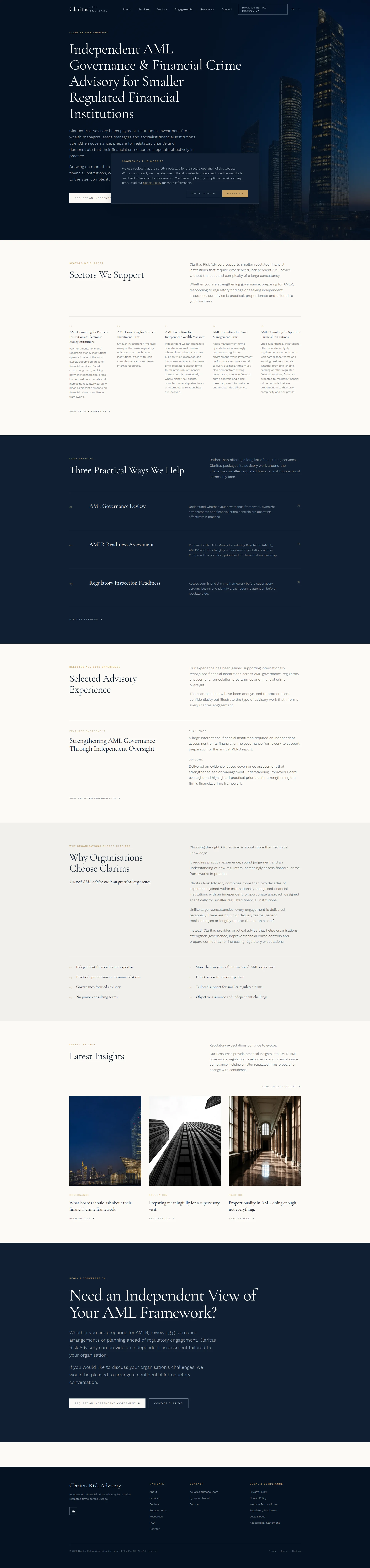
Right, listen up. Claritas Risk Advisory has built a website that LOOKS like a Michelin-starred restaurant — dark, elegant, restrained, the kind of place where serious people make serious decisions. And fair play, the design is genuinely beautiful. But here's where I lose my mind: you're selling TRUST. That's your entire bloody product. And yet your homepage has ZERO named testimonials visible, ZERO client logos in the hero, and case studies so anonymized they could be bedtime stories. You've apparently got 10 testimonials somewhere — USE THEM! Meanwhile, your mobile page takes 4.45 seconds to load, which puts you firmly in Google's red zone. That's like making a client wait five minutes for a glass of water before they've even seen the menu. The copy is technically competent but so safe it could be a regulatory filing itself. You've got experience at major international banks buried on your About page like a secret ingredient you're embarrassed about. Bring it to the front of the plate! The bones of this site are excellent — the structure, the design, the tone — but you're leaving conversion on the table because you refuse to be specific, refuse to show proof, and refuse to let your page load at a speed that doesn't make Google weep.
The Most Polished AML Advisor Nobody's Heard Of
Look, Claritas Risk Advisory has done something genuinely impressive: built a website that looks like it belongs to a firm three times its size. The dark hero, the restrained typography, the methodical section structure — this is not amateur hour. But here's the brutal truth: when your entire value proposition is 'trust me, I know AML,' and your website has testimonials tucked away somewhere but not deployed on the homepage where they'd actually do conversion work, and case studies so anonymized they could be fiction, you're asking prospects to take a leap of faith the size of a Basel III capital buffer. The copy is polished but plays it so safe it forgets to actually sell. Major bank names are referenced on the About page — which is great — but buried where only the truly motivated will find them. Meanwhile, Google's mobile crawler is experiencing a 4.45-second LCP, which in 2026 is the digital equivalent of showing up to a regulatory inspection with a fax machine.
Sección Hero
DECENT
RIGHT. Let's talk about this hero section, shall we? It's like a beautifully plated dish that's completely UNDERSEASONED.
Independent AML Governance & Financial Crime Advisory for Smaller Regulated Financial Institutions — look, I'll give credit where it's due. That headline tells you EXACTLY what the firm does. No ambiguity, no clever nonsense. For a compliance officer actively searching for this service, that clarity is like a perfectly clear consommé. Respect.
The sub-copy reinforces the positioning by listing specific client types — payment institutions, investment firms, wealth managers, asset managers — and anchors credibility with more than two decades of experience within international financial institutions. That's your best ingredient, and it's sitting in the sub-copy like a truffle shaved into a side salad!
But BLOODY HELL, where is the social proof?! You've got 10 testimonials apparently living somewhere on this site, and NOT ONE of them makes it into the hero? That's like having a walk-in fridge full of wagyu and serving the customer toast! You sell TRUST for a living, and the first thing a visitor sees has zero logos, zero client count, zero evidence that anyone has ever actually hired you.
The two CTAs — Request an Independent Assessment and Explore Our Services — are present above the fold, which is correct. But Request an Independent Assessment as the primary CTA for a COLD visitor? That's like asking someone to commit to a ten-course tasting menu before they've even read the first page of the menu. Where's the low-friction option? A See how we helped a payment firm pass their inspection link? ANYTHING?
The dark city skyline visual is atmospheric and on-brand for financial services, but it's pure decoration. It could belong to any bank, law firm, or insurance company on the planet. It's wallpaper, not a message.
Typography hierarchy is clean, the visual structure works, the CTAs are visible. The hero is FUNCTIONAL. But functional isn't good enough when your entire business depends on a stranger trusting you with their regulatory future in the first five seconds.
Ejemplos de mejoras
Independent AML Governance & Financial Crime Advisory for Smaller Regulated Financial Institutions
Independent AML Advisory for Smaller Regulated Firms — Senior Expertise from Leading International Banks. No Junior Teams. No Generic Frameworks.
Your experience at major international financial institutions is your single most powerful trust signal — it's currently buried on the About page like a secret recipe you're ashamed of. Bring it to the headline! Adding 'No Junior Teams' directly addresses the #1 objection against boutique consultancies before the prospect even thinks it. Stop hiding your best ingredients in the pantry.
Puntos fuertes
- H1 clearly states the exact service and target audience with zero ambiguity — 'Smaller Regulated Financial Institutions' is a specific niche claim that resonates instantly with the right visitor, like a perfectly targeted amuse-bouche
- Two CTAs present above the fold with a logical primary/secondary hierarchy — the kitchen has the right stations set up, even if the orders need work
- Sub-copy lists specific institution types (payment institutions, investment firms, wealth managers) which immediately qualifies visitors and confirms relevance — you're not wasting anyone's time, and that's worth something
A mejorar
- ZERO social proof in the hero — no client logos, no numbers, no testimonial snippet — on a site where trust is literally the ENTIRE product. You've got 10 testimonials somewhere! Put one in the hero or I'm shutting this kitchen down!
- The unique value proposition ('independent, practical advice') is so generic it could be stamped on every AML consultancy's business card from London to Singapore — WHERE is your signature dish?
- Primary CTA 'Request an Independent Assessment' is a high-commitment ask for a cold visitor — that's like proposing marriage on the first date. Give them a low-friction taster first!
Copywriting
NEEDS WORK
Oh, this copy. THIS COPY. It's like eating at a restaurant where everything is technically perfect — correct temperature, correct seasoning, correct plating — and you leave feeling absolutely NOTHING. That's what's happening here.
The writing is grammatically flawless, professionally controlled, and so carefully measured that it never once makes you sit up in your chair. Every sentence is a beige wall in a beige room. Is THAT how you sell a service that keeps firms from getting fined into oblivion?!
Let's look at the Why Organisations Choose Claritas section. Eight bullet points: Independent financial crime expertise, More than 20 years of international AML experience, Practical, proportionate recommendations. These are INGREDIENTS, not a DISH. What does 20 years of experience actually MEAN for the client sitting there wondering if they'll survive their next regulatory inspection? It means someone who's been in the room with the regulator and knows what they look for. It means fewer sleepless nights before an FCA visit. NONE of that is said. You're listing flour, eggs, and butter instead of describing the soufflé!
And SERIOUSLY — the word practical appears roughly EIGHT TIMES on the homepage alone. Eight! That's not a differentiator anymore, that's a verbal tic. It's like a chef who keeps saying fresh — after the fifth time, I start wondering what they're hiding.
Now, the tone match — I'll be fair — is actually strong. The formal, measured language is appropriate for compliance officers and MLROs. This audience doesn't want hype; they want gravitas. On that dimension, well done. You've read the room correctly.
But here's what makes me want to flip a table: you've got 10 testimonials on this site. TEN! And the homepage copy reads like nobody has ever actually worked with you. The Selected Advisory Experience section uses a challenge/outcome structure, which is the right format, but the outcomes are still abstract. Strengthened senior management understanding, improved Board oversight — what does that MEAN in human terms? Did the board change their reporting structure? Did they pass an inspection they were worried about? Give me the SIZZLE, not just the steak!
And the biggest crime of all: major international bank experience is referenced on the About page. Those names would TRANSFORM trust on the homepage. Instead, they're locked away like fine wine in a cellar nobody visits. BRING THEM OUT!
Ejemplos de mejoras
Unlike larger consultancies, every engagement is delivered personally. There are no junior delivery teams, generic methodologies or lengthy reports that sit on a shelf.
Unlike larger consultancies, every engagement is led personally by a senior AML professional with over two decades of experience at leading international banks — not handed to a junior analyst on their third compliance project. You get the expert you spoke to, doing the work, every time.
The original copy makes a valid differentiation claim but leaves it completely abstract — like describing a dish as 'good' without saying what's in it. Making the 'personal delivery' promise concrete and vivid, referencing the actual experience level, transforms a generic boutique-vs-big-firm argument into a specific, memorable commitment that a compliance officer can actually picture. Stop being shy about your credentials!
Puntos fuertes
- Tone is perfectly calibrated for a compliance and regulatory audience — formal, measured, and authoritative without being stiff. You've matched the temperature of the room beautifully, like a sommelier who knows exactly what to pour
- The 'Selected Advisory Experience' section with its challenge/outcome structure is the right format for this audience — anonymization is handled transparently rather than evasively, which shows integrity
- You've got 10 testimonials on the site, which means real clients have said real things about you — that's a pantry full of premium ingredients most consultancies would kill for
A mejorar
- The word 'practical' is used approximately 8+ times across the homepage — it's become white noise, a verbal tic that screams 'I couldn't think of a better word.' Replace each instance with a SPECIFIC example of what 'practical' actually looks like in action
- The eight-point 'Why Choose Claritas' list is entirely features with ZERO translation into client outcomes — you're reading me a recipe instead of describing how the dish tastes. What does the client's Monday morning look like AFTER working with Claritas?
- Your most powerful credential — experience at major international financial institutions — is buried on the About page instead of deployed on the homepage where it could do actual conversion work. That's like keeping your Michelin stars in a drawer!
Call-to-Action
DECENT
Contenido bloqueado
Prueba Social
CRITICAL
Contenido bloqueado
Arquitectura
DECENT
Contenido bloqueado
SEO y Meta
NEEDS WORK
Contenido bloqueado
Móvil
DECENT
Contenido bloqueado
Diseño Visual & Branding
GOOD
Contenido bloqueado
Rendimiento
NEEDS WORK
Contenido bloqueado
llmreadiness
CRITICAL
Contenido bloqueado