El veredicto
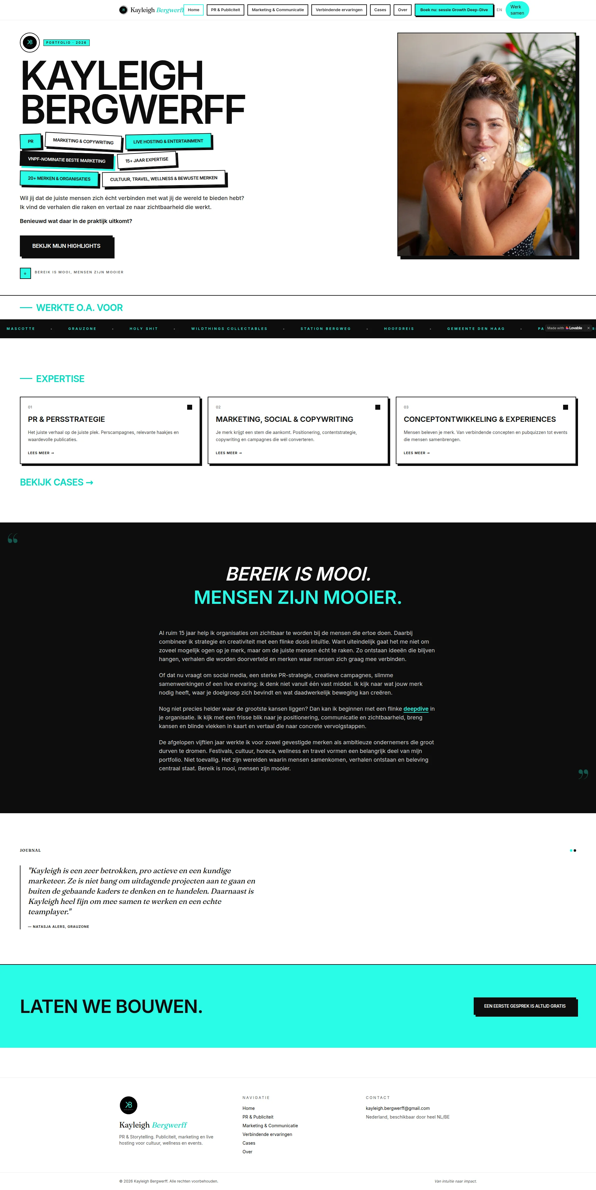
Right, listen up. The visual identity here is BOLD — black, cyan, and white with typography that could punch you in the teeth. I RESPECT that. It's got personality, it's got swagger, it's got a color palette that screams confidence. But then the hero section tries to be a bloody LinkedIn profile, a portfolio, AND a sales page all at once, and ends up being NONE of them properly. The copy? Kayleigh can clearly write — the tagline 'Bereik is mooi, mensen zijn mooier' is genuinely brilliant — but she's serving up philosophy when clients are hungry for PROOF. You've got TEN testimonials apparently available and you're showing ONE on the page? ONE?! That's like having a walk-in fridge full of wagyu and serving the customer a cheese toastie. The client logo ticker is there, the expertise cards are structured, the page FLOWS — but it's a beautiful plate with not enough protein on it. Fix the hero hierarchy, stack that social proof like your career depends on it, and stop hiding your best CTA in the bloody footer. LCP clocks in at 2.999 seconds — that's AVERAGE territory, not a disaster but not winning any races either. The bones are good. The talent is obvious. Now cook the damn thing properly.
Kayleigh Bergwerff: Gorgeous Face, Confused Website
Look, Kayleigh clearly knows her stuff — 15 years of experience, a VNPF nomination, a client list that includes actual municipalities and festivals. The bones are good. The photo is great. The color palette is chef's kiss levels of confident. But somewhere between 'I have a personal brand' and 'I have a website that converts,' the ball got dropped. The hero section throws seven badge-style tags at you like a slot machine, the copy leans hard into philosophy when prospects need specifics, and there's exactly ONE testimonial on this entire portfolio. One. For someone who's worked with 20+ brands over 15 years, that's leaving serious credibility on the table. The structure is logical but the page feels more like a personal manifesto than a business tool. Fix the hero, stack the social proof, and this thing could actually do some heavy lifting.
Sección Hero
DECENT
RIGHT. Let me tell you what's happening here. The hero has SWAGGER — massive bold black typography on white, that gorgeous cyan accent color popping on the tags, a warm personal photo of Kayleigh looking like she actually enjoys her life. Visually? It's a STUNNING plate. I genuinely love the confidence of it. But then — BLOODY HELL — you've got SEVEN floating badge tags cluttering the space before anyone even knows what this woman DOES! PR. Marketing & Copywriting. Live Hosting & Entertainment. VNPF-Nominatie. 15+ Jaar Expertise. 20+ Merken & Organisaties. Cultuur, Travel, Wellness & Bewuste Merken. That's not a hero section, that's a WORD SALAD with croutons! It's like walking into a restaurant and the maître d' throws the entire menu at your face before you've even sat down. The ACTUAL value proposition — Wil jij dat de juiste mensen zich écht verbinden met wat jij de wereld te bieden hebt? — is GENUINELY good copy. It's warm, it's human, it speaks to the client's desire. But it's BURIED underneath that tag avalanche like a truffle under a pile of potato peelings! And the CTA — Bekijk Mijn Highlights? Seriously?! You're asking people to BROWSE when you should be asking them to BOOK. Your footer already has Een eerste gesprek is altijd gratis — THAT'S your money CTA! Why is it hiding at the bottom like a shy commis chef? Get it up top where it belongs! The social proof badges mentioning 15+ years and 20+ brands are decent ingredients, but saying 20+ brands when you've worked with Gemeente Den Haag is like saying 'I've cooked for some people' when you've catered for the bloody government. NAME DROP, darling!
Ejemplos de mejoras
Wil jij dat de juiste mensen zich écht verbinden met wat jij de wereld te bieden hebt? Ik vind de verhalen die raken en vertaal ze naar zichtbaarheid die werkt.
I turn your story into visibility that actually works — through PR, marketing and live experiences that connect your brand to the people who matter. 15+ years. 20+ brands. Results you can measure.
Move this value statement ABOVE the badge tags so it's the first thing visitors read. Lead with the DISH, not the ingredient list. Add the credentials inline instead of as a scattered tag cloud, and make the outcome concrete.
BEKIJK MIJN HIGHLIGHTS
PLAN EEN GRATIS GESPREK
Swap the soft 'view highlights' CTA for the free consultation offer that already exists in your footer — it's a much stronger conversion action. You've already GOT the right CTA, it's just in the WRONG place! That's like putting the best dish on the kids' menu.
Puntos fuertes
- Bold, oversized black typography on white creates instant visual authority — this hero COMMANDS the room like a head chef walking into their kitchen
- The portrait photo is warm, natural, and human — perfect for a personal brand, not some sterile corporate headshot that looks like it was taken at a passport office
- Cyan-accented credential badges (15+ years, 20+ brands, VNPF nomination) are present in the hero, giving immediate proof this isn't someone's first rodeo
A mejorar
- Seven badge-style tags explode across the hero BEFORE any human explanation of what Kayleigh does — it's like reading the ingredients list before you even know what dish you're ordering
- CTA 'Bekijk Mijn Highlights' is a portfolio-browse action, not a conversion action — you're inviting people to WINDOW SHOP when you should be getting them through the door
- The actual value proposition sentence is buried below the tag cloud instead of leading the section — your best ingredient is hidden at the back of the fridge
Copywriting
DECENT
Okay, Kayleigh can WRITE. Let's get that on the table right now. The voice is authentic, the Dutch flows naturally, and that central tagline — Bereik is mooi, mensen zijn mooier — is the kind of line that makes me go YES, CHEF! It's memorable, it's warm, it's differentiating. That's a Michelin-worthy garnish right there. The long-form manifesto section in the dark block reads like someone who genuinely THINKS about their craft, not just someone who churns out Instagram captions for a living. So what's the PROBLEM? The problem, darling, is that this entire page reads like a love letter to Kayleigh's philosophy and NOT ONCE does it tell me what actually HAPPENS when you hire her! Where are the RESULTS?! You're selling PR and marketing services — where's 47 press mentions in 3 months for Festival X? Where's grew brand Ys reach by 340%'? NOWHERE! It's like a chef telling you about their passion for seasonal ingredients for twenty minutes and never actually bringing you any FOOD! The expertise card descriptions — Je merk krijgt een stem die aankomt — yeah, lovely, but so does every freelance marketer's website from here to Amsterdam. Give me SPECIFICS! Give me PROOF! And oh — oh THIS is beautiful — in the testimonial, pro actieve is written as TWO WORDS instead of proactieve. You're a COPYWRITER with a SPELLING ERROR on your portfolio! That's a chef with a dirty apron, love! That's the kind of thing that makes me want to shut the whole kitchen down! Also — you've apparently got TEN testimonials available and you're showing ONE on the page?! ONE! That's criminal! That's like having a wine cellar full of Grand Crus and serving house plonk! Stack that social proof immediately!
Ejemplos de mejoras
Je merk krijgt een stem die aankomt. Positionering, contentstrategie, copywriting en campagnes die wél converteren.
Je merk krijgt een stem die aankomt — en dat meten we ook. Van positionering en contentstrategie tot campagnes die aantoonbaar converteren. Zoals de campagne voor [Klant X] die leidde tot 3x meer aanvragen in 6 weken.
Add ONE concrete case example directly in the expertise card. This transforms a generic claim into a credible proof point. Show me the DISH, not just the menu description!
Nog niet precies helder waar de grootste kansen liggen? Dan kan ik beginnen met een flinke deepdive in je organisatie.
Nog niet precies helder waar de grootste kansen liggen? In de Growth Deep-Dive breng ik in 2 uur je positionering, communicatie en zichtbaarheid in kaart — en ga je weg met een concreet actieplan. Eerste gesprek is altijd gratis.
The Deep-Dive offer is mentioned in the nav button but never properly explained in the copy. Spell out the format — 2 hours, concrete action plan, free first conversation. Make the offer TANGIBLE. Stop being coy about your best dish!
Puntos fuertes
- Distinctive, authentic voice perfectly calibrated for creative and culture-sector audiences — this copy has a PERSONALITY, not just a word count
- The tagline 'Bereik is mooi, mensen zijn mooier' is genuinely brilliant — memorable, warm, and differentiating. THAT is how you season a brand, people
- The long-form manifesto section positions Kayleigh as a strategic thinker, not just a pair of hands — it builds real depth and trust for the right audience
A mejorar
- ZERO concrete results or metrics anywhere on the page — for someone selling PR and marketing, having no proof of outcomes is like a restaurant with no reviews. Suspicious!
- Expertise card descriptions are vague and interchangeable ('een stem die aankomt', 'verhalen die raken') — every freelancer in the Netherlands could claim these exact same things
- 'Pro actieve' in the testimonial is written as two words instead of 'proactieve' — a spelling error on a COPYWRITER'S portfolio! That's serving raw chicken in a cooking competition, love!
Desbloquear las 8 categorías restantes
Call-to-Action
DECENT
Contenido bloqueado
Prueba Social
CRITICAL
Contenido bloqueado
Arquitectura
DECENT
Contenido bloqueado
SEO y Meta
CRITICAL
Contenido bloqueado
Móvil
DECENT
Contenido bloqueado
Diseño Visual & Branding
GOOD
Contenido bloqueado
Rendimiento
DECENT
Contenido bloqueado
llmreadiness
NEEDS WORK
Contenido bloqueado
Contenido bloqueado
Accede a la conclusión completa con las 3 acciones prioritarias y un mensaje motivador personalizado.