El veredicto
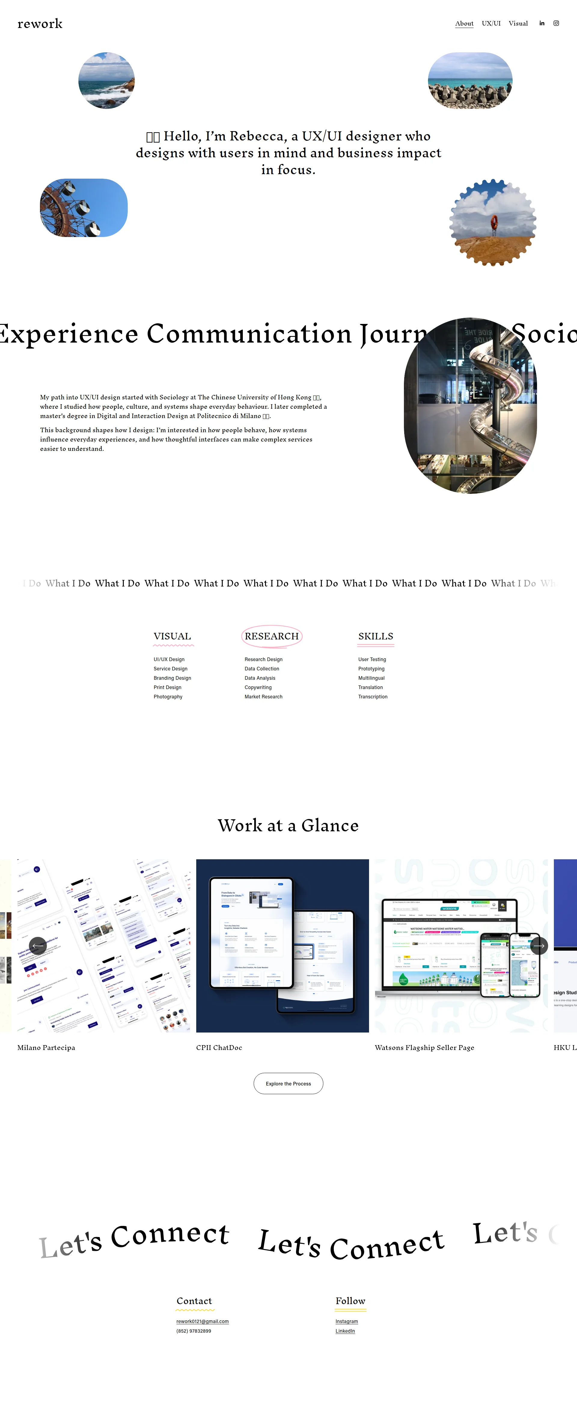
Right, let me get this straight. Rebecca — a UX/UI designer, someone whose ENTIRE JOB is making things work beautifully for users — has built a portfolio that takes nearly TEN SECONDS to load on mobile. TEN. SECONDS. That's not a loading screen, that's a bloody hostage situation! The visual design is clean, I'll give her that — tasteful, restrained, the kind of minimalism that actually works. The personal story from Sociology at CUHK to Politecnico di Milano? Genuinely compelling arc. She's got Meta on her résumé, 10 testimonials with photos sitting somewhere — and yet NONE of that firepower makes it into the hero or the page copy. It's like having wagyu beef in the walk-in and serving the customer plain toast. The hero has no CTA, the copy is thinner than consommé at 228 words, the SEO is nonexistent (title tag is just 'rework' — REWORK WHAT, exactly?), and that 9.92s LCP means half your recruiters have already closed the tab and moved on to someone who respects their time. The bones are genuinely good here. The taste level is there. But Rebecca, love — you need to cook this portfolio with the same care you'd bring to a client project, because right now you're the cobbler whose children have no shoes.
A Designer's Portfolio That Forgot Designers Get Judged Too
Look, Rebecca clearly knows how to design — the work gallery has 11 projects, the personal story is genuinely interesting (Sociology to Politecnico di Milano is a great arc), and the overall aesthetic is clean enough to not embarrass itself. BUT. This is a portfolio. A UX designer's portfolio. The one artifact in the universe where you absolutely cannot afford to have a 9.92 second mobile LCP, a hero section with no CTA, and a meta description that doesn't exist. You're selling your ability to create great user experiences, and the first user experience a recruiter gets is waiting a full 10 seconds on their phone while your decorative circle photos load. That's not irony, Rebecca. That's a war crime. The bones are good. The execution needs the same thoughtfulness you presumably bring to client work.
Sección Hero
CRITICAL
Oh, Rebecca. REBECCA. You're a UX/UI designer and your hero section has NO call-to-action?! That's like me opening a restaurant and forgetting to put a door on it — people can SEE the food, they just can't bloody GET to it!
Let's start with what's actually working, because I'm not a monster. The opening line — 👋🏼 Hello, Im Rebecca, a UX/UI designer who designs with users in mind and business impact in focus' — is genuinely better than the soggy Creative Visionary nonsense I see on 90% of portfolios. You get the who, the what, and a hint of your philosophy in one breath. That's a well-seasoned sentence. Bravo.
But then! THEN! Instead of following that solid intro with a reason to keep scrolling — a button, a link, even a cheeky arrow pointing downward — you've surrounded it with four decorative circular photos of... the ocean? Some birds? A ferris wheel? What IS this, your holiday scrapbook?! These images communicate NOTHING about your design work, your skills, or why someone should hire you. They're garnish on an empty plate!
Here's what kills me: you've worked with Meta. META! You have 10 testimonials with photos! And yet your hero section mentions NONE of this. You're sitting on a Michelin-star ingredient list and serving a bowl of plain broth. That scrolling ticker — Sociology User Experience Communication Journalism — is trendy, sure, but a first-time visitor has no idea if those are your skills, your degree subjects, or your Wordle guesses from last week.
A recruiter gives you THREE SECONDS. In those three seconds, your hero needs to say: who you are, why you're credible, and what they should do next. Right now it handles the first one and completely fumbles the other two. That's a 33% pass rate. In my kitchen, that gets you sent home.
Ejemplos de mejoras
👋🏼 Hello, I'm Rebecca, a UX/UI designer who designs with users in mind and business impact in focus.
👋🏼 I'm Rebecca — a UX/UI designer who turns complex systems into experiences people actually understand. 11 projects across gov, health, and e-commerce. Former Meta contributor. [See My Work ↓]
The original is warm but passive — it's a greeting with no follow-through. This version keeps the personality, drops a concrete credibility bomb (11 projects, real industries, Meta), and gives the visitor an immediate action. Your hero isn't a welcome mat — it's the maître d'. It needs to seat people at the table, not just wave at them from across the room.
Puntos fuertes
- The opening line 'a UX/UI designer who designs with users in mind and business impact in focus' communicates a dual value prop (UX craft + business awareness) that genuinely differentiates from the sea of generic 'I make pretty things' portfolios — well done, that's a properly seasoned headline
- The emoji wave and first-person casual tone create an approachable, human personality that fits the UX field perfectly — it makes the hero feel like meeting a real person, not reading a corporate brochure
- The circular image treatment creates a distinctive visual signature that's memorable and different from the standard full-bleed hero photo — it's a bold design choice even if the content inside those circles needs rethinking
A mejorar
- ZERO CTA in the hero section — no button, no link, no directional element, nothing! For a portfolio whose entire purpose is to get someone to look at work or make contact, this is like opening a shop and forgetting the cash register
- The four decorative circle photos (ocean, birds, ferris wheel, landscape) are aesthetically pleasant but professionally meaningless — they don't show Rebecca's work, her face, or anything that builds the credibility a recruiter needs in those critical first seconds
- Meta is listed as a brand connection and there are 10 testimonials with photos available, yet NONE of this social proof appears in the hero — you're hiding your best ingredients in the pantry while the dining room starves
Copywriting
NEEDS WORK
Right, the copy situation here is like a beautiful restaurant with a menu that only has three items on it and none of them have descriptions. You KNOW there's talent in the kitchen — but the menu is doing absolutely NOTHING to sell it!
The About section bio is your best dish, and I mean that sincerely. My path into UX/UI design started with Sociology at The Chinese University of Hong Kong... I later completed a masters degree in Digital and Interaction Design at Politecnico di Milano' — THAT is storytelling. That's a real arc with real institutions that a hiring manager can verify and respect. And the follow-up — interested in how people behave, how systems influence everyday experiences, and how thoughtful interfaces can make complex services easier to understand — is genuinely beautiful positioning. You're not just a pixel-pusher, you're a THINKER. That line alone is worth more than half the portfolios I've seen.
But then — BLOODY HELL — the skills section! UI/UX Design. Service Design. Branding Design. Data Collection. Transcription. That's not copywriting, Rebecca, that's a SHOPPING LIST! You might as well have written Things I Can Do, Please Hire Me, Thank You. Where are the benefits? Where's the I can save your team from building the wrong thing? Where's the I turned a 47-step government form into something a pensioner could complete in 3 minutes?
228 words across the ENTIRE page. Two hundred and twenty-eight! Your UX/UI subpage has 37 words. Your Visual page has 23. That's not a portfolio, that's a TWEET! You have 10 testimonials with photos gathering dust somewhere — USE THEM! You've worked with Meta — MENTION IT! The project titles — CPII ChatDoc, Anastasia_AI x AR — mean absolutely nothing to anyone who isn't already inside your head. Every project card is a missed opportunity to hook someone with a problem-solution story.
The tone is right. The grammar is clean. The personality is there. But you've given us an amuse-bouche when we need a five-course meal.
Ejemplos de mejoras
UI/UX Design Service Design Branding Design Print Design Photography
UI/UX Design — turning complex workflows into interfaces that actually make sense Service Design — mapping the full journey, not just the screen Branding Design — visual systems that hold together across every touchpoint
The original is a feature list that any designer on earth could copy-paste onto their site. Adding a single benefit line to each skill takes 30 seconds to write and immediately communicates why these skills matter to someone with a specific problem to solve. You wouldn't serve a plate without describing what's on it — don't list skills without explaining why anyone should care.
Puntos fuertes
- The About section bio is genuinely differentiated — the Sociology-to-UX-design arc with named institutions (CUHK, Politecnico di Milano) creates a memorable personal narrative that most portfolio copy completely lacks, and it makes you stand out from the 'I've always loved design' crowd
- The line 'how thoughtful interfaces can make complex services easier to understand' is a clean, jargon-free articulation of design philosophy that resonates with both UX practitioners and non-designer hiring managers — that's Michelin-level copywriting right there
- Tone is consistently human and accessible throughout — no corporate buzzword salad, no 'synergistic user-centric paradigms,' just clear English that respects the reader's intelligence and time
A mejorar
- The skills sections (VISUAL, RESEARCH, SKILLS) are pure feature lists with zero benefit framing — 'Data Collection' and 'Transcription' tell a recruiter WHAT Rebecca does but not WHY it matters or what problems she solves, which is like listing ingredients without describing the dish
- At 228 total words, the page is critically starving — there are no project outcome statements, no metrics, no 'reduced user drop-off by X%' evidence, and 10 testimonials with photos are completely absent from the page, leaving the work gallery pretty but unpersuasive
- The project titles in 'Work at a Glance' are completely unexplained — 'CPII ChatDoc' and 'Milano Partecipa' mean nothing to someone outside those projects, and without even a one-line problem statement, the gallery generates zero curiosity to click through
Call-to-Action
CRITICAL
Contenido bloqueado
Prueba Social
CRITICAL
Contenido bloqueado
Arquitectura
DECENT
Contenido bloqueado
SEO y Meta
CRITICAL
Contenido bloqueado
Móvil
CRITICAL
Contenido bloqueado
Diseño Visual & Branding
DECENT
Contenido bloqueado
Rendimiento
CRITICAL
Contenido bloqueado
llmreadiness
CRITICAL
Contenido bloqueado