El veredicto
Right, listen up. Spatz has the heart of a proper village pub — warm, welcoming, everyone knows your name. The concept is BRILLIANT: hyperlocal newsletters for 104 Swiss communes, written by a real bloke named Leon who actually gives you his email. That takes guts, and I respect it. The hero copy? 'Mein Dorf. Jede Woche. Kostenlos.' — six words, full value prop, DONE. That's Michelin-star copywriting right there. BUT — and this is a Gordon-Ramsay-sized BUT — your website loads like a cow walking through treacle! An LCP of EIGHT SECONDS on mobile?! That's not a landing page, that's a HOSTAGE SITUATION! Your visitors are sitting there watching a blank screen while 24 scripts have a bar fight in the background. You've got the recipe for something genuinely special, but you're serving it on a plate that takes eight seconds to arrive at the table. By then, your guests have already left the bloody restaurant. Fix the performance, tighten your testimonials with real outcomes instead of vague vibes, get your structured data sorted so AI assistants actually know you exist, and you'll have something worth queuing for. Right now? You're a five-star meal trapped inside a one-star kitchen.
Spatz.news: The Cute Little Bird That's Choking on Its Own Feathers
Look, Spatz is the kind of project you want to root for — a hyperlocal newsletter for Swiss villages, run by a real human named Leon who gives you his email address in the bio. That's genuinely refreshing in 2026. The concept is tight, the copy is warm without being sappy, and the subscription flow is dead simple. But here's the thing: Google doesn't care about your charming village vibes when your mobile LCP is sitting at 8 full seconds. That's not a website, that's a waiting room. The HTML weighs 355KB, there are 24 scripts fighting each other like drunk uncles at a Fasnacht party, and the AI readiness score of 22/100 means every LLM on the planet is basically ignoring you. You've built something worth visiting — now you need to make it actually load before your users give up and go read the printed Dorfzeitung instead.
Sección Hero
DECENT
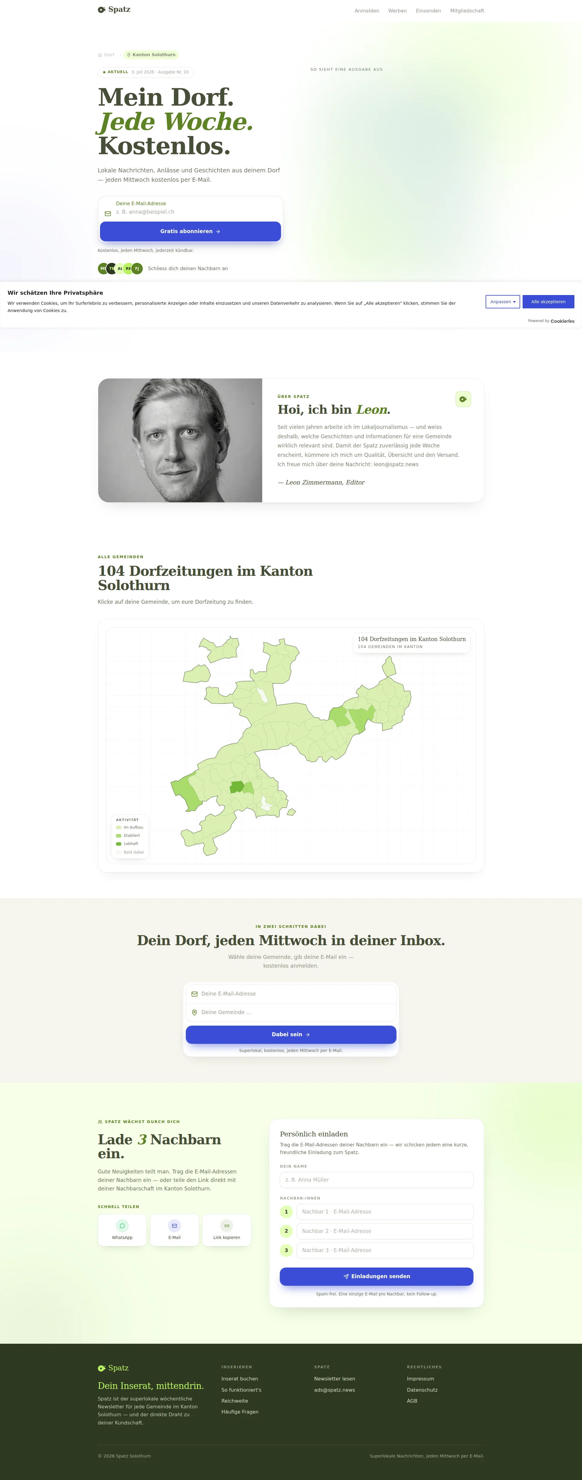
RIGHT THEN. Let me tell you what's GOOD first, because credit where it's bloody due: Mein Dorf. Jede Woche. Kostenlos. — that's a three-word knockout punch. BAM BAM BAM. Value prop delivered in under three seconds, like a perfectly timed amuse-bouche. A visitor from Solothurn lands here and IMMEDIATELY knows the deal. No waffle, no corporate nonsense, no we leverage synergies in the hyperlocal content space. Just straight-up clarity. I could kiss whoever wrote that headline.
The reassurance line underneath — Kostenlos, jeden Mittwoch, jederzeit kündbar — is GORGEOUS. Three objections killed in one line: cost, frequency, commitment. That's like seasoning a dish with salt, pepper, and acid in a single gesture. Chef's kiss, genuinely.
The sample newsletter preview on the right (So sieht eine Ausgabe aus) is a smart move — showing people what they're signing up for BEFORE they commit. That's like letting someone smell the dish before ordering. Problem is, those preview cards are TINY. Squinting at them like I'm reading the specials board from across a motorway. If you're going to show a preview, make it LEGIBLE or don't bother — right now it's decoration pretending to be persuasion.
The avatar stack with initials (MS, TB, AL, RK, FJ) — oh come ON. Is THAT your social proof? A bunch of letters that look like a Swiss license plate? Real faces build trust. Initials build nothing. You've got 10 testimonials apparently floating around this site — USE some of those real humans up here where they matter!
And that CTA button — Gratis abonnieren. It WORKS, it's clear, it's above the fold. But it's about as exciting as ordering tap water. You're not telling people what they GET, you're telling them what they DO. There's a difference between Place order and Get your feast. Add some emotional punch, make it feel like joining a community, not filling out a form.
The green color palette is fresh and earthy — feels like spring in the countryside, which is PERFECT for a local village newsletter. Typography hierarchy is clean with that italic accent on Jede Woche adding personality without breaking readability. The overall layout is tidy but the left side feels slightly cramped with everything stacked tight. Give it room to breathe — even a soufflé needs space to rise.
Ejemplos de mejoras
Gratis abonnieren
Mein Dorf jetzt abonnieren →
Adding 'Mein' creates ownership and personalization, 'jetzt' adds urgency, and the arrow signals forward momentum — all without adding friction or complexity
Puntos fuertes
- 'Mein Dorf. Jede Woche. Kostenlos.' delivers the ENTIRE value proposition in 6 words — that's Michelin-star headline writing that works in under 3 seconds flat
- The reassurance line 'Kostenlos, jeden Mittwoch, jederzeit kündbar' is a masterclass in objection-killing — cost, frequency, and commitment fears all neutralized in one clean sentence below the CTA
- The sample newsletter preview ('So sieht eine Ausgabe aus') is the right instinct — showing the product before signup reduces abstract risk and lets visitors taste the dish before ordering
A mejorar
- 'Gratis abonnieren' is as emotionally exciting as ordering toast — it describes the ACTION not the BENEFIT, and a newsletter CTA needs to make people feel like they're joining something, not submitting a form
- The avatar social proof uses initials only (MS, TB, AL, RK, FJ) which look like Swiss postal codes, not real humans — swap those for actual faces and watch your trust signal jump overnight
- The newsletter preview cards are so small they're basically illegible — if you're going to show me a sample of your cooking, don't hold the plate across the room where I can't see what's on it
Copywriting
DECENT
BLOODY HELL, the copy on this site is like finding a beautifully handwritten letter in a world of spam emails. Hoi, ich bin Leon — YES! That's how you open a conversation with your neighbor, not some corporate Welcome to our platform drivel. The consistent 'du' register throughout feels like chatting over a garden fence, which is EXACTLY right for a hyperlocal community newsletter. Whoever's writing this copy understands their audience the way a good chef understands their regulars.
Dein Dorf, jeden Mittwoch in deiner Inbox — simple, rhythmic, benefit-first. And the contribute page? Du kennst dein Dorf besser als jede Redaktion — that's BRILLIANT. You're flattering the reader AND making a genuinely true argument at the same time. It's like telling a home cook Nobody knows your familys taste buds like you do' — it's empowering AND accurate.
BUT — and here's where I start throwing pans — your testimonials are serving me VIBES when I need STEAK. Kompakt, sympathisch, lokal — oh lovely, three adjectives and zero specifics. That's a fortune cookie, not a testimonial! You've apparently got 10 testimonials on this site. TEN! And the best you can do is vague feelings? Where's the person who discovered the village market through Spatz? Where's the teacher who found out about the school event? Give me SPECIFICS, give me OUTCOMES, give me a reason to feel like I'm MISSING OUT by not subscribing!
The membership page copy with Hannes's personal note is authentic and the steuerlich absetzbar detail is a Switzerland-specific trust builder that shows you KNOW your audience. Smart. But the pricing tiers — Nachbar, Freund, Patron — where's the copy that makes me WANT to be a Patron instead of just a Nachbar? You've got three tiers with the emotional differentiation of a parking garage: Level 1, Level 2, Level 3. Tell me WHY the Patron tier matters, what impact my 25 CHF actually has!
The advertise page — oh, don't even get me started. A REVENUE page with a missing H1 and barely enough words to fill a Post-It note?! That's like having a restaurant with no menu at the front door. Local businesses need to be CONVINCED to spend their CHF, and you're giving them a whisper when they need a pitch.
And here's the biggest gap: there's NO problem-agitation anywhere. You jump straight to heres our lovely newsletter' without first making the reader FEEL the pain of what they're missing. It's like serving dessert without dinner — pleasant, but you haven't earned the emotional investment. Make them feel the sting of that Dorffest they missed, that neighbor's shop that closed without them knowing. THEN offer the solution.
Ejemplos de mejoras
«Kompakt, sympathisch, lokal. Über Spatz habe ich schon mehrere Anlässe entdeckt, die ich sonst verpasst hätte.» — Severin, Lehrer
«Letzten Monat habe ich über Spatz den Flohmarkt im Dorfzentrum entdeckt — ohne den hätte ich ihn verpasst. Jetzt lese ich jeden Mittwoch als erstes den Spatz.» — Severin R., Lehrer, Solothurn
Specific event + specific behavior change + full location = a testimonial that feels REAL and triggers FOMO in other locals who might have also missed that market — adjectives don't convert, stories do
Puntos fuertes
- Tone is consistently warm and community-rooted — 'Hoi, ich bin Leon' and the 'du' register throughout feel like genuine neighbor-to-neighbor conversation, not some marketing department's idea of 'relatable'
- The contribute page's before/after submission demo ('Vom Zettel zur Zeitung') is BRILLIANT UX copy — it shows the transformation from raw input to polished output, removing intimidation like a chef showing you the recipe is only 4 steps
- Switzerland-specific details like 'steuerlich absetzbar' and TWINT payment on the membership page prove genuine local audience awareness — these are trust signals that no generic template could replicate
A mejorar
- The main landing page testimonials are serving adjective soup instead of real stories — 'Kompakt, sympathisch, lokal' is a MOOD BOARD, not a conversion tool, and it converts worse than a specific 'I found the Frühlingsmarkt two days early thanks to Spatz'
- The advertise page has a missing H1 and barely 119 words for a page that needs to convince local businesses to spend real money — that's your REVENUE kitchen running with no head chef and half the burners off
- Zero problem-agitation anywhere on the site: you're prescribing medicine without diagnosing the illness first — make readers FEEL the sting of that village event they missed last Wednesday before you offer them the cure
Call-to-Action
DECENT
Contenido bloqueado
Prueba Social
NEEDS WORK
Contenido bloqueado
Arquitectura
DECENT
Contenido bloqueado
SEO y Meta
NEEDS WORK
Contenido bloqueado
Móvil
CRITICAL
Contenido bloqueado
Diseño Visual & Branding
DECENT
Contenido bloqueado
Rendimiento
CRITICAL
Contenido bloqueado
llmreadiness
CRITICAL
Contenido bloqueado