Le verdict
AeroBase has the bones of something genuinely special — a razor-sharp niche, screaming-fast performance, and a dark UI that looks like it was designed by someone who actually runs at 5am. But BLOODY HELL, you've built a restaurant with no menu on the window! Zero social proof, chart previews that look like your monitor died, and CTAs so generic they could belong to literally any product launched since the dawn of SaaS. You've done the hard part — now stop hiding the good stuff.
AeroBase: A Fit Body with Zero Stage Presence
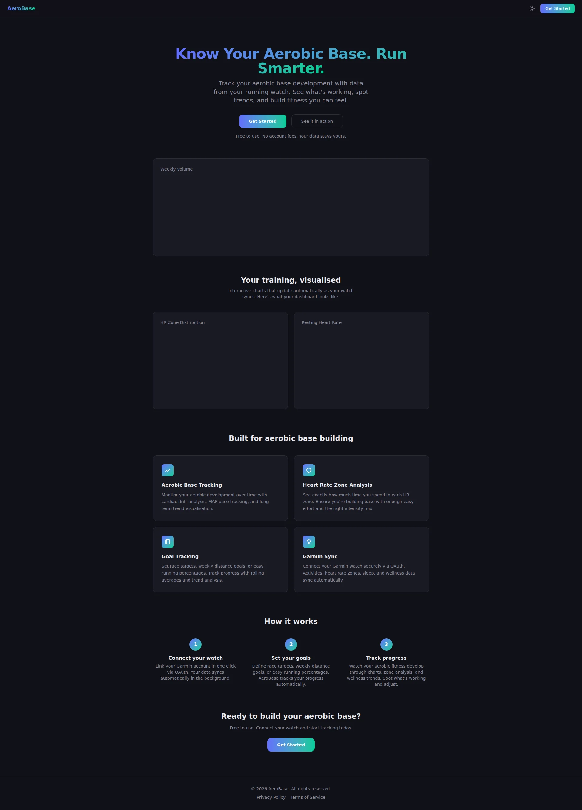
Right, sit down. Let me tell you what's happening with AeroBase. You've got a product that's laser-focused on aerobic base training for Garmin runners — that's SMART. Most fitness apps try to be the Swiss Army knife of health and end up being the plastic fork nobody wants. You picked your lane. Respect. But here's the thing: you're running that lane in pitch darkness wearing camouflage. Your hero section? A ghost town. Social proof? WHAT social proof? Those gorgeous interactive charts you clearly spent weeks building? They show up as empty black voids on your landing page — congratulations, you've created the most convincing 'page failed to load' simulator I've ever seen. The copy is written by someone who KNOWS running but forgot they're also supposed to be SELLING. The good news? Your technical foundation is ROCK SOLID. PageSpeed 90 on mobile, 100 on desktop — most SaaS teams would sell a kidney for those numbers. The dark theme is clean. The product concept is sharp as a chef's knife. You're not a disaster — you're a perfectly seared steak sitting on a paper plate with no garnish, no sides, and the waiter forgot to bring it to the table. Fix five things and you go from 'eh, another fitness tracker' to 'shut up and take my Garmin data.' Let's carve into this.
Hero Section
NEEDS WORK
What IS this hero section? You've got the right ingredients laid out on the counter and then you just... walked away from the stove! The headline Know Your Aerobic Base. Run Smarter. — actually, that's DECENT. It's specific enough to make every Zone 2 obsessed, Maffetone-worshipping runner perk up, and it communicates a clear benefit in under 3 seconds. That's rarer than a perfectly cooked soufflé in a student kitchen. The sub-headline does its job but reads like a feature spec sheet wearing a benefits costume. Build fitness you can feel — THAT'S the money line. It's evocative, it's human, it RESONATES. The rest? Just... describing the app like a tech manual. Now the CTA. Get Started. SERIOUSLY?! That's the SaaS equivalent of a waiter pointing vaguely across the room and mumbling foods over there somewhere.' It tells me NOTHING about what I'm starting, what I'm getting, or why I should care right now. Your SECONDARY CTA See it in action is actually more compelling than your primary one — that's like your side dish upstaging the main course! And that hero visual — oh, where do I begin. That Weekly Volume chart preview? It's a BLANK DARK RECTANGLE. That's not a product demo, that's a loading error! If this is supposed to show me what AeroBase looks like, it's showing me a whole lot of NOTHING. And social proof? Zero. Not a single runner vouching for you. You're asking people to hand over their Garmin credentials with nothing but vibes and a gradient button. COME ON!
Exemples d'améliorations
Get Started
Track My Aerobic Base — Free
Tells the user exactly what they're doing AND reminds them it's free — two objections squashed in four words. That's a CTA that actually MEANS something.
Track your aerobic base development with data from your running watch. See what's working, spot trends, and build fitness you can feel.
Connect your Garmin in 60 seconds. See your Zone 2 distribution, cardiac drift trends, and MAF pace progress — all in one dashboard built for aerobic runners.
Specificity SELLS. '60 seconds' creates urgency, specific features (Zone 2, cardiac drift, MAF pace) speak your target audience's language like a secret handshake.
Code Suggestions
Rebuilt hero with specific CTA text, social proof badge, and micro-copy that tackles objections head-on instead of whispering from across the room
<section class="hero">
  <h1>Know Your Aerobic Base. Run Smarter.</h1>
  <p>Connect your Garmin in 60 seconds. Track Zone 2 distribution, cardiac drift, and MAF pace — all in one dashboard built for aerobic runners.</p>

  <!-- Social proof badge -->
  <div class="social-proof">
    <span>⭐ Trusted by 1,200+ aerobic runners</span>
  </div>

  <div class="cta-group">
    <a href="/signup" class="btn-primary">Track My Aerobic Base — Free</a>
    <a href="#demo" class="btn-secondary">See it in action ↓</a>
  </div>

  <p class="micro-copy">Free to use · No credit card · Your data stays yours</p>
</section>
Points forts
- Headline 'Know Your Aerobic Base. Run Smarter.' nails the niche — specific, benefit-driven, and speaks directly to the MAF/Zone 2 crowd in under 3 seconds
- Dual-CTA strategy with 'See it in action' as a secondary option is genuinely smart — gives fence-sitters a lower-friction path forward
- 'Free to use. No account fees. Your data stays yours.' — three objections demolished in one line. That's efficient copywriting right there
À améliorer
- ZERO social proof in the hero — no user count, no testimonial snippet, no 'join X runners' — visitors have absolutely no reason to trust you on sight
- Hero chart preview renders as an empty black rectangle — your product looks BROKEN, not impressive. That's a conversion killer dressed as a feature showcase
- 'Get Started' is the most flavourless CTA in the entire SaaS universe — it communicates no benefit, creates no urgency, and could belong to literally any product ever made
Copywriting
NEEDS WORK
Right. Let's talk about your copy. Sit down, because this is going to sting. You CLEARLY know running — cardiac drift analysis, MAF pace tracking, HR Zone Distribution — you're throwing around terminology like a coach at a Maffetone seminar. And for your target audience, that's BRILLIANT for credibility. But here's the problem: you're writing FOR runners but not ABOUT runners. There's a MASSIVE difference between Monitor your aerobic development over time with cardiac drift analysis, MAF pace tracking, and long-term trend visualisation and Finally understand why your easy runs feel hard — and fix it. One describes a tool. The other describes a TRANSFORMATION. Guess which one makes someone click? Your features section is four feature descriptions wearing feature-flavoured names. Aerobic Base Tracking — Monitor your aerobic development over time with cardiac drift analysis. That's a SPEC SHEET, not a sales pitch! It's like describing a Michelin-starred meal by listing the cooking temperatures. The How it works section? Actually, that's your BEST writing on the entire page. Clear, sequential, action-oriented. Connect your watch → Set your goals → Track progress. Clean three-step narrative. I can taste the competence there. But then you go and ruin it with that closing section — Connect your watch and start tracking today. Is THAT your big finale?! That's as exciting as a recovery jog. Your page has the right words but ZERO emotional punch. Where's the pain? Where's the you know that feeling when youve been running easy for months and you STILL can't tell if it's working?' THAT'S what sells. Not feature lists.
Exemples d'améliorations
Monitor your aerobic development over time with cardiac drift analysis, MAF pace tracking, and long-term trend visualisation.
Stop guessing if your easy runs are actually easy. AeroBase shows you cardiac drift, MAF pace trends, and Zone 2 compliance — so you know exactly if you're building your aerobic base or quietly burning it down.
Starts with a pain point every aerobic runner KNOWS, then delivers the features as the solution. Converts a bland feature list into a story that hits home.
Connect your watch and start tracking today.
Your next PR starts with your aerobic base. Connect your Garmin and find out where you actually stand — in 60 seconds, for free.
Ties the emotional outcome (a PR!) to the action, adds specificity (60 seconds) and removes friction (free). The current version is a yawn in text form.
Points forts
- Niche-specific terminology (cardiac drift, MAF pace, Zone 2) builds instant credibility — your target audience will feel like this was built by one of THEM
- 'How it works' section is the best-written part of the page — clear, sequential, and action-oriented with a clean three-step structure
- 'Free to use. No account fees. Your data stays yours.' — three objections, one line, zero fat. That's copywriting efficiency I can respect
À améliorer
- Features masquerading as benefits EVERYWHERE — 'Monitor your aerobic development over time' describes the tool, not the transformation the runner actually experiences
- Zero emotional resonance — no pain points addressed, no runner frustrations acknowledged, no 'you know that feeling when...' moments that make someone nod and reach for their wallet
- Closing CTA copy ('Connect your watch and start tracking today') is the most limp, uninspired finale for a page that SHOULD be building excitement about becoming a better runner
Call-to-Action
DECENT
Contenu verrouillé
Preuve Sociale
CRITICAL
Contenu verrouillé
Architecture
DECENT
Contenu verrouillé
SEO & Meta
DECENT
Contenu verrouillé
Mobile
DECENT
Contenu verrouillé
Design Visuel & Branding
DECENT
Contenu verrouillé
Performance
CRITICAL
Contenu verrouillé
llmreadiness
CRITICAL
Contenu verrouillé