Le verdict
Right, listen up. Stefano's portfolio is like a beautifully plated wagyu steak — gorgeous sear, perfect temperature — but he forgot the bloody seasoning. The site loads fast, the case studies have REAL numbers (not fairy tales), and the dark theme is slick enough to make Gordon himself nod approvingly. BUT — and this is a big but — the trust section is serving NOTHING. He's got 10 testimonials sitting somewhere and NONE of them are on display. That's like having a Michelin star and hiding the certificate in your sock drawer! The LCP at 2.7 seconds on mobile is hovering just above average — not terrible, but not the rocket ship the original report claimed. No structured data, no AI readiness, and the SEO is thinner than a crêpe. The bones of this dish are EXCELLENT — the presentation is sharp, the case studies are the real deal, and the copy actually speaks human instead of developer gibberish. But that last 20%? That's the difference between a packed restaurant and an empty one. Sort out the trust signals, feed the search bots, and this goes from 'nice portfolio' to 'shut up and take my money' territory.
The Dark Knight of Dev Portfolios — Almost There, But Missing the Cape
Look, Stefano clearly knows how to write code — the case studies are detailed, the stack is impressive, and the site loads faster than most developers can explain what a LCP is. The dark theme is clean, the project carousel works, and there are actual measurable results in the copy ('10,000 organic downloads', '4 hours to 20 minutes'). That's the good news. The bad news? There are 10 testimonials apparently available but ZERO visible on the page, zero client logos, zero structured data, and the AI bots can't even find a llms.txt to know this guy exists. It's like building a Ferrari and then parking it in a garage with no address. The site is 80% of the way to being a conversion machine — but that last 20% is exactly where clients decide whether to book an audit or bounce to the next freelancer on Google.
Hero Section
DECENT
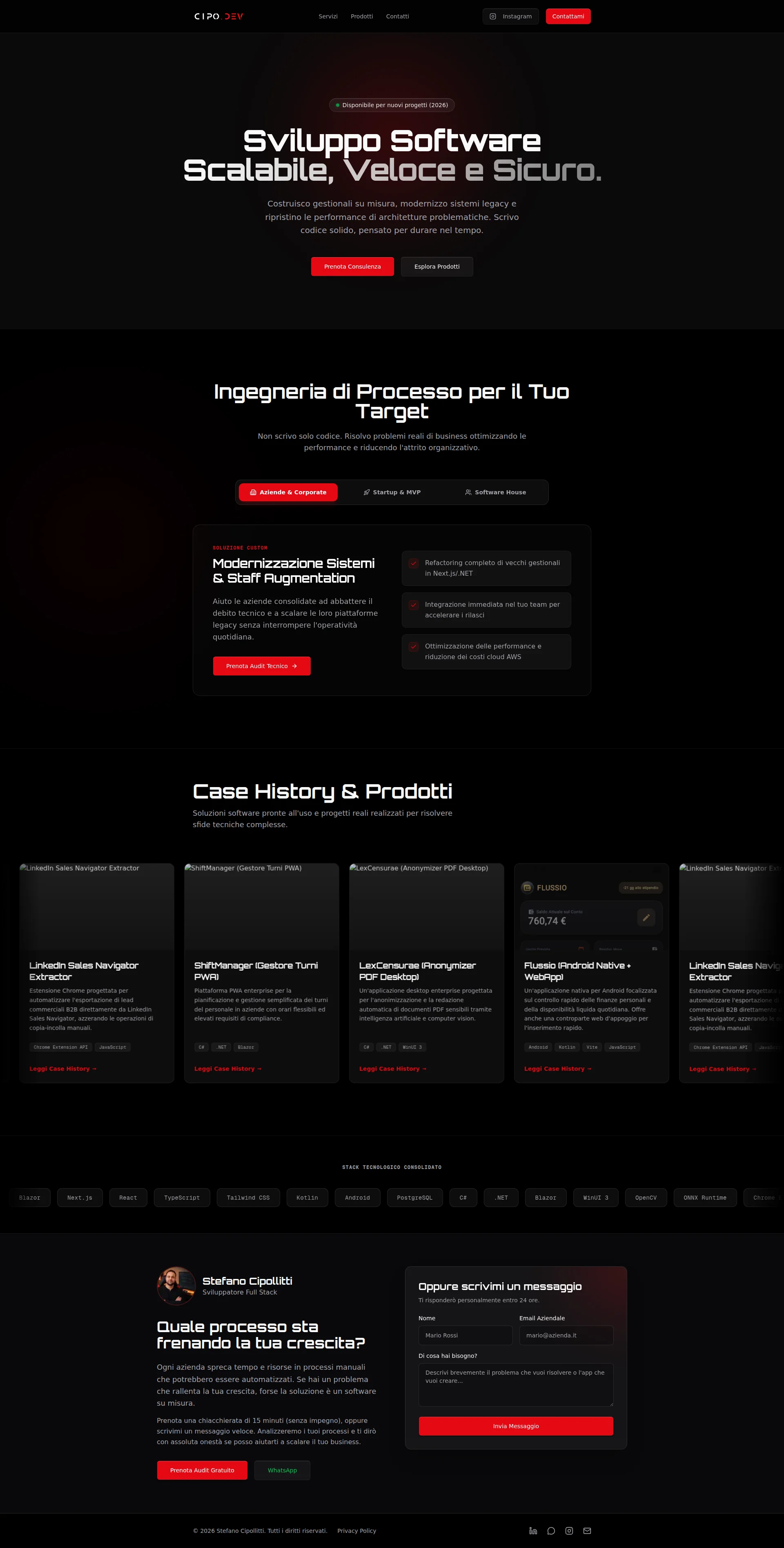
RIGHT THEN. Let's talk about this hero section, shall we? The H1 — Sviluppo Software Scalabile, Veloce e Sicuro — hits you clean. Three seconds on this page and you KNOW what Stefano does. That's how it should be. No mystery, no waffle, just straight to the point like a chef calling orders on the pass. The Disponibile per nuovi progetti (2026) badge? Clever little touch — it whispers 'I'm in demand but I've got a seat for you' without being desperate. I actually LIKE that.
The sub-headline does its job too — custom management systems, legacy modernization, architecture fixes. Specific. Tangible. You can taste what's on the menu before you order. GOOD.
But then — BLOODY HELL — we get to the value proposition. Scrivo codice solido, pensato per durare nel tempo. I write solid code built to last. Are you SERIOUS?! Every freelance developer from Milan to Mumbai has that exact sentence tattooed on their LinkedIn profile! That's like a chef saying I cook food that tastes good. NO KIDDING! What makes YOU different, Stefano? Are you faster? Do you specialize in something? Do you turn projects around in half the time? The hero doesn't answer any of this, and when your potential client has 12 browser tabs open comparing developers, solid code isn't going to cut through the noise like a knife through butter.
The dual CTAs — Prenota Consulenza in that punchy red, Esplora Prodotti in the outlined ghost button — that's proper visual hierarchy. The red pops against the dark background like a garnish on a black plate. Well done there.
But WHERE is the social proof?! You've got 10 testimonials apparently sitting in the kitchen and NONE of them are being served in the hero! No trusted by X companies, no 10+ projects delivered, NOTHING. You're asking someone to book a consultation on a PROMISE with zero evidence. That Flussio app hit 10,000 organic downloads — that number should be SCREAMING from the hero section, not buried six scrolls down in a case study card. It's like hiding your best dish on page four of the menu. Madness!
Exemples d'améliorations
Costruisco gestionali su misura, modernizzo sistemi legacy e ripristino le performance di architetture problematiche. Scrivo codice solido, pensato per durare nel tempo.
Ho aiutato aziende a ridurre i tempi di pianificazione da 4 ore a 20 minuti e raggiunto 10.000+ download organici con app native. Costruisco software che risolve problemi reali — non codice che dura finché non tocchi nulla.
Stop telling people you write 'solid code' — that's the developer equivalent of a restaurant saying 'we serve edible food.' Replace the generic promise with ACTUAL results from your case studies. Numbers don't lie, and they hit harder than any adjective ever could.
Points forts
- H1 communicates the core offer instantly — scalable, fast, secure software development — no ambiguity, no waffle, just a clean plate
- Dual CTA structure with clear primary/secondary hierarchy — that red button against the dark background pops like a perfectly reduced sauce
- Availability badge 'Disponibile per nuovi progetti (2026)' is a smart, subtle urgency signal — it says 'I'm booked but I'll make room for you' without begging
À améliorer
- ZERO social proof in the hero — you've got 10 testimonials and not a single one makes it above the fold where it actually MATTERS
- Value proposition 'Scrivo codice solido, pensato per durare nel tempo' is so generic it could be a template placeholder — every developer alive claims this, mate
- No visual element reinforces the message — the entire hero is pure typography with no mockup, no screenshot, no visual proof of the actual work — it's all talk and no plate
Copywriting
DECENT
Alright, I'll give credit where it's due — this copy is genuinely ABOVE AVERAGE for a developer portfolio. And yes, that bar is so low it's practically underground, but Stefano clears it with room to spare and that deserves a nod. The case studies? THOSE are the star of this menu. Each one follows a proper Business Challenge → Technical Architecture → Solution & Impact structure that actually tells a STORY instead of just vomiting a list of technologies at you. 4 ore settimanali a soli 20 minuti and da 2 minuti a meno di 5 secondi per lead — THOSE are the numbers that make a client's wallet twitch. Specific, believable, delicious.
The Ingegneria di Processo section makes a BRILLIANT pivot — Non scrivo solo codice. Risolvo problemi reali di business. That's the moment Stefano stops being a commodity coder and becomes a business problem-solver. That's like going from line cook to head chef in one sentence. And the closing CTA — Quale processo sta frenando la tua crescita? — is a genuinely GOOD pain-point question. It doesn't list services, it pokes the bruise. Smart.
BUT — and here's where I start throwing pans — the tech stack section is an ABSOLUTE MESS for anyone who isn't a developer. Blazor, ONNX Runtime, WinUI 3 — is THAT supposed to impress a CEO?! A business owner reads that and thinks you're having a stroke on the keyboard! That's like listing every ingredient in molecular notation instead of just saying pan-seared salmon. TRANSLATE IT into business outcomes or don't bother!
The three audience tabs — Aziende & Corporate, Startup & MVP, Software House — are a BRILLIANT idea served with LAZY execution. You've got three different diners at the table and you're serving them all the same dish! A startup founder and a corporate IT manager need to hear COMPLETELY different things. A startup wants speed and budget. A corporate wants reliability and compliance. Same kitchen, different menus. Sort it out!
And the technical jargon — architettura decoupled, DOM-parsing asincrono, MutationObserver — look, I KNOW these are real things, but your buyer isn't reading Stack Overflow, they're reading your portfolio trying to decide if they trust you with their budget. Speak THEIR language, not yours. The grammar and spelling are clean throughout — at least the Italian is well-seasoned even if the messaging needs work.
Exemples d'améliorations
STACK TECNOLOGICO CONSOLIDATO — C# .NET WinUI 3 Blazor Next.js React TypeScript Tailwind CSS Kotlin Android PostgreSQL...
Tecnologie che uso per costruire software affidabile: app web moderne (Next.js, React), applicazioni enterprise Windows (C#/.NET), app Android native (Kotlin), e sistemi backend scalabili (PostgreSQL). Ogni scelta tecnologica è motivata dal problema da risolvere, non dalla moda del momento.
A wall of raw technology names is like throwing uncooked ingredients on a plate and calling it dinner. Group them by what they DO for the client, add a line explaining your philosophy, and suddenly the non-technical CEO reading this actually understands why they should trust your choices.
Points forts
- Case studies serve up concrete, mouth-watering metrics ('da 4 ore a 20 minuti', '10.000 download organici') — these are the Michelin stars of copywriting, specific and impossible to fake
- The positioning shift from 'developer' to 'business problem solver' in the process engineering section is strategically BRILLIANT — that's the difference between charging by the hour and charging by the outcome
- The closing CTA question 'Quale processo sta frenando la tua crescita?' speaks directly to the prospect's pain instead of listing services — that's a chef asking 'what are you craving?' instead of reading the entire menu aloud
À améliorer
- The tech stack section is a scrolling conveyor belt of acronyms that means NOTHING to the non-technical decision-maker holding the chequebook — they see alphabet soup where they should see reassurance
- Three audience segments are labeled beautifully but served the SAME copy underneath — a startup founder and a corporate IT manager are completely different diners who need different menus
- Technical jargon ('architettura decoupled', 'DOM-parsing asincrono', 'MutationObserver') leaks into case studies and will lose the business owners who are the ACTUAL buyers — speak their language or lose their attention
Débloquer les 10 catégories restantes
Call-to-Action
DECENT
Contenu verrouillé
Preuve Sociale
CRITICAL
Contenu verrouillé
Architecture
DECENT
Contenu verrouillé
SEO & Meta
CRITICAL
Contenu verrouillé
Mobile
GOOD
Contenu verrouillé
Design Visuel & Branding
DECENT
Contenu verrouillé
Performance
GOOD
Contenu verrouillé
llmreadiness
CRITICAL
Contenu verrouillé
Contenu verrouillé
Accédez à la conclusion complète avec les 3 actions prioritaires et un message motivant personnalisé.