Le verdict
Right, listen up. Floatz has built a gorgeous dark-navy dining room for a restaurant that forgot to put food on the plates. The niche is brilliant — AI due diligence for biotech investors writing million-dollar checks — and the visual identity screams 'we're serious players.' But BLOODY HELL, where's the meat?! The hero is a half-dressed starter with no CTA button, the copy reads like a PhD thesis abstract instead of a sales pitch, and the trust section is thinner than a crêpe at a Michelin reject. You've got backer logos from Google for Startups and ETH Zürich — lovely garnish — but zero client testimonials, zero case studies, zero ROI numbers. Performance is solid at under 2 seconds LCP, so at least the kitchen isn't on fire. But for a B2B SaaS asking pharma BD directors to hand over their due diligence process, you're serving tapwater and calling it champagne. The bones of this dish are genuinely good. Now actually COOK something with them.
Floatz: Slick Enough to Fool Your Mom, Not Enough to Close a Deal
Look, Floatz is not a disaster. It's actually a pretty site with a dark, techy aesthetic that fits the 'serious AI platform' vibe. The problem is that serious AI platforms targeting life science investors need to do a lot more heavy lifting than 'here are three bullet points and a contact form.' The copy is stuck in feature-land, there's zero pricing transparency, no testimonials from actual clients, no case studies, no ROI numbers, and the only CTA is 'Contact us' — which for a B2B buyer deciding whether to trust you with their due diligence process is about as reassuring as a surgeon saying 'trust me bro.' The bones are good. The flesh is missing.
Hero Section
NEEDS WORK
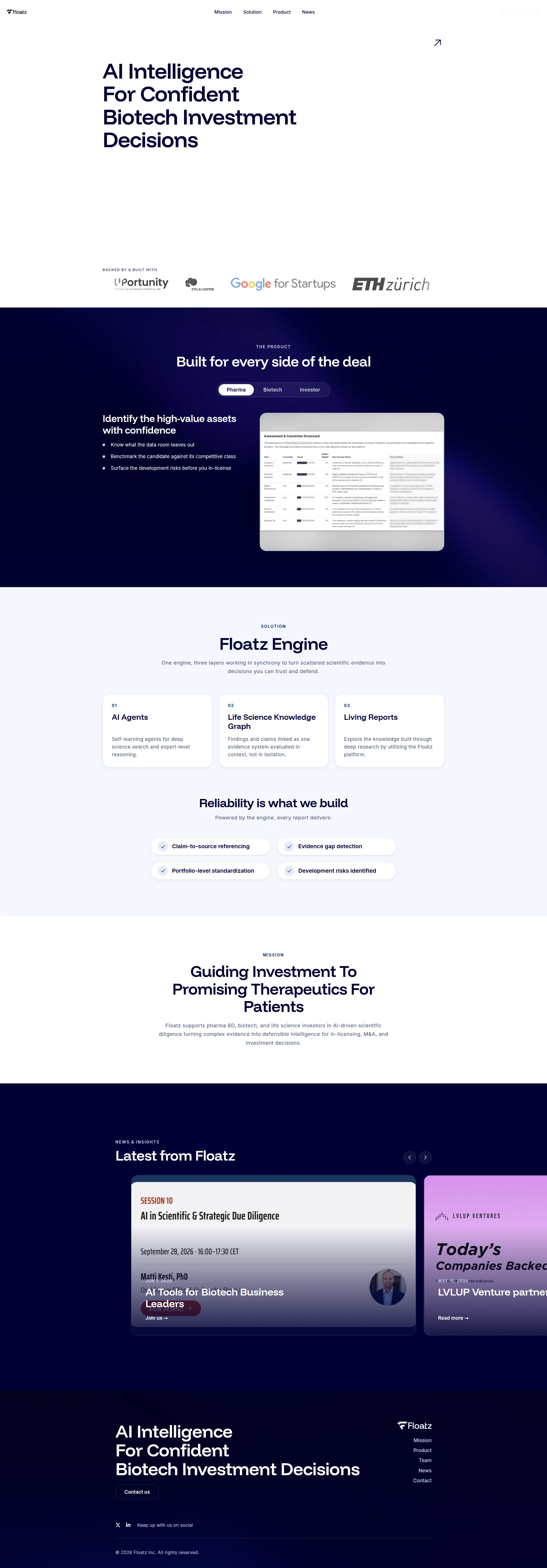
Right, let me look at this hero. AI Intelligence For Confident Biotech Investment Decisions. You know what AI Intelligence is? It's saying Automated Teller Machine machine. REDUNDANT! Intelligence is literally what the 'I' in AI stands for! Come on! That said — and I'll give credit where it's due — you walk into this restaurant and you know EXACTLY what's on the menu within five seconds. Biotech investment decisions. Target audience clear. That's not nothing, and frankly more than most startups manage. The dark-navy aesthetic with that big left-aligned headline? It's like walking into a proper fine-dining room — the typography hierarchy is clean, the fonts are weighted beautifully, it FEELS premium. I actually respect the visual craft here. But then — oh, then — you look below the headline and there's this MASSIVE empty void of nothingness before the backer logos. It's like setting a gorgeous table and forgetting to bring out the entrée! That's your most expensive real estate on the entire page, and you've left it as blank as a chef's notepad on holiday! And WHERE — where in the name of all that is holy — is your CTA button?! There's no Book a Demo, no See It In Action, NOTHING in the hero screaming at the visitor to take action. The Contact us link is hiding in the navigation like a waiter ducking into the kitchen! You're selling to pharma BD directors and VC partners evaluating six-figure tools, and your conversion strategy is... hoping they'll go hunting through your nav bar?! Seriously?! Now, the backer logos — Google for Startups, ETH Zürich, UPortunity — those are genuinely strong. That's real institutional credibility simmering in the pan. But there are no CLIENT logos, no trusted by X firms stat, no testimonial snippet. You've shown me who BACKED you, not who USES you. The product screenshot peeking out below is too small to read and too buried to impress. You've got a beautiful dish here that's been plated with half the ingredients missing.
Exemples d'améliorations
AI Intelligence For Confident Biotech Investment Decisions
Know What the Data Room Hides Before You Write the Check — AI Due Diligence for Life Science Investors
The rewrite leads with the specific pain (data room blind spots), speaks directly to the buyer's deepest fear (committing capital on incomplete info), and makes the mechanism tangible. It's a dish with actual flavour instead of a generic menu description.
Points forts
- Audience and use case hit you like a pan to the face — 'Biotech Investment Decisions' tells the right person they're in the right place before they've even sat down at the table
- Backer logos (Google for Startups, ETH Zürich) in the hero zone are like having a Michelin inspector's recommendation on the door — instant credibility for an early-stage product
- Typography hierarchy is chef's-kiss clean — large dominant headline, consistent font weight progression, premium dark aesthetic that matches the serious B2B positioning perfectly
À améliorer
- ZERO primary CTA button in the hero — no 'Book a Demo,' no 'See It In Action,' just a 'Contact us' buried in the nav like a tip jar hidden behind the espresso machine
- Massive empty space below the headline before the backer logos — you're wasting the most valuable real estate on the page like a chef leaving the best cut of beef sitting on the counter
- No sub-headline or supporting line explaining HOW Floatz delivers confident decisions — the hero promises the meal but doesn't even describe what's in it
Copywriting
CRITICAL
Oh, this copy. THIS COPY. It's doing that classic startup thing where you describe the engine of the car instead of telling the buyer how fast it goes. One engine, three layers working in synchrony to turn scattered scientific evidence into decisions you can trust and defend — that's a features sentence wearing a benefits costume to a fancy dress party, and EVERYONE can see through it! What does decisions you can trust and defend actually MEAN for a pharma BD director? Does it mean fewer failed in-licensing deals? Fewer moments of cold sweat before the board? Diligence cycles cut in half? PICK ONE AND SAY IT! Don't serve me a mystery tasting menu and expect me to guess the ingredients! Now — and I'm being fair here — the bullet points under the product section are actually BRILLIANT. Know what the data room leaves out. Surface the development risks before you in-license. THAT is cooking with fire! Those are specific, pain-focused, and speak directly to what keeps your buyer awake at 2 AM. So WHY are they buried in a tab halfway down the page instead of screaming from the hero?! It's like hiding your signature dish in the staff canteen! The Floatz Engine section introduces AI Agents, Life Science Knowledge Graph, Living Reports — three technical concepts that mean absolutely NOTHING to a VP of Business Development until you connect them to outcomes. Self-learning agents for deep science search and expert-level reasoning — mate, that's how you talk to your CTO over beers, not how you sell to the person signing the purchase order! The mission section — Guiding Investment To Promising Therapeutics For Patients — is noble, sure, but it's vaguer than a fortune cookie. And the supporting paragraph is a run-on sentence stuffed with so many buzzwords it could win Jargon Bingo: AI-driven scientific diligence turning complex evidence into defensible intelligence for in-licensing, M&A, and investment decisions. Four buzzword clusters! In ONE sentence! Is THAT your pitch?! And here's what really gets me — 258 words total. TWO HUNDRED AND FIFTY-EIGHT. For a B2B SaaS targeting sophisticated buyers who need to be educated, convinced, and armed with internal justification before they'll even book a demo. That's not a landing page, that's a TWEET THREAD. And not a single number anywhere — no reduce diligence time by X%, no analyzed Y compounds, no Z reports delivered. For a product selling precision and reliability, the copy is ironically the most imprecise thing on the entire page. You're asking people to trust you with their investment decisions while giving them absolutely nothing concrete to trust!
Exemples d'améliorations
One engine, three layers working in synchrony to turn scattered scientific evidence into decisions you can trust and defend.
Most in-licensing decisions are made on incomplete data. Floatz reads the full scientific record — not just the data room — and delivers a structured risk assessment your investment committee can actually interrogate.
The rewrite opens with the problem every buyer recognises (incomplete data), names the specific mechanism (reads beyond the data room), and ends with a concrete outcome (investment committee-ready report). It turns a vague feature description into a value proposition that actually makes someone's mouth water.
Points forts
- The product tab bullets ('Know what the data room leaves out,' 'Surface the development risks before you in-license') are the filet mignon of this page — sharp, specific, and aimed right at the buyer's pain points
- Tone walks the tightrope between professional and accessible without falling into either 'boring corporate' or 'cringe startup bro' territory — exactly the right register for pharma and biotech decision-makers
- The 'Reliability is what we build' section with its four concrete pillars (claim-to-source referencing, evidence gap detection, portfolio-level standardization, development risks identified) names actual deliverables a buyer can evaluate — proper mise en place
À améliorer
- ZERO quantified outcomes anywhere on the entire page — not a single number, percentage, or time-saved metric to make your claims credible for a buyer who needs to justify a six-figure purchase to their CFO
- The 'Floatz Engine' section describes your technology architecture instead of business results — 'Life Science Knowledge Graph' is chef's jargon that means nothing to the diner until you tell them what disaster it prevents
- At 258 words total, this page is starving — there's not enough content to educate, build trust, and convert a sophisticated B2B buyer who needs ammunition for their internal business case
Débloquer les 10 catégories restantes
Call-to-Action
CRITICAL
Contenu verrouillé
Preuve Sociale
CRITICAL
Contenu verrouillé
Architecture
DECENT
Contenu verrouillé
SEO & Meta
CRITICAL
Contenu verrouillé
Mobile
DECENT
Contenu verrouillé
Design Visuel & Branding
DECENT
Contenu verrouillé
Performance
DECENT
Contenu verrouillé
llmreadiness
CRITICAL
Contenu verrouillé
Contenu verrouillé
Accédez à la conclusion complète avec les 3 actions prioritaires et un message motivant personnalisé.