Le verdict
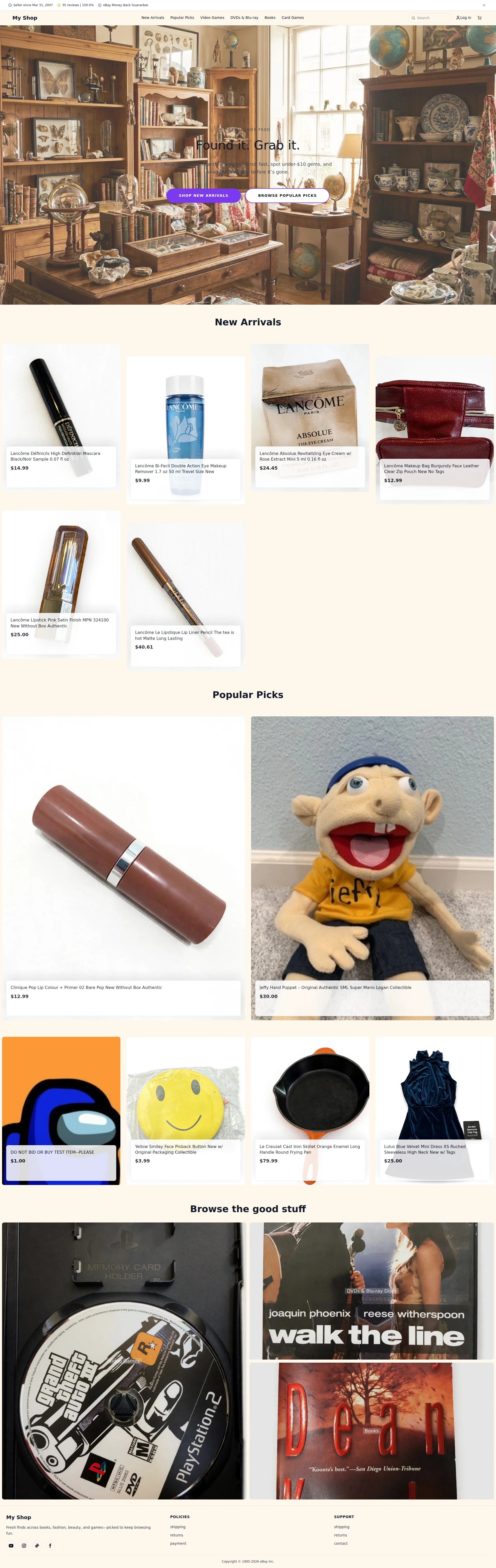
Right, listen up. happylife11.shop is an eBay storefront wearing a cheap disguise — like a line cook putting on a chef's hat and calling himself a restaurateur. You're selling Lancôme mascara next to a JEFFY PUPPET next to a '$1 DO NOT BUY test item' that's STILL LIVE on your homepage. Are you having a laugh?! The trust? Borrowed entirely from eBay like a sous chef riding on his head chef's reputation. The SEO? Nonexistent — you're a restaurant with no sign on the door, no listing on Google Maps, and the lights off. Your brand identity is 'whatever fell out of someone's attic this week.' Look — the bones of something functional are here. You've got 19 years of selling history and 100% positive feedback, which is genuinely impressive. But you're HIDING that in tiny text nobody reads while putting a TEST LISTING in your showcase window. That's like keeping your Michelin star certificate in the toilet while displaying a health code violation on the front door. Performance is borderline passable at 2.7s LCP — not a disaster, but not winning any races either. You need to decide what this shop IS, clean the bloody test items off the homepage, and start building trust that doesn't depend entirely on eBay's logo doing the work for you.
A Glorified Garage Sale With An Identity Crisis
Look, there's something almost charming about a shop that sells luxury French cosmetics, a cast iron skillet, a children's puppet, and a smiley face pin — all on the same page, all in the same breath. Almost. What we actually have here is an eBay seller who built a custom storefront, forgot to tell anyone what it IS, forgot to write title tags, forgot to remove the test product listing, and then slapped a vintage library photo on the hero and called it branding. The bones of a functional shop are here — products have prices, there are CTAs, eBay's trust infrastructure is doing the heavy lifting. But this isn't a store, it's a digital thrift bin with a domain name. If you want people to buy from you instead of just from eBay directly, you need to give them a reason to trust YOU — not just the platform you're renting space on.
Hero Section
CRITICAL
RIGHT THEN. Your hero section is like a restaurant with a gorgeous mahogany bar, leather booths, ambient jazz — and then you serve microwave dinners and puppet-shaped chicken nuggets. The disconnect is STAGGERING.
The H1 — Found it. Grab it. — is actually punchy. I'll give you that. Short, snappy, makes me want to act. And the subheadline underneath? New, cheap, constantly changing. Scroll fast, spot under-$10 gems, and snag the last copy before its gone.' That's got REAL energy — urgency, price positioning, scarcity — three value props packed into two sentences. Someone in this kitchen can actually cook!
But then you went and ruined it. BLOODY HELL, that background image! It's a warm, cozy antique library — bookshelves, globes, wooden furniture — and you're selling Lancôme travel mascara and a Jeffy hand puppet. That hero image belongs on a Victorian curiosity shop's Etsy page, not on YOUR storefront. It's like putting a sommelier's wine list on the wall of a fish and chips shop. Your visual and your copy are in two completely different restaurants!
You've got two CTAs — SHOP NEW ARRIVALS and BROWSE POPULAR PICKS — which is fine in theory, but those buttons are fighting for their lives against that dark, cluttered background. They're there, they've got decent action text, but they're NOT commanding the room. They should be SCREAMING at me, not whispering.
And here's what makes me want to throw a pan — you've got 19 YEARS of selling history and 100% positive feedback sitting in microscopic text in the header bar where NOBODY looks! That's your single most powerful ingredient and you've buried it in the pantry! Put it in the hero where it can actually DO something! That's like having the freshest truffle in town and leaving it in the walk-in while you serve canned mushrooms.
Exemples d'améliorations
Found it. New, cheap, constantly changing. Scroll fast, spot under-$10 gems, and snag the last copy before it's gone.
Found it. Grab it. Trusted seller since 2007 — 100% positive feedback across 35 sales. New arrivals daily: beauty, games, collectibles, and more — all under $40. Snag it before it's gone.
Your 19-year selling history and perfect feedback score are the TRUFFLE in this dish — stop leaving them in the pantry! Weaving them directly into the hero subheadline transforms a generic urgency pitch into a trust-backed value proposition. Visitors instantly know WHY they should buy here instead of searching eBay directly.
Points forts
- The H1 'Found it. Grab it.' is short, punchy, and communicates the thrill-of-the-find shopping experience — genuinely well-seasoned copy that makes me want to act
- The subheadline packs three real value props into two sentences: price point ('under-$10 gems'), freshness ('constantly changing'), and scarcity ('snag the last copy') — that's solid instinct from someone who knows how to write a hook
- Two CTAs with clear action text ('SHOP NEW ARRIVALS' and 'BROWSE POPULAR PICKS') give visitors two paths based on intent — smart navigation thinking
À améliorer
- The hero background — a warm antique library with globes and bookshelves — has ZERO connection to your actual product mix of cosmetics, puppets, and cast iron pans, creating instant brand whiplash for anyone who lands here
- Your most powerful trust signal ('Seller since 2007, 100% positive feedback') is buried in tiny header text instead of being front and center in the hero — you're hiding your best dish in the back kitchen
- CTA buttons lack sufficient visual punch against that busy, dark hero image — they need to POP, not blend into the furniture like wallflowers at a party
Copywriting
CRITICAL
Oh, where do I even START with this mess? Your copy has a split personality disorder that would keep a therapist busy for years. It's like having three different chefs in the kitchen, none of them talking to each other, and one of them is actively trying to BURN THE RESTAURANT DOWN.
Let's start with what's actually working — the hero subheadline. New, cheap, constantly changing. Scroll fast, spot under-$10 gems, and snag the last copy before its gone.' That's GOOD. It's punchy, benefit-driven, creates urgency. Someone here has genuine copywriting chops.
The product page for the Lancôme eye makeup remover? Also decent: New and unused — gently removes even waterproof eye makeup. 100% authentic Lancôme. Perfect for travel or trying this cult favorite. Benefits, trust signal, use case — all in three sentences. That's a properly plated dish!
But then we get to the homepage product cards, and it's like someone swapped the chef for a barcode scanner. Lancôme Bi-Facil Double Action Eye Makeup Remover 1.7 oz 50 ml Travel Size New. Is THAT your product copy?! That's not copy, that's a SHIPPING LABEL! No benefits, no emotional hooks, no heres why you need this in your life.' Just cold, clinical text that makes browsing your homepage feel like reading an inventory spreadsheet.
The tone lurches around like a drunk waiter — casual and urgent in the hero, robotic and catalog-like in the product titles, blandly corporate in the footer (Fresh finds across books, fashion, beauty, and games — picked to keep browsing fun). Pick a VOICE and stick with it!
And now for the pièce de résistance — the absolute CHERRY on this disaster cake. Sitting right there in your Popular Picks section, in full view of every visitor, is a listing that reads: DO NOT BID OR BUY TEST ITEM--PLEASE at $1.00. Seriously?! SERIOUSLY?! That's not a copywriting problem, that's a five-alarm fire in your credibility kitchen! It's like putting a sign on your restaurant door that says 'WE'RE NOT ACTUALLY READY TO SERVE FOOD.' I don't care how good your hero copy is — that test listing torpedoes EVERYTHING. Delete it. Delete it NOW. Before another single human being sees it.
Exemples d'améliorations
DO NOT BID OR BUY TEST ITEM--PLEASE $1.00
[DELETE THIS LISTING FROM THE STOREFRONT IMMEDIATELY]
A test listing screaming 'DO NOT BUY' in all-caps, sitting in your CURATED Popular Picks section, tells every single visitor that nobody is minding this kitchen. This isn't a copywriting fix — it's a credibility EMERGENCY. Delete it, hide it, burn it — I don't care how, just get it OFF the homepage before another customer sees it.
Lancôme Bi-Facil Double Action Eye Makeup Remover 1.7 oz 50 ml Travel Size New
Lancôme Bi-Facil Eye Makeup Remover — Travel Size | Removes waterproof makeup gently. 100% authentic. Perfect for your gym bag or next trip.
The original reads like a shipping label slapped on a cardboard box. The rewrite keeps the SEO keywords but adds a benefit (removes waterproof makeup), a trust signal (100% authentic), and a real use case (travel/gym) that makes a visitor actually IMAGINE owning it. Sell the sizzle, not just the steak's serial number.
Points forts
- The hero subheadline shows genuine copywriting instinct — benefit-driven language, urgency triggers ('snag the last copy'), and price anchoring ('under-$10 gems') all working together like a well-balanced sauce
- The Lancôme eye makeup remover product page has a real benefit-driven description with an authenticity claim and use case — proof you CAN cook when you actually try
- Navigation categories ('New Arrivals,' 'Popular Picks,' 'Video Games,' 'DVDs & Blu-ray,' 'Books,' 'Card Games') are clear and jargon-free — simple, functional menu organization
À améliorer
- Homepage product cards display ZERO benefit-driven copy — just raw eBay listing titles and prices — making the entire browsing experience feel like scrolling through a warehouse inventory sheet instead of shopping
- A live 'DO NOT BID OR BUY TEST ITEM--PLEASE' listing at $1.00 is sitting in your POPULAR PICKS section — this is the single most trust-destroying piece of copy on the entire site, like leaving a rat trap visible on a restaurant dining table
- Brand voice is completely fractured: urgent and casual in the hero, clinical and robotic in product titles, blandly generic in the footer — you've got three different personalities and none of them are convincing
Débloquer les 10 catégories restantes
Call-to-Action
NEEDS WORK
Contenu verrouillé
Preuve Sociale
CRITICAL
Contenu verrouillé
Architecture
NEEDS WORK
Contenu verrouillé
SEO & Meta
CRITICAL
Contenu verrouillé
Mobile
DECENT
Contenu verrouillé
Design Visuel & Branding
CRITICAL
Contenu verrouillé
Performance
NEEDS WORK
Contenu verrouillé
llmreadiness
CRITICAL
Contenu verrouillé
Contenu verrouillé
Accédez à la conclusion complète avec les 3 actions prioritaires et un message motivant personnalisé.