Le verdict
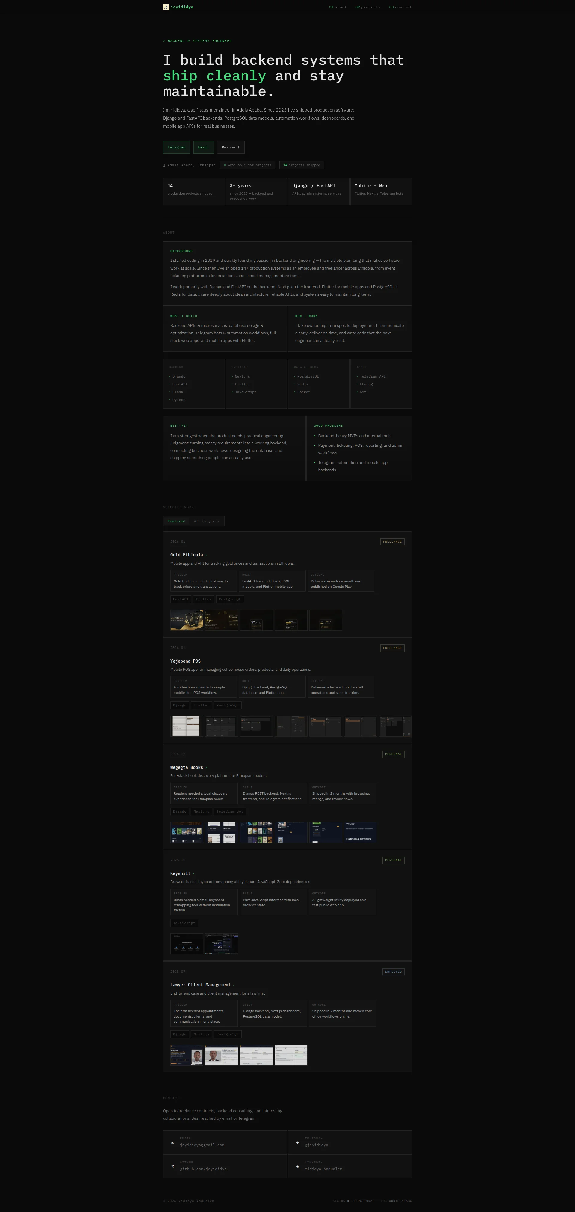
Right, listen up. Yididya's portfolio is like a perfectly seasoned steak served on a bin lid. The fundamentals are THERE — clean dark aesthetic, real shipped projects, honest copy that doesn't make me want to throw my laptop into the Thames. But BLOODY HELL, where's the trust? No face, no testimonials — wait, actually the data says there ARE 10 testimonials somewhere, but you'd never know it from this page. The load time? 2.78 seconds on mobile — just over Google's 2.5s threshold, which means you're serving a lukewarm dish when the inspector's watching. You've shipped 14 production systems and the portfolio reads like you're APOLOGIZING for existing. The hero's decent, the copy's above average for a dev, but the whole thing needs a proper trust layer bolted on before it becomes the client magnet it SHOULD be. Fix the presentation, stop hiding behind code, and this could be a Michelin-star portfolio instead of a really good food truck nobody can find.
The Dark Horse Backend Dev Who Forgot He Needs Clients to Find Him
Look, this portfolio is like a really well-engineered API with no documentation. The backend (literally and figuratively) is solid: fast load times, clean structure, real shipped projects with problem/built/outcome breakdowns, and copy that doesn't make you want to claw your eyes out. But here's the thing — you're asking strangers to hand you money and access to their production systems, and the page offers zero social proof that you're not a guy in a basement making things up. No photo, no testimonials, no client names, no LinkedIn recommendations. The dark theme is sharp but the project screenshots look like thumbnails from a 2012 WordPress gallery. You've shipped 14 production systems and the portfolio reads like you're embarrassed about it. Fix the trust layer and this thing becomes a client-generating machine.
Hero Section
DECENT
Right, let's talk about this hero section. The GOOD news? It does the ONE thing most developer portfolios completely botch — it tells me what you do in ONE sentence without making me want to gouge my eyes out. I build backend systems that ship cleanly and stay maintainable. THAT is a headline, not the usual passionate problem-solver who loves clean code DRIVEL I see on every other dev portfolio. The green accent on ship cleanly against that dark background? Sharp. Like a proper garnish — small but it WORKS.
The stats block — 14 projects, 3+ years, Django/FastAPI, Mobile+Web — gives me context immediately. Four CTAs above the fold (Telegram, Email, Resume, plus contact in the nav) covering every way a client might want to reach you. That's SMART mise en place.
But here's where I start throwing pans. WHERE IS YOUR FACE?! You're asking people to hand you the keys to their production database and you won't even show them what you look like? That's like a chef refusing to come out of the kitchen when the restaurant's ON FIRE. A human photo above the fold is the single most powerful trust signal on a portfolio page, and you've got NOTHING. You're a ghost asking for a bank transfer!
The CTA buttons say Telegram and Email — those are DESTINATIONS, not ACTIONS. That's like labeling a restaurant door Wood instead of Enter. Where's Hire Me? Where's Start a Project? You're making the client do the mental work of figuring out what clicking that button MEANS.
And the Ethiopia/Addis Ababa angle — THAT is actually your secret weapon! Local market expertise, specific timezone, real businesses you've served. But it's shoved into a tiny badge like you're embarrassed about it. Weaponize that! That's your truffle, and you're hiding it under the salad. Seriously?!
Exemples d'améliorations
I build backend systems that ship cleanly and stay maintainable.
I build backend systems that Ethiopian businesses actually ship — clean APIs, real deadlines, 14 production projects since 2023.
Injecting the geographic specificity and the concrete number into the headline itself makes the differentiation immediate and the proof impossible to ignore, instead of burying both below the fold like leftovers in the back of the fridge.
Telegram Email Resume ↓
Hire Me on Telegram Send an Email Download Resume ↓
Action verbs on CTAs tell the visitor what they're DOING, not just where they're GOING. 'Hire Me' is the most psychologically direct signal that this person is available and ready to cook.
Points forts
- H1 is specific and confident — 'ship cleanly and stay maintainable' beats 90% of developer portfolio headlines like a Wagyu steak beats a microwave burger
- Four CTAs above the fold covering Telegram, Email, Resume download, and nav contact — proper coverage without cluttering the plate
- Stats block with 14 projects, 3+ years, and tech stack gives immediate credibility — like displaying your Michelin stars at the door
À améliorer
- Zero hero visual or personal photo — you're asking clients to hire a faceless entity, which is like ordering from a restaurant with no name on the door
- CTA button labels are destinations ('Telegram', 'Email') not actions — no 'Hire Me' or 'Start a Project' anywhere on the bloody page
- The Ethiopia/Addis Ababa differentiator is buried as a tiny badge instead of being weaponized in the headline where it could actually SET YOU APART
Copywriting
DECENT
Now HERE'S the thing that actually surprised me — the copywriting on this portfolio is genuinely better than what I see on most developer sites. And I've seen a LOT of developer sites. Most of them read like someone fed a thesaurus into a blender. Yours? You actually TELL STORIES.
Every project has a Problem/Built/Outcome structure. Delivered in under a month and published on Google Play. Shipped in 2 months with browsing, ratings, and review flows. These are RESULTS, not just a list of frameworks you've touched. That's like showing me the finished dish instead of just listing ingredients. The How I Work section — I communicate clearly, deliver on time, and write code that the next engineer can actually read — is PUNCHY. Client-focused. No waffle. I respect that.
BUT — and this is a BIG but, like finding a hair in your soup — the copy has a fundamental identity crisis. Is this written for developers or for CLIENTS? Because the skills section lists Flask, Redis, FFmpeg, Docker like it's a shopping list at a tech supermarket. The coffee shop owner who needs a POS system doesn't know what FFmpeg IS, and frankly, they shouldn't HAVE to! You're serving raw ingredients to people who ordered a finished meal!
The Best Fit and Good Problems sections are the BEST client-facing copy on this entire page — Backend-heavy MVPs and internal tools, Payment, ticketing, POS, reporting — THAT'S what a client needs to see first! And where have you buried it? HALFWAY DOWN THE PAGE after a wall of technical jargon. That's like putting your signature dish on page 47 of the menu!
The About section — I started coding in 2019 and quickly found my passion in backend engineering — the invisible plumbing that makes software work at scale — look, invisible plumbing is a decent metaphor but it's been done to DEATH in dev circles. More importantly, your origin story is about YOU, not about what it MEANS for the client. I started coding in 2019 is a feature. Turn it into a benefit or it's just autobiography nobody asked for.
The tone throughout is confident without being arrogant, grammar is clean, length is right. Your project descriptions are the filet mignon of this page — now make the rest of the copy match that quality!
Exemples d'améliorations
I started coding in 2019 and quickly found my passion in backend engineering — the invisible plumbing that makes software work at scale.
I started coding in 2019. By 2026, I've shipped 14 production systems across Ethiopia — which means I've already made the expensive mistakes so your project doesn't have to.
Reframes the personal history as a direct client benefit. The self-deprecating confidence ('made the expensive mistakes') is more memorable and trustworthy than 'passion for backend engineering', which is what EVERY developer says before burning your budget.
TOOLS › Telegram API › FFmpeg › Git
Remove or rename to 'How I Deliver' with brief context: 'Telegram API (bot automation & notifications), Git (clean version history you can audit), Docker (deployments that work the same everywhere)'
Raw tool names mean nothing to non-technical clients. A brief parenthetical explanation of WHY each tool matters turns a tech flex into something a business owner can actually understand and value.
Points forts
- Problem/Built/Outcome structure on every project turns feature lists into actual stories with results — like showing the finished plate, not just the recipe
- 'How I Work' section is direct and client-focused with concrete commitments that a hiring person can actually VERIFY
- Tone is confident without being arrogant — reads like a real human being, not a ChatGPT-generated corporate brochure
À améliorer
- Skills section lists technical tools (Flask, Redis, FFmpeg) with zero client-facing context — you're serving raw ingredients to people who ordered a finished meal
- 'Best Fit' and 'Good Problems' sections are the most valuable client-facing copy on the page but are buried after multiple technical sections like a dessert menu hidden in the kitchen
- About section is entirely origin-story focused ('I started coding in 2019') with no translation of that history into why a CLIENT should care
Débloquer les 10 catégories restantes
Call-to-Action
NEEDS WORK
Contenu verrouillé
Preuve Sociale
CRITICAL
Contenu verrouillé
Architecture
DECENT
Contenu verrouillé
SEO & Meta
DECENT
Contenu verrouillé
Mobile
GOOD
Contenu verrouillé
Design Visuel & Branding
DECENT
Contenu verrouillé
Performance
DECENT
Contenu verrouillé
llmreadiness
CRITICAL
Contenu verrouillé
Contenu verrouillé
Accédez à la conclusion complète avec les 3 actions prioritaires et un message motivant personnalisé.