Le verdict
Right, listen up. The bones of this dish are GOOD — a genuinely clear value proposition, a 'free forever' angle that actually means something, and copy that's specific enough to make me believe somebody actually built a product here. But then you scroll down and hit a testimonial section that literally says 'Early Adopter Slot #1' with greyed-out ghost avatars. That's like opening a restaurant and putting 'RESERVED FOR FUTURE CUSTOMERS' signs on every table — you're TELLING people nobody's eating here! The design is clean but so safe it's practically invisible, the hero does its job but whispers when it should be shouting, and the trust section is a barren wasteland. LCP at 2.8 seconds is in the average range — not terrible, not great, like a medium-rare steak when I asked for rare. The ingredients are fresh, the recipe has potential, but you've served it half-cooked and expected a Michelin star. Get back in the kitchen.
Nihongo Dost: A Solid Free Tool That Forgot to Show It's Real
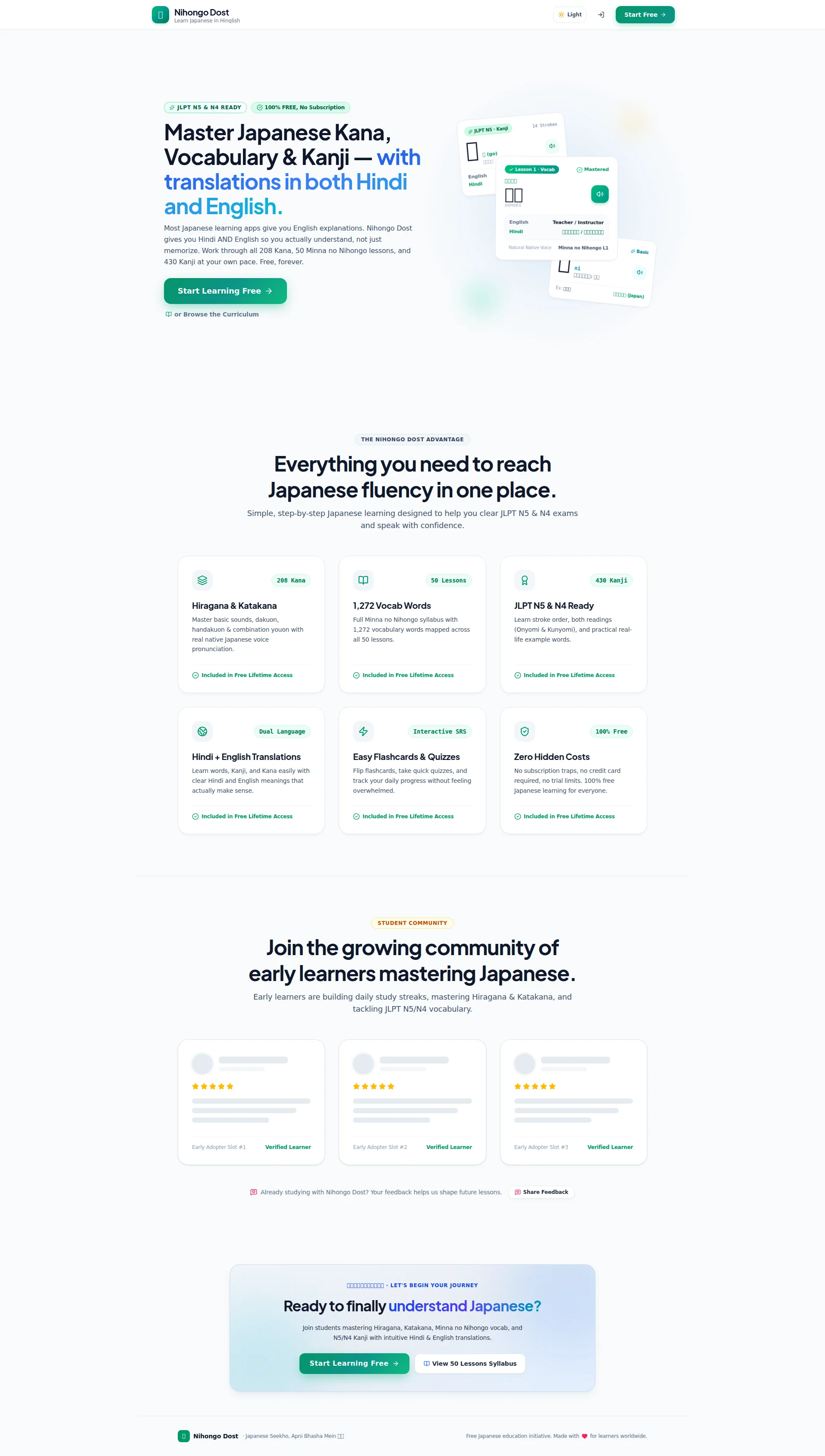
Nihongo Dost has something genuinely rare: a real, specific niche (Hindi + English Japanese learning, free forever) and the copy to back it up. The hero communicates the offer fast, the numbers are concrete (208 Kana, 1,272 vocab words, 430 Kanji), and the 'free, forever' promise cuts through the subscription-trap noise that plagues every other language app. But here's the problem — when you scroll down to prove any of this, you hit a testimonial section that literally says 'Early Adopter Slot #1' with greyed-out placeholder avatars. That's not social proof, that's a confession that the site is brand new and hoping nobody notices. The design is functional and modern enough, but the visual hierarchy is timid, the hero product screenshot is doing most of the heavy lifting, and there's no video, no app badges, no real user faces anywhere. The bones are good. The flesh is missing.
Hero Section
DECENT
RIGHT. Let me give credit where it's due — this hero section gets the fundamentals right in a way that makes me think someone actually read a conversion book before building this. The H1 — Master Japanese Kana, Vocabulary & Kanji — with translations in both Hindi and English — tells you EXACTLY what you're getting within two seconds flat. That's a properly seasoned headline. The unique angle — Hindi AND English, not just English like every other lazy app out there — is called out immediately. THAT'S your secret ingredient, and you've put it right on the plate. Well done.
The Start Learning Free CTA is above the fold, uses an action verb, and the secondary Browse the Curriculum option gives the hesitant browsers somewhere to go without cluttering the main action. That's textbook CTA hierarchy done RIGHT — like having a tasting menu AND an à la carte option.
Those two badges up top — JLPT N5 & N4 READY and 100% FREE, No Subscription — are doing REAL work. They kill the two biggest objections before the visitor even reads the headline. That's like greeting a customer at the door with Yes, we have tables available and no, theres no dress code.' Smart.
BUT HERE'S WHERE IT FALLS APART. There is ZERO social proof in the hero. Not a single user count, not a Join 500 learners badge, NOTHING. You're asking students to invest their study time and you can't even show them that ONE other human being has done it before them? That's like a chef refusing to let anyone see other diners eating! BLOODY HELL!
The product screenshot on the right side shows actual UI cards — Kanji, vocab, Hiragana — which helps visitors visualize the product. But it's static, partially cropped, and looks like someone took a screenshot with their eyes closed. It's doing the work of a product demo with the energy of a stock photo.
And that subtext paragraph — you've BURIED your best line. Actually understand, not just memorize should be LEADING the charge, not hiding in the middle of a three-sentence block like a shy contestant on MasterChef. Pull it forward, make it punch!
Exemples d'améliorations
Most Japanese learning apps give you English explanations. Nihongo Dost gives you Hindi AND English so you actually understand, not just memorize. Work through all 208 Kana, 50 Minna no Nihongo lessons, and 430 Kanji at your own pace. Free, forever.
Every other Japanese app gives you English explanations. Nihongo Dost gives you Hindi AND English — so you actually understand, not just memorize. 208 Kana, 50 lessons, 430 Kanji. Free, forever. Joined by 3,200+ learners from India, Nepal & beyond.
Leads with the competitor contrast for more punch, tightens the sentence structure so it doesn't waffle, and adds a social proof number — the ONE element this hero is desperately starving for
Points forts
- The unique value proposition — Hindi + English dual-language learning — is stated immediately and clearly differentiates from every competitor out there. That's your signature dish and you've put it front and center. GOOD.
- Two trust badges ('JLPT N5 & N4 READY' and '100% FREE, No Subscription') sit above the headline and pre-emptively slaughter the two biggest objections before a visitor can even think them
- Primary + secondary CTA hierarchy ('Start Learning Free' + 'Browse the Curriculum') correctly handles both the ready-to-commit and the just-browsing visitors — proper restaurant service, that
À améliorer
- ZERO social proof in the hero — no user count, no active learners stat, no star rating — for a site asking people to invest their study time, this is like a restaurant with no reviews and blacked-out windows. Who's going to walk in?!
- The product screenshot is partially cropped and completely static — it looks like someone accidentally pasted it rather than deliberately showcasing the product. Make it shine or don't show it at all!
- The subtext paragraph buries the killer line 'actually understand, not just memorize' in the middle of a three-sentence slab — that line should be LEADING, not hiding in the back of the kitchen
Copywriting
DECENT
The copywriting on this page is better than 80% of free educational tools — and before you get too excited, that's both a compliment and an indictment of how low that bar is. Let me carve into this.
The SPECIFICITY is the strongest ingredient you've got. 208 Kana, 1,272 Vocab Words, 430 Kanji, 50 Lessons — those are REAL numbers. Concrete. Tangible. That's like putting the weight of the steak on the menu — it tells me you've actually got something on the plate, not just steam and garnish. THAT builds credibility without needing a single testimonial.
The tone is spot on for a student audience — actually understand, not just memorize and without feeling overwhelmed speak directly to the emotional pain of trying to learn Japanese and feeling like your brain is melting. No corporate fluff, no synergize your linguistic potential rubbish. You're talking like a human to humans. GOOD.
That Included in Free Lifetime Access tag repeated under EVERY feature card? That's BRILLIANT. It's a persistent little objection-killer that keeps whispering theres no catch, there's no catch' as you scroll. That's the kind of persuasive structure that shows someone was actually THINKING about conversion, not just making pretty cards.
BUT THEN — oh, THEN — we hit the community section. Join the growing community of early learners mastering Japanese. GROWING COMMUNITY?! You've got placeholder testimonials labeled Early Adopter Slot #1 with greyed-out avatars! That's not a growing community, that's an EMPTY RESTAURANT with Coming Soon written on the menu! Your copy is writing cheques your page design can't cash, and visitors aren't stupid — they'll see through it faster than you can say konnichiwa.
Now, the BEST line on this entire page — Ready to finally understand Japanese? — is buried at the BOTTOM. That word finally is pure emotional dynamite. It validates every frustrated hour someone spent trying to learn Japanese with apps that didn't work. And you've stuck it at the very end like a dessert nobody will see because they've already left the restaurant! Drag that emotional power UP.
The features section keeps slipping into tech-speak — stroke order, both readings (Onyomi & Kunyomi) — without translating it into what the student actually GETS. You're describing ingredients instead of describing how the dish TASTES. And there's no FAQ, no why is this free? section — the ONE question every skeptical visitor is screaming in their head, and you just... ignore it? Seriously?!
Exemples d'améliorations
Learn stroke order, both readings (Onyomi & Kunyomi), and practical real-life example words.
Learn stroke order and both readings so you can actually recognize Kanji in real manga, signs, and messages — not just on flashcards.
Swaps a dry technical feature list for a concrete, relatable outcome the student actually cares about — reading real Japanese in the wild, not just passing a quiz
Join the growing community of early learners mastering Japanese.
2,800+ learners from India, Pakistan, and Nepal are building their Japanese streak right now. Join them free.
Replaces a vague community claim that the page itself contradicts with a specific, credible number and geographic detail that makes it feel REAL — and adds urgency with 'right now'
Points forts
- Concrete, specific numbers everywhere — '208 Kana', '1,272 Vocab Words', '430 Kanji' — these give the copy the kind of credibility that vague promises could never dream of. That's a properly weighed recipe, not a 'pinch of this, dash of that' mess
- The 'Included in Free Lifetime Access' tag repeated under every feature card is a persistently smart objection-killer — it keeps countering subscription skepticism with every scroll like a waiter who keeps topping up your water without being asked
- 'Ready to finally understand Japanese?' uses 'finally' as an emotional trigger that validates past failure — it's the most persuasive line on the entire page and it KNOWS the visitor's pain
À améliorer
- The features section repeatedly lists technical jargon — stroke order, Onyomi, Kunyomi — without translating any of it into actual student outcomes. You're reading me the ingredient list instead of telling me how the meal will make me FEEL!
- The community section copy ('Join the growing community') is DIRECTLY contradicted by placeholder 'Early Adopter Slot #1' testimonials — you're claiming a packed house while showing empty tables. Pick one or the other!
- No objection-handling copy ANYWHERE — the obvious question 'why is this completely free?' is never addressed, and that silence creates a trust gap that kills conversions from anyone with an ounce of skepticism
Débloquer les 10 catégories restantes
Call-to-Action
DECENT
Contenu verrouillé
Preuve Sociale
CRITICAL
Contenu verrouillé
Architecture
DECENT
Contenu verrouillé
SEO & Meta
NEEDS WORK
Contenu verrouillé
Mobile
DECENT
Contenu verrouillé
Design Visuel & Branding
DECENT
Contenu verrouillé
Performance
NEEDS WORK
Contenu verrouillé
llmreadiness
NEEDS WORK
Contenu verrouillé
Contenu verrouillé
Accédez à la conclusion complète avec les 3 actions prioritaires et un message motivant personnalisé.