Le verdict
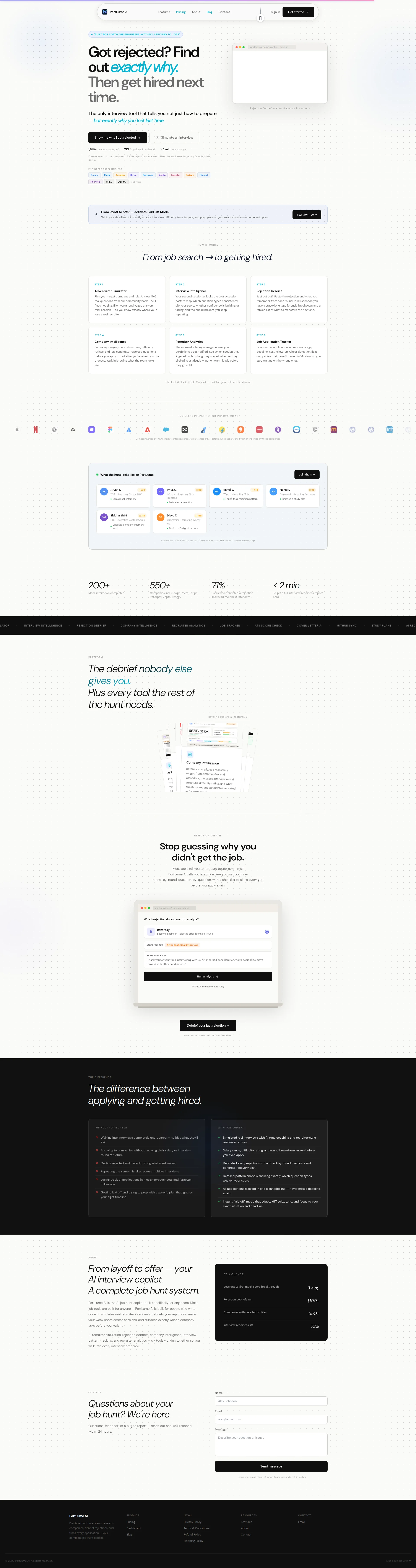
Right, listen up. PortLume AI has a genuinely BRILLIANT concept — telling rejected engineers exactly why they got binned instead of the usual 'just practice more' rubbish. The copy knows how to twist the knife and offer the bandage in the same sentence. But BLOODY HELL, a mobile LCP of 9.89 seconds?! That's not a landing page, that's a LOADING SCREEN. Nearly ten seconds! Your visitors will have swiped to LinkedIn, applied to three jobs, AND got rejected again before your hero even renders. You've got 10 testimonials with photos sitting there, logos from Stripe, Google, Meta, and Amazon lending credibility — that's a proper mise en place of trust signals. But then you drown it all in six feature sections of equal weight, turning what should be a sharp tasting menu into an all-you-can-eat buffet where nobody finishes their plate. Tighten the menu, fire up the performance oven, and let your Rejection Debrief be the signature dish — because right now, the best idea in job-hunting SaaS is being served on a plate that takes ten seconds to reach the table. Cold.
The Rejection Debrief Tool That Needs Its Own Rejection Debrief
Look, the core idea here is actually brilliant — instead of telling rejected engineers to 'prep harder,' PortLume AI tells them exactly WHY they got ghosted. That's a real pain point, and the copy knows it. The hero headline lands. The Rejection Debrief feature demo is clever. But then you scroll down and it's like the founder copy-pasted every feature they ever dreamed of into a single infinite-scroll nightmare. 57 images, 158 HTTP requests, and a mobile LCP of nearly 10 seconds — this thing loads slower than the HR email telling you you didn't get the job. The trust signals are doing the bare minimum (illustrative user cards, suspiciously round numbers), and the 'Made in India' positioning is fine but the Razorpay payment badge on a USD-priced product creates friction for the Western engineers you're clearly targeting. Fix the performance, tighten the feature presentation, and get some real testimonials with faces on them — then we're talking.
Hero Section
DECENT
Right, let's talk about this hero section. The headline — Got rejected? Find out exactly why. Then get hired next time. — is like a perfectly seared scallop. It opens the wound, pours salt in it, then hands you the antidote. That's PROPER PAS copywriting, that is. Engineers who just got a polite 'we've decided to move forward with other candidates' email will feel this one in their CHEST. The italic emphasis on exactly why is the chef's kiss — it screams specificity, which is your entire differentiator. Well done.
The subheadline — The only interview tool that tells you not just how to prepare — but exactly why you lost last time — doubles down beautifully. The word only is carrying that sentence like Atlas carrying the bloody world, and it WORKS because it's specific enough that engineers won't immediately call rubbish on it.
Now, Show me why I got rejected as a CTA? BRILLIANT. That's not a button, that's a MIRROR held up to every engineer's worst moment. It mirrors the exact thought rattling around their head at 2 AM after a rejection. I genuinely love it. Pairing it with Simulate an interview for the proactive crowd? Smart — you're catching fish swimming in both directions.
BUT HERE'S WHERE YOU LOSE ME. The stats strip. 1,100+ rejections analyzed — specific, credible, good. 71% improved after debrief — strong outcome metric, lovely. 200+ mock interviews completed — oh come ON. Is THAT your third flex?! Two hundred?! You've analyzed 1,100 rejections but only 200 people have done a mock interview? That's like a restaurant bragging about serving 1,100 dinners but only 200 people ordered dessert — it makes the whole operation look half-baked. Those two numbers sitting next to each other tell contradictory stories about your traction, and any sharp engineer will clock it immediately.
Also — you've got logos from Stripe, Google, Meta, and Amazon on this page, and you've got 10 testimonials with photos! WHY aren't those trust signals doing heavier lifting up here in the hero? That's like having wagyu beef in the walk-in and serving frozen nuggets at the pass. Get those brand logos near the hero. Let people see that this tool is used by people targeting REAL companies.
The hero product visual — that mockup showing a rejection debrief output — is conceptually right. Show the product doing the thing. But at this size and contrast, it reads like a blurry menu board from across the street. Nobody can actually READ what the debrief says, so it decorates rather than demonstrates. The BUILT FOR SOFTWARE ENGINEERS ACTIVELY APPLYING TO JOBS badge above the headline? Brilliant targeting signal, rendered so small it might as well be written in invisible ink. What a waste!
Overall: a hero that knows how to land a punch, undermined by one embarrassing stat and a product visual that whispers when it should SHOUT.
Exemples d'améliorations
200+ Mock interviews completed
1,100+ rejection debriefs run · 71% cleared their next interview
Lead with your STRONGEST number, not your weakest! '200+' is embarrassingly low and creates doubt right where you need confidence. Replace it with the outcome stat that actually proves the product works — keep the momentum consistent across all three metrics.
Points forts
- 'Show me why I got rejected' is an OUTSTANDING CTA — it mirrors the exact emotional state of a rejected engineer at 2 AM. That's not copywriting, that's mind-reading. Rare to see this level of empathy in a bloody button.
- The subheadline 'The only interview tool that tells you not just how to prepare — but exactly why you lost last time' nails the differentiation in one clean sentence — no waffle, no jargon, just a sharp knife through the noise
- The stats strip concept is right — volume (1,100+ rejections), outcome (71% improved), and speed (<2 min to first insight) give three credibility anchors that cover different trust angles
À améliorer
- '200+ mock interviews completed' sitting next to '1,100+ rejections analyzed' is like putting a Michelin star next to a health code violation — those numbers tell contradictory stories about your traction and any smart engineer will spot the gap instantly
- The hero product visual is too small and low-contrast to communicate what the debrief actually LOOKS like — if I can't read it, it's wallpaper, not a selling tool
- The 'BUILT FOR SOFTWARE ENGINEERS ACTIVELY APPLYING TO JOBS' label is positioned above the H1 but rendered so tiny it's functionally invisible — you've got a perfect audience-filtering signal and you've set it to 'mute'
Copywriting
DECENT
Alright, the copy on PortLume AI is like a kitchen that knows how to prep beautiful ingredients but then throws them ALL on the plate at once until you can't taste anything anymore. Let me break this down.
The GOOD stuff first, because credit where it's due. The WITHOUT PORTLUME AI / WITH PORTLUME AI comparison section? CHEF'S KISS. That is the single most effective piece of copy on this entire page. Getting rejected and never knowing what went wrong versus Debriefed every rejection with a round-by-round diagnosis — that's specific, parallel, and hits engineers right in their lived experience. If this section were a dish, I'd put it on the specials board.
Specificity is genuinely strong in places, and THAT is what separates this copy from the usual SaaS slop. 90 seconds. Stage-by-stage forensic breakdown. Flags hedging, filler words, and vague answers mid-session. Ghost detection flags companies that havent moved in 14+ days.' These are the details that make copy feel TESTED rather than aspirational. You can almost smell the product working. The company intelligence mock showing Design Stripes payment retry system' and Implement idempotency keys — that's proper product storytelling that engineers will respect.
Think of it like GitHub Copilot — but for your job applications — BANG. Perfect analogy. Every engineer in your target audience understood that in half a second. No explanation needed. That's efficient copy.
BUT HERE'S WHERE THE KITCHEN CATCHES FIRE.
You're trying to sell SIX different tools simultaneously and giving them all equal billing. The Rejection Debrief, the AI Recruiter Simulator, Company Intelligence, Recruiter Analytics, Job Application Tracker, Resume Checker — each gets its own section, its own pitch, its own moment in the spotlight. By the time a visitor has scrolled through all of them, they've forgotten what your CORE promise was. This isn't storytelling, this is a feature INVENTORY. It's like a restaurant with a 47-page menu — I don't trust ANY of the dishes because you clearly can't be great at all of them.
Your Rejection Debrief is your SIGNATURE DISH. It's what makes you different from every other interview prep tool. But it gets the same copy real estate as your Job Application Tracker, which is — let's be honest — a spreadsheet with a UI. That's like giving your wagyu steak the same menu space as your side salad. Madness!
Now, you've got 10 testimonials with photos on this page. TEN! That's actual social proof with faces! And you've got logos from Stripe, Google, Meta, and Amazon! SERIOUSLY?! Why isn't this copy DRIPPING with that credibility? Instead, you've got an illustrative user activity feed with a disclaimer that says Illustrative of the PortLume workflow — you're literally TELLING visitors your social proof is MADE UP. That's not an own goal, that's picking up the ball and throwing it into your own net while the crowd watches. You have REAL testimonials! USE THEM!
The Laid Off Mode callout is a genuinely smart emotional hook — laid-off engineers are your highest-urgency, highest-conversion segment. They're DESPERATE. They'll pay TODAY. But you've buried this feature in a thin banner that reads like an afterthought between sections. That's like having a CURE FOR HUNGER sign written in 6-point font on the back of your menu.
Grammar and spelling are clean throughout — at least the kitchen is sanitary. But at 1,678 words, you're serving a seven-course tasting menu when your visitors came in for a quick, decisive meal. Cut the feature sections by 30%, give the Rejection Debrief 30% MORE real estate, and swap every fake activity card for one of those 10 real testimonials you're inexplicably hiding.
Exemples d'améliorations
Illustrative of the PortLume workflow — your own dashboard tracks every step.
Remove the disclaimer and replace the illustrative cards with 2-3 of your actual testimonials (with photo, first name, previous company, and target company) — or remove the section entirely.
Telling visitors your social proof is FAKE is worse than having NO social proof at all. You have 10 real testimonials with photos! A single genuine quote ('I debriefed my Google rejection and finally understood I was losing at system design — Aryan K., ex-TCS') beats six illustrated fake activity cards every single time. Stop hiding your best ingredients in the pantry!
Points forts
- The 'WITHOUT / WITH PORTLUME AI' comparison section is the BEST piece of conversion copy on the entire page — specific, parallel, and maps directly to real engineer pain points like a surgeon's scalpel
- Feature descriptions use precise, concrete language ('flags hedging, filler words, and vague answers mid-session,' 'Ghost detection flags companies that haven't moved in 14+ days') that makes the product feel battle-tested, not hypothetical
- 'Think of it like GitHub Copilot — but for your job applications' is a perfect analogy for the target audience — instantly understood, zero cognitive load, and it borrows credibility from a tool engineers already love
À améliorer
- The page pitches six tools with equal weight and never commits to a primary hero feature — the Rejection Debrief is your sharpest differentiator but it gets the same copy real estate as a glorified job tracker spreadsheet
- The user activity feed is explicitly labeled 'Illustrative of the PortLume workflow' which TELLS visitors the social proof is fabricated — meanwhile you have 10 REAL testimonials with photos sitting elsewhere on the page. That's like serving plastic fruit when you have a bowl of fresh strawberries in the fridge!
- The 'Laid Off Mode' feature targets your highest-urgency, highest-conversion segment (desperate laid-off engineers who will pay TODAY) but it's buried in a thin banner instead of getting a dedicated section that converts them on the spot
Call-to-Action
DECENT
Contenu verrouillé
Preuve Sociale
CRITICAL
Contenu verrouillé
Architecture
DECENT
Contenu verrouillé
SEO & Meta
DECENT
Contenu verrouillé
Mobile
CRITICAL
Contenu verrouillé
Design Visuel & Branding
DECENT
Contenu verrouillé
Performance
CRITICAL
Contenu verrouillé
llmreadiness
DECENT
Contenu verrouillé