Le verdict
Right, listen up. PortLume AI — you've got a clean kitchen, decent ingredients, and you clearly know how to plate a dish. The value prop is sharp, the before/after section is genuinely brilliant, and the free tier messaging is doing real work. BUT — and this is a Gordon-sized BUT — your mobile page takes nearly NINE SECONDS to load. Nine! That's not a landing page, that's a loading screen for a loading screen. You're serving a soufflé that deflates before anyone gets to taste it. You've got 10 testimonials apparently hiding somewhere like shy waiters in the back — USE THEM! And that Gmail support address? Mate, you're asking developers to trust their career to a product that looks like it's run from someone's bedroom. The bones are excellent. The seasoning needs serious work. Fix that catastrophic mobile speed, parade those testimonials front and center, and stop hiding your best ingredients in the walk-in freezer.
The Portfolio That Gets You Hired... If Google Can Find It First
Look, PortLume AI is not a disaster — it's actually a pretty decent first attempt at a SaaS landing page. The value prop is clear, the before/after comparison section is genuinely smart, and the 'no credit card required' messaging is doing real work. But here's the thing: you're selling a product that helps developers look professional to recruiters, and your own site is running on a Gmail address, has zero real testimonials, and loads slower than a senior dev reviewing a junior's first PR. The bones are good. The execution has some serious 'pushed to production on a Friday' energy. Fix the mobile performance, get some real faces next to some real quotes, and sort out your currency identity crisis — then you've got something worth shouting about.
Hero Section
DECENT
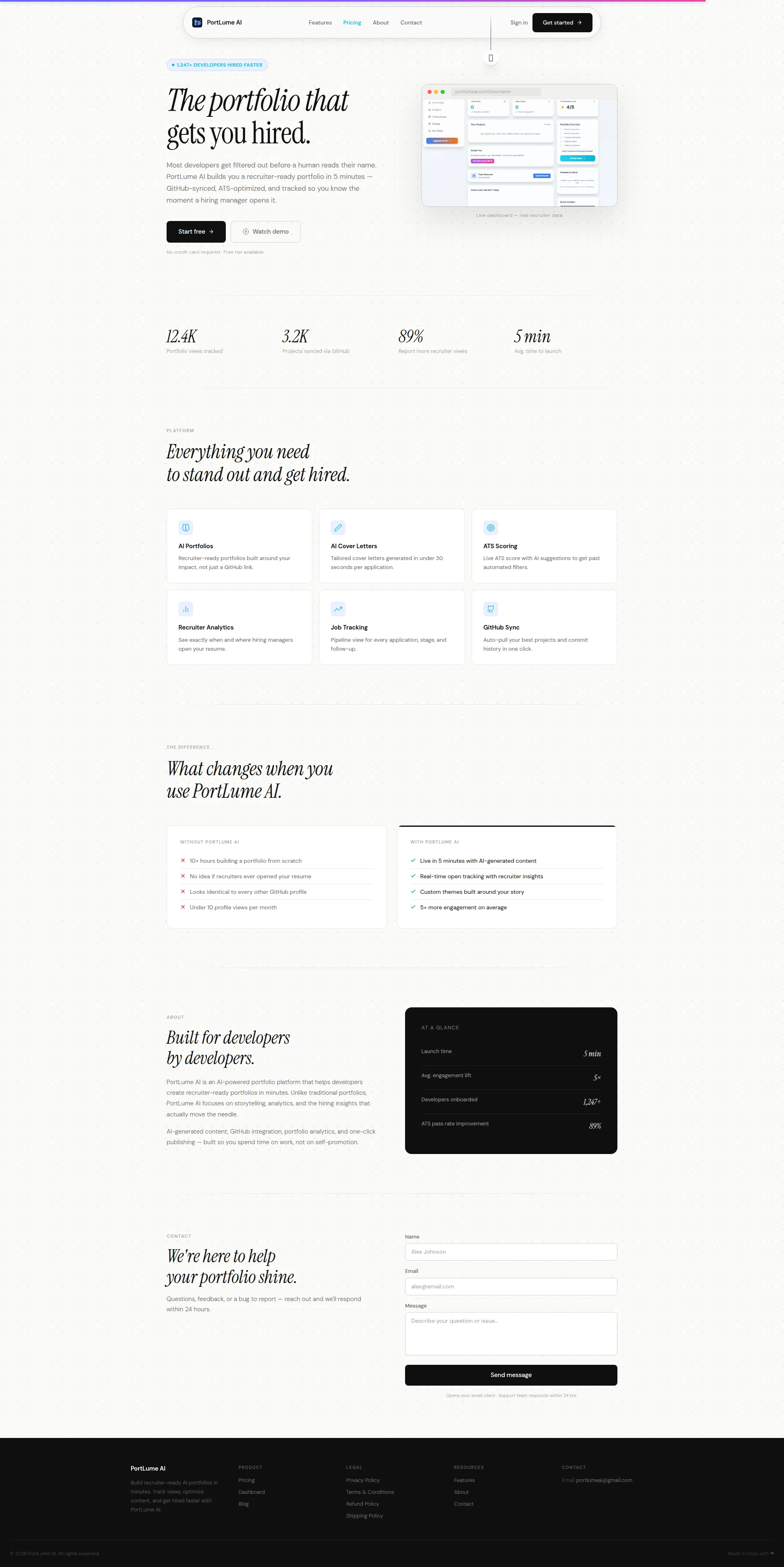
RIGHT THEN. Let's talk about this hero section. The portfolio that gets you hired — YES, CHEF! That lands faster than a Gordon Ramsay insult. A visitor knows exactly what you're selling in under three seconds, and in this attention-span-of-a-goldfish world, that's BRILLIANT. The subheadline is doing the heavy lifting of an entire sous chef team: recruiter-ready portfolio in 5 minutes — GitHub-synced, ATS-optimized, and tracked so you know the moment a hiring manager opens it. That's specific, that's juicy, that's a properly marinated value proposition. The 1,247+ DEVELOPERS HIRED FASTER badge above the headline? Smart placement — like putting the daily special on a chalkboard right at the entrance. Though 1,247+ hired faster — faster than WHAT exactly? Faster than a sloth building a WordPress site? Give me a benchmark or it's just garnish with no steak! Start free plus Watch demo as your dual CTA with No credit card required underneath — that's textbook, and I mean that as a COMPLIMENT. You've removed friction like a proper chef removes fish bones. Now where it all goes a bit soggy: that hero image. It's a dashboard screenshot that looks like it was assembled during a caffeine crash at 2am. You're selling developers on looking PROFESSIONAL and your hero visual has all the charisma of a microwaved ready meal. The italic serif headline font — look, it's gorgeous for a wine bar menu, but for a DEVELOPER TOOLS product? That's like serving fish and chips on a doily. Developers trust clean, sharp, sans-serif type. You're whispering poetry at people who want precision. And those stats below — 89% report more recruiter views — SELF-REPORTED?! That's like me saying 89% of my restaurants are amazing because I said so. Where's the methodology? Where's the source? You've got this stat sitting in a trust-critical position doing NOTHING to earn trust. The structure is solid, the message is clear, but you're leaving conversion points on the table like tips at a bad restaurant.
Exemples d'améliorations
The portfolio that gets you hired.
The portfolio that gets you hired — in 5 minutes, not 5 hours.
Folding the key differentiator (time) directly into the headline eliminates the need for the visitor to read the subheadline to understand the core value. Faster comprehension = higher conversion. You don't make diners read the fine print to know the special is good.
Points forts
- Value prop hits like a perfectly timed service bell — 'recruiter-ready portfolio in 5 minutes' is concrete, memorable, and makes you want to click immediately
- Dual CTA setup (Start free + Watch demo) with the 'No credit card required' friction-reducer underneath is EXACTLY how you run a proper SaaS kitchen — remove every excuse NOT to try
- Social proof badge '1,247+ DEVELOPERS HIRED FASTER' placed above the H1 grabs attention before the pitch even starts — that's appetizer-before-the-entrée strategy done right
À améliorer
- Hero visual is a limp dashboard mockup with zero emotional punch — it's the soggy bread of product screenshots, doing NOTHING to make a developer feel 'this was built for me'
- Italic serif headline font is serving wine-bar elegance to a developer audience that wants clean technical precision — it's a tonal mismatch that whispers 'I don't know my customers'
- '89% report more recruiter views' is an unverified, self-reported stat sitting in prime real estate with no source — that's serving raw chicken and hoping nobody notices
Copywriting
DECENT
BLOODY HELL, there's actually some TALENT in this kitchen! The copywriting on PortLume AI is genuinely above average for a solo-developer SaaS, and I don't say that lightly. That before/after comparison section — WITHOUT PORTLUME AI versus WITH PORTLUME AI — is the STAR DISH of this entire page. No idea if recruiters ever opened your resume and Looks identical to every other GitHub profile — those are REAL pain points that developers actually feel in their bones. That section alone is doing more conversion work than every feature card combined. It's like having one perfectly seared scallop surrounded by mediocre side dishes. Speaking of which — the features section. Recruiter-ready portfolios built around your impact, not just a GitHub link — that's GOOD, that's benefit-driven. But then you follow it with Pipeline view for every application, stage, and follow-up. Is THAT your best pitch?! That's describing the OVEN instead of the MEAL. Nobody cares about your pipeline view! Tell me I'll never miss a follow-up deadline again. Tell me I'll stop losing track of applications like socks in a dryer! The Built for developers by developers section is warm and human, but — oh for the love of — the hiring insights that actually move the needle?! MOVE THE NEEDLE? You were doing so well! That's the kind of corporate buzzword bingo that makes developers physically cringe. You might as well have said leverage synergies. And here's what REALLY gets me: you have 10 testimonials according to the data, and yet there's NO closing emotional punch anywhere on this page. No 'you've spent years building your skills, don't let a rubbish portfolio be the reason you don't get the call' moment. The page just... deflates into a contact form like a soufflé pulled out too early. You had all the ingredients for a Michelin-star closer and you served me a contact form. The specificity elsewhere is genuinely strong — 30 seconds per application, 5× more engagement, 5 min to launch — those numbers have TEETH. The tone is appropriately direct for developers, no corporate nonsense. But you're ending your tasting menu with a wet napkin instead of a showstopper dessert. WHERE ARE THOSE 10 TESTIMONIALS?! Get them on this page NOW!
Exemples d'améliorations
Pipeline view for every application, stage, and follow-up.
Never lose track of a job application again — every stage, every deadline, every follow-up in one place.
The original describes a feature like a spec sheet. The rewrite describes the RELIEF of using it. Developers applying to 30+ jobs simultaneously are drowning in tabs and spreadsheets — speak to the anxiety, not the UI element. Sell the sizzle, not the pan.
Points forts
- The 'WITHOUT / WITH PORTLUME AI' comparison section is the best dish on the menu — specific, pain-aware, and using real developer frustrations as conversion fuel like a chef who actually EATS at their own restaurant
- Specificity is genuinely strong where it counts: '30 seconds per application,' '5× more engagement,' '5 min to launch' — these are concrete numbers with teeth, not fluffy marketing air
- Tone is appropriately direct and non-corporate for developers — no 'synergize your workflow' rubbish, just straight talk that respects the reader's intelligence
À améliorer
- Features section describes the kitchen equipment instead of the meal — 'Pipeline view for every application, stage, and follow-up' tells me what buttons exist, not what anxiety disappears from my life
- 'The hiring insights that actually move the needle' is generic corporate garnish that CLASHES with the otherwise grounded developer tone — it's like dropping a frozen prawn into a fresh seafood platter
- No closing argument or emotional CTA before the footer — you've got 10 testimonials sitting in a cupboard somewhere and instead of a powerful conversion close, you serve a lonely contact form. Seriously?!
Call-to-Action
DECENT
Contenu verrouillé
Preuve Sociale
CRITICAL
Contenu verrouillé
Architecture
DECENT
Contenu verrouillé
SEO & Meta
DECENT
Contenu verrouillé
Mobile
CRITICAL
Contenu verrouillé
Design Visuel & Branding
DECENT
Contenu verrouillé
Performance
CRITICAL
Contenu verrouillé
llmreadiness
DECENT
Contenu verrouillé