Le verdict
Right, listen up. SHMINSITU has clearly done proper work underground — 1,000+ projects, Saudi Aramco on the client list, nuclear power plants, the whole lot. Brilliant. But this website? It's like a Michelin-starred chef serving their tasting menu on a paper plate in a car park. The hero section tells you NOTHING useful in under 3 seconds — just a founding year and a creepy eyeball logo. No H1, no meta description, no testimonials visible, and the homepage has 33 words. THIRTY-THREE! I've written longer complaints to my dry cleaner. Mobile performance is actually decent at 90/100, and the inner pages have genuinely solid technical content buried where nobody will ever bloody find it. The client list — Gazprom, Shell, Saudi Aramco, TotalEnergies — is world-class credibility sitting in the kitchen instead of being plated up front and center. Fix the fundamentals, drag that content out of hiding, and this site could punch well above its weight. Right now it's a diamond ring sitting at the bottom of a borehole.
SHMINSITU: The Geotechnical Genius That Forgot It Has a Website
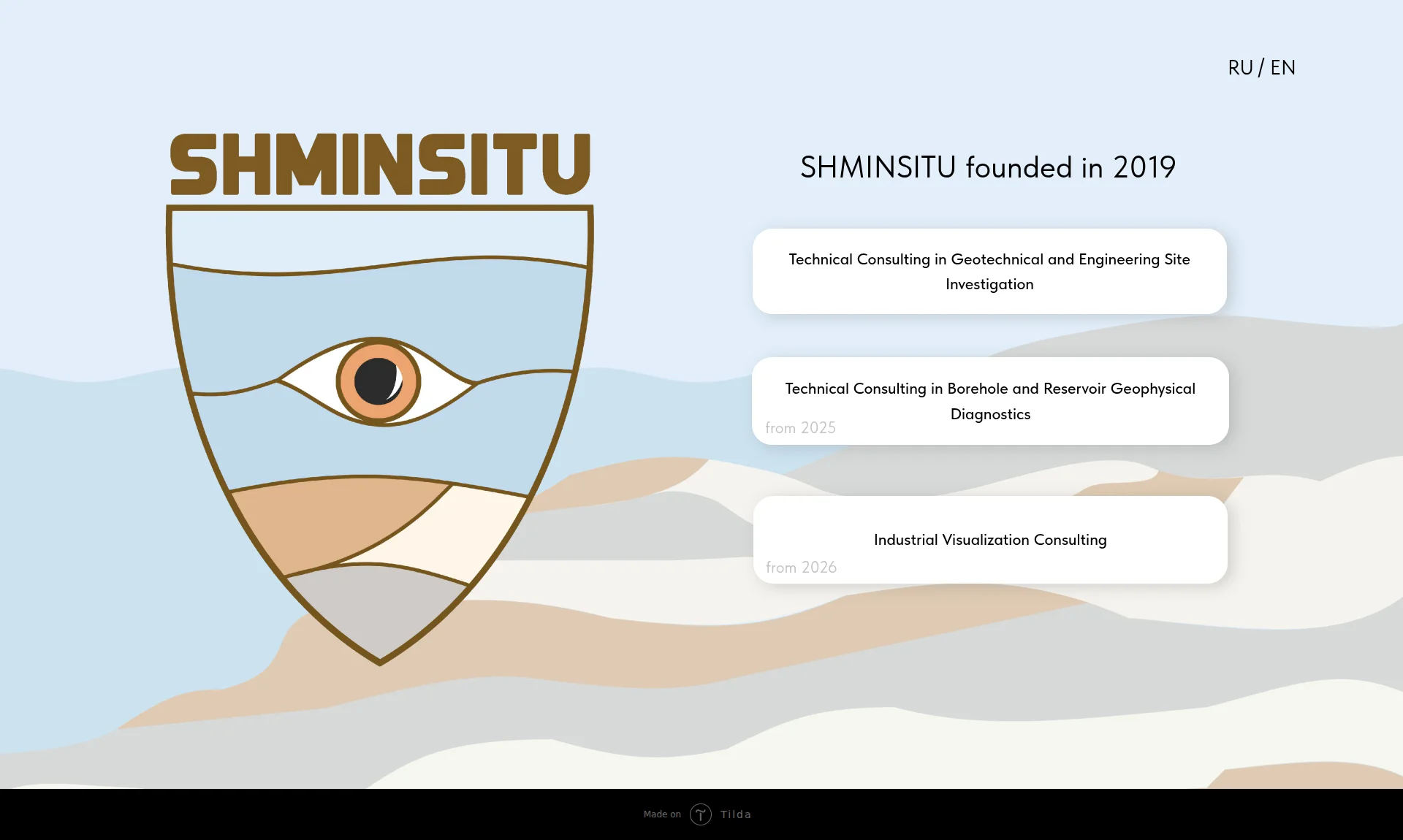
Look, SHMINSITU is clearly run by people who are genuinely excellent at sticking equipment into the ground and figuring out what's happening in boreholes. That's legitimately impressive. But this website is the digital equivalent of showing up to a client pitch in a lab coat covered in mud — the expertise is real, but nobody can see it because the presentation is a disaster. The homepage has 33 words and a shield logo with an eyeball on it. The hero section is essentially a company name, a founding year, and three service cards that say 'from 2025' and 'from 2026' like they're announcing future products at a trade show. There's no H1, no meta description, no testimonials, no contact form, no portfolio of actual projects, and the desktop PageSpeed score is literally 0/100. The good news: the underlying content on the inner pages is solid, the client list is legitimately impressive (Gazprom, Shell, Saudi Aramco, TotalEnergies), and the mobile performance is actually decent. Fix the fundamentals and this site could punch way above its weight class.
Hero Section
CRITICAL
BLOODY HELL, is THAT your hero section?! I've seen more information on a parking ticket! You land on this page and you get: a shield logo with a geological cross-section and a creepy eyeball staring at you like a Cyclops guarding absolutely nothing, the word SHMINSITU in brown letters, SHMINSITU founded in 2019 as the headline, and three service cards — two of which say from 2025 and from 2026. That's it. That's the ENTIRE hero. It's like opening a restaurant and putting nothing on the menu except We exist since 2019. Food coming soon.
Message clarity? A visitor landing here has ZERO idea what this company does in under 3 seconds. Founded in 2019 is not a value proposition — it's something you'd carve on a tombstone! The three service cards use dense technical jargon with zero context for why anyone should care. You've got 3 seconds to hook someone and you're spending them on a birthday announcement!
Unique value proposition? There ISN'T one! Not a single word explaining why SHMINSITU over any other geotechnical consultancy on the planet. You've worked with Saudi Aramco and Shell, you've done 1,000+ projects — and NONE of that is anywhere near the hero! That's like having Gordon Ramsay in your kitchen but putting Chef Available on the sign outside.
Main CTA? There IS no CTA above the fold! Nothing! No button, no contact us, no see our work — just three service cards that actively tell visitors from 2025 and from 2026, which screams WE DONT ACTUALLY DO THIS YET.' Brilliant way to lose a client in under 5 seconds.
Social proof above the fold? Zero. No client logos, no numbers, no testimonials. You've got 10 testimonials apparently sitting somewhere — USE THEM!
The shield logo with geological layers is conceptually interesting, I'll give you that — someone actually thought about the symbolism. And the muted blue and sandy palette is calm and professional. But a pretty plate doesn't matter when there's no food on it.
Exemples d'améliorations
SHMINSITU founded in 2019
Independent Technical Consulting for Geotechnical & Borehole Investigations — 1,000+ Projects Delivered Across 10+ Countries
The original headline tells visitors when the company was born. Congratulations, nobody cares. The revised version tells them what the company does, at what scale, and with what geographic reach — all information that actually exists on the inner pages but is buried like one of their boreholes. This is the difference between a gravestone inscription and a value proposition that actually makes someone pick up the phone.
Points forts
- The shield logo with geological cross-section layers is conceptually clever — the soil strata and the investigative eye actually reference the company's real work in site investigation, and someone clearly put thought into that symbolism
- The three service cards at least give visitors a navigation path into the site's deeper content, functioning as a basic wayfinding system even if they're poorly labeled
- The overall visual palette — muted light blues and sandy earth tones — creates a calm, professional atmosphere that's appropriate for a B2B technical consultancy selling to oil majors
À améliorer
- The headline 'SHMINSITU founded in 2019' communicates absolutely NOTHING about what the company does or why anyone should care — your founding year is the least persuasive hero headline imaginable, it's like introducing yourself at a party by announcing your birth year
- There is ZERO CTA above the fold — no button, no 'contact us,' no 'see our projects,' nothing that tells a visitor what to do next, so they just stare at an eyeball and leave
- The 'from 2025' and 'from 2026' labels on service cards actively signal that these services aren't available yet — on a hero section that's supposed to SELL, you're literally telling prospects to come back later
Copywriting
CRITICAL
Right, here's what's driving me absolutely MAD about SHMINSITU's copy. The inner pages? Actually decent! Genuinely solid technical content that would impress the engineers reading it. But the homepage — the page that 90% of visitors will judge this entire company by — has 33 words. THIRTY-THREE WORDS! My signature on a receipt has more persuasive content than your most important page!
It's like building a gorgeous five-course meal, locking it in the walk-in freezer, and handing customers who walk through the front door an empty plate with a note that says food exists somewhere in this building.
On the inner pages, the copy actually shows real expertise. The borehole diagnostics page lists specific methods — thermometry, flowmetry, resistivimetry, magnetic pulse defectoscopy — and explains what each achieves. That's the kind of technical depth that makes procurement managers at oil companies sit up and pay attention. The client list — Gazprom, Shell, Saudi Aramco, TotalEnergies, ConocoPhillips — is DROP-DEAD credible. The 1,000+ projects figure across multiple countries gives genuine scale. This is EXCELLENT raw material!
But the copy is almost entirely feature-led. We provide services in the field of... — NOBODY CARES what you provide! Tell me what PROBLEM you solve! Tell me what happens when geotechnical data goes wrong! Tell me about the project that nearly collapsed because someone else botched the investigation and YOU fixed it!
The tone is appropriate for the technical audience — these buyers know what water holdup logging means, so the jargon works. But sometimes it reads like an internal report that accidentally got published as a website.
And then there's this gem: SEE A SAMPLE PRESENTANTION. PRESENTANTION! On a site selling TECHNICAL PRECISION and QUALITY CONTROL, you've got a spelling error in a CTA button! That's like a surgeon with dirty fingernails — it doesn't matter how skilled you are, nobody wants to let you near them! Seriously?!
Exemples d'améliorations
We provide services in the field of geotechnical and engineering site investigation. Our objective is to assist clients in selecting the most appropriate approach from available options, ensure the application of state-of-the-art investigation methods, support data quality assessment, carry out investigation supervision, and prepare reports with design recommendations based on the available dataset.
Bad geotechnical data costs projects millions. We've reviewed 1,000+ investigations across nuclear plants, offshore fields, and infrastructure projects in 10+ countries — and we know exactly where the errors hide. We help you catch them before they reach the design table.
The original opens with what the company does — a feature dump that reads like a corporate brochure from 1997. The rewrite opens with the client's PAIN — bad data equals expensive mistakes — then uses the real credibility numbers to back it up, then delivers the benefit: catch errors early. Problem, Agitation, Solution. It's also half the word count, because good copy doesn't need to be verbose, it needs to be sharp.
Points forts
- The client list on the borehole diagnostics page — Saudi Aramco, Shell, TotalEnergies, Gazprom, ADNOC — is absolutely world-class credibility that should be tattooed across the homepage, not buried on an inner page where only the most patient visitors will ever find it
- The specific technical methodology breakdown — thermometry, flowmetry, resistivimetry, and the rest — demonstrates genuine deep expertise that will resonate with the technical decision-makers who actually sign these contracts
- The 1,000+ projects figure combined with the multi-country experience list (Kazakhstan, Lithuania, UAE, Hungary, Russia) provides concrete evidence of scale that clearly differentiates from smaller boutique consultancies
À améliorer
- The homepage has 33 words of actual content — a fortune cookie delivers more persuasive copy than SHMINSITU's most important page, and at least the fortune cookie gives you a call to action ('lucky numbers')
- Copy is almost entirely feature-led — 'we provide,' 'our competencies include' — with almost no client-outcome framing; nobody hires a consultant because of their competencies, they hire them because they're terrified of what happens WITHOUT them
- There's a typo in a CTA button: 'SEE A SAMPLE PRESENTANTION' — on a site selling technical precision and quality control to the world's most demanding engineering companies, a spelling error in a button is a self-inflicted wound that would make any procurement manager wince
Call-to-Action
CRITICAL
Contenu verrouillé
Preuve Sociale
CRITICAL
Contenu verrouillé
Architecture
CRITICAL
Contenu verrouillé
SEO & Meta
CRITICAL
Contenu verrouillé
Mobile
DECENT
Contenu verrouillé
Design Visuel & Branding
CRITICAL
Contenu verrouillé
Performance
NEEDS WORK
Contenu verrouillé
llmreadiness
CRITICAL
Contenu verrouillé