Le verdict
Right, listen up. sini.id is sitting on 775,000+ indexed Indonesian businesses — that's a BEAUTIFUL ingredient, the kind of thing most startups would KILL for. But what have you done with it? You've served it RAW. On a paper plate. In an empty dining room. The hero headline is genuinely clever — I'll give you that, it's a proper amuse-bouche. But then? NOTHING. The homepage has fewer words than a parking ticket. You've got 10 testimonials apparently hiding somewhere like shy waiters who won't come out of the kitchen. Your trust signals are weaker than watered-down stock. The LCP at 2.6s is in the average zone — not terrible, not winning any races either. You've built a Ferrari engine and mounted it on a bicycle frame. The product clearly works, the database is massive, the concept is sound — but this website is so afraid of selling itself that it practically whispers. Get some MEAT on these bones, put your best numbers front and center, and for the love of GOD, stop hiding your strengths in the footer like you're embarrassed by them!
sini.id: The Indonesian Google Maps That Forgot to Show Up to Its Own Party
Look, sini.id is sitting on a goldmine — 775,146 indexed Indonesian businesses, a slick map feature, and a genuinely useful service for a massive market. The problem? The homepage looks like someone built a Ferrari and then forgot to put seats in it. You get a search bar, five category chips, and a decorative background pattern that looks like it was designed by someone who really, really loves compass roses. There's no explanation of WHY you should use sini.id over Google Maps, no social proof beyond a live visitor counter, no testimonials on the homepage, no pricing, no About page — nothing that would convince a skeptical first-time visitor to stick around. The bones are good. The meat is missing. This is a product that clearly works but a website that refuses to sell it.
Hero Section
NEEDS WORK
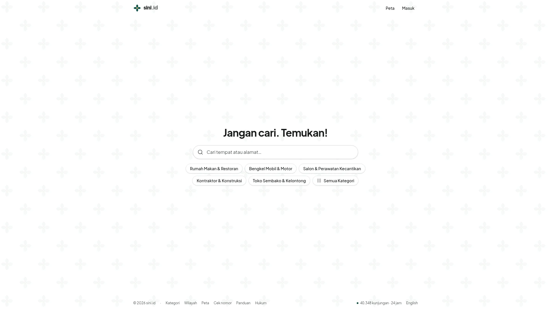
BLOODY HELL, is THAT your hero?! It's like walking into a restaurant and finding nothing but a menu stand in an empty room! Look — I'll be fair — the headline Jangan cari. Temukan! is a proper stroke of genius. Three words, instant differentiation, punchy as a right hook. That's the work of someone who actually THINKS about messaging. The search bar is dead center, immediately usable, no distractions — like a perfectly clean prep station. And the five category chips below? Smart move. They give lost visitors a starting point without overwhelming them. That's good kitchen organisation, that is.
But then the hero just DIES. It flatlines like a soufflé that's been slammed in the oven door. There's NO subheadline telling a cold visitor what sini.id actually IS. Is it a directory? A map? A phone number checker? It's ALL of those things, but you'd never know it because the hero is too shy to open its mouth! A first-time visitor has THREE SECONDS to figure out if they're in the right place, and you're making them play detective.
And the social proof situation? EMBARRASSING. You've got 40,348 kunjungan · 24 jam buried in the FOOTER like yesterday's leftovers shoved to the back of the fridge. You've got 775,146 perusahaan terindeks hiding on the map page — that's your BEST number and it's not even on the homepage! That's like winning a Michelin star and keeping the certificate in the toilet. You've apparently got 10 testimonials somewhere — WHERE ARE THEY?! Put them to work!
The background — those grey fleur-de-lis crosses tiling across the entire page on a white background — it's decorative wallpaper that does ZERO conversion work. It's not ugly, but it's like garnishing a plate with parsley nobody asked for. Clean typography, clear hierarchy with the bold black H1, but below the headline everything is the same visual weight. There's no visual path saying do THIS next. You've set the table but forgotten to bring out the food.
Exemples d'améliorations
Jangan cari. Temukan!
Jangan cari. Temukan! — 775.146 perusahaan Indonesia, satu tempat. Cari nama, alamat, nomor telepon, atau kategori usaha.
The headline is BRILLIANT — keep it, don't touch it. But add ONE supporting line underneath that tells visitors the SCALE and the USE CASE. Right now your hero is a punchline delivered to an empty room. Give people the context so the punchline actually LANDS.
Points forts
- Headline 'Jangan cari. Temukan!' is genuinely brilliant — communicates the core value proposition in 3 words like a perfectly reduced sauce
- Search bar is immediately visible and actionable above the fold with zero distractions — clean prep station energy
- Category chips (Rumah Makan, Bengkel, Salon, etc.) reduce friction for new users who don't know what to search — smart navigation shortcuts
À améliorer
- Zero subheadline or supporting text explaining what sini.id is — a cold visitor lands on this page and has to GUESS what the product does, like walking into a restaurant with no signage
- The massive '775,146 perusahaan terindeks' stat is hidden on the map page and completely absent from the homepage hero where it would actually build trust and communicate scale
- 10 testimonials exist somewhere but NONE appear in the hero or anywhere on the homepage — you've got satisfied diners and you're gagging them
Copywriting
CRITICAL
Right, let's talk about the copy. Or rather, let's talk about the GHOST of copy, because that's what we're dealing with here — an apparition, a rumour, a whisper in an empty kitchen. The entire homepage has FIFTY-ONE words of visible content. Fifty-one! I've sent back dishes with longer complaint notes! A fortune cookie has more persuasive writing than this homepage!
What little copy exists is functional, not persuasive. Cari tempat atau alamat... is placeholder text doing placeholder work. The category labels are navigation crumbs, not copywriting. The footer links are legal boilerplate. The ONLY thing approaching a value statement is the headline, and we've already covered that.
Here's what makes me want to THROW something: there is ZERO benefit-driven copy anywhere on this homepage. Not a SINGLE sentence explaining what a user GETS from using sini.id. You've got 775,000+ businesses indexed — not mentioned. You've got a gorgeous map feature — not mentioned. You've got Cek nomor (phone number lookup) which is a KILLER differentiator — not mentioned! That's like having truffle in the pantry and serving plain toast! And the passwordless login? Tidak ada kata sandi yang perlu diingat — that's genuinely user-friendly and trust-building, but it's BURIED in the login modal where nobody sees it until they've already committed!
You've got 10 testimonials apparently. TEN! And not a single one graces the homepage. That's like having 10 five-star reviews and keeping them in a locked drawer. Seriously?!
The tone is appropriately casual and Indonesian-market-friendly — fine. The grammar is clean — fine. But achieving no jargon is easy when you have almost NO WORDS. That's not minimalism, darling. That's a product that's too terrified to talk about itself. It's a chef who cooks a beautiful meal and then serves it with the lights off.
Exemples d'améliorations
Rumah Makan & Restoran Bengkel Mobil & Motor Salon & Perawatan Kecantikan Kontraktor & Konstruksi Toko Sembako & Kelontong Semua Kategori
Temukan bisnis di seluruh Indonesia — dari warung makan di gang kecil sampai kontraktor besar. 775.000+ perusahaan terindeks, lengkap dengan alamat, nomor telepon, dan peta. Rumah Makan & Restoran · Bengkel Mobil & Motor · Salon & Perawatan Kecantikan · Kontraktor & Konstruksi · Toko Sembako & Kelontong · Semua Kategori
Add a single paragraph of benefit copy ABOVE the category chips. This tells visitors the scale, the use case, and the key features (address, phone, map) before they even touch the search bar. Stop serving a blank plate and give people a reason to sit down at your table.
Points forts
- The headline is the one piece of actual copywriting and it's punchy and benefit-oriented — 'Find' vs 'Search' is a real distinction that shows someone on this team can actually WRITE
- Category page titles follow a clear, keyword-rich format ('Rumah Makan & Restoran di Indonesia — 891 perusahaan') that communicates scale effectively
- The login page copy is surprisingly transparent and trust-building: 'tidak ada kata sandi yang perlu diingat' and 'Kami hanya menyimpan alamat email' are genuinely reassuring — now put that energy on the HOMEPAGE
À améliorer
- 51 total words on the homepage is not minimalism — it's a website that forgot to write its own pitch, leaving visitors to guess what the product does like reading a menu in the dark
- Zero benefit-driven copy anywhere: the 'Cek nomor' phone number lookup feature is a genuine differentiator that gets zero homepage real estate or explanation — you're hiding your best dish
- 10 testimonials exist but are completely absent from homepage copy — you've got social proof sitting in storage while your empty homepage begs for credibility
Débloquer les 10 catégories restantes
Call-to-Action
CRITICAL
Contenu verrouillé
Preuve Sociale
CRITICAL
Contenu verrouillé
Architecture
CRITICAL
Contenu verrouillé
SEO & Meta
CRITICAL
Contenu verrouillé
Mobile
DECENT
Contenu verrouillé
Design Visuel & Branding
NEEDS WORK
Contenu verrouillé
Performance
DECENT
Contenu verrouillé
llmreadiness
CRITICAL
Contenu verrouillé
Contenu verrouillé
Accédez à la conclusion complète avec les 3 actions prioritaires et un message motivant personnalisé.