Le verdict
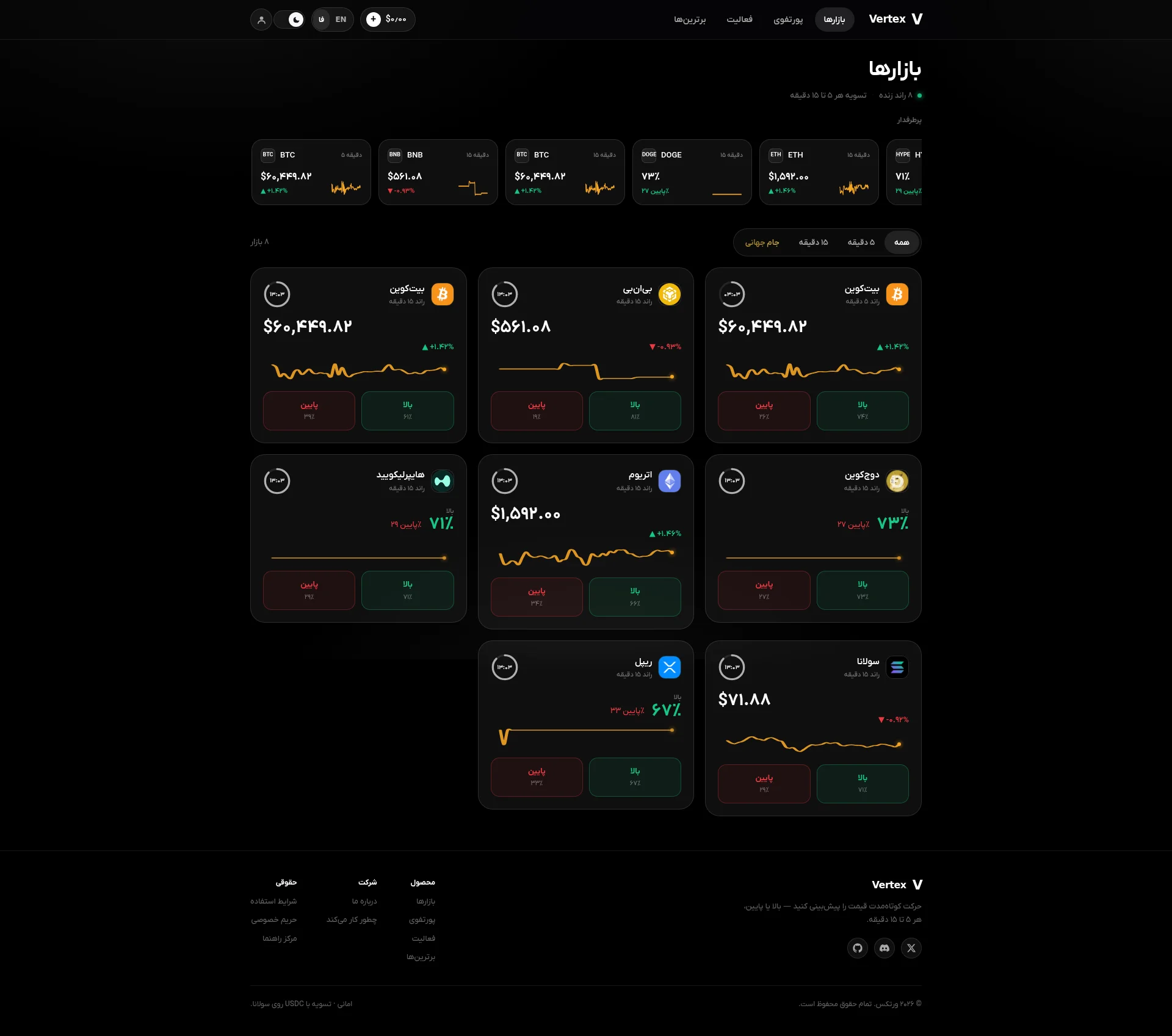
Right, listen up. Vertex walks into my kitchen with a sleek black apron and a sharp set of knives — dark-mode interface, live market data, clean card grid — and then proceeds to serve RAW CHICKEN. No hero section. No value proposition. No social proof. NOTHING. It's like opening a Michelin-star restaurant and forgetting to put a bloody sign on the door. The homepage dumps visitors straight into a trading dashboard with zero context — imagine sitting someone down at a table and throwing ingredients at them instead of a menu. Performance? LCP over 4.3 seconds on mobile — that's not slow, that's GEOLOGICAL. The copy reads like a legal document had a baby with a spreadsheet. Zero testimonials, zero user counts, the leaderboard literally says 'coming soon.' You've built what could be a genuinely interesting product — a USDC-settled prediction market on Solana — and then hidden every reason to care about it in the footer like leftover chips at the bottom of a takeaway bag. This isn't a landing page, it's an unfinished app with a URL. Get a proper front door on this restaurant before you lose every customer walking past.
Vertex: A Crypto Casino Dressed Up as a Trading Platform — With Zero Hype to Back It Up
Look, Vertex is not ugly. The dark interface with gold/amber chart lines and clean card grid actually looks like someone who knows what they're doing built it. But here's the problem: this is a crypto prediction market targeting real users with real USDC, and the homepage has the conversion strategy of a government DMV website. There's no hero. No value proposition above the fold. No 'here's why you should trust us with your money.' Just... markets. Raw, context-free markets. The leaderboard says 'coming soon.' The portfolio page says 'log in to see.' The activity page says 'log in to see.' Three out of five nav items are basically dead ends for a new visitor. The copy is technically accurate but emotionally flat — it reads like a legal disclosure document cosplaying as marketing. In 2026, when every DeFi platform is screaming for attention, Vertex whispers politely in Farsi and hopes someone notices. They won't.
Hero Section
CRITICAL
WHERE IS YOUR HERO SECTION?! Seriously, I've seen empty walk-in fridges with more to offer than this homepage! You open the door to what should be your restaurant's grand entrance and — NOTHING. No welcome, no menu, no maître d'. Just a kitchen pass with raw tickets flying everywhere. The H1 is literally بازارها — Markets. That's not a headline, that's a LABEL ON A FILING CABINET! You know what the most infuriating part is? You actually HAVE a brilliant tagline — Predict short-term price movement — up or down, every 5 to 15 minutes. It's clear, it's punchy, it's actually quite good. And where did you put it? THE FOOTER. The BLOODY FOOTER! That's like writing the best dish description in the world and taping it to the inside of the bin lid. Your unique selling point — a trustless, USDC-settled prediction market on Solana — is genuinely compelling. That's a dish I'd want to taste! But you've buried it on a secondary page that nobody will ever find because there's ZERO reason for a first-time visitor to go looking for it. No primary CTA above the fold. The only clickable thing is a microscopic '+' button next to $0.00 in the nav — oh lovely, shall I click the mystery button on a crypto platform I've never heard of? That inspires confidence, doesn't it? Social proof? ZERO. User counts? ZERO. Testimonials? ZERO. The leaderboard says coming soon — which is honest, I'll give you that, but honesty without substance is just a polite way of saying 'we've got nothing.' The live market data IS impressive — it proves the product works, the 8 live rounds indicator shows real activity, and the card grid is genuinely well-organized. But you're showing me the engine before you've even told me what the car does. This isn't a hero problem — this is a MISSING HOMEPAGE problem. You built a beautiful kitchen and forgot to build the dining room!
Exemples d'améliorations
بازارها (H1, homepage) — 'Markets'
پیشبینی قیمت ارز دیجیتال در ۵ دقیقه — روی سولانا، با تسویهٔ USDC / Predict Crypto Price Moves in 5 Minutes — Trustless, USDC-Settled on Solana [followed by 'Start Predicting' CTA]
The H1 needs to be a value proposition, not a category label. You wouldn't name your restaurant 'Food.' Tell visitors what this is, why it's different, and what to do next — all above the fold, in that order. That's the recipe.
Points forts
- Live market data is immediately visible — this proves the product is real, functional, and breathing. That's your mise en place, and it's solid
- The footer tagline 'Predict short-term price movement — up or down, every 5 to 15 minutes' is genuinely clear and punchy — it just needs to be at the TOP of the page, not buried in the basement
- The '8 live rounds' badge and 'settlement every 5 to 15 minutes' subtext show real specificity that builds credibility — concrete numbers always beat vague promises
À améliorer
- ZERO hero section — new visitors land on a raw dashboard with no context, no value proposition, and absolutely no reason to stay past three seconds
- No primary CTA above the fold — the only actionable element is a cryptic '+' deposit button that means nothing to an uninitiated visitor
- The only articulation of what Vertex IS and WHY it's different lives on a secondary /how-it-works page that first-time visitors have zero incentive to click
Copywriting
CRITICAL
Oh, BLOODY HELL. The copywriting on this site is like watching a brilliant chef describe his signature dish by reading out the nutritional information on the packaging. Technically accurate? Sure. Makes you want to eat it? NOT A CHANCE. The /how-it-works page — your most copy-heavy page at 322 words — reads like an onboarding manual written by an accountant who's never felt joy. Deposits are added to your in-app balance and recorded in a precise double-entry ledger. A DOUBLE-ENTRY LEDGER! Nobody — and I mean NOBODY — has ever woken up at 3am thinking God, I really fancy a double-entry ledger right now. That's not a selling point, that's an audit report! The homepage itself? 235 words, most of which are navigation labels and price tickers. Actual persuasive copy? Maybe 30 words total. That's not a landing page, that's a POST-IT NOTE with numbers on it. Here's what drives me mad — you actually have some genuinely good ingredients scattered around. Every winning contract pays $1. 5-15 minute windows. 8 live rounds. These are SPECIFIC, CONCRETE, and CREDIBLE. But they're sprinkled across the UI like garnish on an empty plate — no main course underneath! The jargon wall is brutal — TOTP, SPL, USDC, KYC, trustless, on-chain — all thrown at visitors without a single word of explanation. For a Persian-language platform presumably targeting Iranian crypto enthusiasts, you're assuming every visitor has a PhD in decentralized finance. You're excluding half your potential audience before they've even sat down! There's zero emotional hook anywhere. No imagine calling BTCs next move and cashing out in 5 minutes' moment. No urgency. No aspiration. No PAS framework. No AIDA structure. Just... features. Dry, lifeless features stacked on top of each other like cardboard boxes in a warehouse. And that footer tagline? STILL the best copy on the entire site. Still at the bottom. Still where nobody reads. It's like hiding your best dish in the staff canteen!
Exemples d'améliorations
واریزها به موجودی درونبرنامهای شما اضافه و در یک دفترکل دوطرفهٔ دقیق ثبت میشوند و آمادهٔ پشتیبانی از یک موقعیتاند
موجودی شما بلافاصله آماده است — هر واریز USDC در ثانیه تأیید میشود و میتوانید همان لحظه شرطبندی کنید / Your balance is ready instantly — every USDC deposit confirms in seconds so you can start predicting immediately
The original sentence explains the technical plumbing — a double-entry ledger. Nobody orders a steak because they love the oven it was cooked in. The rewrite translates the mechanism into a user benefit: speed and readiness to act. Benefits sell. Ledgers don't. EVER.
Points forts
- Concrete specifics like 'every winning contract pays $1' and '5-15 minute settlement windows' give the product real clarity and credibility — these are the kind of details that make people lean in
- The /how-it-works page follows a logical 6-step flow that, while dry as overcooked toast, does explain the full user journey from signup to withdrawal
- Honest disclosure copy like 'no fake traders shown' and 'US and South Korea are blocked' builds genuine credibility — transparency in crypto is rare and valuable
À améliorer
- Zero benefits-oriented copy across the entire site — every sentence describes what the product DOES, never what the user GAINS or FEELS. Features without benefits are ingredients without a recipe
- Heavy DeFi jargon (TOTP, SPL, trustless, double-entry ledger) used without any explanation whatsoever, creating an impenetrable wall for less experienced crypto users
- No persuasive structure ANYWHERE — no problem/agitation/solution arc, no emotional hook, no urgency trigger across any page. It's a menu with no descriptions, just item numbers
Call-to-Action
CRITICAL
Contenu verrouillé
Preuve Sociale
CRITICAL
Contenu verrouillé
Architecture
CRITICAL
Contenu verrouillé
SEO & Meta
CRITICAL
Contenu verrouillé
Mobile
NEEDS WORK
Contenu verrouillé
Design Visuel & Branding
DECENT
Contenu verrouillé
Performance
CRITICAL
Contenu verrouillé
llmreadiness
CRITICAL
Contenu verrouillé