Le verdict
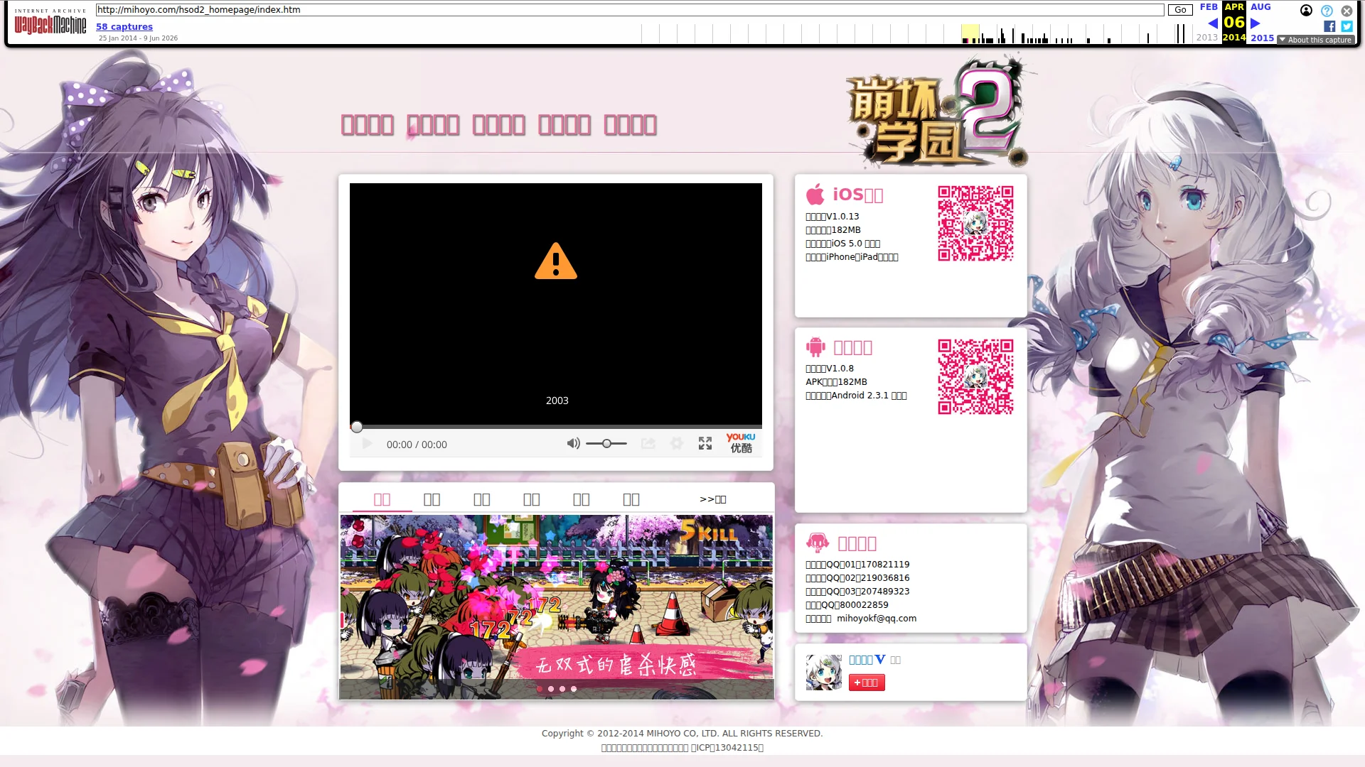
Right, listen up. I just opened a 2014 Wayback Machine snapshot of miHoYo's game page and my eyes are BLEEDING. The hero section? A BROKEN VIDEO PLAYER with a giant orange warning triangle as your first impression — that's like inviting guests to your restaurant and serving them an empty plate with a Post-it note saying 'kitchen's closed.' Two gorgeous anime girls are flanking the page like bouncers at a club nobody can get into, and there's not a SINGLE headline telling anyone what this game actually IS. The copy? Forty-six words on the homepage — I've seen more text on a fortune cookie! All the genuinely brilliant, personality-packed writing is buried in sub-pages where nobody will ever find it. The download buttons exist but read like a software manual, the trust signals are basically non-existent — no player counts, no ratings, just QQ group numbers — and the SEO is so catastrophic there's no H1, no meta description, NOTHING. Performance? 14.1MB page weight, 132 HTTP requests, and an FID of 889ms — this page loads slower than a hungover line cook on a Monday morning. LCP at 1.31s is actually decent, I'll give it that, but everything else is a trainwreck. The anime art is legitimately stunning and the brand identity is clear, but stunning art without conversion strategy is just an expensive screensaver. This is the digital equivalent of a Michelin-starred chef cooking in a dumpster.
miHoYo 2014: A Time Capsule of Chaos Wrapped in Anime Girls
Look, let's be real — this is a Wayback Machine snapshot of a 2014 Chinese mobile game promotional site, and judging it by 2026 standards is like roasting a flip phone for not having Face ID. BUT. The job is the job. What we have here is miHoYo — yes, THAT miHoYo, the future billionaire Genshin Impact overlords — running a homepage that features: a broken video player with a giant warning triangle, two anime girls as the entire visual strategy, zero English copy for a game with English character names, no H1 tag anywhere on the entire site, a missing meta description, and download buttons pointing to a game most visitors have never heard of. The page has genuine personality and the anime art is legitimately high quality, but personality without conversion architecture is just expensive wallpaper. The bones of a good game marketing page are here — app store badges, QR codes, gameplay screenshots, community links — but they're assembled like someone threw them at the wall and called it a layout.
Hero Section
CRITICAL
BLOODY HELL, is THAT your hero section?! Let me paint you a picture: imagine walking into a five-star restaurant and the first thing you see is a BROKEN TELEVISION mounted on the wall showing nothing but a black screen with a hazard symbol. That's EXACTLY what this hero does. A dead Youku video player with an orange warning triangle IS your first impression. Your OPENING DISH is literally an error message. I want to throw my laptop into the Thames.
Now look — the two anime character illustrations flanking the page? They're genuinely GORGEOUS. Professional-grade, beautifully detailed, consistent style — these are the work of artists who know their craft, and I respect that. The art alone tells me this team has TASTE. But taste without strategy is like having the world's best ingredients and then serving them RAW on a dirty napkin. These stunning illustrations communicate NOTHING about what this product actually is. Is it a game? An anime? A body pillow catalogue? A new visitor has ZERO clue!
There's no headline. No H1. No tagline. No value proposition. NOTHING. The game logo sits in the upper right corner looking lovely, sure, but a logo isn't a message — it's a name tag at a party where nobody knows you. Where's the hook? Where's the THIS is why you should care? Where's the Download now and join X million players?
The download buttons for iOS and Android ARE technically above the fold in the sidebar — I'll give credit where it's due, at least someone had the sense to put the conversion action where eyeballs can find it. And the QR codes are a smart touch for the Chinese mobile market. But they're sitting in a quiet little sidebar while two massive anime girls SCREAM for all the visual attention. It's like putting your specials board behind the toilet door while a clown dances in the dining room.
Zero social proof in the hero. No player counts, no ratings, no awards, no featured on badges. For a mobile game in 2014 competing against thousands of others — that's not just a missed opportunity, that's NEGLIGENCE.
Exemples d'améliorations
[No headline exists — the hero contains only the game logo image and two character illustrations with no text value proposition]
崩坏学园2 — The ACG Action Game You've Been Waiting For. 100+ levels, professional voice acting, hundreds of weapons and costumes. Download free now for iOS & Android.
A hero without a headline is a restaurant without a sign on the door. You need to tell visitors WHAT it is, WHY it matters, and WHAT to do next — all in under 5 seconds. Right now you're expecting people to already be in love with you before they've even tasted the food.
Points forts
- The anime character illustrations are genuinely stunning — professionally executed, beautifully detailed, and perfectly calibrated for the ACG audience. This is the ONE ingredient in the kitchen that's actually world-class
- The game logo (崩坏学园2) is prominently placed with strong visual weight and clear branding — you KNOW whose restaurant you've walked into, even if the menu is missing
- iOS and Android download options with QR codes are present above the fold in the sidebar — at least the conversion action EXISTS and doesn't require scrolling to find
À améliorer
- The main video player is BROKEN — a black screen with an orange warning triangle is literally your first impression. That's like serving your signature dish and the plate is EMPTY with a 'sorry, kitchen error' card on it
- There is NO headline, NO tagline, NO value proposition, NO explanatory text anywhere in the hero — a first-time visitor has absolutely ZERO context for what this product is or why they should give it a single second of their time
- Zero social proof anywhere near the hero — no download counts, no star ratings, no player testimonials, no 'featured on App Store' badge — for a product that lives and dies by social validation, this is like opening a restaurant with no reviews and wondering why nobody walks in
Copywriting
CRITICAL
Forty-six words. FORTY-SIX WORDS on the homepage. I've written longer COMPLAINTS to my dry cleaner! That's not a landing page, that's a POST-IT NOTE with anime girls stapled to it. You've got a homepage that reads like a software release log — version numbers, file sizes, OS requirements — and you expect people to get EXCITED about downloading your game?! Version V1.0.13, 182MB, requires iOS 5.0. Wow, be still my beating heart! That's the culinary equivalent of listing the oven temperature and cooking time instead of describing the dish!
But here's what KILLS me — and I mean genuinely makes me want to weep into my apron — the GOOD copy exists! It's RIGHT THERE on the sub-pages! The game description with its self-deprecating fat otaku tech gentlemen line? BRILLIANT. That's the kind of authentic, personality-drenched voice that builds cult followings. The lore about the 0.000000001% survival probability? That's a HOOK that makes you want to know more. The irreverent, nerdy tone that says 'we're one of you'? CHEF'S KISS.
But you've BURIED it all behind navigation clicks that 90% of visitors will never make! It's like hiding your best dish in the back kitchen and only serving breadsticks in the dining room. You've got a Wagyu steak in the walk-in freezer while your customers are staring at a menu that says Food. 182 grams. Requires plate.
The homepage copy is ALL features, ZERO benefits. Hundreds of levels, hundreds of equipment, hundreds of costumes — those are ingredients, not a meal description. Tell me what it FEELS like to play. Tell me why I'll stay up until 3 AM. Tell me why my friends are already addicted. SELL ME THE SIZZLE, not the serial number!
The tone mismatch is criminal too — the sub-page copy is witty, warm, and perfectly pitched for the audience. The homepage copy sounds like it was written by the IT department. These two voices shouldn't be on the same PLANET, let alone the same website.
Exemples d'améliorations
版本号:V1.0.13 / 文件大小:182MB / 适用固件:iOS 5.0 及以上 / 专门针对iPhone和iPad优化设计
Free to download. Optimized for iPhone & iPad. Join millions of players in the most stylish ACG action game on mobile — 100+ levels, pro voice acting, and enough costumes to make your waifu jealous. iOS 5.0+ | 182MB
Lead with the SIZZLE — the benefit, the emotion, the hook — THEN follow with the technical specs for the detail-oriented folks. The current version reads like a server log, not a game advertisement. You're describing the plate instead of the food!
Points forts
- The sub-page game description has GENUINE personality and voice — the self-deprecating humor and insider ACG references are perfectly calibrated for the target audience. That's the kind of authentic copy that turns casual visitors into lifelong fans. Whoever wrote that deserves a raise
- The lore section delivers rich, detailed world-building with specific narrative hooks — the 0.000000001% survival probability, the Black Death reframed as a 'Collapse' event — these are the kind of details that make gamers lean forward in their chairs
- Technical specifications (iOS 5.0+, Android 2.3.1+, 182MB file sizes) are clearly and cleanly listed, removing download friction for users checking compatibility — at least the boring stuff is done RIGHT
À améliorer
- The homepage has only ~46 words of actual copy, NONE of which explain what the game is, why it's worth downloading, or what makes it different from the 500 other mobile games launching the same week — that's not minimalism, that's ABANDONMENT
- All the brilliant personality-packed copy — the humor, the world-building, the game mechanics — is buried in sub-pages behind navigation clicks, completely invisible to the vast majority of visitors who will bounce long before they ever find it
- The copy is entirely feature-based with zero benefit framing — version numbers and file sizes instead of emotional hooks. There's no 'this is what it FEELS like to play,' no urgency, no social proof numbers, no reason to download TODAY instead of never
Call-to-Action
CRITICAL
Contenu verrouillé
Preuve Sociale
CRITICAL
Contenu verrouillé
Architecture
CRITICAL
Contenu verrouillé
SEO & Meta
CRITICAL
Contenu verrouillé
Mobile
CRITICAL
Contenu verrouillé
Design Visuel & Branding
CRITICAL
Contenu verrouillé
Performance
CRITICAL
Contenu verrouillé
llmreadiness
CRITICAL
Contenu verrouillé