Le verdict
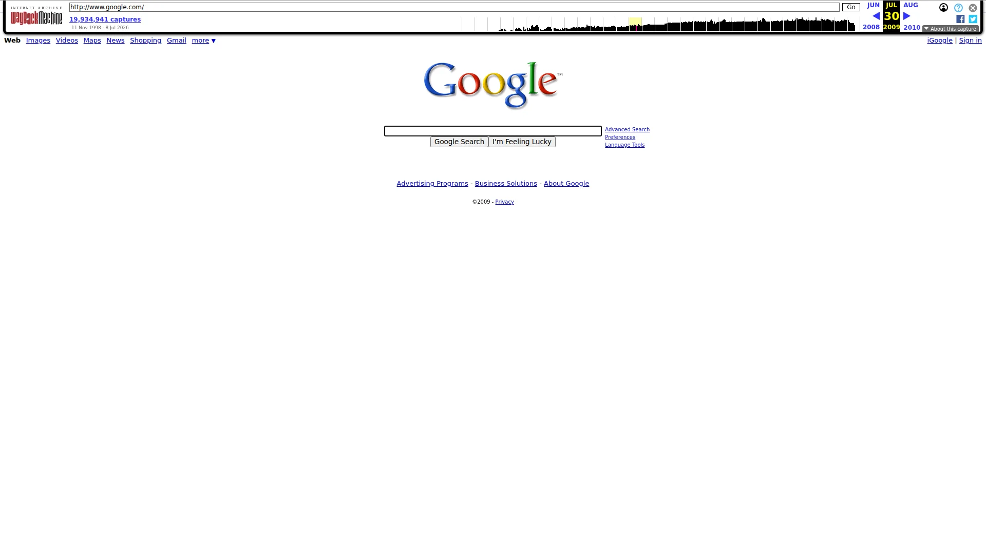
Right, let me get this straight. Someone's sent me a SEVENTEEN-YEAR-OLD snapshot of Google's homepage and wants me to give it a proper roasting. This is like pulling a frozen fish finger out of 2009 and asking me to plate it at a Michelin dinner. The page has ONE job — a search box — and it does that job with the arrogance of a chef who serves a single boiled egg on a white plate and charges you £200 for the experience. No headline, no value proposition, no persuasion whatsoever. Just a logo, a box, and blind faith that you already know what Google is. The mobile LCP clocks in at over 4 seconds, which is POOR by Google's OWN standards — the irony is so thick you could spread it on toast. There's a Google logo as the sole trust signal, no testimonials visible despite data suggesting some exist somewhere, and the copy totals 29 words. Twenty-nine! I've written longer complaints to room service. By every modern conversion metric, this page is raw chicken served on a paper plate. But the maddening truth? It still works. Sometimes the simplest dish is the one that sells.
Google 2009: The Fossil That Still Somehow Runs the Internet
Listen. You sent me a screenshot of Google from 2009. GOOGLE. From 2009. This is like asking Gordon Ramsay to review a school cafeteria chicken nugget from the Bush administration. The page has 29 words, one image, and the design ambition of a Post-it note. And yet — and this is the infuriating part — it still works. It's the digital equivalent of a guy showing up to a black-tie gala in a plain white t-shirt and somehow being the coolest person in the room. By every modern conversion optimization standard, this page is a dumpster fire. By the standard of 'does it do what it says on the tin,' it's flawless. Let's roast it anyway, because that's what we're here for.
Hero Section
CRITICAL
BLOODY HELL, is THAT your hero section?! A logo and a box?! That's not a hero — that's a HOSTAGE SITUATION where someone stripped out every piece of useful content and left you staring at a white wall!
Look, I've seen empty plates in my kitchens that had more storytelling than this. There's no headline. No value proposition. No find anything on the internet in 0.3 seconds. No 'we've indexed 8 billion pages so you don't have to.' NOTHING. Just a multicolored logo sitting on a sea of white like a lonely garnish on an otherwise empty plate. If you were an alien landing on Earth and this was your first web page, you'd think it was broken.
The visual hierarchy? There IS no visual hierarchy! It's logo at the top, box in the middle, buttons below — it works the same way gravity works. Things fall down. That's not design, that's physics. The typography is flatter than a pancake that's been sat on — everything's roughly the same size, same weight, no drama, no storytelling, no emotional pull whatsoever.
And then there's 'I'm Feeling Lucky.' Now THAT — that one button — is the only thing on this page with a PULSE. It's cheeky, it's bold, it's the one line of personality in a sea of clinical nothingness. That button is carrying this entire page's brand voice on its shoulders like a sous chef doing the work of ten people.
But here's what I'll give it — and I'm gritting my teeth saying this — the restraint is genuinely brilliant. There is NOTHING between you and that search box. No pop-ups, no cookie banners, no newsletter begging. Just the box. It's like walking into a restaurant where there's one item on the menu and it's perfect. The friction is zero. The clarity of purpose is absolute. But mate, you can't just serve bread and call it a tasting menu!
Exemples d'améliorations
(Empty space above the search box — no headline, no tagline, no value proposition)
Search the entire internet in under a second. Over 8 billion pages indexed. Just type.
Adding a single benefit-driven headline above the search box would give first-time users context and reinforce why they should use this over any alternative, without adding visual clutter — like adding a proper sauce to a perfectly cooked piece of protein
Points forts
- Zero friction — that search box sits front and center like the only dish on the pass, and NOTHING competes with it. Not a single distraction. That's restraint that most modern pages would kill for
- Extreme simplicity means even your grandmother who's never touched a computer could figure out what to do in half a second flat
- 'I'm Feeling Lucky' is a stroke of copywriting genius — one button with more personality than most entire websites, and no competitor has ever had the guts to copy it
À améliorer
- No value proposition, no headline, no tagline — a first-time visitor gets ZERO explanation of what this product does. You're relying entirely on brand recognition, which is cheating like bringing a pre-cooked dish to a cooking competition
- No social proof anywhere in the hero — no user count, no 'trusted by billions,' nothing. The Google logo is present as a trust signal, but it's doing ALL the heavy lifting alone
- Typography hierarchy is essentially nonexistent — logo, nav links, search box, and buttons all sit at roughly the same visual weight. There's no storytelling arc, no visual journey, just... flatness
Copywriting
CRITICAL
Twenty-nine words. TWENTY-NINE WORDS! I've had LONGER ARGUMENTS with waiters about the temperature of butter! This page has fewer words than a fortune cookie and somehow it's the most visited website on the planet. It's like serving an empty plate and winning Chef of the Year — infuriating and impressive in equal measure.
Let me inventory this culinary catastrophe for you: navigation links (Web, Images, Videos, Maps, News, Shopping, Gmail), two button labels, three utility links, three footer links, a copyright notice, and a privacy link. That's the ENTIRE menu. There are no specials. There is no wine list. There is no dessert.
From a persuasion standpoint? There IS no persuasion! No benefits. No features. No heres why you should use us instead of Yahoo.' No numbers, no claims, no proof of any kind. The tone is impossible to evaluate because there IS no tone — this page has the personality of a freshly wiped whiteboard. Where are the testimonials? The source data says there are 10 of them somewhere, but they're certainly not HERE. They're hiding in the back like a line cook who burned the risotto!
There's no AIDA framework. No PAS structure. No persuasive journey of any kind. You land, you see a box, you type or you leave. The entire copywriting strategy is our brand is so massive we dont need to explain ourselves,' which — fair play — has worked spectacularly, but it's NOT a replicable strategy for literally anyone else on Earth.
The ONLY piece of copy with any soul, any warmth, any LIFE is 'I'm Feeling Lucky.' That one button label is doing the emotional labor of an entire content team. Give that button a promotion and a corner office, because it's the only employee on this page who showed up to work!
Exemples d'améliorations
Google Search I'm Feeling Lucky
Google Search — Find anything on the web instantly I'm Feeling Lucky
Even a minimal benefit phrase next to the primary CTA communicates what the product actually does — because not everyone in the world already knows, and even those who do deserve a reminder of why this box is worth their time
Points forts
- Zero jargon — every single word is immediately understandable by anyone who can read. When your entire page is 29 words, clarity isn't a strategy, it's a mathematical inevitability
- 'I'm Feeling Lucky' is a masterclass in microcopy — three words that inject more personality, warmth, and brand character than most companies achieve in 3,000 words of 'About Us' drivel
- Grammar and spelling are flawless, which — when you've only got 29 words — is the BARE MINIMUM, like not burning toast. Congratulations, you didn't burn the toast
À améliorer
- 29 words is not a copywriting strategy, it's a VOID. No value proposition, no benefit statement, no persuasive content anywhere — this page communicates less than a 'Wet Floor' sign
- Zero specificity — no numbers, no claims, no proof points. The source data mentions 10 testimonials and a recognized brand logo, yet NONE of that social proof makes it onto the actual page. It's like having a Michelin star and not putting it on the door!
- No persuasive structure of any kind — no attempt to guide, convince, or even gently nudge a visitor toward understanding what this product does or why it matters
Call-to-Action
NEEDS WORK
Contenu verrouillé
Preuve Sociale
CRITICAL
Contenu verrouillé
Architecture
CRITICAL
Contenu verrouillé
SEO & Meta
CRITICAL
Contenu verrouillé
Mobile
CRITICAL
Contenu verrouillé
Design Visuel & Branding
CRITICAL
Contenu verrouillé
Performance
NEEDS WORK
Contenu verrouillé
llmreadiness
CRITICAL
Contenu verrouillé