Le verdict
Right, listen up. FreeCustom.Email has a genuinely GOOD product hiding behind a hero section that greets visitors like a bouncer at a nightclub — arms crossed, no explanation, figure it out yourself. The value proposition is brilliant when you finally find it, buried below the fold like a Michelin-star dish served under a cloche that nobody bothers to lift. Performance? The kitchen's on FIRE — and I mean that in the worst way. A 2,401-second LCP is not a slow page, it's a page that's gone on HOLIDAY. That's not loading, that's geological time. Your mobile score might look pretty on paper but the actual load time is a catastrophe. Trust signals are decent — 10 testimonials, real logos including Facebook, solid social proof numbers — but your structured data is broken and your H1 says 'Cookie preferences' across every page, which is the SEO equivalent of putting 'CLOSED' on your front door while you're open for business. The copy is genuinely sharp when it appears, the three-tier pricing is crystal clear, and the blog content shows real expertise. But you're serving a raw product demo as your first course when visitors need a bloody MENU first. Fix the hero, fix that apocalyptic load time, fix the H1, and this goes from 'confusing tech demo' to a proper conversion machine.
The Inbox That Forgot to Introduce Itself
Look, the product is real, the free tier is generous, and the copy actually talks about benefits rather than just listing features — which already puts FreeCustom.Email ahead of 80% of SaaS landing pages. But here's the problem: the first thing a new visitor sees is a raw SMTP conversation and a live inbox interface, with zero explanation of what they're even looking at. It's like walking into a restaurant where the chef throws raw ingredients at you instead of a menu. The social proof numbers are solid (1.9M+ emails, 50K users, 4.9/5 stars), the pricing is transparent and friction-low, and the blog content is genuinely useful. But the broken H1, missing structured data, and a hero section that assumes you already know what temp mail is are leaving real conversions on the table. Fix the fundamentals and this site goes from 'confusing but functional' to 'actually converts.'
Hero Section
DECENT
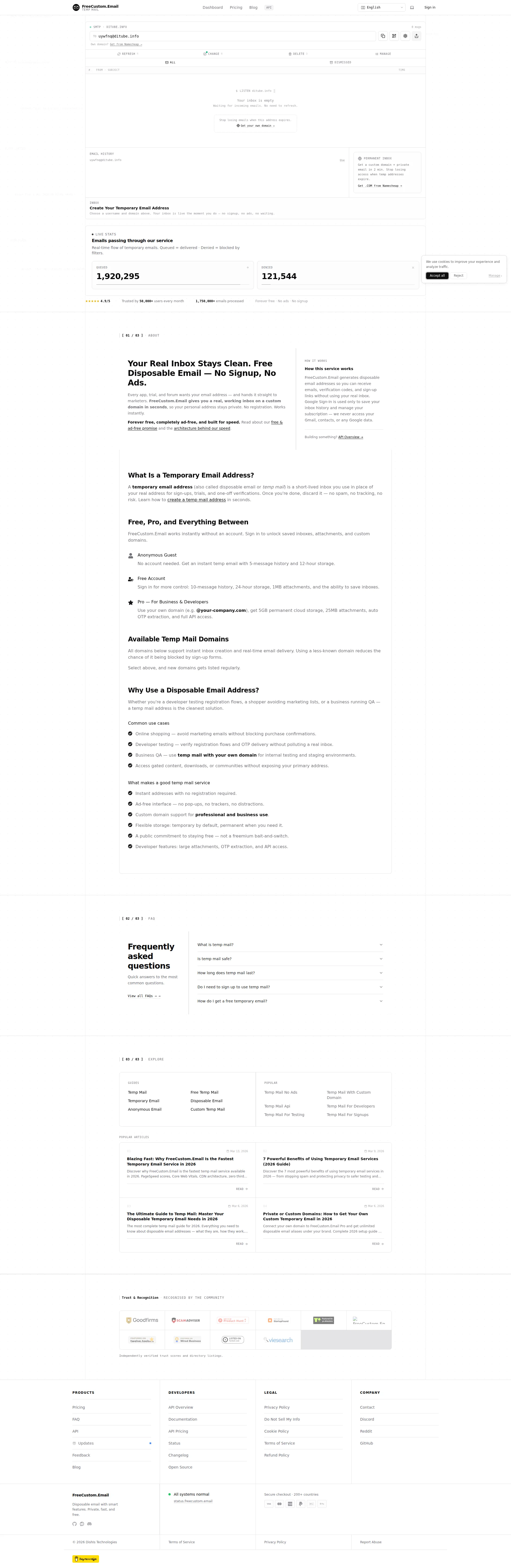
BLOODY HELL, what is this hero section?! It's like walking into a restaurant and instead of a maître d' greeting you, someone shoves a raw chicken in your face and says Figure it out, mate. The first thing visitors see is a live SMTP terminal spewing commands like EHLO api2.freecustom.email and RCPT TO — that's not a welcome, that's a HOSTAGE SITUATION for anyone who isn't a backend developer!
Here's what kills me — the ACTUAL value proposition is GORGEOUS. Your Real Inbox Stays Clean. Free Disposable Email — No Signup, No Ads. THAT is a headline that sells! That's the sizzle on the steak! But where is it? BELOW THE FOLD, tucked away in a section labeled [01/03] ABOUT like it's embarrassed to be seen. You've hidden your best dish in the walk-in freezer while serving terminal commands as the amuse-bouche. Seriously?!
The live inbox AS the CTA is a bold move — I'll give you that. It's like an open kitchen concept. But an open kitchen still has a MENU, doesn't it? There's no button, no label, no start here prompt. First-time visitors have to GUESS that they should interact with the email field. That's not confidence in your UX, that's abandonment of your customers.
Your social proof is genuinely impressive — 4.9/5 stars, 50K+ users, 1.75M+ emails processed. Those are REAL numbers that build REAL trust. But they're sitting below the fold after that bewildering SMTP terminal, so half your visitors have already bounced before they ever see them. You've got 10 testimonials and even Facebook in your trust logos — BRILLIANT ingredients — but you've plated them where nobody's looking!
The typography is clean, the brand is clear, the inbox interface itself is modern and well-designed. But you've built a product screenshot masquerading as a hero section. That's like putting a photo of the kitchen on the front door instead of the restaurant name. Lead with the promise, THEN show the product.
Exemples d'améliorations
EHLO api2.freecustom.email 250 2.1.0 Ok From: [email protected] RCPT TO:<[email protected]>
Your throwaway inbox is ready. No signup, no ads, no tracking. Just paste the address wherever you need it — and we'll handle the rest.
The SMTP terminal is a clever easter egg for developers but a conversion killer for everyone else. It's like printing your food safety inspection report on the menu cover. A single explanatory sentence above the inbox would dramatically reduce bounce rate for first-time B2C visitors.
Points forts
- The value proposition copy 'Your Real Inbox Stays Clean. Free Disposable Email — No Signup, No Ads.' is an absolute BELTER of a headline — specific, benefit-led, and genuinely differentiating. When the user finally reaches it, it SINGS
- The live inbox as hero is a bold 'show don't tell' approach — like an open kitchen that eliminates friction for returning users and technically-savvy visitors who already know the recipe
- Social proof stats (4.9/5 · 50,000+ users · 1,750,000+ emails processed) are specific, credible numbers that carry real weight — not vague 'thousands of happy customers' waffle
À améliorer
- The actual value proposition lives in the '[01/03] ABOUT' section BELOW THE FOLD — a first-time visitor drowns in a live SMTP terminal before they even understand what the product does. That's serving dessert before the starter!
- No explicit above-the-fold CTA button exists — the inbox interface acts as an implicit CTA, which completely fails non-technical B2C users who don't know they're supposed to interact with it. Where's the bloody 'Start Here' button?!
- The SMTP command animation (EHLO, RCPT TO, AUTH PLAIN) is developer jargon that actively REPELS the majority B2C audience of shoppers and privacy-conscious users who just want a clean inbox
Copywriting
DECENT
Now HERE'S where I get genuinely excited — and then genuinely furious. The copywriting on this page is like finding a perfectly seasoned filet mignon... served on a paper plate in the car park. The quality is THERE, the placement is a DISASTER.
Every app, trial, and forum wants your email address — and hands it straight to marketers. THAT is chef's kiss copy! That's empathy-first writing that grabs the reader by the collar and says I understand your pain. The three-tier breakdown — Anonymous Guest, Free Account, Pro — uses concrete specifics like 5-message history, 12-hour storage, 25MB attachments instead of vague more storage rubbish. That's how a professional writes a menu — with ACTUAL portion sizes!
The not a freemium bait-and-switch line? BRILLIANT. That's the copywriting equivalent of a chef looking you in the eye and saying Yes, the bread is actually free. It names the exact objection every visitor has about free tools and CRUSHES it. I wish more SaaS pages had this level of self-awareness.
But here's where you're leaving money on the table like a waiter who forgets to bring the bill. Your BEST conversion copy — the FOMO upgrade message about lost emails, the fresh domain rotation — lives on the PRICING PAGE. Not the homepage. Not where cold traffic lands. You've put your most persuasive argument in a room that only warm leads ever enter. That's like hiding your daily special behind the kitchen door!
The FAQ section is painfully basic — What is temp mail? and How long does temp mail last? These educate but they don't CLOSE. Where's Is this really free? Where's Will sites block these addresses? Those are the questions that keep people from clicking, and you're answering questions nobody who's already on your page is asking.
Oh, and new domains gets listed regularly? Gets? GETS?! It's GET listed. Small error, but on a product that sells itself on being polished and professional, that's like a Michelin restaurant with a typo on the wine list. Fix it TODAY.
Exemples d'améliorations
FreeCustom.Email works instantly without an account. Sign in to unlock saved inboxes, attachments, and custom domains.
No account needed — your inbox is live in 3 seconds. Sign in free to save it forever, download attachments, and use your own domain.
The original buries the speed and makes 'sign in' sound like a gate rather than an upgrade. The revised version leads with the speed benefit, makes the free tier explicit, and reframes signing in as unlocking MORE rather than being required. That's the difference between 'kitchen closed' and 'chef's table available.'
Points forts
- 'Every app, trial, and forum wants your email address — and hands it straight to marketers' — this is empathy-first, problem-aware copy that grabs visitors by the throat and validates their pain instantly. Proper seasoning, that
- Feature descriptions use concrete specifics throughout — '5GB permanent cloud storage', '25MB attachments', '10-message history, 24-hour storage' — no vague 'enhanced features' waffle. You've written a proper menu with actual portion sizes
- The 'not a freemium bait-and-switch' line directly names and NEUTRALIZES the #1 trust objection for any free tool. That's unusually self-aware and devastatingly persuasive — like a chef who admits the wait time upfront
À améliorer
- Your most compelling conversion copy — the FOMO upgrade message about expiring emails and fresh domain rotation — is BURIED on the pricing page instead of the homepage where cold traffic actually lands. You're hiding your specials board in the kitchen!
- The homepage FAQ uses purely educational questions ('What is temp mail?') that inform but don't convert. Missing the objection-handling questions that actually close — 'Is this really free?' and 'Will sites block these addresses?' would do real work
- 'New domains gets listed regularly' — gets?! It's GET. Minor grammar slip, but on a product selling itself as polished and professional, it's a crumb on the tablecloth at a fine dining establishment
Call-to-Action
DECENT
Contenu verrouillé
Preuve Sociale
NEEDS WORK
Contenu verrouillé
Architecture
DECENT
Contenu verrouillé
SEO & Meta
CRITICAL
Contenu verrouillé
Mobile
GOOD
Contenu verrouillé
Design Visuel & Branding
DECENT
Contenu verrouillé
Performance
GOOD
Contenu verrouillé
llmreadiness
DECENT
Contenu verrouillé