Le verdict
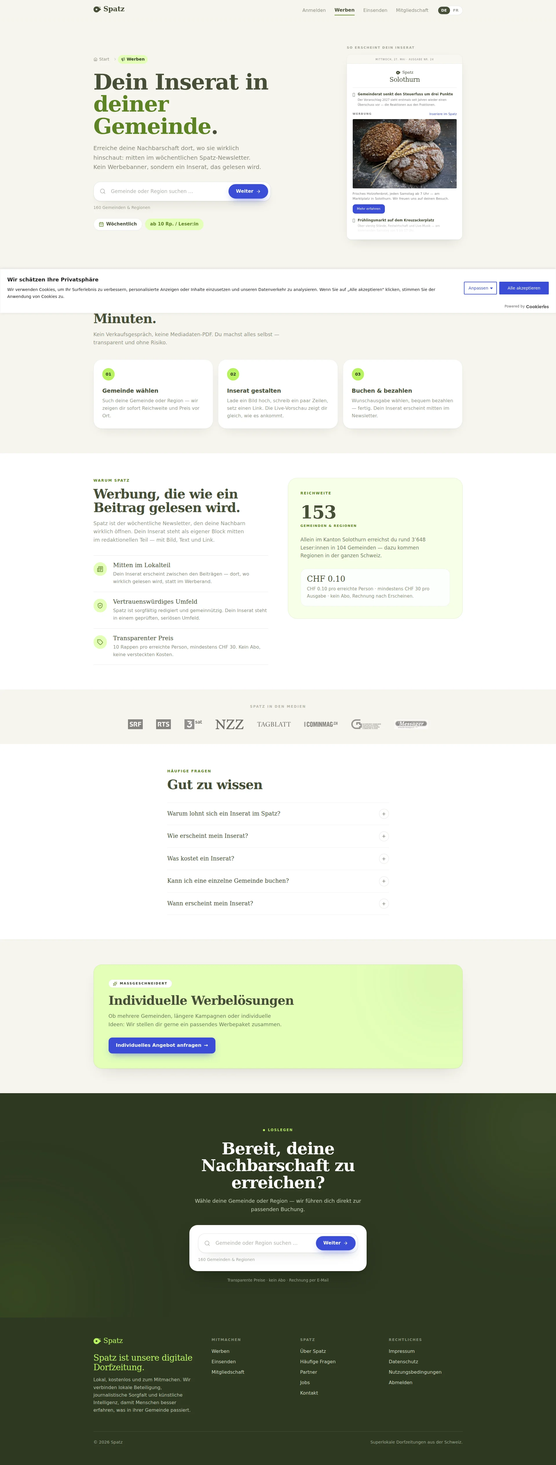
Right, listen up. Spatz has a genuinely brilliant concept — a hyper-local Swiss newsletter that actually gets read. That's a RARE ingredient, and they've got it. But this advertising page? It's like serving a Michelin-worthy soufflé on a paper plate in a car park. The CTA says 'Weiter' — WEITER! That's not a call to action, that's what you mumble when you're sleepwalking! There's ZERO advertiser proof — no testimonials, no case studies, no 'Bäckerei Schmidt got 200 new customers.' The pricing transparency is genuinely refreshing at CHF 0.10 per reader, but it's whispered in a corner instead of being the bloody headline. And the mobile LCP? 6.55 seconds! That's not a loading time, that's a PRISON SENTENCE. Half your potential advertisers have closed the tab, made a coffee, and moved on with their lives before your page even shows up. The copy is warm and the design is clean, but this page has more conversion holes than a colander. The bones are excellent — now stop serving them raw and COOK THE DAMN THING PROPERLY.
Spatz: The Charming Village Newsletter That Forgot to Sell Itself
Look, Spatz is genuinely lovable — a hyper-local newsletter for Swiss villages, nonprofit vibes, clean editorial tone. The concept is solid gold. But this advertising page? It's like a great bakery with no sign on the door. The copy talks a good game about 'Werbung, die wie ein Beitrag gelesen wird,' which is actually a killer differentiator — but then buries it under a search field that just says 'Weiter.' There are no real advertiser testimonials, no case studies showing 'local bakery X got 47 new customers,' no open-rate numbers, no comparison to Facebook Ads or print. The pricing transparency (CHF 0.10/reader, min CHF 30) is genuinely refreshing and should be screamed from the rooftop — instead it's whispered in a bullet point. Meanwhile, Google's PageSpeed clocks the mobile LCP at 6.55 seconds, which means half your potential advertisers have already rage-quit before seeing your pitch. The bones are good. The execution needs a serious shake-up.
Hero Section
DECENT
BLOODY HELL, where do I start? The hero section is like a beautifully plated appetizer that you forgot to season. The headline Dein Inserat in deiner Gemeinde — fine, it's clear, it's local, a visitor gets it in three seconds. Good. The subheadline Kein Werbebanner, sondern ein Inserat, das gelesen wird is actually BRILLIANT — it's doing the heavy lifting of an entire sales team in one sentence. That's your golden truffle right there, and I genuinely mean that.
But then — THEN — you slap a Weiter button on it?! WEITER?! Is THAT your hero CTA?! That's not a call to action, that's what a bored receptionist says when she's transferring your call! You've got a visitor emotionally engaged with your ad gets actually READ by your neighbors and then you hand them a button that says... Next. It's like wooing someone with poetry and then proposing with a Post-it note.
The newsletter mock-up on the right? Smart idea — showing the ad in context is like letting someone taste the dish before ordering. But the image is so small and compressed at this scale that it's like reading a menu through frosted glass. Nobody's zooming in, mate. Make it READABLE or don't bother.
The little tags — 160 Gemeinden & Regionen and ab 10 Rp. / Leser:in — are nice whispers of proof, but where's the ROAR? Where's Over 500 local businesses already advertise with us? Where's the open rate that would make a Facebook marketer weep? You've got NO advertiser-specific social proof in the most critical real estate on the page. That's like opening a restaurant with no menu in the window — people just walk past!
Exemples d'améliorations
Weiter
Inserat erstellen →
An action verb plus a clear next step transforms this from a bureaucratic 'proceed' button into something that actually sounds like the START of a journey. Even better: 'Reichweite & Preis anzeigen' would directly mirror the value proposition and give people a reason to click.
Dein Inserat in deiner Gemeinde.
Dein Inserat. Gelesen von deinen Nachbarn.
Shifts emphasis from the feature (local placement) to the outcome (actually read by neighbors) — which is the ENTIRE differentiator Spatz keeps mentioning but inexplicably buries below the fold. Lead with the sizzle, not the pan!
Points forts
- The subheadline 'Kein Werbebanner, sondern ein Inserat, das gelesen wird' is genuinely exceptional positioning — it immediately differentiates Spatz from banner advertising and speaks to every small business owner who's been burned by invisible display ads
- The newsletter preview mock-up in the hero is a smart visual move — showing the actual ad placement in context is far more persuasive than describing it, like showing the finished dish instead of just reading the recipe
- Pricing transparency 'ab 10 Rp. / Leser:in' shown immediately in the hero removes a massive friction point — budget-conscious local advertisers don't have to hunt for the price, and THAT is how you build trust from second one
À améliorer
- The primary CTA 'Weiter' is the most lifeless, passionless button text I've ever seen on a conversion page — it communicates absolutely zero benefit, zero excitement, zero reason to click. It's the CTA equivalent of a wet handshake
- Zero advertiser-specific social proof in the hero — no open rates, no number of active advertisers, no testimonial snippet from a local business owner. You're asking people to BUY without giving them a single reason to TRUST
- The newsletter mock-up visual is rendered too small and dense to actually read at hero scale — it's supposed to be your showpiece product demo but instead it's a blurry thumbnail that undermines the very proof it's trying to provide
Copywriting
DECENT
Right, the GOOD news first because I'm feeling generous: the copy on this page is genuinely above average for a small Swiss media startup. It's warm, it's jargon-free, it speaks in a consistent 'du' tone that feels like a neighbor chatting over the garden fence. The three-step process — Gemeinde wählen, Inserat gestalten, Buchen & bezahlen — is laid out cleanly, and the friction-removal line Kein Verkaufsgespräch, keine Mediadaten-PDF. Du machst alles selbst — transparent und ohne Risiko is SUPERB. That single sentence does more conversion work than most landing pages manage in five paragraphs. Chef's kiss on that one, genuinely.
The pricing section? CHF 0.10 pro erreichte Person, mindestens CHF 30 pro Ausgabe, kein Abo, Rechnung nach Erscheinen. Specific. Honest. No hidden nonsense. That's the kind of transparency that turns skeptics into customers. I LOVE that.
BUT — and here's where I grab you by the apron — where in the name of all that is holy are your RESULTS?! Not a SINGLE advertiser success story! Not one! You've got 10 testimonials apparently hiding somewhere, but on this page? NOTHING. No Bäckerei Müller reached 847 readers for CHF 84.70 and sold out by Saturday. No Yoga Studio Sonnenberg booked three classes from one newsletter. You're serving the menu description without ever letting anyone TASTE the food!
The Warum Spatz positioning — Werbung, die wie ein Beitrag gelesen wird — is a genuinely memorable line. But it's a CLAIM without PROOF. It's like me saying best risotto in London and then not letting you eat it. SHOW ME THE RESULTS!
The FAQ section has the right questions — Was kostet ein Inserat?, Kann ich eine einzelne Gemeinde buchen? — but they're all collapsed behind accordions. Your best objection-handling content is HIDDEN. That's like locking your best ingredients in the pantry during service!
And then the Individuelle Werbelösungen section at the bottom introduces a contact us for custom pricing path that completely CONTRADICTS the beautiful self-serve simplicity you just spent the entire page building. You've told me no sales calls needed! and then three scrolls later you're saying actually, call us. Pick a lane!
Exemples d'améliorations
Werbung, die wie ein Beitrag gelesen wird. Spatz ist der wöchentliche Newsletter, den deine Nachbarn wirklich öffnen.
Werbung, die wie ein Beitrag gelesen wird. Spatz-Newsletter erzielen durchschnittlich 58% Öffnungsrate — dein Inserat erscheint dort, wo deine Nachbarn wirklich lesen, nicht im Werberand.
Adding a concrete open rate metric transforms a nice-sounding claim into actual proof. If the real open rate is strong (and local newsletters typically crush it), this single number does more conversion work than three paragraphs of positioning. Give me the NUMBERS!
Warum lohnt sich ein Inserat im Spatz?
Warum lohnt sich ein Inserat im Spatz? (collapsed FAQ)
The single most important FAQ question should have its answer visible by default — or at bare minimum show a one-line teaser answer before the accordion expands. Don't make people WORK to find out why they should give you money. Expand it, show the goods, let the page do the selling even for the lazy scrollers.
Points forts
- The friction-removal copy 'Kein Verkaufsgespräch, keine Mediadaten-PDF. Du machst alles selbst — transparent und ohne Risiko' is conversion gold — it directly tackles the number one fear of small business owners approaching media buying and demolishes it in one clean sentence
- Pricing copy is exceptionally specific and transparent: 'CHF 0.10 pro erreichte Person, mindestens CHF 30 pro Ausgabe, kein Abo, Rechnung nach Erscheinen' — no hidden costs, no vague 'contact us,' just honest numbers that build instant trust
- The core positioning line 'Werbung, die wie ein Beitrag gelesen wird' is genuinely differentiated and memorable — it draws a clear line between Spatz and everything advertisers hate about banner ads and gets to the heart of the value proposition
À améliorer
- ZERO advertiser outcome stories or ROI examples anywhere on the page — the copy tells advertisers what the product IS but never once PROVES it works with a real business result, a real name, a real number. This is the biggest missed opportunity on the entire page
- The FAQ answers are all collapsed behind accordions, meaning the page's most persuasive objection-handling content is invisible until someone bothers to click — you're hiding your best arguments like a chef who keeps the specials board in the kitchen
- The 'Individuelle Werbelösungen' section with 'Individuelles Angebot anfragen' introduces a high-friction, sales-mediated path that directly contradicts the self-serve simplicity promised in the hero — it's a tonal whiplash that undermines trust
Call-to-Action
CRITICAL
Contenu verrouillé
Preuve Sociale
CRITICAL
Contenu verrouillé
Architecture
DECENT
Contenu verrouillé
SEO & Meta
NEEDS WORK
Contenu verrouillé
Mobile
CRITICAL
Contenu verrouillé
Design Visuel & Branding
DECENT
Contenu verrouillé
Performance
CRITICAL
Contenu verrouillé
llmreadiness
CRITICAL
Contenu verrouillé