El veredicto
Right, listen up. RoastMySite is like a chef who writes a brilliant menu but serves the steak on a dusty plate. The headline? SHARP. The tone? Consistent and genuinely entertaining. The pricing copy? Made me laugh AND understand the tiers — that's rare. But here's the bloody problem: you're a tool that ROASTS other people's landing pages, and your own trust section has the credibility of a pop-up restaurant with no health certificate. You've got logos — Stripe, Hubspot — buried in a social proof section instead of slapped right in the hero where they belong. You've got 10 testimonials with photos but you're hiding that firepower like it's a secret recipe. Your mobile LCP is 2.85 seconds — that's AMBER zone, not green, not the catastrophe some might claim, but for a performance tool? That's like a personal trainer who's slightly out of breath walking up stairs. The copy is carrying this page on its back like a sous chef covering for a missing head chef. The bones are brilliant — the self-roast section is genuinely inspired — but the trust gaps and that wheezing desktop performance score of 74 would get a 'needs improvement' from your OWN tool. Stop roasting everyone else and fix your own kitchen first.
The Cobbler's Shoes Are On Fire (And Not In A Good Way)
Look, there's something deliciously ironic about a landing page roaster with a landing page that needs roasting. And to be fair — this isn't a disaster. The headline is sharp, the tone is consistent, and the pricing is transparent. You've clearly got a brain. But you've also got the social proof of a brand-new Etsy shop, zero security badges while asking people to hand over their professional URLs, and a desktop PageSpeed score of 74 that would get a 'needs improvement' sticker slapped on it by the very tool you're selling. The copy is doing heavy lifting to compensate for trust gaps that copy alone can't fix. You've built a Ferrari engine and put it in a car with bald tyres. The bones are there — now stop roasting everyone else and fix your own damn pipes.
Sección Hero
DECENT
RIGHT. Let me tell you something — that headline, Does your landing page deserve its traffic? — that's a BEAUTIFUL piece of work. It's a punch to the ego wrapped in a question mark. It creates doubt, it pokes insecurity, it makes every marketing manager on the planet whisper oh God, does it? in under three seconds. THAT is how you write a headline, people. Take notes!
The subtitle delivers the goods too: Get a brutal (but fair) roast of your page in 90 seconds. Score out of 100, actionable recommendations, zero BS. — concrete, differentiated, not a single wasted word. It's like a perfectly reduced sauce — nothing unnecessary, everything essential. And the micro-copy Get your score for free — Subscribe if you want more handles the price objection before the visitor even THINKS to object. That's not marketing, that's mind-reading. Brilliant.
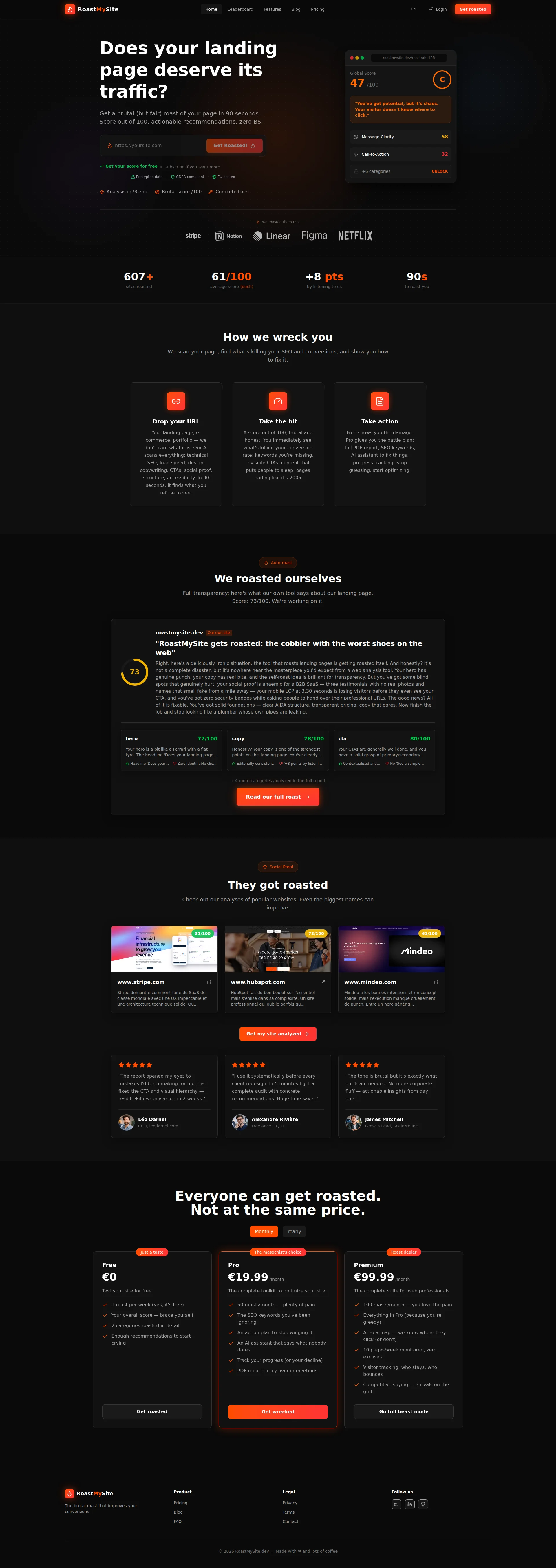
BUT — and here's where I start throwing pans — your social proof in the hero is EMBARASSING for what you're trying to do. 607+ sites roasted and 61/100 average score? That's it? You've got Stripe and Hubspot logos on this page! I can SEE them! They're sitting down in the social proof section like wallflowers at a party while your hero is up here STARVING for credibility. Get those logos INTO the hero section, you muppet!
The interface mockup showing a score of 47/100? Decent idea, but you're using a placeholder URL roastmysite.dev/roast/abc123. Is THAT your proof? A FAKE result? That's like a restaurant putting plastic food in the window and wondering why nobody walks in. Show a REAL roast from a recognisable domain and that mockup goes from 'meh' to SHUT UP AND TAKE MY URL.
And those trust badges — Encrypted data, GDPR compliant, EU hosted — they're sitting BELOW the CTA input field! BELOW! The visitor is hovering over that input box, finger trembling, thinking should I really type my company URL into this thing? and your reassurance is hiding underneath like a shy waiter. Move them NEXT to the input field where they can actually do their bloody job.
The dark background with that orange CTA button? Strong contrast, catches the eye immediately. The typographic hierarchy is clean. No complaints on the visual execution. But this hero is 80% of the way to being world-class and it's stalling at the finish line like a soufflé that collapsed because someone slammed the oven door. SO close. Now finish the job.
Ejemplos de mejoras
607+ sites roasted | 61/100 average score (ouch)
607+ sites roasted — including stripe.com, hubspot.com | Trusted by 200+ freelancers and growth teams
Replacing abstract vanity metrics with the recognisable brand names that are ALREADY on your page transforms weak stats into credible social proof. You have the ingredients — stop leaving them in the pantry!
Puntos fuertes
- Headline 'Does your landing page deserve its traffic?' is a MASTERCLASS in ego-driven curiosity — creates instant self-doubt and compels action in under 3 seconds. I'd frame this on my wall if I had one for copy.
- Micro-copy 'Get your score for free — Subscribe if you want more' proactively kills the price objection right next to the CTA input — that's the kind of objection-handling that separates amateurs from professionals
- Trust badges (GDPR compliant, EU hosted, Encrypted data) are present and relevant for a B2B audience handling professional URLs — you actually THOUGHT about what your audience worries about
A mejorar
- Social proof limited to '607+ sites roasted' while Stripe and Hubspot logos are buried further down the page — get those recognisable names INTO the hero where they can actually build credibility at first glance
- Interface mockup uses placeholder 'roastmysite.dev/roast/abc123' instead of a real, named-brand roast result — it screams 'prototype' instead of 'proof' and undermines the entire product demonstration
- Trust badges positioned BELOW the CTA input field instead of adjacent to it — they're missing the critical moment of hesitation when a visitor is about to hand over their professional URL
Copywriting
GOOD
BLOODY HELL, your copywriter deserves a raise and also a stern talking-to, because they've done something magnificent AND something lazy on the same page.
Let's start with what's BRILLIANT. Renaming How it works to How we wreck you? That's not just a section title, that's a STATEMENT. It tells me this brand has a spine. The three-step sequence — Drop your URL / Take the hit / Take action — is clean, logical, and dripping with personality. Lines like pages loading like its 2005' and what you refuse to see create exactly the emotional sting an audit tool needs. You're not selling software, you're selling a mirror, and the copy makes sure that mirror is unflattering. PERFECT.
The tone consistency from H1 to footer (Made with love and lots of coffee) is genuinely impressive. Most pages lose their voice by the third section like a singer who forgot the lyrics. Not this one. The pricing copy — The masochists choice', Roast dealer, Go full beast mode — is FUNNY without sacrificing clarity. That's the hardest trick in copywriting, and you pulled it off like a perfect crème brûlée.
And that self-roast section? We roasted ourselves — Score: 73/100. Were working on it.' That is GENIUS. It demonstrates the product, builds transparency, and shows you eat your own cooking. That's the kind of move that makes me want to shake someone's hand.
NOW. Where you've gone and dropped the soufflé.
+8 pts by listening to us — EIGHT POINTS OF WHAT? Over what timeframe? Across how many sites? That number is floating in space like a lost astronaut with no context, no credibility, and no reason for anyone to believe it. It reads like someone typed a random number into a Figma mockup during a coffee break. Seriously?!
Your testimonials — you've got 10 of them WITH photos, which is great. But results like +45% conversion in 2 weeks need more backing at the B2B level. The reviewer names and companies feel just generic enough to make a sceptical CMO squint. You've got the QUANTITY of social proof — now make it VERIFIABLE.
And that Premium plan at €99.99/month? Competitive spying — 3 rivals on the grill is a fun line, but it tells me NOTHING about what data I'm actually getting. At that price point, the salesperson needs to show up and the copywriter needs to step aside. Your wit is outrunning your substance, and at a hundred euros a month, substance is what closes the deal.
Ejemplos de mejoras
+8 pts by listening to us
+8 pts average score improvement after implementing our recommendations — across 200+ sites audited in 2025
Adding timeframe, sample size, and context transforms a suspicious orphaned number into a credible, verifiable claim. Right now it's a garnish with no dish underneath — give it a plate to sit on!
Puntos fuertes
- Consistent provocative tone throughout — 'How we wreck you', 'what you refuse to see', 'pages loading like it's 2005' — creates genuine brand personality that carries from headline to footer without once breaking character
- Pricing section copy ('The masochist's choice', 'Roast dealer', 'Go full beast mode') is memorable, on-brand, and communicates audience intent without sacrificing clarity — funny AND functional, like a Michelin-starred burger
- The self-roast section ('We roasted ourselves — Score: 73/100') is a transparency MASTERPIECE that simultaneously demonstrates the product, builds credibility, and shows you eat your own cooking
A mejorar
- '+8 pts by listening to us' is a context-free statistic floating in the void — no timeframe, no site type, no sample size — making it feel like a number someone invented in Figma rather than real evidence
- Premium plan features at €99.99/month lack sufficient detail to justify the price — 'Competitive spying — 3 rivals on the grill' is entertaining but doesn't explain what data is delivered, how often, or in what format
- Testimonial names and companies ('Léo Darnel / leodarnel.com', 'James Mitchell / ScaleMe Inc.') could benefit from more verifiable details — at this price point, a sceptical B2B buyer needs more than a name and a star rating
Desbloquear las 8 categorías restantes
Call-to-Action
GOOD
Contenido bloqueado
Prueba Social
CRITICAL
Contenido bloqueado
Arquitectura
DECENT
Contenido bloqueado
SEO y Meta
DECENT
Contenido bloqueado
Móvil
DECENT
Contenido bloqueado
Diseño Visual & Branding
DECENT
Contenido bloqueado
Rendimiento
DECENT
Contenido bloqueado
llmreadiness
GOOD
Contenido bloqueado
Contenido bloqueado
Accede a la conclusión completa con las 3 acciones prioritarias y un mensaje motivador personalizado.