The Verdict
AeroBase has a genuinely solid foundation — clean dark design, niche-specific copy, and a smooth technical setup — but it's been 24 hours since the last roast and the three biggest killers are STILL alive: zero social proof, bland CTAs, and a trust section that screams 'give me your Garmin credentials, trust me bro.' The charts now render (hallelujah!), but this page is still converting like a 5K runner who refuses to do interval training.
AeroBase: Still Running in Place — Better Shoes, Same Finish Line
Alright Michael, let's have a frank chat. You came back. That's good. That means you care. And I can see you've been busy — the charts are actually rendering now, the copy has some genuine emotional moments in it, and the overall structure is still holding up. But here's the brutal truth: the issues I flagged last time that actually KILL conversions? Still. Right. There. You're asking complete strangers to hand you their Garmin OAuth credentials — their heart rate, sleep patterns, resting HR, the whole biometric diary — and your social proof section is emptier than a runner's stomach on race morning. Zero testimonials. Zero user count. Zero 'join X runners' anywhere on the page. Your CTA says 'Get Started' three times like a broken GPS repeating the same instruction. And the copy, while improved in spots, still leans heavily on describing what the tool DOES rather than what the runner BECOMES. The good news? You're genuinely close. The bones are right. The niche positioning is sharp. The dark aesthetic is actually working. Fix the trust, fix the CTAs, add one human face to this page — and you're looking at a completely different conversion rate. Let's go through it properly.
Hero Section
NEEDS WORK
Your hero has the right skeleton but it's still missing the muscle that makes people actually click. Know Your Aerobic Base. Run Smarter. — look, I'll say it again: this headline is GOOD. It's specific, it speaks directly to the MAF-obsessed, Zone 2-worshipping runner who's been training for months and still doesn't know if it's working. You nailed the niche. That's genuinely hard to do and you did it.
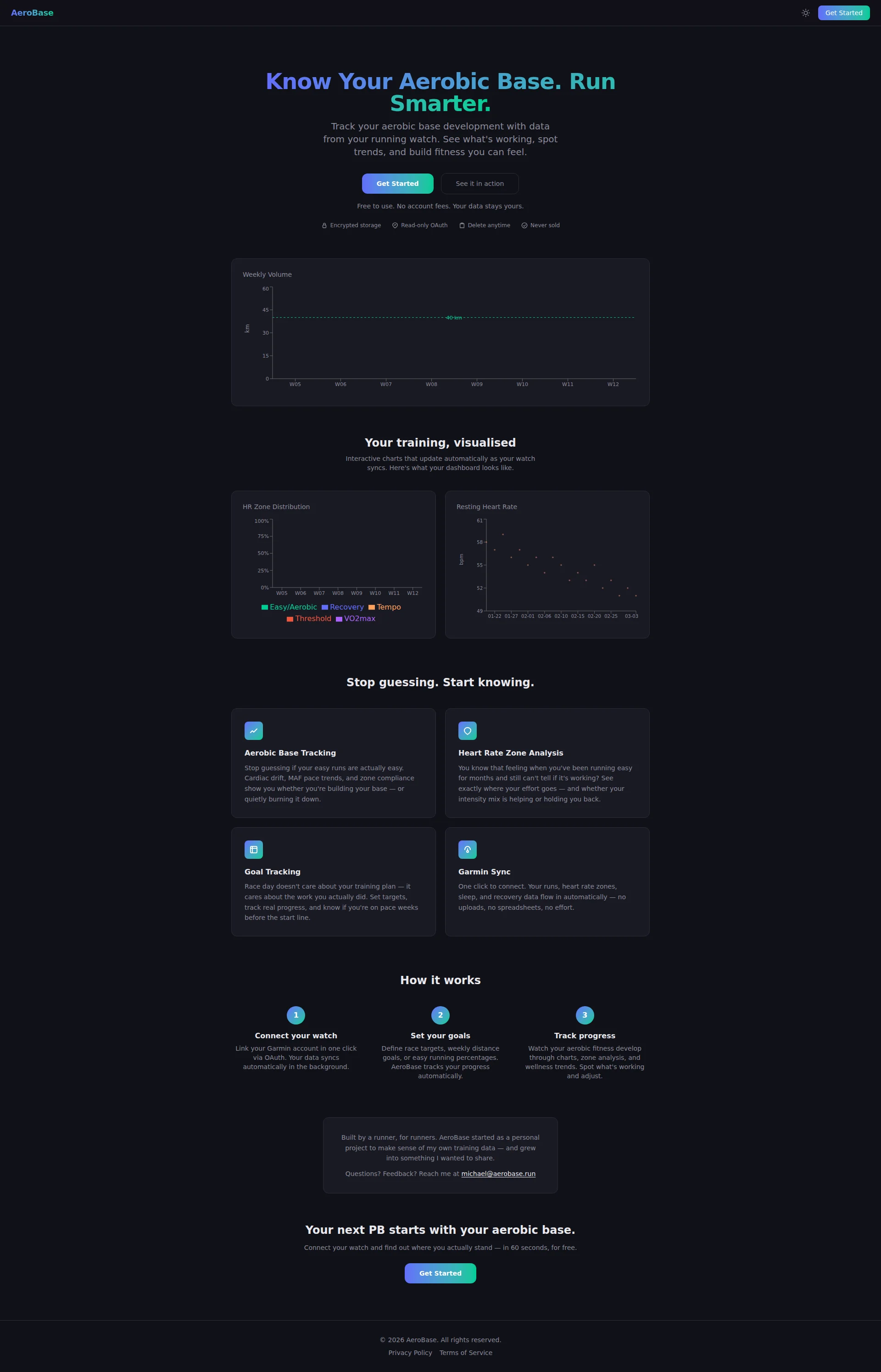
The dual-CTA strategy — Get Started + See it in action — is still smart. Fence-sitters get a lower-friction option. That's textbook B2C SaaS thinking and it stays.
Now the problems. The hero chart is RENDERING this time — I can see the Weekly Volume graph with actual data points, the 40km line, the W05-W12 axis. That's a massive improvement from the empty black rectangle situation. BUT — and this is a big but — it's positioned so far below the fold that it barely counts as a hero visual. The hero section itself still has no visual product representation above the fold.
More critically: ZERO social proof in the hero. Not a single number. Not Join 847 runners already tracking their aerobic base. Not a testimonial snippet. Not even a vague 500+ runners. You're asking people to click Get Started — which leads directly to Garmin OAuth — with absolutely no community evidence that anyone else trusts you. That's like a new restaurant with no reviews asking you to prepay for dinner.
Get Started as your primary CTA is still the blandest four syllables in the SaaS universe. It tells me nothing about what I'm getting, what happens next, or why I should care right now.
Improvement examples
Get Started
Track My Aerobic Base — Free
Tells the visitor exactly what they're doing, reminds them it's free, and creates a sense of personal ownership. 'My' is doing a lot of heavy lifting here — it's the difference between a generic action and a personal commitment.
Know Your Aerobic Base. Run Smarter.
Know Your Aerobic Base. Run Smarter. Join 1,200+ runners already tracking their Zone 2 progress.
The headline is already strong — don't change it. Just add one line of social proof directly underneath. Even a modest, honest number transforms the trust dynamic completely.
Code Suggestions
Add this directly below your subtitle and above the CTA buttons. Social proof + trust micro-copy in the hero is the single highest-impact change you can make right now.
<div class="hero-social-proof">
  <span class="runner-count">🏃 1,200+ runners tracking their aerobic base</span>
  <div class="trust-badges">
    <span>⭐ Free to use</span>
    <span>🔒 No credit card</span>
    <span>⚡ 60-second setup</span>
  </div>
</div>
Strengths
- 'Know Your Aerobic Base. Run Smarter.' is genuinely sharp — specific enough to make every MAF-method runner stop scrolling and read
- Dual-CTA approach with 'See it in action' as a secondary option correctly handles both ready and hesitant visitors
- 'Free to use. No account fees. Your data stays yours.' demolishes three objections in one line — that's efficient, confident copywriting
To improve
- Zero social proof in the hero section — no user count, no testimonial, no 'join X runners' — you're asking for Garmin OAuth trust with zero community evidence
- 'Get Started' as primary CTA communicates zero benefit and creates zero urgency — it could belong to a tax software, a dog grooming app, or a fitness tracker equally
- No product visual above the fold — the chart preview lives well below the hero, leaving the most valuable screen real estate completely unoccupied by anything that shows the actual product
Copywriting
DECENT
Right. The copy situation. There's been some genuine improvement here and I want to acknowledge it — the Heart Rate Zone Analysis section has an actual emotional moment: You know that feeling when youve been running easy for months and still can't tell if it's working?' THAT. That right there is what good B2C copy looks like. You're acknowledging a real runner frustration, not just listing a feature. That's the energy the entire page needs.
Similarly, Race day doesnt care about your training plan — it cares about the work you actually did.' That's punchy, specific, and speaks directly to the anxiety every runner feels before a race. Keep that. Frame it on a wall.
But here's where it still falls apart. The feature-benefit imbalance is still too heavy on the feature side in too many places. Cardiac drift, MAF pace trends, and zone compliance show you whether youre building your base' — that's still describing the tool, not the transformation. What does building my base FEEL like? What race does it unlock? What time does it shave off my 10K?
The Built by a runner, for runners section is genuinely charming and humanises the product. But it's buried at the bottom in a tiny box like an afterthought. This is your BEST trust-building content and it's hiding in the footnotes.
The closing CTA copy — Connect your watch and find out where you actually stand — in 60 seconds, for free — is actually much better than last time. 60 seconds and for free are doing real conversion work there. That's a genuine improvement.
The jargon level is appropriate for the audience — cardiac drift, MAF pace, Zone 2 compliance — your target runners KNOW these terms. That's not a problem, that's a feature.
Improvement examples
Cardiac drift, MAF pace trends, and zone compliance show you whether you're building your base — or quietly burning it down.
Cardiac drift, MAF pace trends, and zone compliance finally answer the question every Zone 2 runner obsesses over: 'Is this actually working?' Stop training blind. Start training smart.
The original describes what the features do. The revision names the specific emotional payoff — answering the question that keeps runners up at night. Same technical content, completely different conversion energy.
Built by a runner, for runners. AeroBase started as a personal project to make sense of my own training data — and grew into something I wanted to share.
Move this section UP — place it between 'How it works' and the final CTA, add a photo of Michael, and expand it to: 'I spent 18 months running 50+ km/week and still couldn't tell if my aerobic base was improving. So I built AeroBase. Now I can. And so can you.'
The founder story is your most powerful trust signal for a B2C fitness app. Right now it's hiding. Move it up, add a face, and make it specific — '18 months' and '50+ km/week' are the kind of details that make runners go 'that's me.'
Strengths
- 'You know that feeling when you've been running easy for months and still can't tell if it's working?' — this is genuine emotional resonance that makes runners nod and reach for the CTA
- 'Race day doesn't care about your training plan — it cares about the work you actually did.' is punchy, specific, and speaks directly to pre-race anxiety
- Niche terminology (cardiac drift, MAF pace, Zone 2) builds instant credibility with the target audience — they feel understood, not marketed to
To improve
- Feature-benefit imbalance persists — 'Cardiac drift, MAF pace trends, and zone compliance show you whether you're building your base' describes the tool, not the runner's transformation or race outcome
- 'Built by a runner, for runners' story is the most humanising content on the page but it's buried in a tiny box at the bottom — your best trust-building asset is being treated like a legal disclaimer
- No quantified outcomes anywhere — no '3 minutes off your 10K', no 'runners who track Zone 2 compliance improve their aerobic base 40% faster' — the copy is emotionally present but lacks the specific proof that seals the deal
Call-to-Action
DECENT
Locked content
Social Proof
CRITICAL
Locked content
Architecture
DECENT
Locked content
SEO & Meta
DECENT
Locked content
Mobile
NEEDS WORK
Locked content
Visual Design & Branding
DECENT
Locked content
Performance
CRITICAL
Locked content
llmreadiness
GOOD
Locked content