The Verdict
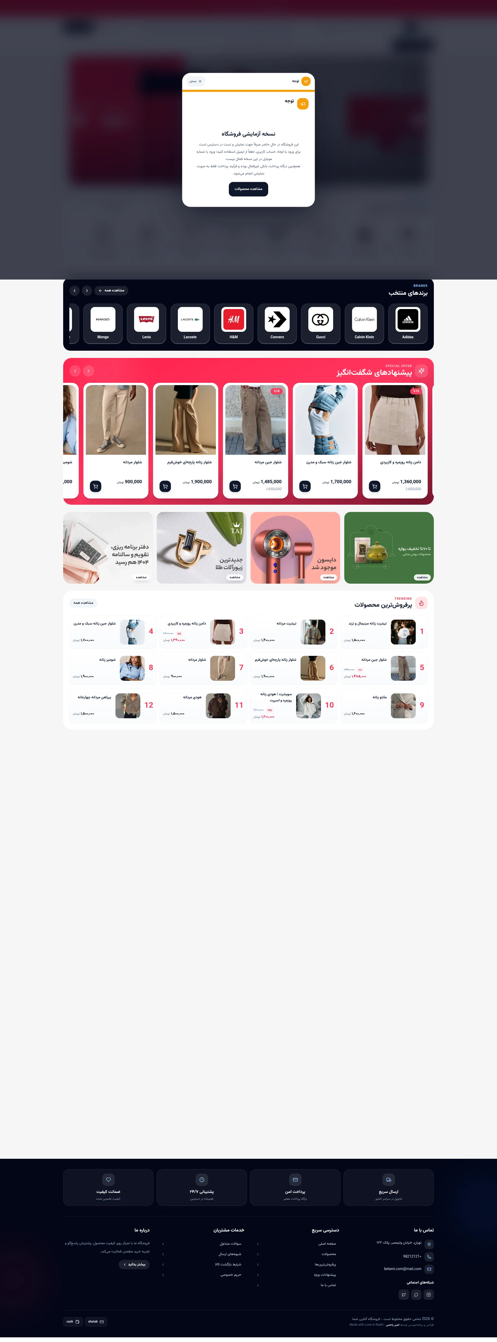
RIGHT. Let me get this straight. You've built an entire fashion store — product cards, brand logos, discount badges, the whole bloody lot — and then you SLAP a popup on every visitor's face saying 'Oh by the way, none of this is real, payments don't work, and you can't even log in on mobile.' That's like opening a Michelin-star restaurant, seating guests at beautifully set tables, and then announcing the kitchen is closed and the food is made of plastic. Your mobile LCP is 5.28 seconds — that's not slow, that's GEOLOGICAL. Google says anything over 4 seconds is poor, and you're cruising past that like it's a suggestion. Half your visitors are gone before they even see your fake popup. You've got zero customer reviews, a generic about-us that could belong to a corner shop or a spaceship parts dealer, and copy that reads like someone fed product SKUs through a label printer. The bones are here — decent layout, recognizable brands like Adidas, H&M, and Levi's in your carousel, clean Farsi text — but bones without meat is just a skeleton, and skeletons don't sell trousers. Fix the fundamentals: kill that popup, write a proper hero, get real reviews, enable real payments, and for the love of everything fashionable, WRITE AN H1 TAG.
Belami.ir: A Fashion Store That Forgot to Actually Open Its Doors
Listen up, because this is the digital equivalent of setting up a gorgeous restaurant, printing menus, hiring staff, and then putting a sign on the door that says 'we're just practicing, food is fake.' Belami.ir has the visual structure of a real fashion e-commerce site — branded sections, product listings, discount badges, a footer with trust icons — but the moment you look under the hood, it's a ghost town. The checkout doesn't work. Mobile login is disabled. There are zero customer reviews. The hero section is literally a popup warning you that none of this is real. You've built a mannequin and called it a store. The design has potential, the product categories are logical, and the brand selection (Adidas, Gucci, H&M, Levis) adds credibility — but credibility borrowed from other brands isn't YOUR credibility. Fix the fundamentals: get real reviews, enable real payments, and for the love of fashion week, write an H1 tag.
Hero Section
CRITICAL
BLOODY HELL. Is THAT your hero section?! It's not a hero — it's a HOSTAGE NOTE. The very first thing every visitor sees is a modal popup screaming THIS IS A TEST VERSION, PAYMENTS ARE FAKE, MOBILE LOGIN IS BROKEN. That's like a chef walking out to the dining room, grabbing the mic, and announcing: Just so you know, the steak is rubber, the wine is grape juice, and the toilets dont flush.' WHY would you do this to yourself?!
Behind that catastrophic popup? NOTHING. No hero image. No headline. No value proposition. No H1 tag — CONFIRMED MISSING. The page just tumbles straight into a brand logo carousel and some sale products like a waiter who trips and dumps the starter on your lap. A visitor cannot understand what Belami is, what it sells, or why they should care within the first 3 seconds. They can't even understand it in 30 seconds because they're too busy reading your apology letter!
The popup CTA says مشاهده محصولات (View Products) — oh brilliant, so your BEST call-to-action is basically please ignore the fact that nothing works and look at stuff anyway. That's not a conversion driver, that's a PLEA FOR MERCY.
Zero social proof in the hero area. No customer counts, no ratings, no testimonials, no trust signals — just a dark blurry background with some product images you can barely see because your WARNING LABEL is covering them. The brand logos below (Adidas, H&M, Calvin Klein, Levi's, Lacoste, Gucci) do add borrowed credibility, but borrowing someone else's reputation when you're actively telling people YOUR shop doesn't work is like wearing a Rolex to a job interview at a company you just got fired from.
You need to DEMOLISH this popup and build a proper hero from scratch: a clear H1 with your brand promise, a stunning lifestyle image of real products, a primary CTA that drives action, and at least ONE trust signal that says 'we're a real store with real customers.' Because right now? You're a mannequin shop with a CLOSED sign.
Improvement examples
نسخه آزمایشی فروشگاه — این فروشگاه در حال حاضر صرفاً جهت نمایش و تست در دسترس است. همچنین درگاه پرداخت بانکی غیرفعال بوده و فرآیند پرداخت فقط به صورت نمایشی انجام میشود.
REMOVE THIS POPUP ENTIRELY before going live. Replace with a hero section: H1 = 'مد روز، قیمت مناسب — ارسال سریع به سراسر ایران' + a full-width product lifestyle image + CTA button 'خرید کنید' + trust badge '۲۴/۷ پشتیبانی | بازگشت آسان کالا'
A test warning modal as the first user experience is the single biggest conversion killer on this entire site. No real customer should EVER see this. It's the equivalent of a restaurant menu that opens with a list of ingredients you're out of. Replace it with a proper hero that sells your VALUE, not your LIMITATIONS.
Strengths
- The popup CTA 'مشاهده محصولات' at least gives users an escape hatch rather than a complete dead end — small mercy, but I'll take it
- The site loads with HTTPS and a proper favicon, so at least the TECHNICAL foundation isn't completely raw
- Brand logos (Adidas, Gucci, H&M, Calvin Klein, Levi's, Lacoste) appear early in the page flow, giving a whiff of credibility from recognized names
To improve
- The FIRST thing every visitor sees is a modal popup confessing that payments are fake and mobile login is broken — this is like greeting dinner guests by listing your kitchen's health code violations
- There is NO H1 tag anywhere on the page and NO dedicated hero section — no value proposition, no brand statement, no reason to stay
- Zero social proof, zero unique differentiation — a visitor has absolutely no reason to choose Belami over literally any other fashion site on the internet
Copywriting
CRITICAL
Let me tell you what the copy on Belami.ir actually is: product names, price tags, and category labels. That's not copywriting — that's a RECEIPT. You've essentially handed your customers a stock inventory list and said here, get excited about this. Seriously?!
Let's look at what's actually written on this page. Product names like شلوار جین زنانه سبک و مدرن (modern slim women's jeans). Section headers like پیشنهادهای شگفتانگیز (amazing offers) and پرفروشترین محصولات (best-selling products). Footer micro-copy like ارسال سریع (fast delivery). And that's IT. That's your entire menu, and it reads like someone photocopied a warehouse manifest.
Benefits? ZERO. Not a single one! شلوار جین زنانه سبک و مدرن tells me WHAT it is. It doesn't tell me it'll make my legs look incredible, that it's perfect for a weekend brunch, or that it stretches without losing shape. You're describing ingredients without telling me how the dish TASTES!
Your footer has four trust icons — fast delivery, secure payment, 24/7 support, quality guarantee — and every single one is a hollow promise with NO specifics. ضمانت کیفیت (quality guarantee) — WHAT is guaranteed?! For HOW LONG?! What happens if I'm not satisfied?! ارسال سریع — how fast? Two days? Two weeks? Two geological eras like your page load time?! پرداخت امن — which payment gateway? What security? You might as well write trust us, were nice people.'
And then there's the about-us gem: فروشگاه ما با تمرکز روی کیفیت محصول، پشتیبانی پاسخگو و تجربه خرید مطمئن فعالیت میکند. Translation: Our store focuses on quality, support, and a safe experience. Oh BRILLIANT. That sentence is so generic it could describe a pet shop, a car dealership, or a dentist's office. It says NOTHING about who you are, what makes you different, or why I should buy trousers from YOU instead of the 400 other stores screaming for my attention.
The tone is clean and appropriate for fashion — I'll give you that. Grammar is solid. But tone without substance is like beautiful plating on an empty plate. You've got the garnish but forgot the steak.
Persuasive structure? AIDA? PAS? Never heard of them, apparently. The page goes: brands → sale items → banners → trending → footer. That's a catalogue, not a sales page. Where's the story? Where's the emotion? Where's the you NEED this in your life moment? NOWHERE.
Improvement examples
ضمانت کیفیت — کیفیت تضمین شده
ضمانت بازگشت ۳۰ روزه — اگر راضی نبودید، کامل پس میگیریم. بدون سوال.
A vague 'quality guarantee' is worth less than the pixels it's printed on. A specific 30-day money-back promise with a clear mechanism removes purchase anxiety and actually MEANS something. That's the difference between a chef saying 'the food is good' and saying 'if you don't love it, it's on the house.'
فروشگاه ما با تمرکز روی کیفیت محصول، پشتیبانی پاسخگو و تجربه خرید مطمئن فعالیت میکند.
بلامی انتخاب میکند تا شما نگران نباشید — هر محصول قبل از ارسال بررسی کیفی میشه، ارسال به تمام ایران در ۳ روز کاری، و اگر اندازه مناسب نبود، تعویض رایگانه.
Replace that wallpaper-paste generic statement with concrete operational promises. Specific details — 3-day delivery, pre-shipment quality check, free size exchange — build REAL trust. Generic fluff builds nothing but skepticism.
Strengths
- Product names include descriptive adjectives ('سبک و مدرن', 'روزمره و کاربردی') that give at least a CRUMB of context about style — it's thin but it's there
- The four footer trust pillars cover the right CATEGORIES of reassurance (delivery, payment, support, quality) — the framework is correct even if the execution is empty
- The Farsi is clean, readable, and free of grammar errors — at least you can spell, even if you can't sell
To improve
- Zero benefit-driven copy anywhere on the entire page — every product description tells you what the item IS but never why you'd WANT it or how it improves your life
- The about-us statement is so generic it could be copy-pasted onto any store in any industry in any country — it communicates absolutely nothing unique about Belami
- Trust claims like 'پرداخت امن', 'ضمانت کیفیت', and 'ارسال سریع' are completely hollow — no numbers, no mechanisms, no proof, no specifics whatsoever
Call-to-Action
CRITICAL
Locked content
Social Proof
CRITICAL
Locked content
Architecture
NEEDS WORK
Locked content
SEO & Meta
CRITICAL
Locked content
Mobile
CRITICAL
Locked content
Visual Design & Branding
DECENT
Locked content
Performance
CRITICAL
Locked content
llmreadiness
NEEDS WORK
Locked content