The Verdict
Right, listen up. Benyamin clearly knows how to COOK — a decade of Android, Rust deep-dives, Linux wizardry, the lad even built a tool to fix his own bloody mouse. That's talent. But this website? It's like a Michelin-star chef serving his tasting menu out of a cardboard box in a car park. No hero telling visitors why they should sit down and eat. No newsletter capturing the audience he's clearly earning. No social proof — NOTHING. And a mobile LCP of 4.15 seconds?! That's not slow, that's geological. Google is actively burying this site while Benyamin's busy writing genuinely brilliant posts that nobody can find. The dark theme with yellow accents actually looks decent — I'll give him that. But the homepage reads like a filing cabinet, not a destination. The authentic voice buried inside the posts is the REAL gold here, and it's completely invisible from the front door. Fix the speed, add a proper introduction, capture some emails, and this could be a proper kitchen. Right now it's a talented chef cooking alone in the dark.
The Dark-Mode Dev Blog That Forgot It Has an Audience
Look, Benyamin clearly knows his stuff — a decade of Android, Rust, Linux deep-dives, and he even built a tool to fix his own mouse problem. That's the good news. The bad news is that the site is essentially a filing cabinet with a dark theme. There's no hero that tells you WHY you should stick around, no newsletter to capture the readers he's clearly earning, no reading time on posts (it's 2026, not 2014), and a mobile LCP of 4.15 seconds that Google is actively penalizing in rankings. The dark color scheme and yellow accents are actually decent, but the layout screams 'I built this in a weekend and shipped it' — which is fine for a side project, but not if you want to grow an audience. The bones are good. The execution needs a serious kick in the terminal.
Hero Section
CRITICAL
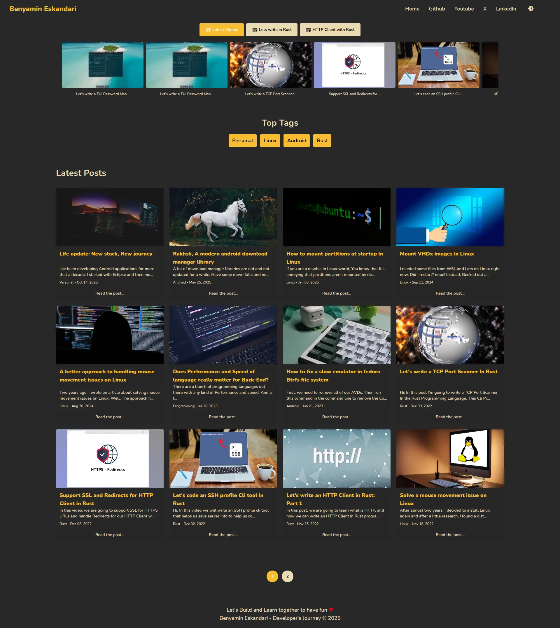
BLOODY HELL, where IS the hero?! I'm looking at this page and it's like walking into a restaurant with no sign, no menu, no host — just someone shoving a tray of food in your face and hoping you figure it out. The page opens straight into a video carousel with TRUNCATED titles — 'Let's write a TUI Password Man...' — oh, Password Man WHAT? Password Manager? Password Mandolin? You've got three seconds to tell a visitor why they should stay, and you're using those three seconds to show them chopped-off YouTube thumbnails!
The name Benyamin Eskandari sits up in the navbar like a quiet little garnish, but there's NO tagline, NO value proposition, NO heres what I serve and why you should eat here.' The actual H1 — Benyamin Eskandari - A developers Journey through Linux, Rust, Go and more' — is buried in the metadata where NOBODY can see it. That's like writing your restaurant's specialty on the back of the toilet door!
Now look, the yellow accent buttons against that dark background? Actually GOOD. They pop, they're visible above the fold, they show you've got content across platforms. The video carousel communicates that you're active and creating — that's smart. But without ANY context, a first-time visitor is just staring at a wall of thumbnails thinking Who IS this person and why should I care?
You don't need a massive hero splash. You're a dev blog, not a SaaS product. But even TWO LINES — just two bloody lines — introducing yourself and what you write about would transform this from a random content dump into a place people want to bookmark. You've got the ingredients, mate. You're just serving them raw.
Improvement examples
Benyamin Eskandari - A developer's Journey through Linux, Rust, Go and more
I'm Benyamin — Android dev turned Rust obsessive. I write real code, fix real problems, and document the whole messy journey. No fluff, just working solutions.
The original reads like a LinkedIn headline nobody asked for. The rewrite tells visitors WHO you are, WHAT you do, and WHY it's worth their time — all in one breath, all above the fold. That's how you greet someone at the door.
Strengths
- Yellow accent buttons pop beautifully against the dark background — they're immediately visible above the fold and actually draw the eye where it needs to go
- Video carousel is a clever content hook that signals active YouTube presence and cross-platform effort without needing a single word of explanation
- Site identity is present in the navbar with clear social links (Github, Youtube, X, LinkedIn) — minimal but functional brand anchoring
To improve
- ZERO value proposition — a first-time visitor lands here and has absolutely no idea in 3 seconds why this blog exists or why they should read it over ten thousand other dev blogs
- No author introduction anywhere above the fold — Benyamin is a ghost on his own homepage, with his bio hiding deep inside individual posts like a shy chef who won't come out of the kitchen
- Truncated video titles ('Let's write a TUI Password Man...') in the carousel look sloppy and communicate nothing useful — you're literally cutting off your own pitch mid-sentence
Copywriting
CRITICAL
Right, this copy situation is like a chef who makes INCREDIBLE food in the back kitchen but puts a blank cardboard sign out front that says Food Here. The actual blog posts? Genuinely brilliant. Benyamin writes like a HUMAN BEING — talking about burnout, mental health struggles, real frustrations — I didnt feel to do those stuff and build this and test that to fix a goddamn issue.' THAT is authentic. THAT is the kind of voice people subscribe for. And it's completely INVISIBLE from the homepage!
The homepage itself? It's a spreadsheet cosplaying as a blog. Post titles, truncated excerpts, dates. That's it. No narrative. No heres why this blog exists.' No reason to care. The titles are functional and keyword-aware — How to mount partitions at startup in Linux — which is fine for SEO, but it reads like a Stack Overflow index, not a place I want to spend my Sunday morning.
And then there's the meta description. Oh, the meta description. Programming Tips & Tricks, Articles, Thoughts, Stories and Ideas. lets explore in the world of Software Development and learn and study with together...' LEARN AND STUDY WITH TOGETHER?! Seriously?! You're writing tutorials for RUST DEVELOPERS and your meta description has a grammatical car crash in it! That's like a spelling mistake on a restaurant menu — your audience WILL notice, and they WILL judge you.
The footer — 'Let's Build and Learn together to have fun ♥' — is actually charming. It's doing ALL the emotional heavy lifting for the entire site by itself, bless it. And Lets write in Rust on that button? Missing apostrophe. A Rust developer's audience will spot that faster than a compiler spots a missing semicolon.
The tone mismatch between the cold, directory-style homepage and the warm, personal blog posts is like serving a frozen starter before a beautifully cooked main course. Bring that warmth FORWARD. Let people taste your personality before they have to click through.
Improvement examples
Programming Tips & Tricks, Articles, Thoughts, Stories and Ideas. let's explore in the world of Software Development and learn and study with together...
Real-world guides on Linux, Rust, and Android from a developer who actually broke things first. No padding, no filler — just working code and honest lessons.
The original is grammatically broken and lists content types nobody searches for. The rewrite speaks directly to the reader's benefit, uses actual topic keywords people Google, and sounds like a human wrote it on purpose — not like it was auto-generated at 3am.
Strengths
- Post-level copy is genuinely authentic and personal — the burnout and mental health context creates real human connection that 99% of dev blogs are too scared to attempt
- Post titles are descriptive, keyword-relevant, and scannable without resorting to clickbait garbage — honest titles for honest content
- The footer tagline 'Let's Build and Learn together to have fun ♥' has warmth and personality that differentiates this from every sterile, corporate-feeling tech blog out there
To improve
- Meta description contains a grammatical horror show ('learn and study with together') and wastes the entire 155-character SEO opportunity on vague feature-listing with no hook or benefit
- The homepage has ZERO copy explaining why this blog exists or what a reader gains — it's a post index with no editorial voice, no personality, no reason to stay
- Button label 'Lets write in Rust' is missing an apostrophe — a tiny error that a Rust developer's audience will absolutely clock before they even finish reading it
Call-to-Action
CRITICAL
Locked content
Social Proof
CRITICAL
Locked content
Architecture
NEEDS WORK
Locked content
SEO & Meta
NEEDS WORK
Locked content
Mobile
DECENT
Locked content
Visual Design & Branding
DECENT
Locked content
Performance
NEEDS WORK
Locked content
llmreadiness
CRITICAL
Locked content