The Verdict
Right, listen up. Calibr8 is like a Michelin-starred chef who spent three years perfecting a consommé and then serves it in a paper cup on a folding table with no menu, no waitstaff, and no bloody front door sign. That H1 — 'Spec sheets lie. Measurements don't.' — is GORGEOUS. The data methodology is legit. The comparison tool actually works. But WHERE is the conversion strategy? No pricing, no signup, no testimonials, and a 3.83-second LCP on mobile that puts you squarely in Google's penalty box. You've built an incredible kitchen — now hire a maître d', print a menu, and actually OPEN THE RESTAURANT. The ingredients are world-class. The service is nonexistent.
Calibr8: The Nerd's Paradise That Forgot to Sell Itself
Look, Calibr8 is the kind of site that a display-obsessed engineer builds at 2am because they're genuinely sick of manufacturer BS — and honestly? Respect. The core idea is solid gold. 'Spec sheets lie. Measurements don't.' is one of the cleanest H1s I've seen in months. But here's the problem: you've built a Ferrari engine and bolted it to a shopping cart. The comparison tool is legitimately useful, the data structure is impressive, and the methodology section actually builds trust — but then you just... stop. No pricing. No signup flow. No testimonials from real humans. The 'Browse by Use Case' section shows 43 monitors in every category including laptops and TVs, which is either a placeholder bug or a very ambitious lie. Prices are displayed in Bangladeshi Taka (৳) on a site with dollar prices elsewhere, which is confusing enough to make visitors question everything. You've got the product. Now build the business around it.
Hero Section
DECENT
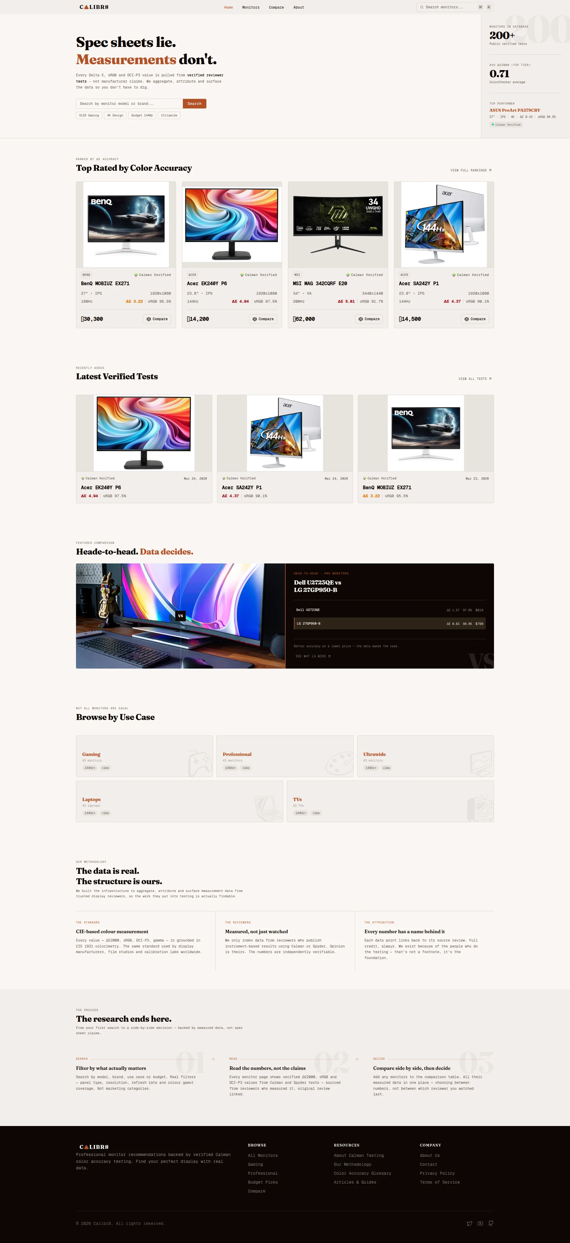
BLOODY HELL, that H1 is BEAUTIFUL. Spec sheets lie. Measurements dont.' — that's the kind of opening line that makes me want to stand up and slow clap. It's sharp, it's confrontational, it picks a fight with every manufacturer's marketing department, and it WINS. The subheadline naming Delta E, sRGB, and DCI-P3 is like seasoning done right — specific, technical, aimed directly at the people who actually CARE. This isn't some watered-down we help you find monitors garbage. This is a DECLARATION OF WAR against spec sheet nonsense. Brilliant.
The three live stats on the right — 200+ monitors tested, 0.71 average ΔE, and the ASUS ProArt PA279CRV as top performer with a Calman Verified badge — that's your amuse-bouche, and it's working. Before the visitor has lifted a finger, you've proven the database is real. That's how you earn trust in the first three seconds.
BUT THEN — oh, THEN — you go and serve this masterpiece with a plastic spork. Your main CTA is a SEARCH BAR?! A passive, limp, type something if you feel like it search bar with a tiny orange button that says Search? Is THAT your hero CTA?! You're assuming every visitor walks in already knowing what monitor they want. What about the photographer who just knows their screen looks wrong? What about the editor who's been lied to by spec sheets for YEARS? You give them NOTHING. No Find my perfect monitor button, no guided entry point, no quiz — just a blank text field and a prayer.
The quick-filter tags underneath — OLED Gaming, 4K Design, Budget 1440p, Ultrawide — are a nice garnish, but they're tiny and easy to miss. And here's the real crime: there's NO hero visual. No screenshot of the comparison tool in action, no monitor imagery that shows what you actually DO. You're selling a data product and you won't SHOW the data! That's like running a restaurant with no photos on the menu and blacked-out windows. Show me the sizzle!
Improvement examples
Search by monitor, model or brand... [Search button]
Find your perfect monitor — filtered by real ΔE scores, not marketing claims. [Search monitors →] or [Browse top picks by use case]
Adding a secondary entry point for undecided visitors and making the CTA text benefit-oriented converts passive browsers into active users — give them a REASON to click, not just a box to type in
Strengths
- H1 'Spec sheets lie. Measurements don't.' is a genuine mic drop — sharp, specific, confrontational, and instantly differentiating from every generic monitor review site out there
- Live stats block (200+ monitors, 0.71 ΔE average, top performer with Calman Verified badge) delivers instant credibility before the visitor scrolls a single pixel
- Subheadline correctly names the exact data points (Delta E, sRGB, DCI-P3) the target audience obsesses over — this is precision copywriting for a precision product
To improve
- Main CTA is a limp search bar — no action-oriented button for visitors who don't know what they're looking for yet, which is probably MOST of your traffic
- Zero hero visual showing the actual product UI — you're selling a data comparison tool and you won't show a single screenshot of it working, that's MADNESS
- The stat block on the right feels visually stranded from the H1 on the left — like two dishes served on the same table that came from different kitchens
Copywriting
DECENT
Right, the copywriting here is like a sous chef who actually KNOWS how to cook but refuses to plate the dish properly. Measured, not just watched. Every number has a name behind it. Not marketing categories. These are EXCELLENT lines — they've got backbone, specificity, and that slightly combative edge that the target audience absolutely eats up. The methodology section naming CIE 1931, Calman, and Spyder? That's the kind of transparency that makes data nerds weak at the knees. WELL DONE.
The three-step process section (Search → Read → Decide) is cleanly structured and benefit-forward. The featured comparison section — Better accuracy at a lower price — the data makes the case — is genuinely persuasive. That's what this entire site should sound like on EVERY section. You nailed it once. Now do it ten more times.
But here's where I want to THROW THE PAN. Who is this FOR? Seriously, WHO? A photographer spending $800 on a monitor that can't hit sRGB 95%? A colorist who's been grading on a lying panel for three years? A studio manager standardizing 20 workstations? The copy NEVER names a single human being with a specific problem. It's all process, process, process — heres how we measure, here's how you search, here's how we verify.' That's the recipe card, not the MEAL. Tell me what changes in my LIFE when I use this.
And then — oh, this one STINGS — Heade-to-head instead of Head-to-head in the featured comparison label. A TYPO. On a site whose ENTIRE brand promise is accuracy and precision. That's like a surgeon with dirty hands. Fix it TONIGHT.
Also, the Browse by Use Case section shows identical specs — 144Hz+, <1ms — for Gaming, Professional, Ultrawide, Laptops, AND TVs. Laptops and TVs with <1ms response time? Either your database is broken or this is placeholder copy that never got updated. Either way, it's the equivalent of serving frozen fish at a seafood restaurant and hoping nobody notices. They WILL notice. Your audience is LITERALLY people who check the numbers.
Improvement examples
The research ends here. From your first search to a side-by-side decision — backed by measured data, not spec sheet claims.
Stop paying $800 for a monitor that lies to you. Calibr8 shows you verified ΔE scores from real instrument tests — so you know exactly what you're buying before you buy it.
Leading with a specific financial pain point and naming the concrete mechanism (verified ΔE scores from instrument tests) transforms this from a process description into an outcome promise — THAT'S what makes someone click
Strengths
- Methodology copy ('Measured, not just watched', 'Every number has a name behind it') is specific, credible, and genuinely differentiating — this is trust-building done RIGHT
- Three-step process section communicates the user journey with concrete benefit language ('Real filters — not marketing categories') — punchy and effective
- Featured comparison section uses actual data to make a persuasive argument — 'Better accuracy at a lower price' is exactly the kind of copy that converts browsers into believers
To improve
- Zero audience-specific copy anywhere — no named personas, no articulated pain points, no 'if you're a photographer/video editor/studio manager' language to make anyone feel SEEN
- Typo 'Heade-to-head' in the featured comparison section is embarrassing on a site built entirely around accuracy — your credibility is your PRODUCT, and you just put a crack in it
- The 'Browse by Use Case' section shows identical placeholder specs (144Hz+, <1ms) for Laptops, TVs, and Gaming — this looks broken and actively DESTROYS trust in the data you're trying to sell
Call-to-Action
CRITICAL
Locked content
Social Proof
CRITICAL
Locked content
Architecture
DECENT
Locked content
SEO & Meta
CRITICAL
Locked content
Mobile
DECENT
Locked content
Visual Design & Branding
DECENT
Locked content
Performance
NEEDS WORK
Locked content
llmreadiness
CRITICAL
Locked content