The Verdict
Right, listen up. Calibr8 has built something genuinely brilliant — verified color accuracy data that cuts through the manufacturer rubbish like a hot knife through butter. The design is clean, the data is real, and the performance is solid. But here's the problem: you've built a Michelin-star kitchen and then put a vending machine at the front door. Your hero is clever but soft. Your copy reads like a textbook when it should read like a sales pitch. Your CTAs are weaker than week-old stock. You've got Apple and Linear logos sitting there and some testimonials, yet the page STILL feels like it's begging nobody in particular to maybe, possibly, if they feel like it, search for a monitor. The LCP clocks in at 2,476 milliseconds — just barely inside the green zone, so I'll give you that. But mate, having a fast page that doesn't convert is like having the fastest oven in London and serving raw chicken. Fix the conversion strategy, sharpen the emotional hooks, and stop hiding your best ingredients in the walk-in freezer. The bones are exceptional. The execution needs a bloody kick up the backside.
Calibr8: The Nerdy Monitor Database That Forgot It Needs to Sell Itself
Look, Calibr8 is doing something legitimately cool — verified, real-world color accuracy data in one place, no manufacturer BS. That's a real problem being solved. The design is clean, the performance is basically perfect (97/100 mobile PageSpeed, respect), and the copy has moments of genuine sharpness. BUT. This site is built like a product demo, not a landing page. There's no pricing, no email capture, no demo CTA, no testimonials from real humans, and the main call-to-action is essentially 'go search for a monitor.' You've built a Ferrari and you're marketing it like a bus schedule. The bones are solid. The conversion strategy is currently a vibe and a prayer.
Hero Section
DECENT
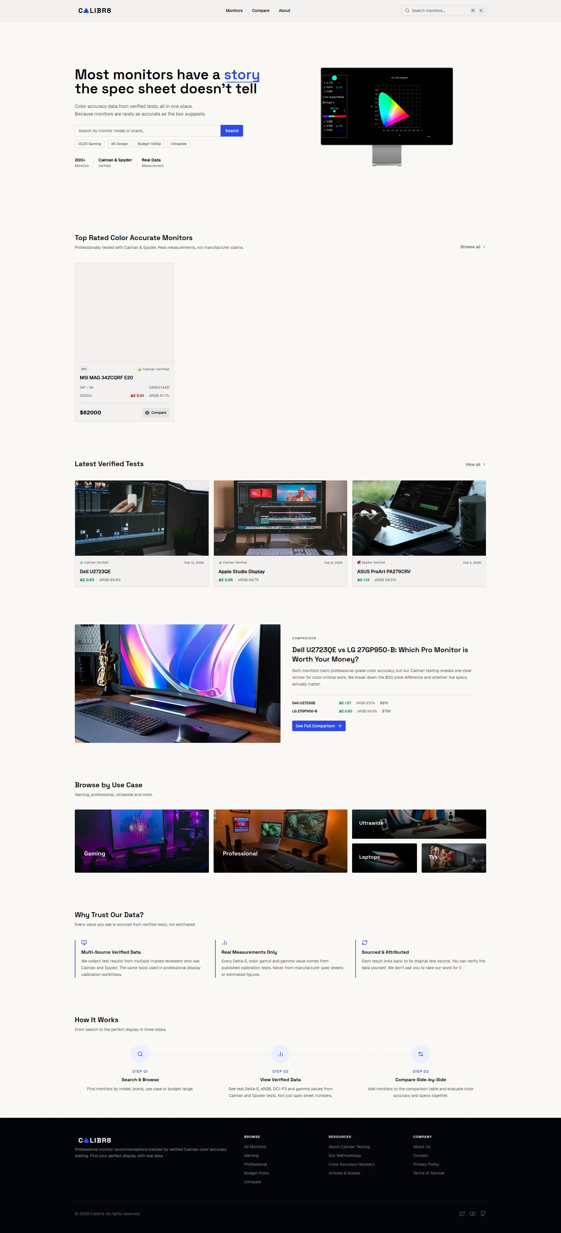
RIGHT. Let's talk about this hero section, shall we? The headline — Most monitors have a story the spec sheet doesnt tell' — is actually GOOD. I mean it. It's clever, it creates a curiosity gap, it speaks directly to every designer and photographer who's been swindled by marketing numbers. That's a proper amuse-bouche that makes you want the next course. Well done. Genuinely.
The subheadline lands the value prop in about five seconds. The social proof trio — 200+ Monitors, Calman & Spyder Verified, Real Data Measurement — uses credible third-party tool names. Smart. The hero visual showing a color gamut chart on a monitor? On-brand, relevant, not some stock photo of a grinning idiot at a laptop. GOOD.
But then — BLOODY HELL — your main CTA is a naked search bar with a blue Search button?! SEARCH?! That's like putting Eat Food on the front of your restaurant! A cold visitor lands here and you're telling them to... search? Search for WHAT? WHY? Where's the Find My Perfect Monitor button? Where's the urgency? Where's the SIZZLE?!
The quick-filter tags — OLED Gaming, 4K Design, Budget 1440p, Ultrawide — are a nice touch, but they're so tiny they might as well be written in invisible ink. And that massive canyon of white space below the search bar? That dead zone kills your momentum stone dead. It's like serving a beautiful starter and then making your guests sit in silence for twenty minutes before the main arrives.
The Calman & Spyder name-drop is great for people who already know what those are. For everyone else? It's like shouting Thermapen verified! at someone who doesn't cook. You need a one-liner explaining WHY these tools matter — that context is buried six scrolls down the page where nobody will ever find it.
Improvement examples
Search (button text on hero CTA)
Find My Color-Accurate Monitor →
An action verb plus a clear benefit transforms a generic search box into an actual conversion moment — the visitor understands what they GET, not just what they DO
Color accuracy data from verified tests, all in one place. Because monitors are rarely as accurate as the box suggests.
Real Delta-E scores from Calman & Spyder tests — not manufacturer claims. Find a monitor that actually delivers the colors you paid for.
Adds specificity (Delta-E scores), names the villain (manufacturer claims), and ties the benefit directly to the visitor's wallet and workflow — that's how you make data SELL
Strengths
- Headline uses a genuine curiosity gap — 'the story the spec sheet doesn't tell' is specific, relatable, and cuts through the generic SaaS noise like a sharp chef's knife
- Social proof stats use credible calibration tool names (Calman & Spyder) that resonate deeply with the professional and enthusiast target audience
- Hero visual of a monitor displaying a color gamut chart directly reinforces the product's core value — no lazy stock imagery, just pure on-brand relevance
To improve
- The primary CTA is a bare 'Search' button — it communicates ZERO benefit and gives cold visitors absolutely no reason to engage. Is THAT your best pitch?!
- Massive white space below the search bar creates a dead zone that murders scroll momentum before the page even gets interesting
- The Calman & Spyder name-drop assumes the audience already knows what professional calibration tools are — no quick explanation of why this matters versus trusting the box
Copywriting
NEEDS WORK
The copy on this page is like a perfectly seasoned dish that someone forgot to plate — technically competent but emotionally FLAT. You know what you are. You just don't make anyone FEEL why they need you. That's the difference between a cook and a chef, and right now you're cooking.
The Why Trust Our Data? section? THAT is your best writing on the entire page. Never from manufacturer spec sheets or estimated figures and We dont ask you to take our word for it' — those lines have TEETH. They're punchy, direct, and dripping with credibility. More of THAT energy everywhere, please!
The comparison headline — Dell U2723QE vs LG 27GP950-B: Which Pro Monitor is Worth Your Money? — is the most conversion-oriented sentence on the page. It asks the exact question your audience is already Googling at 2 AM. Brilliant. That's the kind of writing that should be leading the charge, not buried halfway down the page.
But here's where I want to throw my apron at you. Your copy is almost ENTIRELY feature-oriented. 200+ Monitors — feature. Calman & Spyder Verified — feature. Real Data Measurement — feature. Where's the BENEFIT?! The benefit is: you stop flushing $800 down the toilet on a monitor that looks like it's rendering everything through a dirty window! That emotional payoff — the fear of wasting money, the frustration of being lied to — is NOWHERE on this page.
And then — oh, THEN — the MSI MAG 342CQRF E20 is listed at $62000. SIXTY-TWO THOUSAND DOLLARS. For a monitor! Seriously?! Is this the monitor or the entire building it sits in?! That's either a catastrophic typo or you're selling monitors to oligarchs. Either way, if ONE visitor spots this — and they WILL — your entire database's credibility goes straight into the bin. You've spent all this effort building trust with verified data and then you sabotage yourself with a price that looks like someone fell asleep on the keyboard.
The Browse by Use Case copy? Fast panels, low latency? That's not copy, that's a LABEL. It's like writing Hot Food on a menu and expecting people to order. And the tone overall — appropriate for a technical audience, yes, but so dry it could cure leather. You've got maybe 150 words of actual persuasive content buried in a sea of specs and UI labels. That's not enough to convert anyone who hasn't already decided to use your site.
Improvement examples
200+ Monitors / Calman & Spyder Verified / Real Data Measurement
200+ monitors tested — so you don't spend $800 on one that fails your color work / Calman & Spyder verified — the same tools pro calibrators use / Real measurements, not the numbers brands want you to believe
Every stat needs a 'so what' — connecting the feature to the visitor's actual fear of wasting money and being deceived turns dry data into a selling point that hits them in the gut
Gaming — Fast panels, low latency
Gaming — See which monitors actually hit their claimed response times (most don't)
Creates curiosity and implies insider knowledge — any gamer who's been burned by '1ms response time' marketing claims will click this faster than they'd click a headshot
Strengths
- 'We don't ask you to take our word for it' in the trust section is confident, direct, and genuinely differentiating — it earns credibility without groveling for it, like a chef who lets the food speak
- The comparison headline 'Which Pro Monitor is Worth Your Money?' frames the value prop as a financial decision — exactly the right emotional trigger for someone about to drop $500-$2000
- Consistent use of specific technical terms (Delta-E, sRGB, DCI-P3, Calman, Spyder) signals genuine expertise to the target audience without being condescending
To improve
- The MSI monitor listed at '$62000' is either a catastrophic pricing bug or the most expensive consumer monitor in human history — either way, it NUKES credibility on a site whose entire promise is accurate data
- Copy is almost entirely feature-focused with virtually no articulation of the emotional or financial benefit — '200+ Monitors' means nothing without 'so you don't waste $800 on a dud'
- The 'Browse by Use Case' section copy is just UI labels masquerading as persuasion — 'Fast panels, low latency' is a feature description, not a reason for a gamer to click
Call-to-Action
CRITICAL
Locked content
Social Proof
CRITICAL
Locked content
Architecture
DECENT
Locked content
SEO & Meta
NEEDS WORK
Locked content
Mobile
GOOD
Locked content
Visual Design & Branding
DECENT
Locked content
Performance
GOOD
Locked content
llmreadiness
CRITICAL
Locked content