The Verdict
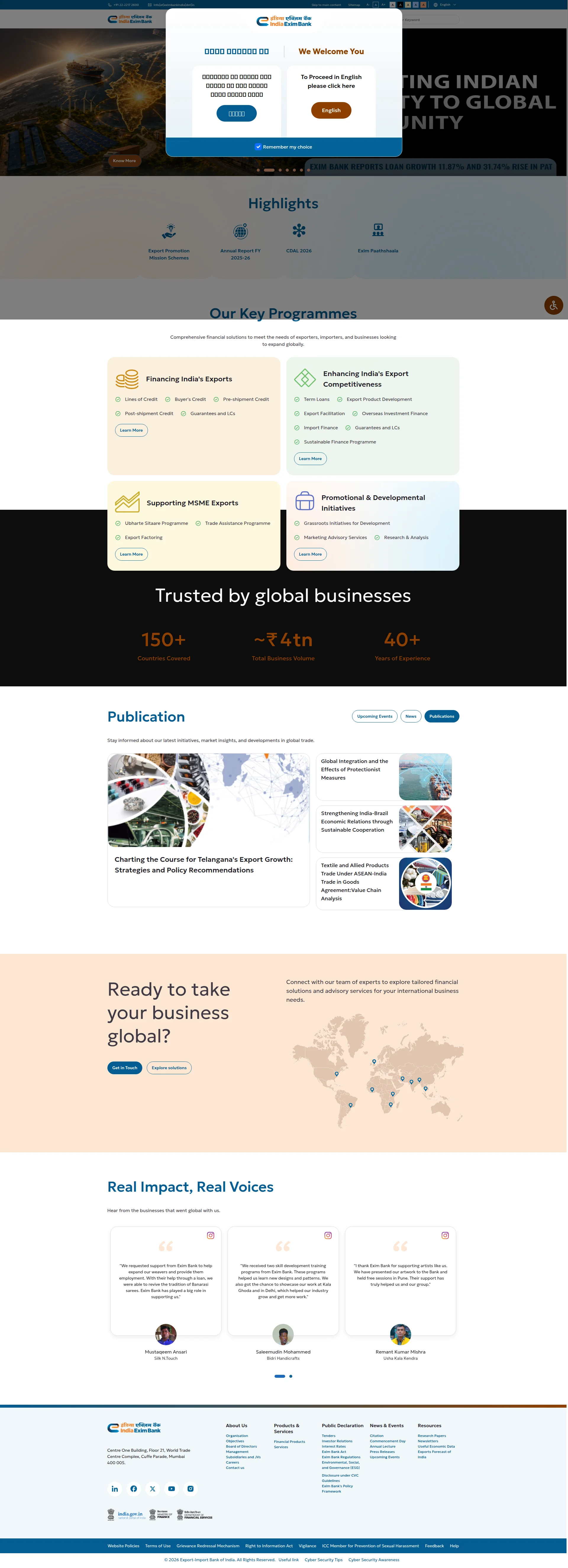
Right, listen up. Exim Bank — you finance India's global trade ambitions, which is bloody important work. So WHY does your website look like it was cooked up during a government committee lunch break in 2014 and never touched again? The hero is hijacked by a language popup before anyone even gets a TASTE of what you do. Then you hit them with a carousel — FOUR rotating messages, which is the digital equivalent of a restaurant with four different menus taped to the door. Your load time? 7.5 seconds. That's not a webpage, that's a HOSTAGE SITUATION. By the time it loads, your visitor could've wired funds manually. Now look — there IS good stuff buried in here. Ten testimonials from real artisans and businesses, solid numbers like 150+ countries and ₹4 trillion in business volume, proper contact details, HTTPS. That's a decent pantry of ingredients! But you've stored them in the basement behind 63 images and institutional waffle that reads like a legal disclaimer wrote a love letter to a PowerPoint deck. The bones are credible. The execution is a government gazette wrapped in a slow-motion car crash. Sort out the fundamentals and you've got a genuinely compelling financial institution site. Right now? You're exporting a terrible first impression.
India's Export Bank Exports a Website That's Stuck in 2014
Look, Exim Bank finances India's global trade ambitions, which is genuinely important work. But this website treats that mission like a government gazette — dense, slow, and designed by committee. The first thing a visitor sees is a bilingual popup asking them to pick a language, which is the digital equivalent of a restaurant asking you to choose your cutlery before you've seen the menu. The hero carousel rotates through four different messages with zero consistent value proposition. The load time of 7.5 seconds is not a performance issue — it's a hostage situation. There are 63 images on a page that should have 12. The copy oscillates between inspirational nation-building rhetoric and dry financial product listings. There IS real social proof buried here — testimonials from actual artisans, solid numbers like 150+ countries and ₹4tn business volume — but they're treated as afterthoughts. This site has the bones of something credible, wrapped in the skin of a 2014 government portal. Fix the fundamentals and you have a genuinely compelling financial institution website. Right now, it's exporting a bad first impression.
Hero Section
CRITICAL
BLOODY HELL — is THAT your hero section?! The first thing I see isn't your value proposition, isn't your 40 years of credibility, isn't a single compelling reason to bank with you. No. It's a POPUP. A bilingual language selector physically blocking the ENTIRE hero like a bouncer at a club nobody asked to enter. That's like walking into a Michelin-starred restaurant and the first thing they do is shove a clipboard in your face asking what language you'd like the napkins folded in. MOVE IT TO THE HEADER WHERE IT BELONGS.
Once I finally dismiss that popup — IF I bother — I land on a carousel. FOUR rotating hero messages: Strengthening Indias Exports Ecosystem,' Empowering Indias Global Trade,' Building Indias Project Exports Capabilities,' and Realising Potential of MSMEs. Four messages. Four audiences. ZERO commitment. A carousel isn't a strategy, it's a chef who can't pick a signature dish so he puts four specials on the board and hopes one sticks. Spoiler: NONE of them stick because nobody waits around for slide three.
There's no H1 tag. NOT ONE. Your hero headlines are visually big but semantically invisible — search engines can't see them, screen readers can't read them. The tagline? Indias premier financial institution engaged in financing, facilitating, and promoting the country's Industrialisation efforts.' That sentence was written by a committee at 11pm and it READS like it. It says everything and nothing at the same time — it's the equivalent of a chef describing his dish as a premier culinary preparation engaged in the facilitation of taste.
And your CTAs! Know More. Contact Us. Learn More. Seriously?! These are the BEIGE CURTAINS of button copy. Know more about WHAT? Why should I care? What happens when I click? There's no urgency, no benefit, no reason to lift a finger. Meanwhile, your BEST ingredients — 150+ countries, ₹4 trillion in business volume, 40+ years of experience — are buried SEVERAL scrolls down like leftovers in the back of the fridge. Those stats belong IN the hero, front and centre, making visitors trust you before they even think about scrolling.
The hero image is some scenic aerial shot that could belong to a tourism board, a real estate firm, or a screensaver. It communicates absolutely nothing about export finance. You're India's EXPORT BANK — show me ports, show me handshakes, show me goods moving across borders. Give me something that MEANS something!
Improvement examples
Empowering India's Global Trade — India's premier financial institution engaged in financing, facilitating, and promoting the country's Industrialisation efforts.
India's Export Finance Partner — Get credit lines, buyer's credit, and trade guarantees to take your business to 150+ countries. Trusted by Indian exporters for 40+ years.
The original is vague institutional waffle that could describe any government body on the planet. The rewrite leads with specific financial tools, anchors credibility with real numbers pulled straight from the page, and tells the visitor exactly what they GET — all in under 25 words. That's how you write a hero.
Know More
Explore Export Financing Options
'Know More' tells the visitor absolutely nothing about where they're going or why they should care. The replacement names the destination, uses a specific action verb, and sets expectations — reducing friction and actually making someone WANT to click.
Strengths
- Multiple hero slides do attempt to address different audience segments — exporters, MSMEs, project exporters — showing at least a basic awareness that your customer base is diverse, even if the execution is a mess
- CTAs are present above the fold on each carousel slide, maintaining some action orientation throughout the rotation — at least you're TRYING to get people to click something
- The language selector popup, while catastrophically placed, shows genuine bilingual commitment for Hindi-speaking users — that's a real accessibility consideration for the Indian market and I respect the intent, just not the execution
To improve
- A language-selection modal is literally the FIRST thing visitors see — it blocks the entire hero and destroys any chance of a compelling first impression before the value prop is even visible. It's like serving a raw ingredient before the appetiser
- Four rotating carousel messages mean ZERO clear, memorable value proposition — no single promise sticks, and visitors who don't wait for all slides miss three-quarters of the messaging. Pick ONE message and commit to it like your reputation depends on it
- Hero CTAs ('Know More,' 'Contact Us,' 'Learn More') are generic placeholder text with no action verb, no stated benefit, and no urgency — they're the culinary equivalent of labelling every dish on the menu 'Food'
Copywriting
CRITICAL
Right, the copy on this page is like a kitchen with two head chefs who've never met — one writes inspirational nation-building speeches (Realising Potential of MSMEs by Integrating with Global Value Chains) and the other writes spreadsheet headers (Lines of Credit, Buyers Credit, Pre-shipment Credit, Post-shipment Credit, Guarantees and LCs'). Neither of them has ONCE thought to write what the visitor actually needs to hear, which is: I need money and support to sell my stuff internationally — can you help me or not?
The Our Key Programmes section? It's a FEATURE DUMP. A raw ingredients list with no recipe. Ubharte Sitaare Programme — lovely, what does that DO? Trade Assistance Programme — for WHOM? Doing WHAT? You're listing product names like a waiter rattling off dishes in a language the customer doesn't speak. There's no outcome language, no heres what happens after you apply,' no heres what this means for YOUR business.' You're forcing visitors to click Learn More just to understand what they're looking at — and most of them WON'T.
BUT — and I'll give credit where it's deserved — the testimonials section is GENUINELY brilliant. Real Impact, Real Voices features named individuals: Mustaqeem Ansari from Silk N.Touch, Saleemudin Mohammed from Bidri Handicrafts, Remant Kumar Mishra from Usha Kala Kendra. These people talk about REAL outcomes — reviving Banarasi sarees, learning new designs and patterns, getting support that helped their industry grow. THIS is the best copy on your entire page, and your CUSTOMERS wrote it, not your marketing team. That should tell you something!
The stats section — 150+ Countries Covered, ~₹4tn Total Business Volume, 40+ Years of Experience — these are solid credibility markers. But that tilde on ~₹4tn? That tiny squiggle says 'we're not quite sure of our own numbers.' Either commit to the figure or explain the range. Confidence matters in finance!
Your tone is stuck in no-man's-land. It's too formal for the artisan weavers you're clearly trying to help, and too vague for the CFOs and trade finance officers who need specifics. You're cooking one dish for two completely different dinner parties and NEITHER table is satisfied. And Publication as a section header when you're listing multiple publications? Come on — that's like writing Dish above a five-course menu. It's Publications. Plural. Details MATTER.
The grammar is clean throughout, which is the bare minimum but I'll acknowledge it — at least the kitchen is sanitary even if the food needs work.
Improvement examples
Comprehensive financial solutions to meet the needs of exporters, importers, and businesses looking to expand globally.
Whether you're a first-time exporter or scaling to new markets — we have the credit lines, guarantees, and advisory support to get you there. Here's what we offer:
The original is a generic mission statement you could paste onto any bank's website without anyone noticing. The rewrite acknowledges different experience levels, names specific tools available, and uses a conversational bridge that makes the product list below feel like a helpful answer rather than a dry catalogue.
Ubharte Sitaare Programme
Ubharte Sitaare Programme — Funding and mentorship for mid-sized Indian companies with high export potential, helping you scale internationally with dedicated support
A programme name in Hindi with no English explanation is invisible to most visitors. Adding a one-line description in plain language means people understand the benefit without clicking away — reducing bounce and actually telling them why they should care.
Strengths
- The customer testimonials are SUPERB — ten named, specific, outcome-focused stories from real artisans and businesses describing genuine transformations. Reviving Banarasi sarees, learning new craft patterns, growing export businesses. This is the kind of copy money can't buy, and you've got TEN of them
- The statistics section provides concrete credibility anchors — 150+ countries, approximately ₹4 trillion in business volume, 40+ years of experience. These are the kind of numbers that make a CFO sit up and pay attention
- Grammar and spelling are consistently clean across the entire page — the kitchen may be disorganised but at least it's hygienic
To improve
- The 'Our Key Programmes' section is a pure feature dump — product names listed with zero outcome language, forcing visitors to click 'Learn More' just to understand what any of these financial tools actually DO for their business. It's like listing ingredients without ever describing the dish
- Copy tone is stuck between formal institutional language for sophisticated finance professionals and accessible language for small artisan exporters — it serves NEITHER audience well and confuses both. Pick a voice and commit to it
- Hero headline copy across all four carousel slides uses abstract nation-building rhetoric ('Realising Potential,' 'Empowering India's Global Trade') with no concrete promise, no timeframe, and no stated benefit for the individual visitor — it's inspirational wallpaper, not persuasive copy
Unlock 8 Remaining Categories
Call-to-Action
CRITICAL
Locked content
Social Proof
DECENT
Locked content
Architecture
NEEDS WORK
Locked content
SEO & Meta
CRITICAL
Locked content
Mobile
CRITICAL
Locked content
Visual Design & Branding
CRITICAL
Locked content
Performance
CRITICAL
Locked content
llmreadiness
CRITICAL
Locked content
Locked Content
Access the full conclusion with the top 3 priority actions and a personalized motivational message.