The Verdict
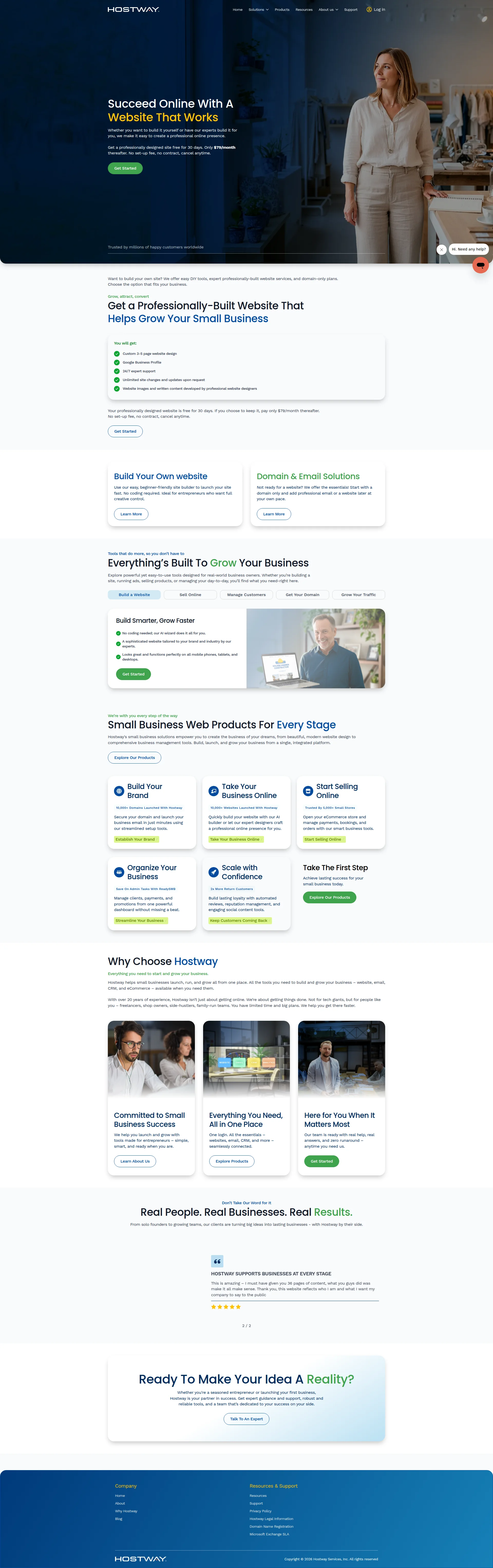
Right, listen up. Hostway is like a chef who's been cooking for 23 years but still serves the same lukewarm soup he learned in culinary school. The bones are there — real pricing on the table, a genuine 20-year track record, and a product lineup that actually makes sense. But BLOODY HELL, the execution! The hero headline is so generic it could be printed on a napkin at any restaurant in the world and nobody would know which one. The copy reads like someone asked ChatGPT to 'write something nice about a web hosting company' and hit publish on the first draft. You've got 10 testimonials and a Google logo for trust, which is something, but for a platform begging small businesses to hand over their ENTIRE digital kitchen — website, email, CRM, ecommerce — you need to be serving a five-course trust feast, not a side salad. Performance? 3.4 seconds to load. That's slower than a sous chef on his first day. Your LCP is firmly in 'average' territory when it needs to be snappy. And your AI readiness? You're a ghost in the machine — no schema, no llms.txt, nothing. Hostway isn't a bad restaurant. It's just a forgettable one. And in 2026, forgettable is the same as closed.
Hostway: 23 Years Online and Still Dressing Like It's 2019
Look, Hostway isn't a disaster. It's more like a reliable Toyota Camry that someone decided to park in a Lamborghini dealership and wonder why nobody's excited. The offer is clear ($79/month, 30-day free, no contract), the product lineup makes sense, and '23 years in business' is genuinely impressive. But the execution? It's the digital equivalent of a firm handshake from someone wearing a wrinkled shirt. The hero is doing okay work, the copy is friendly but forgettable, and the trust section is basically two anonymous testimonials and some round numbers that could have been invented on a lunch break. For a platform that wants small business owners to trust it with their website, email, CRM, AND ecommerce, Hostway needs to stop being the nice guy in the room and start being the obvious choice. Right now, it's neither.
Hero Section
DECENT
Oh, for the love of — is THAT your hero section?! Succeed Online With A Website That Works. That's not a headline, that's a PLACEHOLDER someone forgot to replace before launch! Every web builder from here to Timbuktu could slap that on their homepage and it would fit like a glove. It's the equivalent of a restaurant sign that says Eat Food That Tastes Good. Well, OBVIOUSLY! Where's the sizzle? Where's the thing that makes me stop scrolling and think THESE are my people?
Here's what drives me absolutely mental — you've actually GOT a decent hook hiding in the subtext like a truffle buried under mud! A 30-day free trial, $79/month, no contract, no setup fee. That's a genuinely compelling offer! But instead of putting it on the marquee where it belongs, you've buried it in a paragraph of text underneath the world's most forgettable headline. That's like hiding your signature dish in the kids' menu!
The CTA says Get Started. Get started doing WHAT exactly? Filling a form? Picking a template? Giving you my firstborn? Get Started is the unseasoned chicken breast of call-to-action buttons — technically food, but nobody's coming back for seconds.
Now, that social proof line — Trusted by millions of happy customers worldwide — mate, elsewhere on your own site you say 500,000 customers. So which is it? Millions or half a million? That's not a rounding error, that's a credibility grenade. You've just told your visitor you either can't count or you're exaggerating, and NEITHER of those is a good look when you're asking someone to trust you with their business.
The hero image? A woman in a professional setting. Fine. Lovely. But it tells me NOTHING about your product. Show me a beautiful website you built! Show me a dashboard! Show me SOMETHING that proves you're not just another stock-photo factory with a Get Started button.
The typography hierarchy works — headline biggest, subtext follows, CTA is distinct. So at least the kitchen is organized, even if the food is bland.
Improvement examples
Succeed Online With A Website That Works
Your Business Website, Built and Live in 30 Days — or Your Money Back
The original is so generic it could be a motivational poster in a dentist's waiting room. The rewrite leads with the concrete outcome (a live website), the timeframe (30 days), and the guarantee — three specific things that actually give someone a reason to choose Hostway over the 47 other tabs they have open right now.
Trusted by millions of happy customers worldwide
Trusted by 500,000+ small businesses across 91 countries
Stop inflating numbers like a desperate soufflé! 500,000 is already an impressive number — OWN IT. Specific numbers with a geographic detail are infinitely more believable than vague superlatives that contradict your own About page.
Strengths
- Pricing is RIGHT THERE in the hero — $79/month, 30-day free trial, no contract — and that kind of transparency is rarer than a perfectly cooked soufflé in this industry. Genuine respect for not hiding the price behind a 'Contact Sales' wall
- CTA button sits above the fold and is visually distinct — at least you know where the front door of this restaurant is, even if the welcome mat is boring
- The subheadline clearly lays out two paths — build it yourself OR let the experts build it — which is smart because it immediately tells two different types of visitor 'yes, we serve YOUR dish'
To improve
- 'Succeed Online With A Website That Works' — I've seen more personality on a hospital elevator sign. Zero differentiation, zero specificity, zero reason for anyone to remember you said it
- 'Trusted by millions' versus '500,000 customers' elsewhere on the site — congratulations, you've contradicted yourself in your own kitchen. That inconsistency doesn't just fail to build trust, it actively DESTROYS it
- The hero visual is generic lifestyle photography with absolutely no product in sight — you're a website builder who won't show a single website in the most important section of the page. That's a chef who won't let you see the food!
Copywriting
NEEDS WORK
Right, the copywriting on this page is like eating at a restaurant where everything is nice. The bread is nice. The salad is nice. The main course is nice. And you leave and immediately forget you ever ate there. THAT is the problem with Hostway's copy — it's pleasant, inoffensive, grammatically correct, and completely, utterly, DEVASTATINGLY forgettable.
Everythings Built To Grow Your Business' — oh, is it? Is it REALLY? Because that sentence tells me absolutely NOTHING. Built HOW? Grow by HOW MUCH? Every SaaS homepage on the planet claims to grow your business. It's the ketchup of marketing copy — it goes on everything and impresses no one.
Build Smarter, Grow Faster — FASTER THAN WHAT?! Faster than a snail? Faster than your competitor? Faster than last quarter? Without a benchmark, this is just two adjectives holding hands and pretending to be a value proposition.
Here's what REALLY gets my blood boiling — you've actually got some genuinely useful numbers hiding on this page like shy little garnishes: 10,000+ Domains Launched, 5,000+ Small Stores, 2x More Return Customers, Save On Admin Tasks With ReadySMB. Those are REAL. Those are SPECIFIC. And where are they? Buried in tiny subheaders under product cards where approximately NOBODY reads them. Meanwhile, the prime real estate is occupied by phrases like powerful yet easy-to-use tools and seamlessly connected. Seriously?! Those aren't benefits, those are filler words!
The Why Choose Hostway section — which should be your KNOCKOUT PUNCH — lands like a wet dishcloth. You mention 20+ years of experience, which is brilliant, and then immediately pivot to talking about freelancers and side-hustlers without ever telling me what those 20 years actually PRODUCED. What's the success rate? What's the average revenue increase? What happens to businesses that choose you versus the competition? GIVE ME SOMETHING TO CHEW ON!
The tone is warm and accessible, I'll give you that — no jargon, no corporate waffle, genuinely readable for a non-technical person. And the pricing transparency repeated across multiple sections is smart. But warm and readable is the MINIMUM. It's having clean plates in a restaurant. Nobody gives you a Michelin star for clean plates.
Grammar is clean, word count is healthy, language is jargon-free. The foundation of a good kitchen is here. Now somebody needs to actually learn to COOK.
Improvement examples
Hostway helps small businesses launch, run, and grow all from one place. All the tools you need to build and grow your business – website, email, CRM, and eCommerce – available when you need them.
Most small business owners juggle 4-6 different tools just to stay online. Hostway replaces all of them — website, email, CRM, and eCommerce — in one login, at a price that doesn't require a spreadsheet to justify.
The original reads like a feature list wearing a benefit costume. The rewrite opens with the customer's actual daily pain — tool sprawl and complexity — makes the same product claim, then lands with an emotional hook about cost simplicity. It speaks TO the visitor instead of AT them, which is the difference between a waiter who remembers your name and one who reads the specials off a card.
Strengths
- You've scattered specific micro-stats throughout the page — '10,000+ Domains Launched,' '5,000+ Small Stores,' '2x More Return Customers' — and when a visitor actually spots them, they do real credibility work. These are the good ingredients; you just need to stop hiding them in the pantry
- The tone is consistently warm, human, and accessible — no tech jargon, no corporate buzzword bingo, genuinely approachable for a small business owner who just wants to get online without a computer science degree. That's the right instinct for this audience
- Pricing transparency ($79/month, 30-day free, no contract, no setup fee) is repeated across multiple sections, which reinforces the low-risk message every time the visitor scrolls. Repetition of a genuinely good offer is smart seasoning
To improve
- The 'Why Choose Hostway' section — literally the most critical persuasion real estate on the entire page — contains ZERO concrete differentiation. 'Real help, real answers' and 'seamlessly connected' could appear on any competitor's homepage without anyone noticing. That's not a value proposition, that's wallpaper
- Benefits are stated at the category level ('grow your business,' 'scale with confidence') without EVER delivering a specific outcome a customer can actually picture — something like 'our clients average 3x more leads in their first 90 days' would be worth more than ten paragraphs of vague encouragement
- The copy never once acknowledges that competitors exist or addresses the visitor's real fear — that they'll spend money on a website that sits there doing nothing. For a small business owner who's been burned before, ignoring that objection is like a chef ignoring a food allergy. It's not just a missed opportunity, it's a deal-breaker
Unlock 8 Remaining Categories
Call-to-Action
DECENT
Locked content
Social Proof
CRITICAL
Locked content
Architecture
DECENT
Locked content
SEO & Meta
NEEDS WORK
Locked content
Mobile
DECENT
Locked content
Visual Design & Branding
DECENT
Locked content
Performance
NEEDS WORK
Locked content
llmreadiness
CRITICAL
Locked content
Locked Content
Access the full conclusion with the top 3 priority actions and a personalized motivational message.