The Verdict
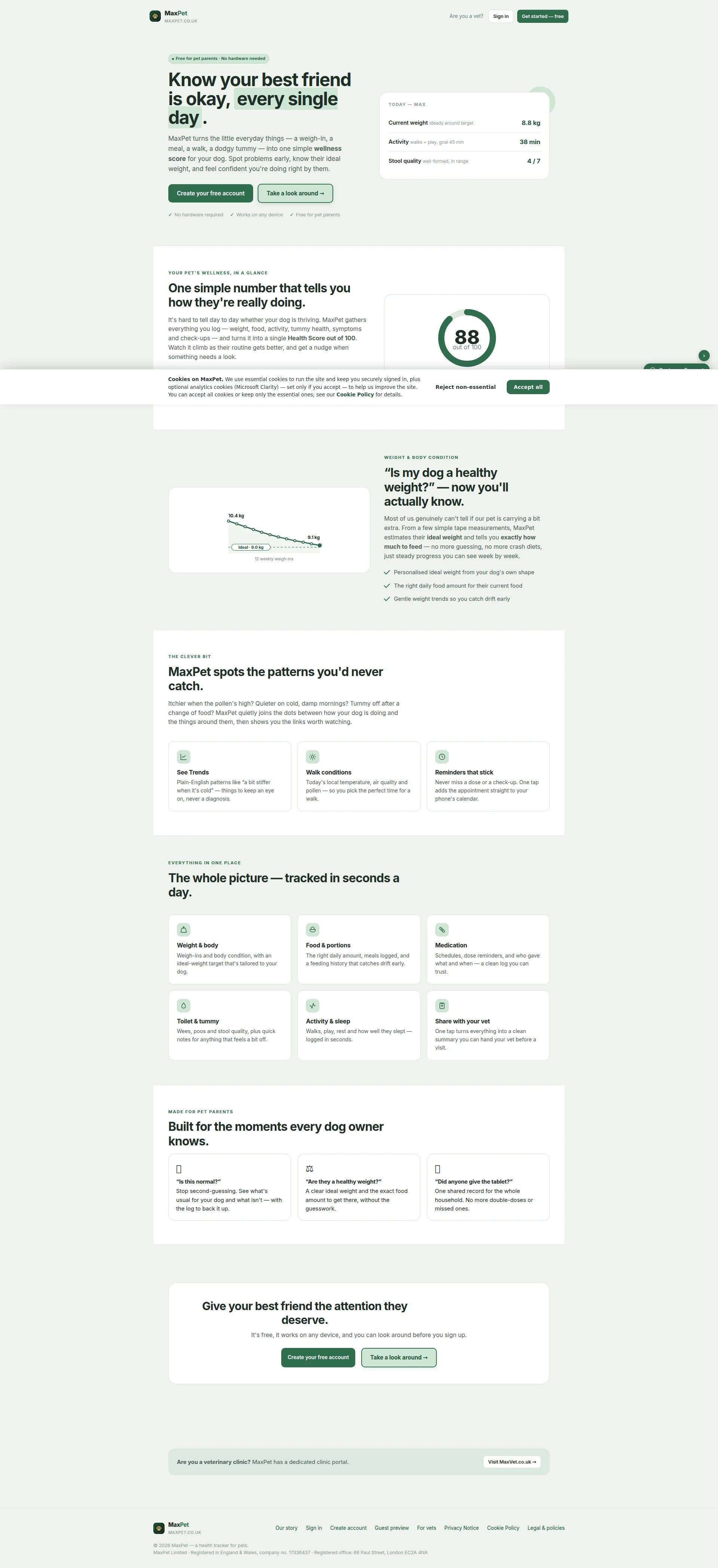
Right, sit down Jay, because I need to be honest with you. You've cooked up something genuinely beautiful here — the copy reads like a warm hug from someone who actually owns a dog, the design is cleaner than a freshly groomed poodle, and the page weighs less than a chihuahua's dinner. That's RARE for a solo founder. But mate — you're serving this gorgeous dish on a paper plate in a dark alley. ZERO testimonials visible on the homepage, no user numbers, no star ratings, no trust badges beyond a Companies House number that nobody's ever been excited to read. You're asking strangers to hand over their pet's health data and your trust section is basically 'trust me bro, I'm registered at Companies House.' The LCP on mobile clocks in at 2.86 seconds — just over the 2.5s good threshold, so that's average, not great. You've got Microsoft Clarity running for analytics, which shows you're thinking about data, but the page itself is STARVING for social proof. The bones of this dish are Michelin-worthy. The presentation needs a complete trust makeover before anyone's going to eat it.
MaxPet: A Genuinely Lovely Dog Tracker That's Terrified of Its Own Shadow
Right, listen up Jay. You've built something genuinely useful, written about it with real heart, and somehow managed to make 'dog poo logging' sound almost poetic. That's not nothing — that's actually hard. The copy is warm, benefit-led, and avoids the corporate waffle that kills most SaaS landing pages stone dead. The design is clean, restrained, and doesn't look like it was assembled by a caffeinated intern at 2am. BUT — and this is a big, labrador-sized but — you're asking people to hand over their data with zero testimonials, zero user numbers, zero social proof of any kind, and a trust section that's basically just 'here's our registered company number, please believe us.' For a brand new app from a founder nobody's heard of yet, that's like showing up to a first date and leading with your Companies House filing. Fix the trust layer, add some real humans saying real things, and you've got something that could genuinely take off.
Hero Section
DECENT
RIGHT, let me tell you what's happening in this hero section. Know your best friend is okay, every single day. — THAT is a headline, that is. It lands in under three seconds, it's emotional, it's clear, and it speaks directly to every dog owner who's ever Googled is my dog limping or am I paranoid at midnight. Well done. GENUINELY well done. The dual CTA strategy — Create your free account alongside Take a look around — is like offering both a tasting menu and a peek through the kitchen window. Smart. Very smart. You're catching the eager AND the cautious, and for a brand nobody knows yet, that guest preview option is BRILLIANT.
BUT — oh, here it comes — where in the BLOODY HELL is your social proof?! You've got this beautiful hero, this warm emotional headline, these clean CTAs sitting there like perfectly plated garnishes... and underneath? NOTHING. No user count, no testimonial snippet, no star rating. It's like serving a stunning risotto and then telling the customer oh, youre the first person to ever try it, good luck!' For a brand-new SaaS with ZERO reputation, that empty space where social proof should be is practically screaming WE JUST LAUNCHED AND NOBODY USES THIS YET. You need SOMETHING there — even five beta testers saying nice things would be better than this void.
The UI mockup showing weight, activity, and stool quality? Conceptually sound but it's TINY. I need a magnifying glass to read 8.8 kg and 38 min. Make it bigger, make it sing! And that Free for pet parents · No hardware needed badge sitting meekly above the headline like it's embarrassed to be there? That's your BIGGEST conversion weapon and you've given it the visual presence of a mouse at a cat convention. FREE should be screaming from the rooftops, not whispering from the footnotes!
Improvement examples
Free for pet parents · No hardware needed
100% free for pet parents · No hardware · No credit card · Works on any device
Adding 'No credit card' removes the single biggest psychological barrier to signup for free SaaS products. The current version answers two objections; this answers four. Stop whispering your best feature and START SHOUTING IT.
Strengths
- 'Know your best friend is okay, every single day.' — this headline is a perfectly seasoned emotional hook that communicates anxiety relief for dog owners without a single drop of jargon. Chef's kiss, genuinely
- The dual CTA approach ('Create your free account' + 'Take a look around') is like having both a front door and a window — you're capturing high-intent AND cautious visitors, with that guest demo being an absolute masterstroke for a product nobody's heard of yet
- The 'Free for pet parents · No hardware needed' pre-header tackles the two biggest objections — cost and complexity — before the visitor even reads the main course. That's proper mise en place, that is
To improve
- ZERO social proof in the hero — no user count, no testimonial, no rating, absolutely NOTHING — is like opening a restaurant with no reviews, no queue outside, and wondering why people walk past. For a brand-new product, this is the single biggest hole you need to fill
- The UI mockup visual is so small it might as well be a postage stamp — it shows data when it should show FEELING. A dog owner smiling at their phone, a vet nodding approvingly, ANYTHING with emotional resonance instead of tiny numbers nobody can read
- Your 'free' message is scattered like crumbs across the hero instead of being served as a proper course — for a freemium product, 'completely free, no credit card required' should be the loudest thing on the page, not buried in a badge the size of a breath mint
Copywriting
GOOD
Listen, I'm going to say something I don't say often enough — this copy is GOOD. Properly good. Jay writes like an actual human being talking to another actual human being, and in the SaaS world, that's rarer than a well-done steak in my kitchen. The benefit-led framing is consistent throughout — it's never we track weight, it's know their ideal weight. It's never we log symptoms, it's spot problems early. That's a chef who understands you don't sell ingredients, you sell the MEAL.
And those question-based section hooks? Is this normal? Are they a healthy weight? Did anyone give the tablet? BLOODY BRILLIANT. Those are the exact words a panicking dog owner types into their phone at 11pm while their labrador gives them a suspicious look. That's not copywriting, that's mind-reading. The conversational tone — dodgy tummy, a bit extra, catches drift early — makes the whole product feel like advice from a trusted friend rather than a software manual.
BUT — and I'm going to shake you by the shoulders here — your SINGLE MOST POWERFUL piece of copy is ROTTING on your About page like a Wagyu steak left in the fridge! The story about the vet asking three questions you couldn't answer? THAT is your homepage opener! That's the emotional gut-punch that makes every dog owner in Britain go oh God, thats me.' And you've HIDDEN it on a page that maybe 4% of visitors will ever click on. That's like putting your best dish on a secret menu that nobody knows about!
The other crime? Zero social proof copy. Not a single testimonial, not a join 500 dog owners, not even a made-up quote from your mum saying lovely app, dear. The copy is doing ALL the persuasion alone with absolutely no backup. It's a one-chef kitchen trying to serve 200 covers — eventually something's going to crack.
Improvement examples
MaxPet turns the little everyday things — a weigh-in, a meal, a walk, a dodgy tummy — into one simple wellness score for your dog.
In 2023, a vet asked me three questions about my dog. I couldn't answer a single one. MaxPet exists so you never have that moment. It turns a weigh-in, a meal, a walk, a dodgy tummy — into one wellness score, so you always know the answer.
The founder's story is the most emotionally powerful ingredient on the entire site and it's locked in the pantry. Leading with it on the homepage creates instant identification with the target audience's exact fear, then positions the product as the direct solution to that specific, painfully relatable failure. Stop hiding your best dish!
Strengths
- The question-based section hooks — 'Is this normal?', 'Did anyone give the tablet?' — are so precisely tuned to real dog owner anxieties that they feel like someone's been reading the audience's browser history. THIS is what proper audience research looks like when it's translated into copy
- Every single feature is immediately married to an owner benefit — never left standing alone like a naked capability statement. 'We track trends' becomes 'spots the patterns you'd never catch.' That's the difference between a recipe and a restaurant
- The plain English is RELENTLESS — 'dodgy tummy,' 'a bit extra,' 'catches drift early' — making the product feel like getting advice from your most trusted friend rather than downloading enterprise software. Not a single word of jargon. Not ONE
To improve
- The most emotionally devastating piece of copy on the ENTIRE site — the vet asking three questions Jay couldn't answer — is buried alive on the About page where it's doing absolutely NOTHING for conversion. Get that story on the homepage NOW or I swear I'll come to your office and move it myself
- Social proof copy is a complete wasteland — no testimonials, no user counts, no pull quotes, no 'trusted by X pet parents.' The copy is carrying 100% of the persuasion load with zero third-party validation as backup. That's a soufflé with no eggs — it WILL collapse
- Several benefit statements go soft when they should go SPECIFIC — 'feel confident you're doing right by them' and 'get a nudge when something needs a look' are warm and fuzzy but tell me NOTHING concrete. Show me the nudge! Show me the notification! Give me a screenshot, an example, SOMETHING tangible instead of vague reassurance
Unlock 8 Remaining Categories
Call-to-Action
DECENT
Locked content
Social Proof
CRITICAL
Locked content
Architecture
DECENT
Locked content
SEO & Meta
CRITICAL
Locked content
Mobile
GOOD
Locked content
Visual Design & Branding
GOOD
Locked content
Performance
GOOD
Locked content
llmreadiness
DECENT
Locked content
Locked Content
Access the full conclusion with the top 3 priority actions and a personalized motivational message.