The Verdict
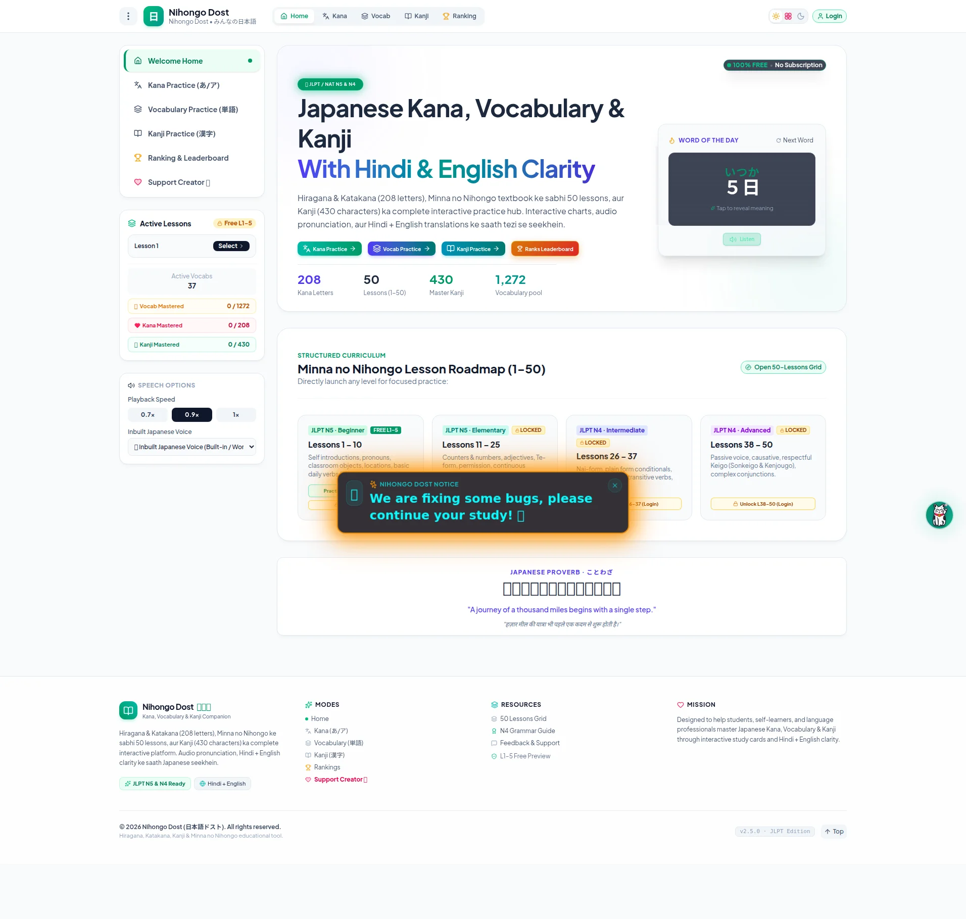
Right, listen up. Nihongo Dost has the INGREDIENTS of something genuinely special — 208 Kana letters, 50 structured lessons, 430 Kanji, a Hindi + English angle that literally NO major competitor offers. That's a Wagyu steak sitting in the walk-in fridge. But instead of plating it beautifully and serving it with confidence, you've dumped the entire kitchen inventory onto the customer's table and said 'figure it out yourself.' The homepage can't decide if it's a landing page or an app dashboard — it's trying to be BOTH and it's succeeding at NEITHER. You've got a sidebar full of mastery counters and speech speed sliders staring at first-time visitors who don't even know what the product IS yet. There are FOUR equal CTA buttons fighting each other like crabs in a bucket, and your strongest selling point — '100% FREE, No Subscription' — is hiding in a tiny badge in the corner like it's ASHAMED of itself. You've got 10 testimonials according to the data and you're showing ZERO of them on the page. ZERO! That's like having a Michelin star and keeping the certificate in your sock drawer. The LCP clocks in at 2.6 seconds — passable, not impressive, but not the problem here. The REAL problem is that this page has no persuasive arc, no social proof, no emotional hook, and a bug-fix popup literally blocking the curriculum section. You've built a solid restaurant kitchen but forgot to hire a front-of-house. Fix the plating, show the reviews, and give people ONE clear reason to sit down and eat.
Nihongo Dost: A Passionate Side Project Cosplaying as a SaaS Product
Look, the bones are here. 208 Kana letters, 50 lessons, 430 Kanji, a leaderboard — this is actually a solid product. But the homepage is doing the digital equivalent of showing someone your entire kitchen before they've decided if they want to eat. The sidebar is app UI, not landing page content. There's a bug-notice popup plastered over the curriculum section like a caution tape at a crime scene. The copy mixes Hindi and English mid-sentence in the description, which is either brilliant bilingual targeting or accidental chaos — and right now it reads as the latter. There's no testimonial, no user count, no 'X students already learning' anywhere. The freemium angle ('100% FREE · No Subscription') is the strongest trust signal on the page and it's buried in a tiny badge. This site needs to decide if it's a landing page or an app dashboard, because right now it's trying to be both and succeeding at neither.
Hero Section
NEEDS WORK
BLOODY HELL, is THAT your hero section?! It looks like someone took an app dashboard and a landing page, threw them in a blender, and poured the result onto the screen. On the LEFT side, you've got a full sidebar — lesson progress bars, Vocab Mastered: 0/1272, speech speed controls at 0.7x and 0.9x — that's your BACK KITCHEN, mate! You don't drag customers through the dishwashing station before they've even seen the menu! A first-time visitor lands here and their brain has to process mastery counters and playback settings before they even understand what you're SELLING. It's like walking into a restaurant and the first thing you see is the walk-in freezer inventory list.
Now, the RIGHT side — that's where the actual dish is. Japanese Kana, Vocabulary & Kanji With Hindi & English Clarity — THAT is a genuinely brilliant headline. That green subtitle pops, and the Hindi + English angle is your secret ingredient that Duolingo and WaniKani simply don't have. The stat strip — 208, 50, 430, 1,272 — those numbers are specific, credible, and they make this feel like a REAL kitchen, not a food truck. The Word of the Day widget with the Japanese character is a lovely amuse-bouche.
But then — FOUR CTA buttons sitting side by side like contestants on a cooking show, all equally dressed, all equally confused about who's supposed to WIN. Kana Practice, Vocab Practice, Kanji Practice, Ranks Leaderboard — where's the PRIMARY action?! Where's the big, beautiful START LEARNING FREE button that grabs someone by the collar?! And your absolute BEST conversion weapon — 100% FREE · No Subscription — is sitting in a tiny green badge in the top-right corner, whispering when it should be SCREAMING. That badge should be the size of a dinner plate, not a garnish.
Improvement examples
Kana Practice → | Vocab Practice → | Kanji Practice → | Ranks Leaderboard
Start Learning Free — No Signup Needed | or Browse the Curriculum ↓
One dominant primary CTA with a clear benefit ('Free, no signup') and a softer secondary option converts dramatically better than four parallel buttons competing for the same click — give the customer ONE dish to order, not four menus
Hiragana & Katakana (208 letters), Minna no Nihongo textbook ke sabhi 50 lessons, aur Kanji (430 characters) ka complete interactive practice hub.
Master Japanese Kana, Vocabulary & Kanji — with translations in both Hindi and English. 208 letters, 50 structured lessons, 430 Kanji. Free forever.
The original mixes Hindi mid-sentence in the hero description, which confuses non-Hindi readers and dilutes the pitch. Lead in English, signal the Hindi support as a feature — don't use it as the delivery language for the main pitch
Strengths
- 'With Hindi & English Clarity' is a genuinely differentiated value prop that the major competitors simply don't offer — this is your signature dish and you've actually put it in the headline, WELL DONE
- The stat strip (208 Kana Letters, 50 Lessons, 430 Master Kanji, 1,272 Vocabulary pool) gives specific, credible numbers that make the product feel substantial — these are real ingredients, not frozen ready-meals
- The '100% FREE · No Subscription' badge directly addresses the #1 objection for a new visitor and removes purchase friction instantly — it's the best thing on the plate, even if you've hidden it in the corner
To improve
- The left sidebar is full app UI (lesson selector, mastery counters, speech speed controls) dumped into the landing page hero — you're showing customers the kitchen inventory spreadsheet before they've even read the menu
- Four equal-weight CTA buttons ('Kana Practice', 'Vocab Practice', 'Kanji Practice', 'Ranks Leaderboard') with no visual primary/secondary hierarchy — it's like a waiter asking 'Would you like steak, fish, pasta, or salad?' all in the same breath with the same enthusiasm
- Zero social proof in the hero — no user count, no testimonial snippet, no rating — and you've got 10 testimonials sitting in the back that you're NOT showing! That's like having rave reviews from food critics and keeping them locked in a filing cabinet!
Copywriting
CRITICAL
Oh, for crying out loud. The copywriting on this page is a spec sheet wearing a trench coat pretending to be persuasive writing. Complete interactive practice hub. Interactive charts, audio pronunciation, aur Hindi + English translations ke saath tezi se seekhein. — you've SWITCHED TO HINDI mid-sentence! In the MAIN product description! On a page targeting people who can't even read Japanese yet! Seriously?!
Look, the bilingual identity is your SIGNATURE FLAVOUR — it's what makes this dish unique. But you don't serve the menu description in two languages mashed together like a confused fusion restaurant. You serve the pitch in English, clearly and confidently, and then you SHOW the Hindi support as a feature. There's a difference between we support Hindi and we forgot which language were writing in.'
Every single line on this page is feature-focused: 208 letters, 50 lessons, 430 kanji, 1,272 vocabulary. Those are INGREDIENTS. But you never tell me what the DISH tastes like! What does mastering 208 Kana letters actually DO for me? It means I can read a menu in Tokyo. It means I can watch anime without squinting at subtitles. It means I can pass the JLPT N5 and put it on my CV. NONE of that emotional payoff appears ANYWHERE on this page. You're listing ingredients without ever describing the meal!
The JLPT angle — JLPT N5 & N4 Ready — is mentioned like a footnote when it should be a HEADLINE. For a student preparing for certification, that's the equivalent of saying oh by the way, this restaurant has a Michelin star in size-8 font at the bottom of the menu. The Japanese Proverb section is a lovely cultural touch — A journey of a thousand miles begins with a single step — but it's decorative, not persuasive. And the Mission copy in the footer is the closest thing to benefit-oriented writing on the entire page, and it's BURIED where nobody scrolls. You've put the best seasoning in the bin and served the dish bland.
Improvement examples
Hiragana & Katakana (208 letters), Minna no Nihongo textbook ke sabhi 50 lessons, aur Kanji (430 characters) ka complete interactive practice hub. Interactive charts, audio pronunciation, aur Hindi + English translations ke saath tezi se seekhein.
Most Japanese learning apps give you English explanations. Nihongo Dost gives you Hindi AND English — so you actually understand, not just memorize. Work through all 208 Kana, 50 Minna no Nihongo lessons, and 430 Kanji at your own pace. Free, forever.
This version opens with the actual problem (English-only apps fail Hindi speakers), positions the unique differentiator as the solution, lists the same features as proof, and ends with the strongest trust signal — all in English, all in one clear, persuasive arc
Strengths
- Specific numbers throughout (208, 50, 430, 1,272) give the copy credibility and make claims verifiable — these are real measurements, not vague 'comprehensive' nonsense that means nothing
- The JLPT certification angle ('JLPT N5 & N4 Ready') speaks directly to a motivated, goal-driven audience segment — students who NEED this for exams will search for exactly this
- The Japanese Proverb section adds cultural authenticity and emotional resonance that most EdTech platforms completely skip — it shows genuine love for the subject
To improve
- The hero description mixes Hindi mid-sentence ('aur Hindi + English translations ke saath tezi se seekhein') in what should be the primary English pitch — you're confusing your audience about who you're actually talking to
- Zero benefit-oriented copy anywhere — every sentence describes features (charts, audio, flashcards) but never answers 'so what does this mean for ME as a learner trying to pass JLPT or finally understand anime without subtitles'
- No persuasive structure whatsoever — no problem/agitation/solution arc, no objection handling, no urgency — the page reads like a GitHub README file, not a page that's supposed to make someone click 'Start Learning'
Unlock 8 Remaining Categories
Call-to-Action
CRITICAL
Locked content
Social Proof
CRITICAL
Locked content
Architecture
NEEDS WORK
Locked content
SEO & Meta
CRITICAL
Locked content
Mobile
DECENT
Locked content
Visual Design & Branding
NEEDS WORK
Locked content
Performance
DECENT
Locked content
llmreadiness
CRITICAL
Locked content
Locked Content
Access the full conclusion with the top 3 priority actions and a personalized motivational message.