The Verdict
Right, listen up. Pepguide is like a beautifully plated dish with NO SEASONING. The design is clean, the niche is smart, the product genuinely solves a problem — biohackers juggling spreadsheets, dodgy suppliers, and their bloody Notes app. But the hero headline is a private inside joke that leaves cold traffic standing at the door like a confused delivery driver. The copy reads like a product manual instead of a sales page. Ten testimonials and not a SINGLE one mentions a concrete result — just 'saves me time' and 'feels organized.' Mate, my sock drawer feels organized. That's not a conversion argument. Trust signals are thinner than consommé — no photos on reviews, no pricing, no contact info, no legal pages. For a SaaS product in a legally grey niche, that's not just lazy, it's DANGEROUS. Performance is decent at 2 seconds LCP — nothing to scream about but nothing to cry about either. The bones are here. The product is real. But somebody needs to stop admiring the features and start SELLING the transformation. Fix the headline, inject specificity into every testimonial, add pricing transparency, and this thing could actually cook. Right now? It's raw in the middle.
Pepguide: The Biohacker's Spreadsheet Killer That Forgot to Sell Itself
Look, Pepguide is doing something legitimately interesting — it's a peptide tracking hub for biohackers who are tired of juggling spreadsheets, sketchy supplier websites, and their Notes app. That's a real problem with a real audience. The design is clean, modern, and doesn't make your eyes bleed, which is more than I can say for half the sites in this space. But here's the brutal truth: the page reads like a product spec sheet written by someone who loves the product but has never tried to SELL it. The hero headline is a name-drop party for pep.ai and cal.ai — useful if you already know what those are, completely useless if you don't. The copy is feature-first when it should be benefit-first. The trust section is ten text-only reviews with generic titles like 'Verified Member' that scream 'I made these up at 2am.' There's no pricing, no free trial callout, no guarantee, and no contact info. For a SaaS B2C product in a legally grey niche, that's not just a conversion problem — it's a credibility problem.
Hero Section
NEEDS WORK
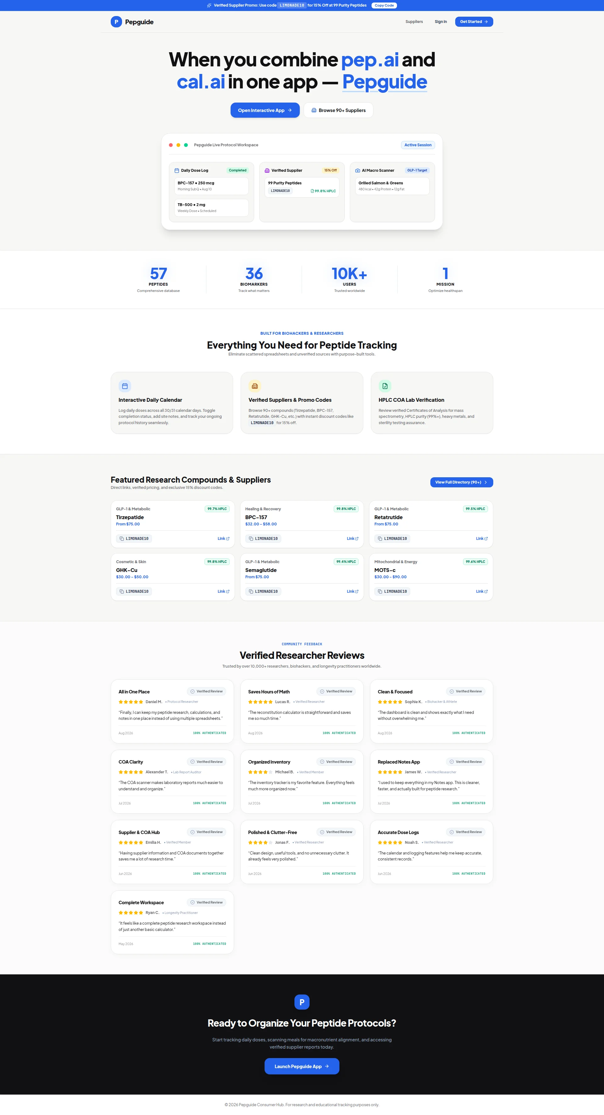
BLOODY HELL. When you combine pep.ai and cal.ai in one app — Pepguide. Is THAT your hero headline?! That's like naming your restaurant When you combine Chef Mikes grill and Janet's pantry — we get a kitchen.' WHO ARE PEP.AI AND CAL.AI? Your visitor doesn't know, doesn't care, and just bounced back to whatever Reddit thread sent them here. You've built a headline that's a VIP party invitation — and nobody's on the guest list.
Now look, it's not ALL rubbish. You've got two CTAs above the fold — Open Interactive App and Browse 90+ Suppliers — and that's actually smart. One for the action-takers, one for the window-shoppers. That's like having both a tasting menu and an à la carte option. Good instinct. But Open Interactive App sounds like you're asking me to beta-test your homework, not start transforming my peptide protocols. Where's the sizzle? Where's the promise?
The product UI mockup in the hero? NOW we're talking. Dose logs, supplier discounts, macro scanning — you're SHOWING the kitchen in action. That's the right move. But the card is so tiny and crammed with detail that it's like reading a menu printed on a postage stamp. Make it bigger, make it breathe, let people actually SEE what they're getting.
And here's what makes me want to throw my apron — you've got 10K+ users sitting in a stats bar BELOW the fold like some forgotten side dish! That number belongs IN the hero, front and center, right under that headline. Trusted by 10,000+ biohackers — THAT'S your credibility appetizer. Serve it first, not after the dessert course.
The typography hierarchy is clean, I'll give you that. Big H1, distinct buttons, nothing fighting for attention. But you've got a gaping hole between the headline and the CTAs — no subheadline, no explanatory bridge, nothing. It's like serving a main course with no sides. Cold traffic hits that headline, gets confused, and leaves. You need a supporting line that says what Pepguide DOES and who it's FOR.
Improvement examples
When you combine pep.ai and cal.ai in one app — Pepguide
The All-in-One Peptide Hub for Biohackers — Track Doses, Verify Suppliers & Scan Macros in One Place
The original headline is a name-drop that only works for the twelve people who already know those apps. The rewrite instantly tells cold traffic WHAT the product does and WHO it's for — which is the bare minimum your headline needs to accomplish. Stop being clever. Start being clear.
Strengths
- Two CTAs with clear primary/secondary distinction — 'Open Interactive App' and 'Browse 90+ Suppliers' serve different visitor intents above the fold like a well-designed menu with options for every appetite
- The product UI mockup in the hero actually shows real functionality — dose logs, supplier discounts, macro scanner — instead of some generic stock photo nonsense. You're showing the kitchen, and that takes guts
- Typography hierarchy is clean with a dominant H1 and visually distinct CTA buttons that don't compete with each other — at least the plating is professional
To improve
- The headline 'When you combine pep.ai and cal.ai in one app — Pepguide' is an inside joke nobody's in on — it communicates ZERO value to anyone who doesn't already know those products, which is basically everyone
- No supporting subheadline exists to explain what Pepguide actually does — cold traffic reads the H1, furrows their brow, and hits the back button. You've left them standing at the door with no greeter
- The 10K+ users stat is buried below the fold in a stats bar when it should be screaming from the hero — that's your best credibility ingredient and you've hidden it in the walk-in fridge
Copywriting
NEEDS WORK
Right, the copy on this page is like a chef who knows every technique but has never actually tasted their own food. Let me carve through this.
The features section headline — Everything You Need for Peptide Tracking — is the copywriting equivalent of food served here. It's FINE but it's not going to make anyone's pulse quicken. However — and I'm giving credit where it's due — the subline Eliminate scattered spreadsheets and unverified sources with purpose-built tools is genuinely BRILLIANT. It names the enemy, it implies the rescue, it speaks directly to the pain. That line is your best ingredient and you've buried it in a section subheader like truffle shavings hidden under a pile of mashed potato. PROMOTE IT TO THE HERO. NOW.
The three feature cards? Seriously?! Log daily doses across all 30/31 calendar days. Toggle completion status, add site notes. That's not sales copy, that's a USER MANUAL. You're reading me the instruction booklet while I'm trying to decide if I want to buy the thing! Where's the outcome? Where's so you never miss a dose or botch a protocol again? You're describing the oven knobs when you should be describing the smell of the roast.
The supplier section is a product catalog with discount codes. Functional? Yes. Persuasive? About as persuasive as a parking meter. And that promo code LIMONADE10 — it appears on this page more times than the word peptide. It goes from helpful reminder to desperate coupon newsletter in about three scrolls. We get it. LIMONADE10. It's burnt into my retinas.
Now, the testimonials. Oh, the testimonials. Ten of them! That's a GIFT. And what do they say? Saves me so much time. Much more organized now. Cleaner, faster. You know what those sound like? Fortune cookies written by someone who's never eaten Chinese food. Not ONE testimonial says I was miscalculating my BPC-157 reconstitution until Pepguides calculator caught my error' or I switched suppliers after seeing the HPLC purity data and my results improved dramatically. THAT'S the specificity that converts in this niche. Vague praise is the enemy of trust.
The footer CTA — Start tracking daily doses, scanning meals for macronutrient alignment, and accessing verified supplier reports today — is a run-on feature shopping list wearing a call-to-action costume. It's trying to say everything and landing on absolutely nothing.
The tone is right for the audience — technical, respectful, not dumbed down. Grammar is spotless. But the fundamental sin is this: you're EXPLAINING the product instead of SELLING the transformation. Stop describing the kitchen equipment and start describing how the meal will change their life.
Improvement examples
Log daily doses across all 30/31 calendar days. Toggle completion status, add site notes, and track your ongoing protocol history seamlessly.
Never lose track of a dose again. Log every peptide, every injection site, every day — so your protocol stays consistent and your results actually mean something.
The original describes UI mechanics like a product spec sheet. The rewrite taps into the fear every biohacker has — losing track and ruining their protocol — then delivers the payoff: results that actually mean something. That's what gets people to click, not toggle descriptions.
Strengths
- 'Eliminate scattered spreadsheets and unverified sources with purpose-built tools' is genuinely sharp, pain-point-first copy — it's the best line on the entire page and it's criminally underused buried in a section subheader
- Tone is perfectly calibrated for a biohacker/researcher audience — technical enough to be credible without being impenetrable. You respect your reader's intelligence and that matters in this niche
- Grammar and spelling are immaculate throughout — no typos, no awkward phrasing, no embarrassing errors. In a niche where credibility is everything, at least you haven't shot yourself in the foot with sloppy writing
To improve
- Feature descriptions read like excerpts from a user manual — 'Toggle completion status, add site notes' tells me HOW the tool works but never WHY I should care. Sell the outcome, not the interface
- All ten testimonials use maddeningly vague language with zero specific results — 'saves me time' and 'more organized' could describe literally any app ever made. Not one concrete before/after scenario that would convert a skeptical biohacker
- The promo code LIMONADE10 is plastered across the page so many times it transitions from helpful to desperate — it dilutes the message quality and makes the whole page feel like a coupon circular
Unlock 8 Remaining Categories
Call-to-Action
DECENT
Locked content
Social Proof
CRITICAL
Locked content
Architecture
DECENT
Locked content
SEO & Meta
NEEDS WORK
Locked content
Mobile
DECENT
Locked content
Visual Design & Branding
DECENT
Locked content
Performance
DECENT
Locked content
llmreadiness
DECENT
Locked content
Locked Content
Access the full conclusion with the top 3 priority actions and a personalized motivational message.