The Verdict
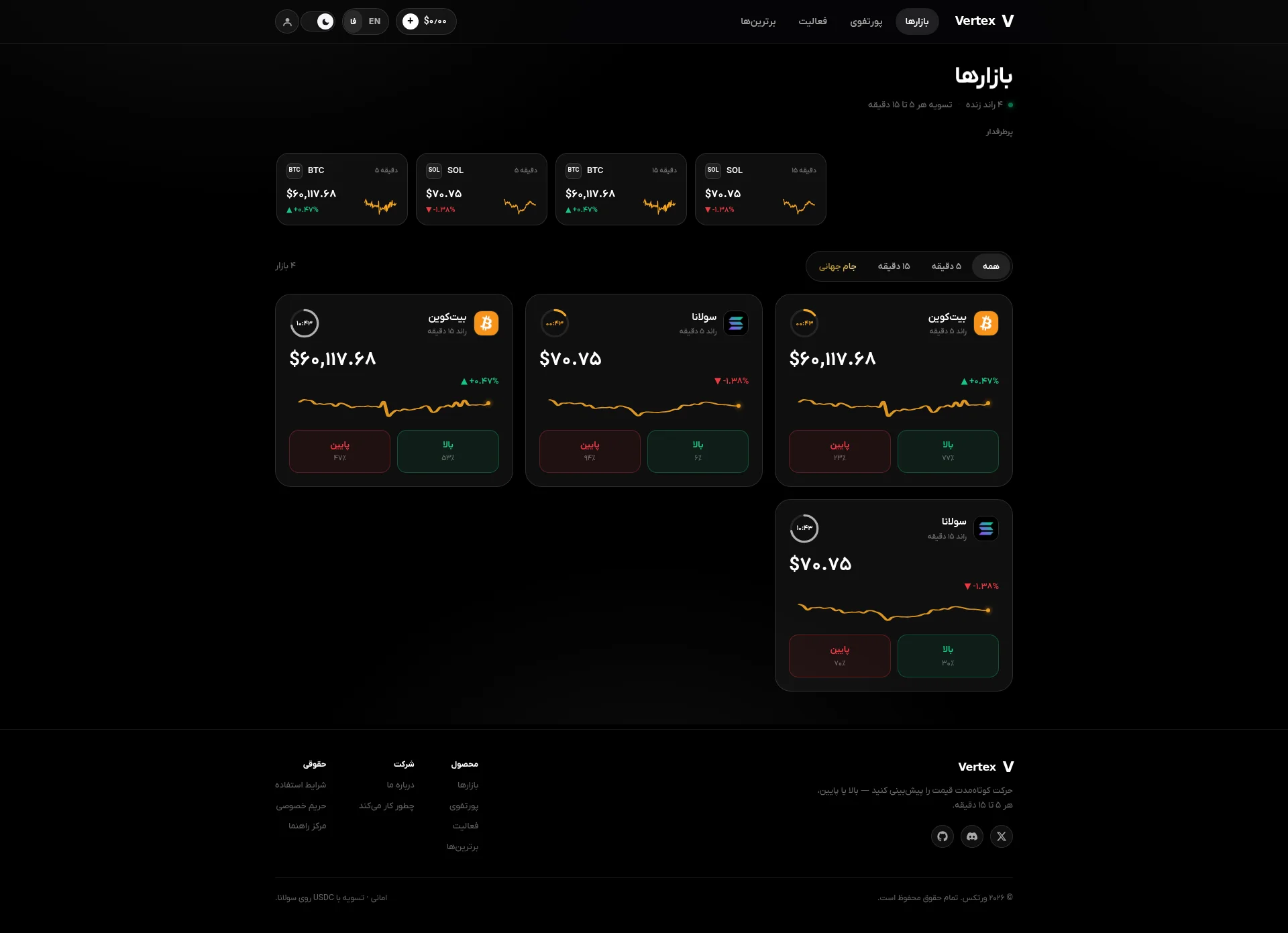
RIGHT. Let me get this straight. You've built a prediction market — a place where people are supposed to hand over REAL MONEY in USDC — and your homepage is just... a dashboard? No welcome mat, no hello, no 'here's why you should trust us with your crypto.' You've essentially opened a restaurant with no front door, no menu, and no maître d' — just a kitchen full of sizzling pans and a sign that says 'Markets' in big letters. The dark theme looks sharp, I'll give you that, and the orange chart lines have a certain Bloomberg-meets-casino charm. But CHARM doesn't convert visitors into users! Your LCP is 4.5 seconds on mobile — that's not slow, that's GLACIAL. Half your potential customers have already left to go bet on something else before your page even finishes loading. Zero testimonials. Zero social proof. Zero onboarding. The leaderboard — your ONE shot at showing people actually use this thing — doesn't even load! Your best piece of copy, the one line that actually explains what you do, is hiding in the FOOTER like a shy waiter who won't come to the table. Listen to me: you've got a functional product wrapped in a beautiful dark skin, but you're serving it raw to people who don't even know what they're eating. Cook it properly, plate it up front, and for the love of God, give people a reason to sit down at your table.
Vertex: A Crypto Casino Dressed Like a Bloomberg Terminal — With Zero Customers to Show For It
Look, Vertex isn't ugly. The dark theme, the orange chart lines, the clean card layout — someone clearly knows what a crypto trading interface is supposed to look like. But there's a massive difference between looking like a product and being a product people will actually use. Right now, this site assumes you already know what a prediction market is, already trust Vertex with your USDC, and already have a Solana wallet ready to go. That's three enormous assumptions for a B2C platform targeting people who want to bet on whether Bitcoin goes up in the next 5 minutes. There's no landing page. No hero that sells the dream. No testimonials. No user count. No 'try it free' button. The leaderboard is broken. The portfolio page says 'log in to see your portfolio' to people who haven't signed up yet. This isn't a conversion funnel — it's a maze where the entrance is also the exit.
Hero Section
CRITICAL
BLOODY HELL, where IS the hero?! I've looked at this page three times now and I STILL can't find one. Your hero is the word بازارها — Markets — just sitting there like a cold plate of toast at a Michelin-star restaurant. Below it? A dashboard. Live price cards. Countdown timers ticking away. You've skipped the entire concept of welcoming a human being to your website and gone straight to shoving a trading terminal in their face! This is like walking into a restaurant and the chef immediately throws a raw steak at you and screams COOK IT YOURSELF! Your actual value proposition — Predict short-term price movement — up or down, every 5 to 15 minutes — is genuinely BRILLIANT. It's clear, it's exciting, it's the kind of line that makes people lean in. And where did you put it? IN THE FOOTER! The FOOTER! That's like writing the specials board and nailing it to the back of the toilet door! Nobody reads the footer first, you donut! The Up/Down buttons on the market cards? Completely useless for new visitors — they need a funded account to work. So your entire above-the-fold experience is a dead end. A beautiful, dark-themed, orange-accented DEAD END. No signup CTA. No Get Started. No social proof — not a single user count, not a single testimonial, not even a Join 500 traders badge. The 4 live rounds indicator tells me the kitchen is open, but it doesn't tell me if anyone's actually eating here. Your visual hierarchy is serving existing users who already know the menu, while every new visitor is standing at the door wondering what kind of restaurant this even is. The RTL Persian layout is handled properly — credit where it's due — but proper typography can't save you when the entire strategic direction of this section is BACKWARDS.
Improvement examples
بازارها (H1, followed immediately by live market cards with no explanation or CTA)
Predict crypto price moves. Win in minutes. — Bet up or down on Bitcoin and Solana every 5–15 minutes. Settle in USDC on Solana. [Create Free Account] [Watch How It Works]
Your current 'hero' is the word 'Markets' — that's not a hero, that's a navigation label pretending to be one. A proper headline + subheadline + dual CTA would catch every single visitor who currently bounces because they have absolutely no clue what to do on this page. Move your footer tagline UP where it belongs!
Strengths
- The footer tagline 'Predict short-term price movement — up or down, every 5 to 15 minutes' is a genuinely sharp, benefit-driven one-liner — it just needs to be your H1, not buried six feet under in the footer like a secret you're ashamed of
- Live market cards with real-time countdowns, orange chart lines, and price data create an immediate sense of energy and legitimacy — for anyone who already understands what they're looking at
- RTL layout and bilingual FA/EN support is properly implemented, showing genuine respect for the target audience — this is real craft, not a Google Translate job
To improve
- There is NO hero section — no headline, no subheadline, no primary CTA above the fold; the page opens directly into a product dashboard as if every visitor already has USDC in their wallet and knows exactly what a prediction market is
- ZERO social proof anywhere on the homepage: no user count, no trading volume, no testimonials, no trust badges — you're asking people to deposit real cryptocurrency into a platform that looks like it might have been built yesterday by one person in a basement
- The only clickable buttons visible (Up/Down on market cards) require a funded account to use, making the entire above-fold experience a gorgeous, well-designed brick wall for new visitors
Copywriting
CRITICAL
Right, let's talk about the WORDS on this website — or rather, the stunning ABSENCE of them. Your homepage has roughly 156 words. That's not a landing page, that's a TWEET THREAD. And most of those 156 words are navigation labels, price numbers, and UI elements! You've built a prediction market where people bet real money, and your homepage copy is basically: Here are some numbers. Bitcoin costs this. Solana costs that. Good luck. IS THAT YOUR PITCH?! That's like a restaurant menu that just says Food. We have it. Sit down. The tragic part? Your how-it-works page actually has DECENT content — a logical 6-step breakdown that walks through signup to withdrawal. Someone on your team CAN write! But even there, it reads like a compliance officer dictated it to a robot. Receive a dedicated deposit address on Solana. Send USDC (SPL) to it. SPL?! You think the average person betting on 5-minute Bitcoin moves knows what SPL stands for? That's like telling a diner your protein has been sous-vide processed at 57.2°C in a vacuum-sealed polyethylene pouch instead of just saying perfectly cooked steak. Every single sentence on this site describes what the product DOES. Not one sentence tells the user what they GET. Settlement every 5 to 15 minutes is a feature. Know if you won in under 15 minutes is a BENEFIT. See the difference? One reads like a spec sheet, the other makes someone's pulse quicken. Your target audience wants FAST, EXCITING, EASY wins — and your copy sounds like it was written by someone who's never felt excitement in their life. The specifics you DO have — $1 per winning contract, USDC settlement, 5 and 15-minute windows — are genuinely credible and concrete. But they're all hiding on the how-it-works page while your homepage sits there, empty as a restaurant on health inspection day. Persian grammar and spelling are clean throughout — at least you haven't butchered the language. But strategically, this copy talks to the product, not to the customer. And customers are the ones with the wallets, yeah?
Improvement examples
تسویه هر ۵ تا ۱۵ دقیقه (Settlement every 5 to 15 minutes)
Find out if you won in under 15 minutes — no waiting, no uncertainty, just fast results straight to your USDC wallet.
The original is a cold feature statement about settlement timing that could be on a blockchain whitepaper. The rewrite turns it into a benefit that speaks to what the user actually WANTS: fast, clear outcomes and money in their wallet. That's the difference between a spec sheet and a page that converts.
یک نشانی واریز اختصاصی روی سولانا دریافت میکنید. USDC (SPL) به آن بفرستید (Receive a dedicated deposit address on Solana. Send USDC (SPL) to it)
We give you your own deposit address — just send USDC to it from any Solana wallet (like Phantom or Backpack) and your balance updates automatically within seconds.
The original assumes the user knows what SPL means and has deposited crypto before. The rewrite names popular wallets for context, adds a reassuring outcome ('updates automatically within seconds'), and removes the cold, clinical tone that makes new users feel like they need a computer science degree to participate.
Strengths
- The how-it-works page has a genuinely clear 6-step structure covering the full user journey, with specific credibility-building details like '$1 per winning contract' and 'USDC (SPL)' — someone on this team understands the product inside and out
- The footer tagline 'Predict short-term price movement — up or down, every 5 to 15 minutes' is concise, clear, and actually communicates the core value prop in plain human language — it's the best line on the entire site
- Specific risk disclosures (KYC required, US/South Korea geo-restrictions) show real transparency that builds trust with serious users who know the regulatory landscape
To improve
- The homepage has 156 words total and virtually ZERO persuasive copy — it's all navigation labels, price numbers, and UI chrome, giving new visitors absolutely no reason to sign up, deposit money, or even scroll down
- The how-it-works page reads like a compliance manual crossed with a technical whitepaper — phrases like 'double-entry ledger' and 'on-chain trading address' will send non-crypto-native users running for the hills, and those users are your biggest growth opportunity
- There is no benefits-oriented copy ANYWHERE on the site — every sentence describes what the product does mechanically, never what the user gains emotionally (excitement, speed, simplicity, the thrill of a quick win)
Call-to-Action
CRITICAL
Locked content
Social Proof
CRITICAL
Locked content
Architecture
CRITICAL
Locked content
SEO & Meta
CRITICAL
Locked content
Mobile
NEEDS WORK
Locked content
Visual Design & Branding
DECENT
Locked content
Performance
CRITICAL
Locked content
llmreadiness
CRITICAL
Locked content