The Verdict
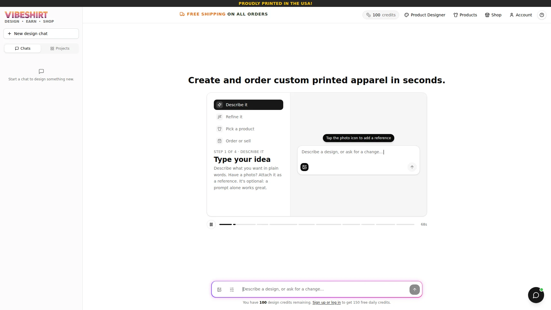
Right, listen up. VibeShirt has a genuinely brilliant idea — AI-powered custom apparel with a creator marketplace. That's a TASTY concept for 2026. But the homepage? It's like opening a five-star restaurant and serving your guests an empty plate with a note that says 'imagine the food.' You land on a white void with a chat box and NOTHING ELSE. No shirts, no happy customers, no sizzle whatsoever. You've got 932+ designs and 41+ stores hiding in the back kitchen while the dining room sits empty! The 'FREE SHIPPING' and 'PROUDLY PRINTED IN THE USA' banners are nice garnishes, but garnish without a main course is just a sad plate. LCP at 2.6 seconds is passable — not brilliant, not terrible. But the REAL crime? Zero structured data, 121 words of copy on the entire homepage, and 7 testimonials that are apparently too shy to show their faces on the front page. You've got the ingredients for something special here. Now COOK THEM.
VibeShirt: Cool Concept, Half-Baked Homepage
Look, VibeShirt is actually onto something. AI-generated custom apparel with a marketplace for creators? That's a solid pitch for 2026. The problem is the homepage doesn't sell ANY of that. You land on what looks like a ChatGPT clone with a logo slapped on top, stare at an empty text box, and think 'wait, is this a design tool or a therapy session?' There's no social proof, no product photos above the fold, no customer reviews — nothing to make a first-time visitor trust that their $17 won't disappear into the void. The shop page is genuinely stacked with 900+ designs and dozens of stores, but none of that energy makes it to the front door. It's like having a packed restaurant but boarding up the windows so nobody knows you're open. The bones are there. The flesh, the muscle, the personality — that needs serious work.
Hero Section
CRITICAL
BLOODY HELL, is THAT your hero section?! I've seen more personality in a hospital waiting room! You're selling CUSTOM PRINTED APPAREL — wearable art, creative expression, FUN — and your hero looks like someone accidentally deployed the developer staging environment to production and went home for the weekend.
Let me give you credit where it's due, because I'm fair. The H1 — Create and order custom printed apparel in seconds. — is actually a proper sentence. Clear, benefit-forward, gets the job done in under three seconds. The four-step process sidebar (Describe it / Refine it / Pick a product / Order or sell) gives visitors a roadmap. And those header banners — FREE SHIPPING ON ALL ORDERS and PROUDLY PRINTED IN THE USA! — at least show you understand that trust signals exist as a concept. WELL DONE on the basics.
But here's where I lose my mind. You've got a product that is FUNDAMENTALLY VISUAL — people are literally designing artwork to wear on their bodies — and your hero contains ZERO product imagery. Not one shirt. Not one design. Not one human being wearing anything. It's a white canvas with a floating chat widget! That's like running a bakery and putting a picture of an oven on the menu instead of the cakes!
Your unique value prop is a three-legged stool: AI design, creator marketplace, print-on-demand shop. The hero communicates ONE of those through a UI widget rather than actual persuasive copy. And social proof? You've got 7 testimonials somewhere on this site and 932+ designs in the shop — those are REAL numbers, those are CREDIBLE — and yet the hero shows me absolutely nothing. No customer count, no star rating, no Join 10,000 creators banner. You're hiding your best dishes in the walk-in freezer!
The 68-second video timeline at the bottom suggests there's a demo video, which is actually smart — but it's sitting there like a forgotten side dish, with no visual preview or thumbnail to entice anyone to watch it. You need to SELL the sizzle before asking someone to type into a blank text box with zero context.
Improvement examples
Create and order custom printed apparel in seconds.
Design Your Perfect Shirt in Seconds — Powered by AI. Join 10,000+ creators who've turned ideas into wearable art. Free shipping. Printed in the USA.
The original H1 is decent but it's doing ALL the work alone with zero backup. The rewrite stacks the value prop with social proof and key reassurances in a supporting subheadline. You need a one-two punch — the headline hooks them, the subheadline closes the trust gap. That's how you convert cold traffic who've never heard of you.
Strengths
- H1 'Create and order custom printed apparel in seconds.' is clear, action-oriented and communicates the core offer instantly — the ONE thing this hero gets right, and it gets it properly right
- 'FREE SHIPPING ON ALL ORDERS' and 'PROUDLY PRINTED IN THE USA!' banners in the header provide immediate trust signals that address two of the biggest e-commerce objections upfront
- The 4-step process sidebar (Describe it / Refine it / Pick a product / Order or sell) gives users a clear mental model of the workflow — it's good UX design even if it's doing the heavy lifting that copy should be handling
To improve
- Zero product imagery in the hero — for a custom apparel brand, showing no actual shirts, no designs, no humans wearing anything above the fold is like a steakhouse with no pictures of steak. Inexcusable!
- No social proof whatsoever in the hero section — you've got 7 testimonials and 932+ designs on this site and NONE of that credibility makes it to the front door where cold traffic lands
- The hero leads with the raw product UI instead of selling the dream first — a first-time visitor sees a blank text box and thinks 'what am I supposed to do here?' instead of 'I NEED to try this right now'
Copywriting
CRITICAL
One hundred and twenty-one words. ONE HUNDRED AND TWENTY-ONE! I've written longer complaints to my dry cleaner! You're running an e-commerce site that needs to convince complete strangers to trust an AI they've never used, pay money for clothes they can't touch, and believe the print quality won't look like a fax machine sneezed on a t-shirt — and you've given them fewer words than a fortune cookie?!
The copy that DOES exist is all instructional text: Describe what you want in plain words. Have a photo? Attach it as a reference. Its optional: a prompt alone works great.' That's a TOOLTIP, not copywriting! It's the equivalent of a waiter explaining how to hold a fork instead of describing what's on the menu. It tells people HOW to use the tool but never once answers the question every single visitor is screaming in their head: WHY SHOULD I CARE?
And here's what makes me want to flip the table — your meta description is actually BRILLIANT: Dream it, wear it. Design and order your perfect custom tee in seconds with AI-powered design tools, or shop the marketplace of independent creators. Starting at $6.99. That's GOOD copy! The $6.99 price point is a killer hook! Dream it, wear it is punchy! But it's buried in the HTML metadata where only Google can see it! You've written your best marketing material for robots and given humans a blank text box!
I know the brand voice exists because your shop page store descriptions are genuinely fun — Raised by cable TV, disciplined by a garage door opener — that's personality! That's flavour! But the homepage is as bland as unseasoned chicken breast. The voice took a holiday the moment someone built the landing page.
No problem/solution framework, no storytelling, no emotional hooks, no benefit statements. Grammar is clean though — so congratulations, you can spell. But you can't win a cooking competition by just not burning the kitchen down.
Improvement examples
Describe what you want in plain words. Have a photo? Attach it as a reference. It's optional: a prompt alone works great.
Just type what you're imagining — 'a vintage NASA logo but make it a cat' — and our AI generates a print-ready design in seconds. Starting at $6.99. Free shipping. No design skills needed.
The original reads like an instruction manual for a microwave. The rewrite shows a concrete, fun example that makes the AI feel real and approachable, drops the devastating $6.99 price anchor, and eliminates the 'I'm not a designer' objection — all in the same breath. THAT'S how you write copy that converts.
Strengths
- The meta description nails the dual value prop (AI design + marketplace) AND includes the $6.99 starting price — it's genuinely strong SEO copy, even though it's tragically invisible to actual human visitors on the page
- The earnings page copy shows real specificity with exact commission tiers ($1.00 to $2.00/item) and unlock thresholds — proof that someone on this team CAN write persuasive, trust-building copy when they bother to try
- Shop page store descriptions show authentic brand personality and voice — 'Raised by cable TV, disciplined by a garage door opener' is the kind of copy that makes people smile and stay. Now put that energy on the HOMEPAGE
To improve
- 121 words on the entire homepage — catastrophically thin for an e-commerce site that needs to build trust with cold traffic, explain a novel AI product, AND convince people to buy apparel they can't physically see or touch
- The $6.99 starting price — arguably the single most powerful conversion hook on the entire site — appears ONLY in the meta description and is completely invisible to any human visitor on any page
- Every sentence on the homepage is either a UI label or a usage instruction — zero benefits-focused copy, zero emotional hooks, zero customer outcomes, zero 'here's why your life is better with VibeShirt'
Unlock 8 Remaining Categories
Call-to-Action
NEEDS WORK
Locked content
Social Proof
CRITICAL
Locked content
Architecture
CRITICAL
Locked content
SEO & Meta
CRITICAL
Locked content
Mobile
DECENT
Locked content
Visual Design & Branding
NEEDS WORK
Locked content
Performance
DECENT
Locked content
llmreadiness
CRITICAL
Locked content
Locked Content
Access the full conclusion with the top 3 priority actions and a personalized motivational message.