The Verdict
Right, let me be straight with you. Your hero section is like a well-plated starter — clean headline, smart dual CTAs, the kind of thing that makes me nod with approval. The copy on the homepage? Actually sharp. Concrete, technical, written by someone who understands their audience. But then — BLOODY HELL — an 8.71-second mobile LCP?! That's not a landing page, that's a hostage situation! Your visitors are trapped in a loading screen longer than it takes me to filet a sea bass. You've got Apple and Linear logos you could be flaunting, three decent testimonials with real names, and a time savings calculator that's genuinely brilliant — but half your audience never sees ANY of it because your kitchen is on fire before the first course even leaves. The cookie consent banner slapping visitors in the face on arrival is the soggy cherry on this undercooked cake. Fix the performance, move the trust signals up where they matter, and for the love of God, stop making people wait nine seconds to learn about a PRODUCTIVITY tool. The irony is killing me.
Lightning Assist: Solid Product, Website That Needs a Defibrillator
Listen, Lightning Assist has a genuinely useful product and the bones of a decent landing page. The headline lands, the value prop is clear, and someone clearly thought about the user journey. But then you look under the hood and find a mobile LCP of 8.71 seconds — that's not a website, that's a waiting room. You've got 78 images crammed into a page that should have 15, 134KB of unused JavaScript just vibing there, and a cookie consent banner that greets mobile users like a bouncer at a club nobody asked to enter. The testimonials are real and specific, which is rare and good — but there are no logos from recognizable companies, no user counts with actual numbers, and the pricing page buries the enterprise tier behind 'Contact Us' like it's a secret society. The product deserves better than this. Fix the performance, beef up the trust layer, and stop letting a cookie popup be the hero of your hero section.
Hero Section
DECENT
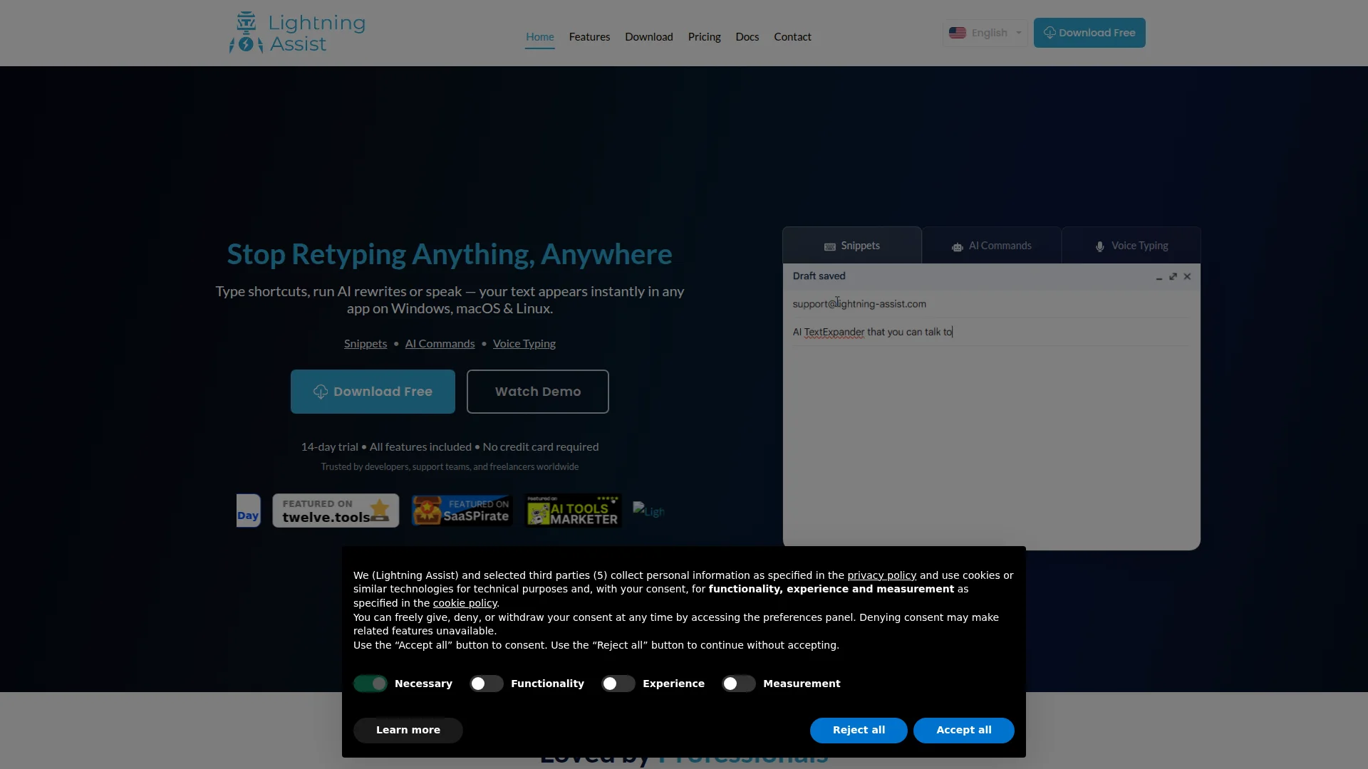
Right, the hero does the ONE thing most SaaS pages completely botch — it tells me what you do in three bloody seconds. Stop Retyping Anything, Anywhere. YES. That's a headline with a backbone. It names the pain, it promises the cure, and it doesn't waste my time with corporate waffle. The sub-headline adds platform clarity — Windows, macOS, Linux — and the three feature pills give me the menu at a glance. Well done, genuinely.
The dual CTA setup? Textbook. Download Free as the main dish, Watch Demo as the side for browsers who aren't ready to commit. And that micro-copy underneath — 14-day trial • All features included • No credit card required — that's friction removal served at exactly the right moment. Like putting the bread basket on the table before anyone has to ask. Smart.
Now let me tell you where this kitchen catches fire. That app mockup on the right? It's showing a HALF-TYPED sentence: AI TextExpander that you can talk to. Is THAT your hero visual?! An incomplete thought mid-keystroke?! That's like serving a steak still mooing — it's not dynamic, it's UNFINISHED. Either show the completed magic or don't show it at all.
And then — oh, this one STINGS — Trusted by developers, support teams, and freelancers worldwide. Worldwide! How impressive! Except you've given me ZERO numbers, ZERO recognizable names, and ZERO reason to believe this isn't just your mum and her book club. You actually HAVE logos — I can see Apple and Linear in your source data — so WHY aren't they front and center in the hero?! That's like having wagyu beef in the walk-in and serving frozen chicken nuggets instead!
Those badge logos at the bottom — Twelve.tools, SaaSPirate, AI Tools Marketer — they're so tiny and visually inconsistent they look like someone panic-glued them on at midnight before launch. And the vertical whitespace above the headline on desktop? You've got the most valuable real estate on your entire website showing... dark background texture. That's prime above-the-fold territory being used as an empty parking lot. Unacceptable.
Improvement examples
Trusted by developers, support teams, and freelancers worldwide
Trusted by 4,000+ developers, support teams, and freelancers — saving an average of 4.5 hours per week
Specific numbers make the same claim 10x more credible. You literally have the time savings data from your own calculator — use it in the hero where it matters most. Vague claims are the empty calories of copywriting.
Strengths
- Headline 'Stop Retyping Anything, Anywhere' immediately communicates the core benefit and pain point in under 3 seconds — this is a properly seasoned dish
- Dual CTA structure with 'Download Free' + 'Watch Demo' correctly serves both ready-to-convert and still-browsing visitors like a menu that works for everyone
- Friction-reducing micro-copy '14-day trial • All features included • No credit card required' placed directly under the primary CTA removes objections before they form
To improve
- Social proof is embarrassingly vague — 'Trusted by developers worldwide' with zero numbers and zero logos when you HAVE Apple and Linear available is like hiding your Michelin stars in a drawer
- The hero app mockup shows an incomplete sentence ('AI TextExpander that you can talk to') mid-typing, making your product demo look broken rather than impressive
- Excessive vertical whitespace above the headline on desktop wastes above-the-fold real estate that should be converting visitors — you're paying rent on a penthouse and leaving the living room empty
Copywriting
DECENT
Now HERE is where I start to see some actual talent in the kitchen. The feature copy on Lightning Assist is genuinely, properly good — and I don't say that lightly. Hold a hotkey, speak, release — your words appear instantly wherever your cursor is. That's CONCRETE. That's SEQUENTIAL. That's a reader watching themselves use the product in their mind. Beautiful.
No browser tabs, no copy-pasting into ChatGPT — naming the competitor behavior and positioning against it? That's a chef who knows what restaurant is across the street. Smart, aggressive, effective.
The time savings calculator showing 29.3 workdays / year? BRILLIANT. That's the kind of personalized, specific number that makes a CFO's eyebrow twitch. That's not save time — that's heres exactly how much time, calculated for YOUR workflow.' Whoever built that deserves a raise.
And the testimonials! Real names, real job titles, real technical use cases — terminal commands and Slack shortcuts, Git, Docker, deployment or SSH commands. These aren't fake five-star fluff written by the founder's cousin. These are developers talking to developers. That's TRUST you can taste.
But then — and I need you to sit down for this — I visit your pricing page and find THIS: Whether youre just getting started or looking for an advanced solution, we offer flexible pricing options designed to help you succeed.' SERIOUSLY?! That sentence is the copywriting equivalent of a microwave dinner! You could paste that on ANY SaaS pricing page on the ENTIRE INTERNET and no one would notice the difference! After writing such sharp homepage copy, how did you let THIS beige wallpaper onto a live page?!
The FAQ is the same problem. Lightning Assist is a versatile desktop application designed to boost productivity by streamlining workflows and reducing repetitive tasks. My eyes glazed over before I finished reading it, and I'm being PAID to read this! Where's the punchy voice from the homepage? Where's the personality? It's like your homepage was written by a chef and your secondary pages were written by an HR department.
And where — WHERE — is the competitive differentiation story on the main page? Why Lightning Assist over TextExpander? Over Espanso? That argument is buried in comparison pages that most visitors will never find. That's like hiding your specials menu inside the broom closet. Bring it to the table!
Improvement examples
Whether you're just getting started or looking for an advanced solution, we offer flexible pricing options designed to help you succeed. Explore our plans and choose the one that best fits your team, snippets, and goals.
One plan. $5.99/month. Unlimited snippets, AI commands, voice typing, and team sharing. Try it free for 14 days — no credit card, no gotchas.
The original is 40 words of absolutely nothing — like serving a plate of garnish with no entrée. The replacement states the price, lists the value, removes friction, and treats the reader like the intelligent adult they are. Say what you mean!
Strengths
- Feature descriptions use concrete, sequential language ('Hold a hotkey, speak, release') that lets prospects visualize the exact experience — this is copywriting that COOKS
- Time savings calculator produces specific personalized numbers ('29.3 workdays / year') that hit harder than any generic 'save time' claim ever could
- Testimonials include real job titles and specific technical use cases (Git, Docker, Slack shortcuts) that speak directly to the developer and power-user audience — authentic and persuasive
To improve
- Pricing page copy is completely generic boilerplate ('flexible pricing options designed to help you succeed') that could belong to any SaaS product ever created — it's a disgrace after such strong homepage writing
- FAQ answer for 'What is Lightning Assist?' uses corporate filler language ('versatile desktop application designed to boost productivity') when it should match the sharp, direct voice of the homepage
- The competitive differentiation story — why Lightning Assist over TextExpander, PhraseExpress, or Espanso — is buried in comparison pages instead of being woven into the main page where it would actually convert browsers into buyers
Call-to-Action
DECENT
Locked content
Social Proof
NEEDS WORK
Locked content
Architecture
GOOD
Locked content
SEO & Meta
DECENT
Locked content
Mobile
CRITICAL
Locked content
Visual Design & Branding
DECENT
Locked content
Performance
CRITICAL
Locked content
llmreadiness
DECENT
Locked content